Educational strip

Cartoon strip
Character for front of pamphlet

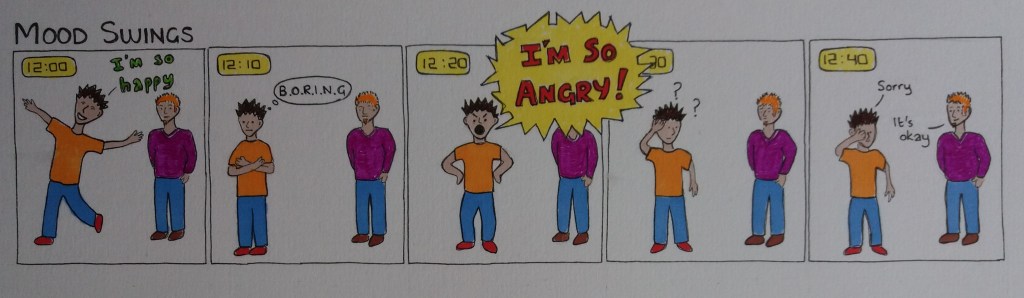
The brief for this exercise is to produce: a cartoon strip of up to five frames to explain to young teenagers how to cope with an aspect of the onset of puberty; and a single illustration of the character from the cartoon strip for use on the front cover of a pamphlet. The title of the leaflet is ‘What’s happening to my body? It’s all going mad’.

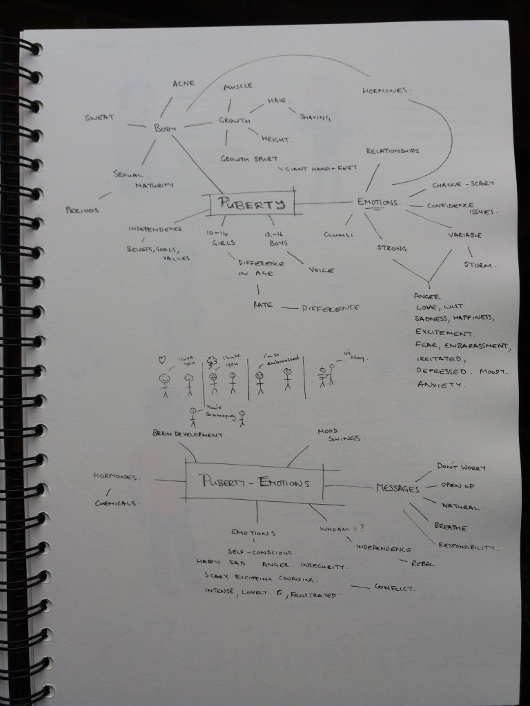
I began by brainstorming aspects of puberty to illustrate in the cartoon. I quickly hooked onto the idea of focussing on emotions, in particular mood swings. An initial idea when I was brainstorming was to have a teenage character having a different emotion to a second character in each panel of the cartoon and then the second character giving a positive message in the final panel. I quite like this idea although it needs development.

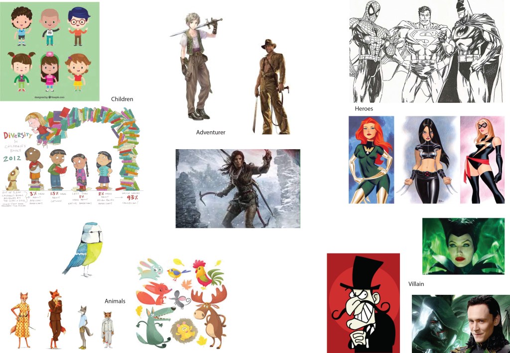
I think it will help to develop the characters and see how the idea evolves. I’m going to take a look at cartoon styles for young teenagers. I’m thinking of having one teenage character who needs to be able to express lots of different emotions and one other character – adult, animal – that just looks empathetic and caring.

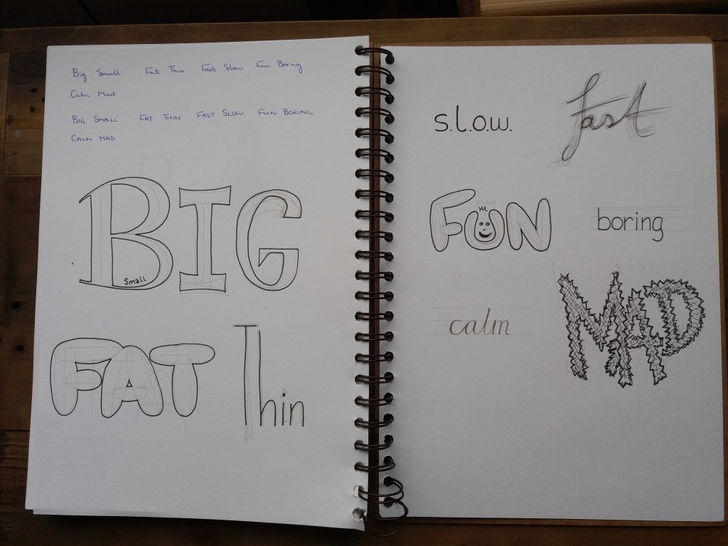
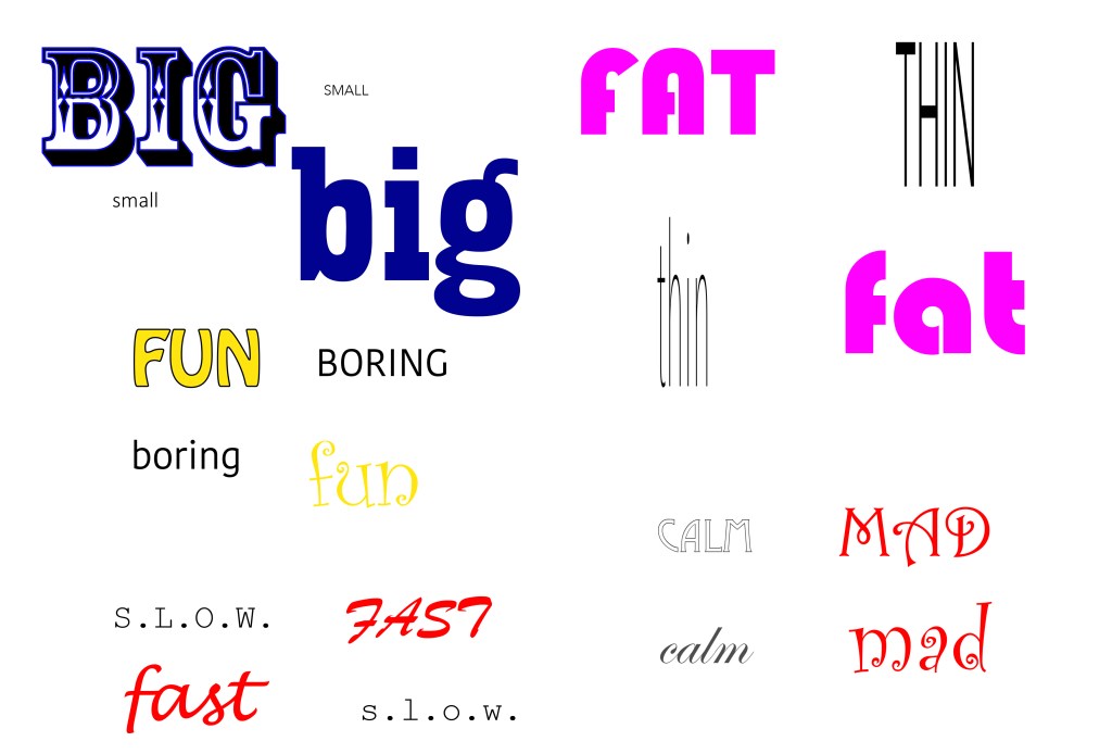
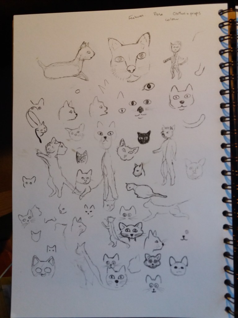
I scrolled through examples of cartoon characters that are aimed at young teenagers. It was notable that the characters are dominantly human, rather than the animals etc aimed at younger ages. They’re also more realistic depictions of humans than cartoons aimed at younger age groups. The cartoons tend to depict teenagers, slightly older than the targeted audience, in bright colours wearing trendy clothes. Given that my character is going to be exhibiting lots of different emotions I should start looking into facial expressions and body stances that indicate different emotions.

Sketches of characters from online research, development of my own character and facial emotions.
Thinking about emotions and posture
My main character

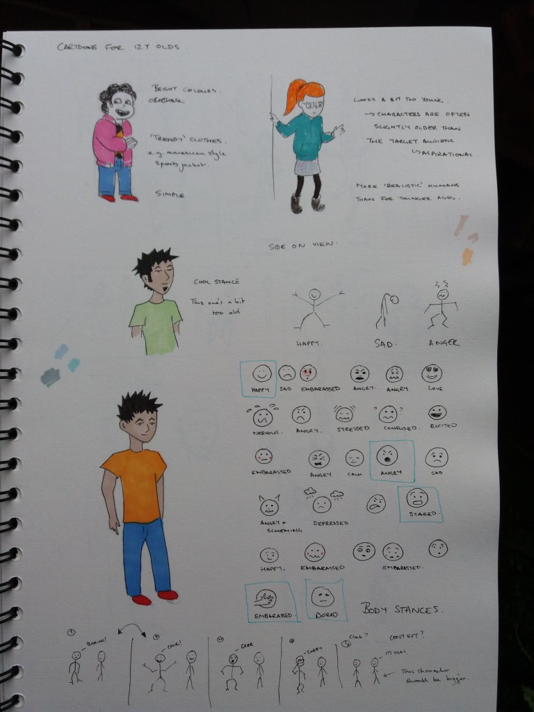
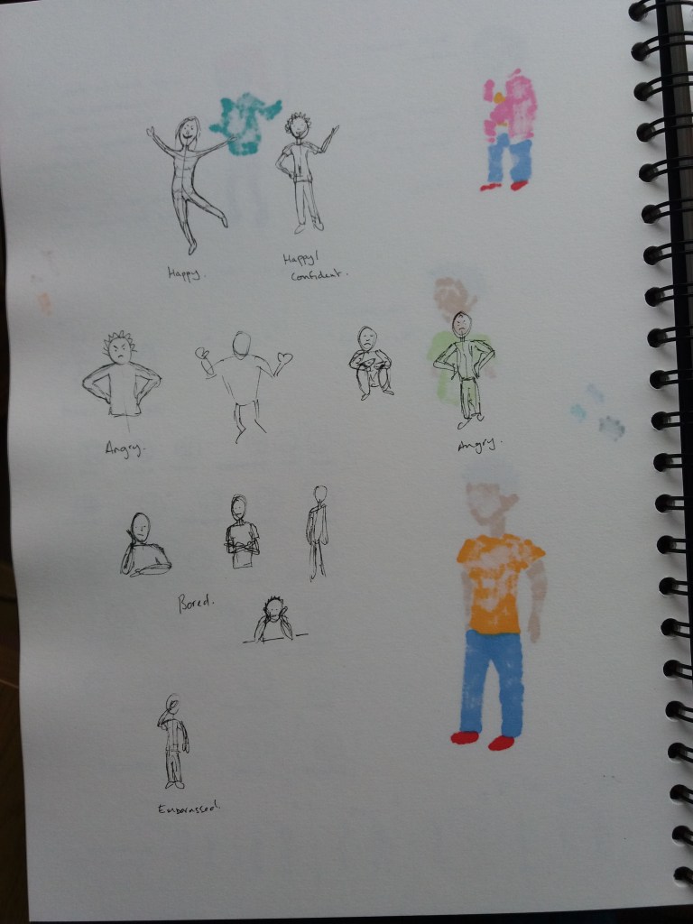
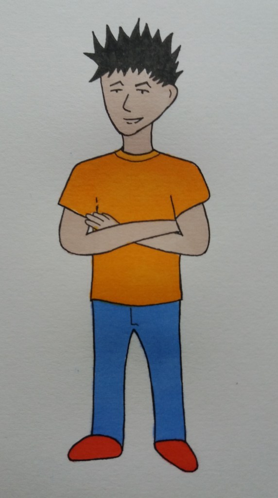
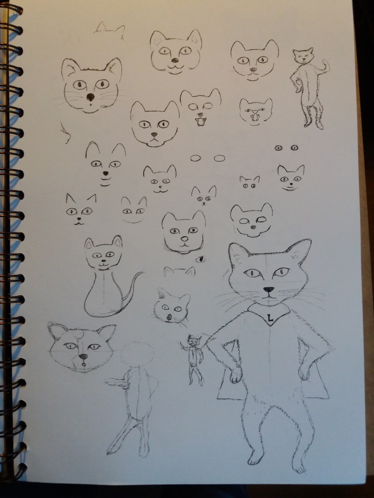
The focus of the images is going to be facial expression and posture in order to convey emotion with minimal words. I researched and sketched some quick ideas about posture before thinking more about the narrative of the cartoon strip. I soon realised that I needed to think about the second character. I was in a quandary for a while as to what gender both the teenage and adult characters should be as it’s a topic relevant to all teenagers. In the end I decided on male simply because I liked the male character that I’d drawn. I think the second character should look like an older version of the first but with a calm persona. That way it is ambiguous as to whether the character is an older brother, parent, or someone else. I think it makes sense to not make the character too parenty – but just an older role model. I think that the amount this character says should be minimal – teenagers (and other people) don’t generally want to be preached to.

I’m envisioning that this pamphlet has a whole series of short cartoons in it. Therefore, I’m going to keep the cartoon as a strip, rather than making it pamphlet sized. I’m going to have a look at cartoon styles and how to integrate images from one panel to the next. My current thumbnails aren’t very dynamic.

Thumbnails
Thumbnails
Cartoon strip – black and white
Cartoon strip – colour

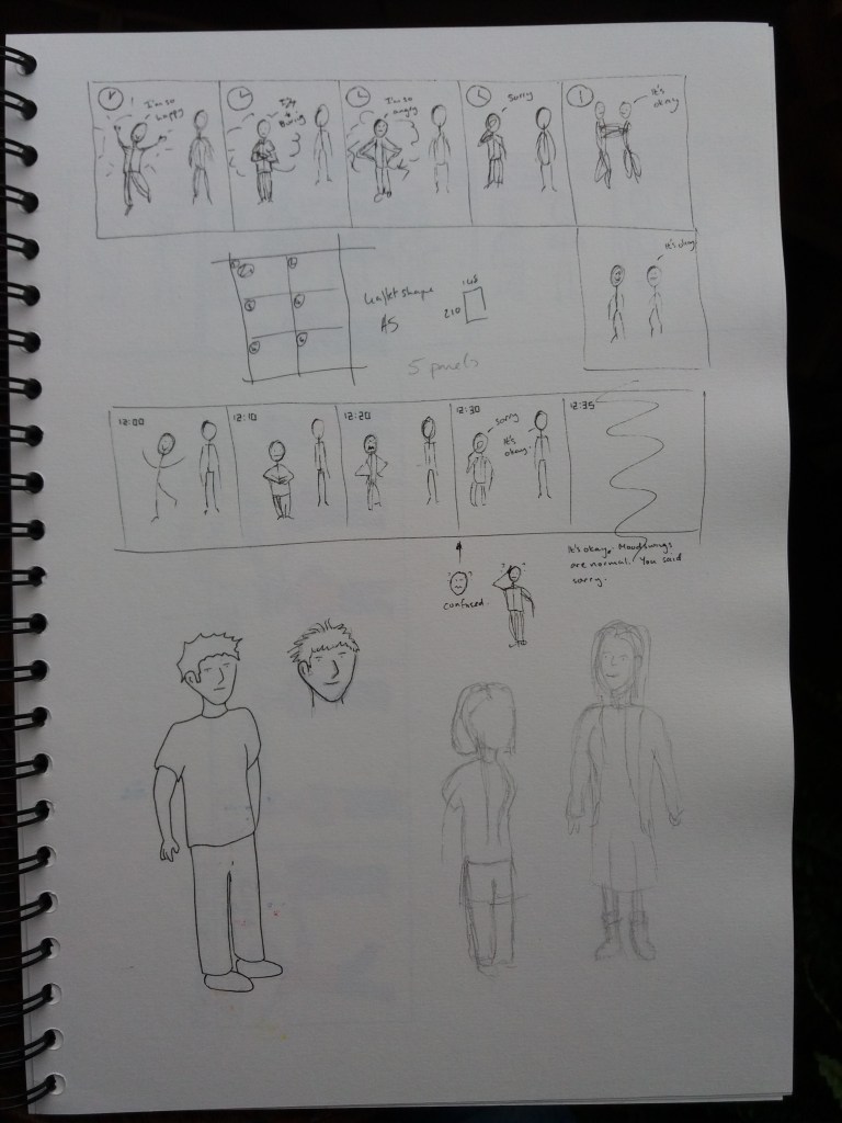
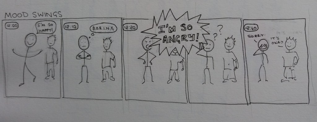
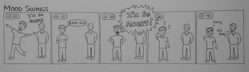
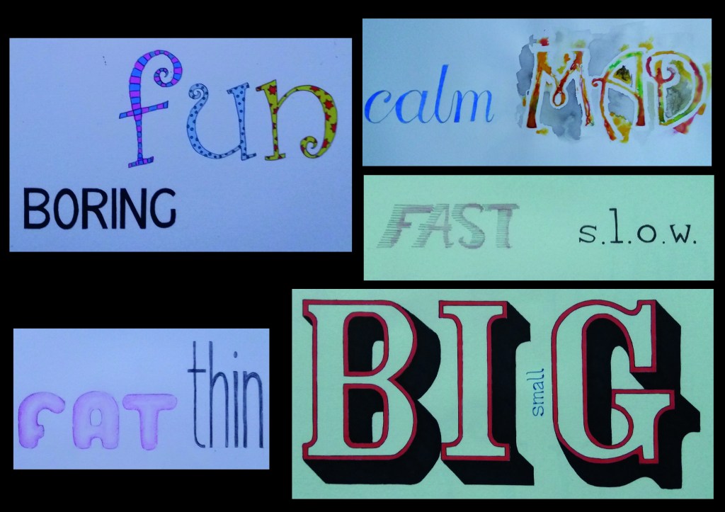
Elements of the cartoon strip that I think work quite well are the narrative, chronology – using the clock, and use of different fonts to help express emotion. I enjoyed learning about facial expressions and posture to show emotions. I think the style of the cartoon strip isn’t particularly exciting. There’s too much white space. I considered including a background; however, I decided that it would detract from the image.

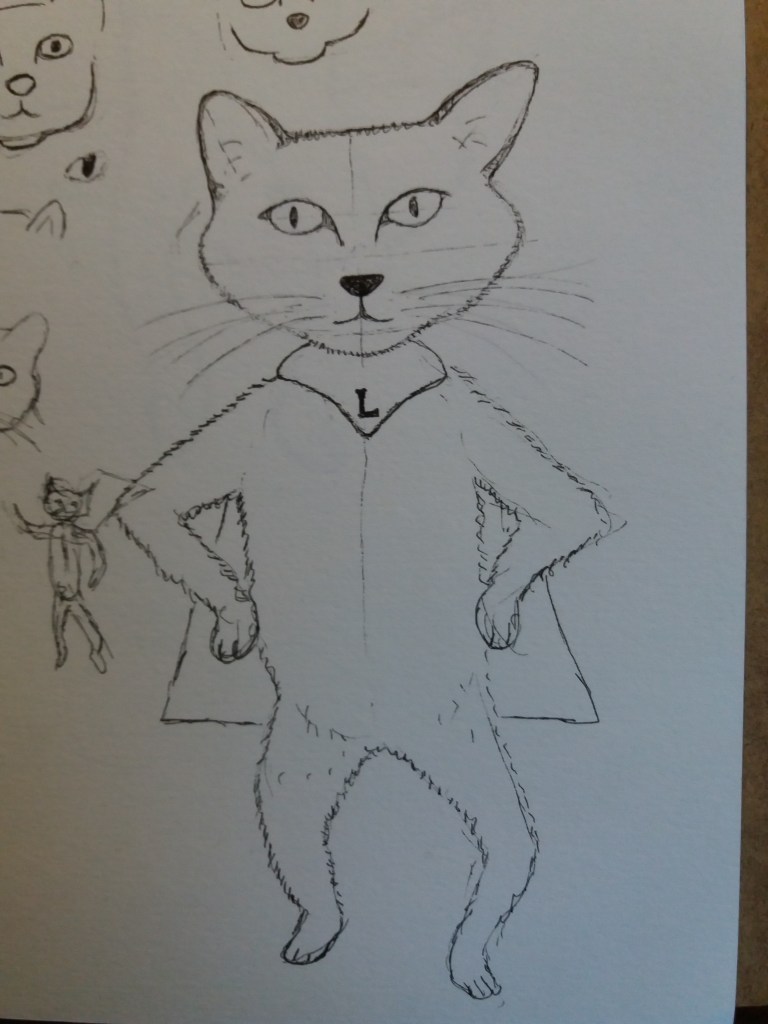
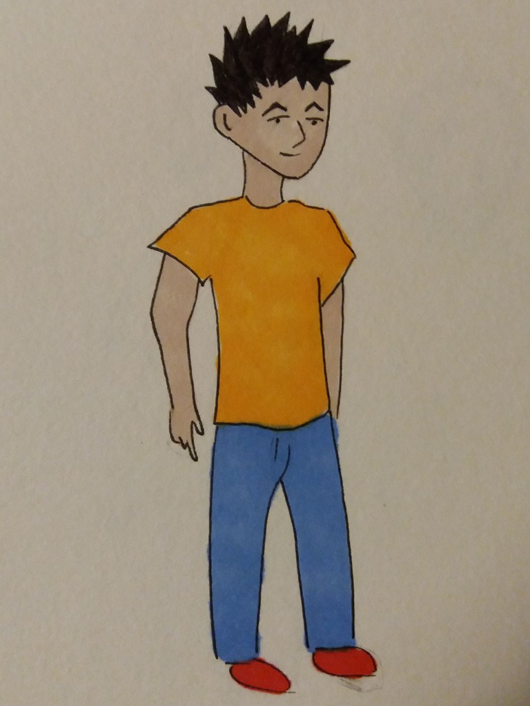
Now I need to consider what the character on the front of the pamphlet should look like – what emotion should he be showing in order to appeal to young teenagers to look at the pamphlet. I decided to try to make him look confident and experimented with different confident postures.

Confident postures

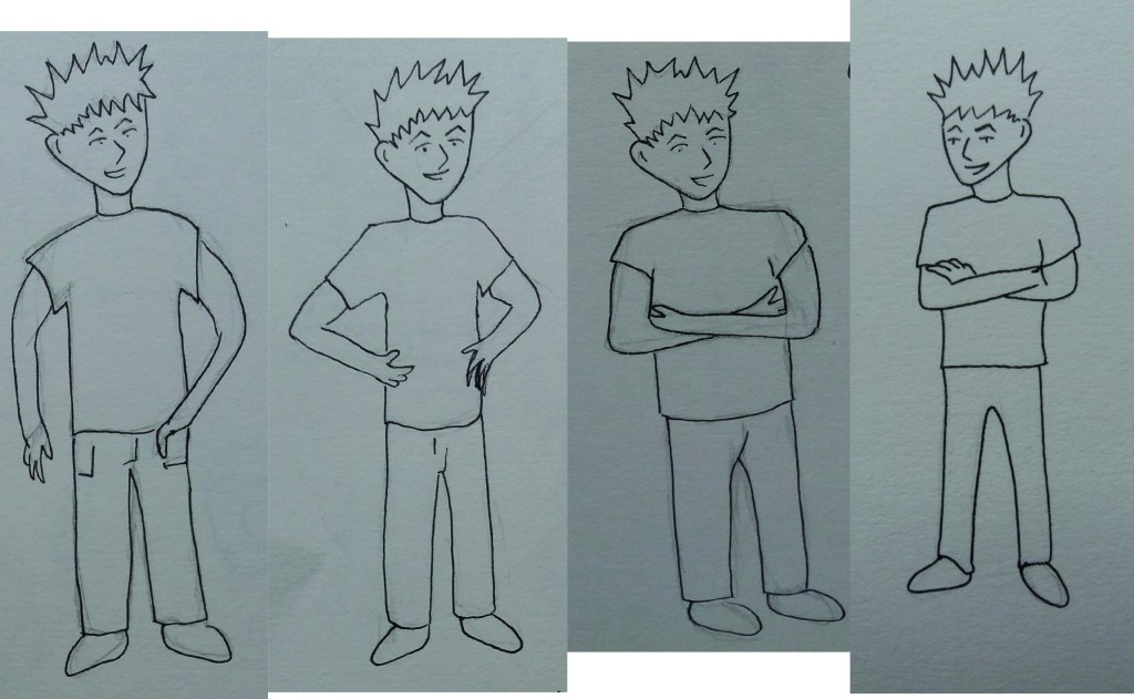
My final character is rather simple. However, his simplicity does make it easy to manipulate his body into different postures to show emotion.

Character for front of pamphlet

Working for children

Images of ‘wild’ lions for younger readers (3-5 years) and older readers 9+ years.

This exercise is about thinking about appropriate visuals for different age groups of children. The exercise begins with an exploration of the different styles used for different age groups. Then choosing words and characters and brainstorming images appropriate to different age groups.

Examples of children’s book illustration

I began by taking a trip to my local library in order to look at a wide range of children’s books. The books for younger readers are very strongly character based. The illustration is often just of the character, in bold colours, with no surrounding scenery. In contrast for 7-9 year olds there is often detailed and complex scenery that can be explored. For older readers, there is a move away from images, towards text, images are often in black and white and decorate the text, rather than depicting the text. There are exceptions to this with formats such as graphic novels. It wasn’t always obvious to me when looking through the library books, what age range the book was intended for, I guess that varies among different children.

For the next stage of this exercise I chose to brainstorm illustration for the word ‘wild’ for pre-school readers (3-5 years) and for established readers (7-9 years).

Brainstorming the work ‘wild’ for different age groups.

I began with some brainstorming of ideas around the word wild. Many of these came out with natural themes of plants and animals. It doesn’t come across well in the images that I tried to keep the images for the younger age group fun and not scary.

For the next stage of this exercise I’m going to introduce the character of a lion. I’ve chosen this as it came up in the previous brainstorming exercise.

Brainstorming lion designs for different age groups

I drafted some different lions. Those towards the left hand side of the pages are aimed at the 3-5 year old audience; whereas, those on the right hand side of the page are aimed at the 7-9 year old audience. For the younger audience, the lions are quite cute; whereas for the older audience they’re showing some signs, such as teeth, of being fierce beasts. I’m contemplating experimenting with digital collage for the younger audience.

The next stage is to create an image of the animal that also communicates the word ‘wild’ and making sure that there is consistency in style among the character and different elements of the image. I began with the image for 3-5 year olds. I decided to make this in digital collage using 1970’s wallpaper swatches. I was conscious with this image to make the character dominant and keep the background quite simple.

‘Wild’ lion design for 3-5 year olds.

I’m really pleased with this image. I think that it’s simple and effective. Maybe I could have adopted a wilder pose for the lion – but I think his staring eyes and teeth give him a certain wildness. It was relatively quick and effective to make the image using digital collage.

For the next image I’m going to make it in the black and white style used in reading books for older children. I’ve decided to go for the 9+ age range, rather than 7-9 year olds. From my initial lion sketches, the image that most jumps out the page at me is the top right image of a lions face, so I’m going to develop an image in this style.

I wonder if my image for older readers is a little complicated, when compared to some of the examples that I looked at earlier. I think that the image lacks a certain liveliness; maybe I should have had the lion in a more dynamic pose. I think it’s quite sad that a lot of books for older readers lack colour illustrations.

Packaging

Final design for choc chip biscuits
Line visuals showing how the three biscuit boxes stack together to form a bigger picture.

The brief for this exercise was to produce a series of illustrations for packaging to be used for a range of organic biscuits for children. There are three varieties of biscuit – raisin, choc chip and ginger. Each illustration should feature an extinct animal interacting in some way with the biscuit. Full colour drawings need to reflect the flavour of the biscuit.

I began by doing some market research into biscuits aimed at children. Such packaging is typically brightly coloured, with cartoon animals and fun font styles. Some interesting designs had transparent areas, where you could see through to the actual biscuits, that were integrated with the illustration e.g. the transparent area was within the animals mouth. As well as appealing to children, many of the packages also had something to appeal to parents. For example, by including some nutritional information on the packet.

To narrow down the brief a little, I have decided that the packaging should be colourful with a fun font and a cartoon animal or animals interacting with the biscuits. I’ll include some nutritional information for adults, alongside the word ‘organic’ in order to try to make the biscuits appear wholesome. The colours of each packet will reflect the flavour.

I began by thinking about the colour of the packets. Raisin might be purple, pink, dark, pink or red. Ginger could be oranges and yellows. The most obvious colour for choc chip is brown but this isn’t very bright and appealing, so maybe, reds, blues, purples, greens – there isn’t an obvious clour associated with this flavour.

Brainstorming extinct animals

I began by exploring and brainstorming different types of extinct animals. This also made me start thinking about how the biscuits might be incorporated into the image. I wondered about whether the packets could help tell the story of how the animal went extinct e.g. sailors stealing biscuits from dodo’s nests, biscuit asteroids wiping out the dinosaurs. This might have a little educational value that could appeal to parents. Alternatively the animals might be playing with the biscuits e.g. pterosaurs ‘bombing’ with biscuits, pleisiosaurs playing ping pong with biscuits etc. Alternatively the biscuits could be part of the animals anatomy e.g. biscuit ammonites. In this part of the exercise I was colouring with felt tip pens. I think these might be appropriate for the final image – childish and brightly coloured.

Thumbnails
Thumbnails for individual designs and stackable boxes

I decided upon using pterosaurs, ammonites and dinosaurs for my designs. I began by thumbnailling the ammonite design. I tried having amonites catching biscuits, or being confused by floating biscuits. At this stage my favourite ammonite designs were more abstract with lots of ammonites and biscuits in a pile. I struggled with how to get the ammonites to interact with the biscuits and decided to move onto the dinosaurs where I had a more obvious story.

I quite quickly came up with a design I liked in which the dinosaurs were being surprised by a biscuit-asteroid impact. I then had the idea of this impact being caused by the pterosaurs bombarding them with biscuits. This made me wonder about having boxes with individual designs that stack together to form a bigger pictre or story. This would increase children’s pester power as they would want to collect the boxes to create the whole picture. Ethically, I’m not too happy with encouraging over-consumerism in children but from the perspective of the brief I think that it works well.

Ideas for stackable boxes

I then had a look into suitable fonts before moving onto the line visual stage. At this stage I needed to decide on a shape and size for the boxes. I have been struggling with how much time and detail to put into line visuals.

Fonts and colour
Line visuals showing the three boxes and how they stack together to form a bigger picture

I’m really pleased with the line visuals – both in terms of the design and because I’m happy with the amount of detail in them. I think that the composition of the ammonite raisin biscuit design needs a little work – there’s not a lot going on on the right hand side of the packet. I am pleased with how the designs work together to tell a story.

Thumbnails to think about colour

Before making a mock up of one of the designs I thought about colour by making rough sketches of the layout of the boxes. The yellow of the biscuits will run through and tie together all three designs but the biscuits will have orange highlights for ginger, brown choc chips and purple raisins. The blue of the sky will continue from the pterodactyl ginger biscuits to the dinosaur choc chip biscuits. Then a different blue for the sea will run from the choc chip biscuits into the ammonite raisin biscuits. In order to emphasize the ginger theme, the pterodactyls will be orange. For the raisin theme the ammonites will be in purples and blues maybe with highlights of brighter colours. The dinsaur packet is more difficult, I want to avoid lots of brown, I will try to get red rather than brown into the image.

Final design for choc chip biscuit box

I’m please with the final design. I think that it’s fun and colourful. I like that the packets tie together to tell a story. If I were to produce this again, I might make the dinosaurs and biscuits a bit bigger and make the colours even more vibrant and bright. I really enjoyed this exercise – I’m sometimes surprised as to which exercises I most enjoy as I wouldn’t have thought that I’d particularly enjoy designing packaging.

Text and image

The first part of this exercise was to take a set of pairs of words and to write them in a descriptive way. I think that the most effective of these words are calm and mad.

I then found some digital fonts that illustrated the words well and chose colours that I felt fit with the meaning of the word. I was struck at this point by how limited using fonts in illustrator is. They don’t necessarily quite do what you want. Of these fonts, I think that the lowercase ‘thin’ works quite well. I didn’t find a font that I felt illustrated the words fast or fat well.

I then created a moodboard for the pairs of words. I found this quite useful for thinking about colour and texture. This gave me good ideas for how to get movement in the word fast – I love the runner at the bottom of the image with his streaky lines. It also gave me the ideas to use lines of colour for mad.

Below are my words. I’m particularly pleased with how the word big worked in it’s bold 3D font. I’m also pleased with the colourful and curly ‘fun’ and the simple blue ‘calm’, which is little changed from myoriginal idea. Using pencil crayons for the fat and thin didn’t work well, they look like something taken from a school art wall. If I redid the word fast, I’d be more accurate about the spacing of the lines and shape of the letters – I think the design is a good idea, however, it’s not well executed.

Travel guides

Travel guide cover for Helsinki

The brief for this exercise is to produce three illustrations for a series of book jackets, at the size of an existing travel guide – for the locations Istanbul, Helsinki, Milan. The client would like illustrations in which many elements are brought together in a diagrammatic way. They would also like the type to be hand-dawn in an appropriate style.

I’m going to begin by researching the three locations. I’m going to do this be searching images and then making quick drawings of them in my sketchbook. Based on this I’m going to think about and refine the brief before providing client visuals for all three illustrations and a mock-up for one. At some point I’ll also do some research into font styles that typify the three locations.

Brainstorming sketches

I then began to think about the format of the covers. An early idea is to use a map of the city in the background with drawings of key features of the city – buildings, food etc … – superimposed on top of the map. However, I’m not sure how well this would actually stand out on a bookshelf in a shop. I also quite like the idea of making a graphic cover, maybe in the country’s national colours, with key features silhouetted on top. If I develop this graphic idea, then the font is going to be an important component of the cover, conveying the feeling of the place, so I started looking into different fonts.

Thumbnails and fonts

In the interests of time I’m going to run with the graphic idea and move onto producing line visuals. My plan is to have the writing and silhouettes in black on a coloured background from the respective countries national flags.

This is where it went a bit wrong. I became a bit obsessed with my initial line visual, which became time consuming, so I developed this into a final cover.

Helsinki book cover.

I took the hand drawn colour into photoshop and removed most of the background. I can never get the photoshop magic wand to behave how I want it to, so I end up using the rubber, which is time consuming. I’m also increasingly realising that I would be better off drawing the different elements of the image seperate from one another, so that they are easier to manipulate in illustrator and photoshop.

Once I’d removed the background, I then added in a background colour.

Travel guide cover for Helsinki

Stylistically I quite like the cover. I think using simple colours, with each book being a different colour taken from their national flag will be distinctive. I also quite like that it looks a bit like the elements have been cut out of paper and put together as a collage. I actually have plans in my head for a christmas card using the paper stars – which might look better if some of their internal white areas were removed.

My main criticism of myself in this exercise is that I failed to produce the three line visuals. This is something I struggle with – I get too particular and want them to look neat and tidy rather than being a representation and giving a feel of the final design. This is something for me to work on woth future exercises and assignments.

You get an idea of what the three designs for this exercise would look like from the thumbnails. The name of the city in an appropriate font is centre stage, then some silhouetted famous buildings and features of the city are at the bottom of the cover and some other decorative items at the top – lamps for Istanbul and shoes and bags for Milan. I had intended to make the neat cover for the Istanbul book cover as I think this would be the best of the three.

Editorial Illustration

How green is your food?

For the first part of this exercise I’m analysing some of the illustrations from today’s (22nd January 2020) opinion supplement of the Guardian newspaper.

I’m talkin’ a trillion trees people!

The first illustration shows a cartoon of a red-faced President Trump shouting ‘I’m talkin’ a trillion trees people!’. In the image Trump is flanked by people in military fatigues or wrapped in US flags in a Klu-Klux-Klan-esque way carrying militia flags and guns made from trees.

The article that accompanies the image isn’t in the supplement but is on the front page of the main newspaper. The article concerns Trumps speech at the World Economic Forum criticising climate crisis warnings pedalled by ‘prophets of doom’ and claiming that he’s a ‘big believer in the environment’ because he’s planting some trees, despite having pulled out of the Paris climate agreement.

The benefit of the illustration, and maybe the reason that it may be in the opinion section of the newspaper, is that the image is far more provocative than the written article. It depicts somebody who is highly aggressive and completely farcical.

On Brexit and Megxit

This large centre-page illustration shows a crowd of Europeans seated in a sports stand watching two men in suits push the UK away from Europe. The UK is topped with a giant crown from which Harry and Meghan are escaping onto a small boat with a Canadian flag.

The image summarises a couple of current news stories and has the title ‘on Brexit and Megxit’ and the caption ‘the rest of Europe is mesmerised as the UK prepares for Brexit and Harry and Meghan simultaneously begin their transition to exiting the royal family’.

This is a humorous political illustration and effectively depicts the farce that is going on in the UK as a European spectator sport. As with the previous illustration, this image very effectively depicts the political leaning of the newspaper.

How green is your food?

The next task is to create an illustration for this newspaper for an article called ‘How green is your food?’. To get ideas for this illustration I began by reading about the topic and making sketches whilst I was reading.

Sketchbook pages

My main take home from this reading is that this is a really complex topic. For example, I would assume that buying food that has been flown half-way around the world would have a higher carbon footprint than buying locally grown food. However, this may not be the case depending on the climate where the food is grown and local farming practices. It seems clear that meat production has one of the worst environmental impacts due to deforestation and the waste produced by animals.

I think that the key concept that I want my illustration to convey is complexity. Other words that may be useful are: air miles; carbon footprint; water; deforestation. I want to get some humour in there, maybe by creating aeroplanes out of vegetables, or having farting cows. I think the next step is to work out how to tie images of different concepts together.

Sketchbook pages

I really struggled with this first approach. It didn’t have a coherent theme. Part of the problem is that only some parts of the story are complex. Some, for example that eating meat has a serious impact are more straight forward. As a result I decided to abandon this plan and instead choose a specific article to illustrate. So I went back to the article that I read about carbon footprints and air miles, which can be found here:https: http://www.theguardian.com/environment/2008/mar/23/food.ethicalliving.

The overall message of the article is that simply considering the distance that a food product has travelled from where it was grown is not a good measure of its carbon footprint. Sometimes, food that has flown long distances has a lower carbon footprint than food grown locally.

The following words and phrases stand out in the article:

  • The concept of food miles is oversimplified.
  • Air transported beans from Kenya could account for the emission of less carbon dioxide than British beans.
  • Air freighted products are not necessarily less sustainable than local produce grown in heated greenhouses.

For the image I think I’m going to focus on the phrase – ‘air transported green beans from Kenya could account for less carbon dioxide than British beans’.

The final image is going to be 24 cm x 14 cm. Stylistically I decided that I wanted to try the style that both of the above illustrations are in – sketchy black line and pro marker/ felt tip pen. The images look quite fresh, or even rushed – like they’ve been drawn quickly for the paper.

How green is your food?

I think that the concept for my image – the CO2 scales – works; however, I don’t think that the illustration is very well executed. I think that the image would work better if it were a but busier. Maybe having the cities in which the food is consumed in the background. Exaggerating the size of some of the elements in the image e.g. the flags and the planes might also help.

Your own work

The aim of this exercise is to use one of my existing images to develop a commercially viable, or appealing object within an area of authorial practice (children’s publishing, decorative illustration, fanzines and artists books, editorial, prints and artwork, fashion and accessories).

I began by assembling a gallery of my work from my sketchbooks and coursework from this module that might be suitable – I realised that I quite like a lot of my rough sketchbook images. Several of these come from the inktober exercises and maybe I should start doing this again – sketching a random word per day.

Gallery of images

I think that it would be really useful for me to learn about the process of making greetings cards as this seems like a small first step towards making a little money from illustration.

Several of the images strike me as appropriate for cards – the bright summery strawberry, the volcano and the sketches of animals. These are certainly the type of greetings cards that I might buy. So for now my audience is me. I’m going to produce some cards, with the purpose of learning about the process of getting cards printed, that I can then give to people rather than buying cards, or producing one off cards for people. Once I understand the process then maybe I could develop more images, and more cards, with other audiences in mind.

I did some research into card printing. For all of the companies that I looked at, the smallest sized card that they would print is A6, which is bigger than I had anticipated but useful to know before the design stage. Different companies clearly had different markets – which was reflected in their minimum print run. I did find a small company that specialises in printing for illustrators, fine artists etc. They do small print runs, try to use sustainable materials etc, provide a photoshop template for the design. I think this is a good place to start.

One thing that I quickly realised when playing around with my images in illustrator is the need to have good quality photos of them. It’s really hard to get the light even across the image. I can really see the value of a scanner at this stage.

I played around with a fragment of my strawberry image from a previous assignment and also the octopus sketch from a children’s book cover exercise.

Strawberry
Strawberries
Card design on printers template

I quite like the chintzy strawberry design but think the octopus design is more the type of thing that I would buy.

This was a really useful exercise for helping me to understand the process of both manipulating my work in illustrator and photoshop and also the process of producing a ‘professional’ card. This has given me a lot more confidence in using photoshop to manipulate and alter hand drawn images. I think some of my methods are still a little clunky; however, if I put in effort to do more of this, I’m sure that things will get smoother. I’m really interested and excited to see my printed card.

Character development

Lucille

This exercise is about character development. I began by collecting together examples of different types of characters in order to understand how different character traits are portrayed visually.

Characters

Most of the characters have some aspect of their features exagerated. For example, children tend to have big heads and big eyes; whereas villains tend to have long faces and angular eyes. Superheroes and adventurers are all tall, fit or muscly and have their sexual features exagerated and highlighted, for example through being oversized, wearing tight fitting clothes and the really odd habit of male superheroes wearing their pants outside of their other clothes.

The pose that the character adopts is also important. I really love the confidence or even arrogance that it implied by the foxes and blue tit standing tall. Superheroes and adventurers have dynamic positions; whereas villains are slightly curled up to imply cunning.

The clothes and props that the characters carry help to develop the character. The villains have angular, jagged clothing. Adventurers wear clothing that is roughed up. The adventurers and superheroes often carry weapons.

The use of colour in the images is also important. For example the use of green in the images of villains may imply envy and jealousy. The use of vibrant colours for children and animals implies fun and happiness.

The next step of this exercise is to begin to develop a character. For this, I decided to develop the character of Lucille who accidentally appeared in the previous exercise. She is a magical, slightly whimsical superhero cat off on adventures to help save the world.

Cats heads
More cats heads … and finally a body

I began by thinking about Lucille’s facial features and also how anthropomorphic her body should be. Her face and body posture will be important in expressing her emotions. I tried lots of different ways of drawing the head – braking it down into a few simple lines, exagerating features, making it cartoony, trying out different expressions. In the end I settled on something semi-realistic but with exagerated features. I also tried using different colours for Lucille – she is a whimsical cat, so could be a whimsical colour.

I then thought more about Lucille’s body. I was, and still am, unsure how anthropomorphic I want Lucille to be. There seems something more whimsical about keeping her in a cat-like pose. I was reminded of the cats in Beatrix Potter books. I think that Lucille is a ‘gentle superhero’ so I don’t want her to look aggressive, carry weapons, etc. Clothing wise I compromised and gave her a little superhero cape. I also gave her a cocky but also slightly silly stance.

Lucille in her little cape.
Lucille adopts different positions.
Lucille from behind

This exercise did make me think more about how to develop characters. However, I’m not that pleased with the end result. I think that the character I have developed is quite generic. I wonder if I should have kept Lucille as more of a cat, rather than allowing her to walk on two legs. I also think that different media would help to give her a more whimsical feel – for example, I think that the pencil crayons in the previous exercise do this better. Maybe some light ink or watercolour washes would also work quite well. I think she would also benefit from having the magic carpet from the last exercise. I love sketching in black fineliner – it’s really quick and enables me to think while sketching. However, maybe it is also a little limiting and I should play with different media more.

Visual distortion

Lucille and her magic carpet

This was a really fun exercise. I’m not sure that I did what was intended in the exercise but it turned out to be a really intriguing way to develop a character. The exercise was to sketch a life-like cat or dog, then produce a simple line drawing from the first image, to use this drawing to produce a collage and then to make a drawing from the collage. I think that there was meant to be more visual distortion involved but I got a little carried away when I noticed the magic carpet in the image.

Lucy

Here’s my original drawing of my friend’s cat Lucy. It’s from a photo where she was attracted by something outside of the window. I like this picture because she is very alert and also (in the original, maybe not in this drawing) quite sphinx like. At this point I wondered about having her being intrigeued by an egyptian sphinx in the final image, or I guess she could turn into a sphinx.

Lucy in lines – discovering her magic carpet

From this original image I produced a line drawing using only five lines. In this line drawing I thought that it looked like Lucy was flying on a magic carpet; which was the surprise inspiration for the images that follow.

Lucy and her magic carpet in collage

I then used the line image to make a simple collage. Lucy is actually dark blue and made from a magazine picture of shoaling fish … which I found amusing; however, this hasn’t come through in the image. I probably should have chosen an area of the magazine picture that was a little lighter. I think this is the point that I was meant to include more visual distortion. However, I was preoccupied with images of Lucy flying through the night to rid the world of evil.

Lucy’s aalter ego Lucille flys through the night on her magic carpet.

I like the final image. While I was drawing it I had in mind children’s book illustrators such as Raymond Briggs. I can imagine writing books about the adventures of Lucille … but for now I should probably move on to the next exercise.

A tattoo

‘Mum’ tattoo

The aim of this exercise is to produce a tattoo based on the word ‘Mum’ that can also be used for a Mother’s Day card. I began by looking into the history and different styles of tattoo.

There is evidence that tatooing was already practiced in the 4th century BC. Historically, it has had signifance beyond being decorative: to brand criminals, for healing purposes, for spiritual purposes; and to identify individuals. Tatooing became more commonplace in Europe with the advent of exploration and trading with the Far East – with sailors returning with tattoos.

There are many different styles of tattoo. With the exception of realistic tattoos, I think that any of them would be suitable for this project. I want the image to ‘look like’ a tattoo, so I’m going to avoid the watercolour and illustrative styles. I think that the tribal, Japanese, or New School styles could work quite well. I love the geometric patterns in the tribal tattoos.

Styles of tattoo

In order to think more about what style might work well for the ‘Mum tattoo’, I started looking into tribal, Japanese and New Style tattoos more and sketching elements of them in my sketchbook. I also started looking into font styles used in tattoos and also elements that might traditionally be associated with Mother’s Day e.g. flowers etc. This is a tricky brief without knowing about more about the person the tattoo is intended for and their Mum. Working on stereotypes this is a tricky brief because it’s quite a feminine subject area but intended for a tattoo on a man.

Sketchbook – different styles of tattoo and examples of existing ‘Mum’ tattoos.

I am wondering about taking something that is a stereotypically feminine object e.g. a flower, or a heart and then using geometric patterns from tribal tattoos to make it into something a little more masculine. Maybe taking the more traditional ‘Mum’ tattoo sketched above and turning it into something more contemporary.

Sketchbook – playing with heart designs

I started playing with a heart design. The top image is mainly based on patterns from Norse tattoos. The second design down based on tribal tattoos made me thing of M. C. Escher and infinite loops. So for the bottom three sketches I played with making a heart infinite loop and then playing with patterns on the different edges. I think that it makes sense to have the text ‘Mum’ within the design – this will also help to link it back to more traditional ‘Mum’ tattoos. I played with having blocky Escher-type writing; however, I decided to use a plain and traditional tattoo font. I considered using different colours for the different edges of my final design. However, in the end I decided to make it all in blue. For the final design, I drew it up in blue biro.

Mum tattoo

I think that produced at a smaller scale this tattoo could work. Retrospectively I think that the version with blocky text linked through the heart looks better better. In general there is a bit too much white space in the middle of the heart. I guess red would be a more conventional colour for a heart tattoo but I think that I prefer it being in a more subtle colour.