For the first part of this exercise I’m analysing some of the illustrations from today’s (22nd January 2020) opinion supplement of the Guardian newspaper.
I’m talkin’ a trillion trees people!
The first illustration shows a cartoon of a red-faced President Trump shouting ‘I’m talkin’ a trillion trees people!’. In the image Trump is flanked by people in military fatigues or wrapped in US flags in a Klu-Klux-Klan-esque way carrying militia flags and guns made from trees.
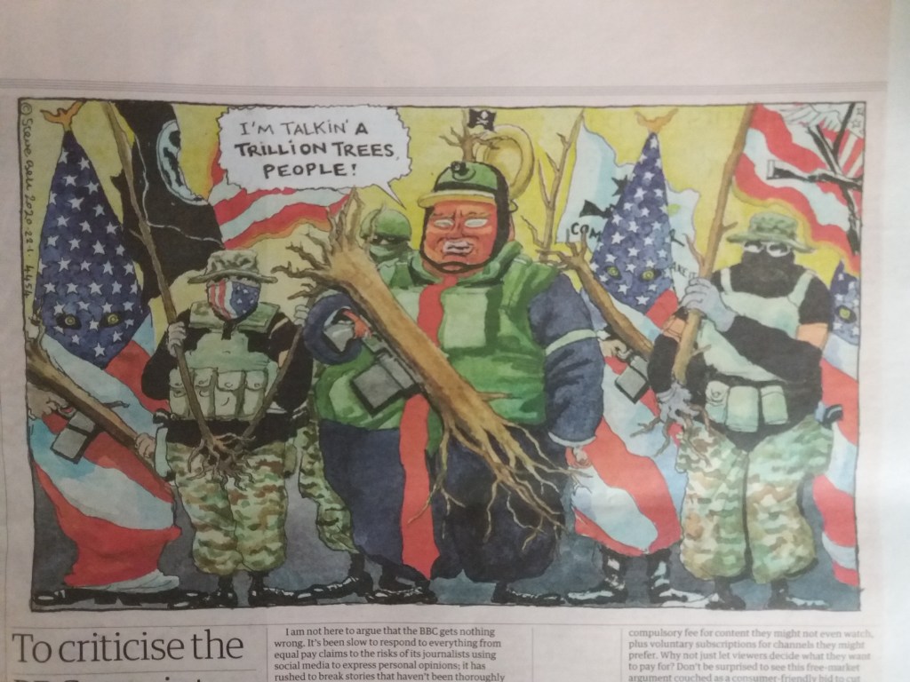
The article that accompanies the image isn’t in the supplement but is on the front page of the main newspaper. The article concerns Trumps speech at the World Economic Forum criticising climate crisis warnings pedalled by ‘prophets of doom’ and claiming that he’s a ‘big believer in the environment’ because he’s planting some trees, despite having pulled out of the Paris climate agreement.
The benefit of the illustration, and maybe the reason that it may be in the opinion section of the newspaper, is that the image is far more provocative than the written article. It depicts somebody who is highly aggressive and completely farcical.
On Brexit and Megxit
This large centre-page illustration shows a crowd of Europeans seated in a sports stand watching two men in suits push the UK away from Europe. The UK is topped with a giant crown from which Harry and Meghan are escaping onto a small boat with a Canadian flag.
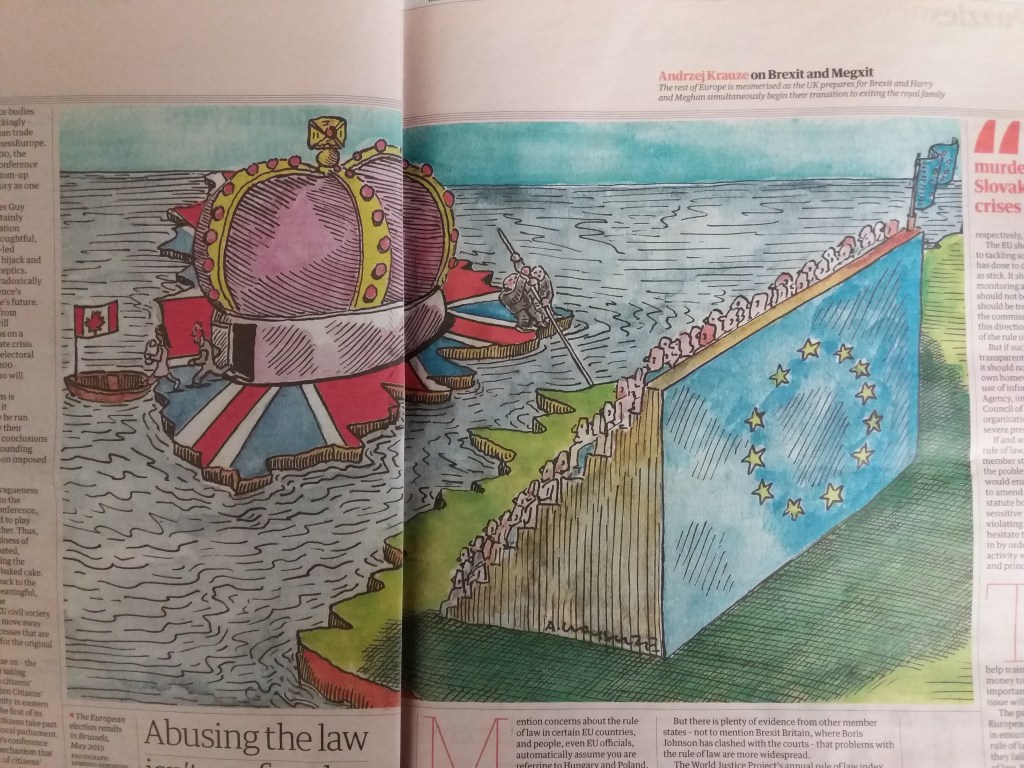
The image summarises a couple of current news stories and has the title ‘on Brexit and Megxit’ and the caption ‘the rest of Europe is mesmerised as the UK prepares for Brexit and Harry and Meghan simultaneously begin their transition to exiting the royal family’.
This is a humorous political illustration and effectively depicts the farce that is going on in the UK as a European spectator sport. As with the previous illustration, this image very effectively depicts the political leaning of the newspaper.
How green is your food?
The next task is to create an illustration for this newspaper for an article called ‘How green is your food?’. To get ideas for this illustration I began by reading about the topic and making sketches whilst I was reading.
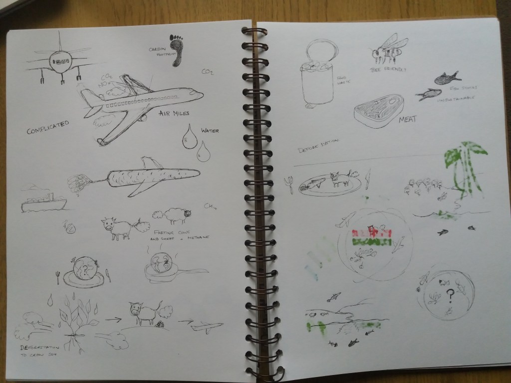
My main take home from this reading is that this is a really complex topic. For example, I would assume that buying food that has been flown half-way around the world would have a higher carbon footprint than buying locally grown food. However, this may not be the case depending on the climate where the food is grown and local farming practices. It seems clear that meat production has one of the worst environmental impacts due to deforestation and the waste produced by animals.
I think that the key concept that I want my illustration to convey is complexity. Other words that may be useful are: air miles; carbon footprint; water; deforestation. I want to get some humour in there, maybe by creating aeroplanes out of vegetables, or having farting cows. I think the next step is to work out how to tie images of different concepts together.
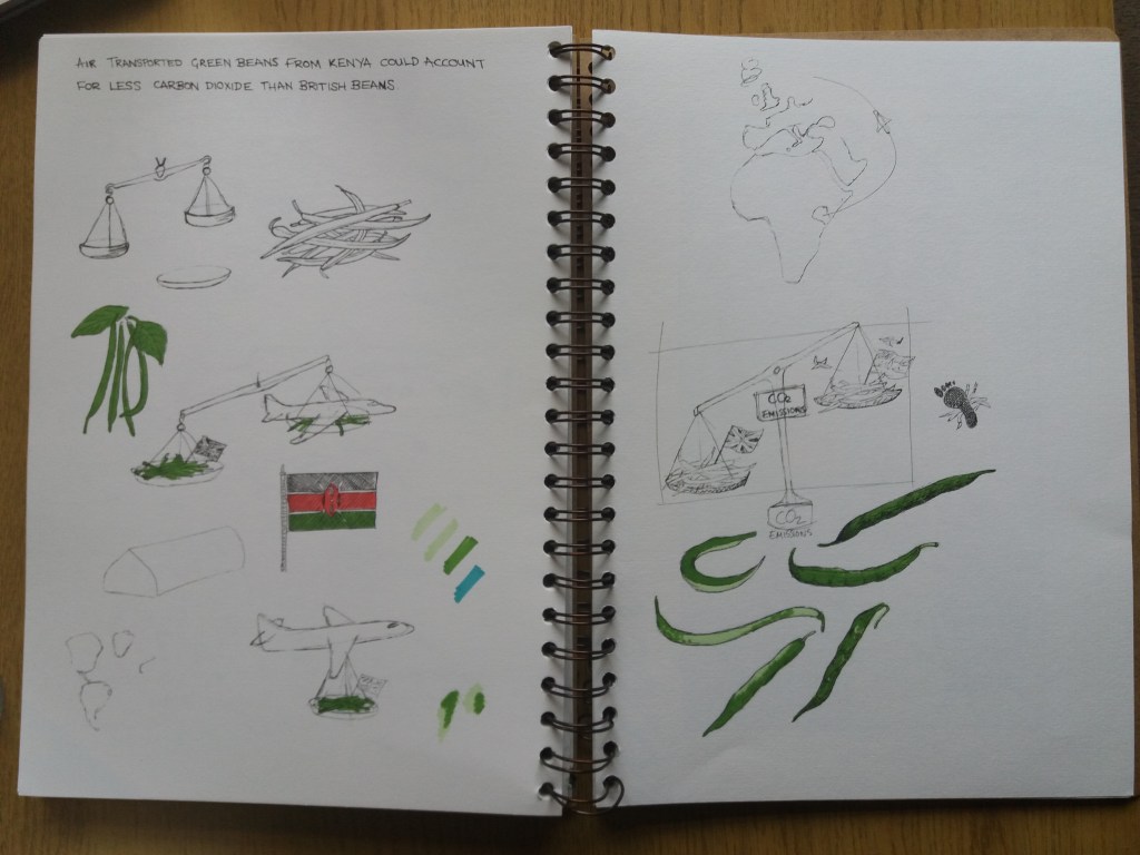
I really struggled with this first approach. It didn’t have a coherent theme. Part of the problem is that only some parts of the story are complex. Some, for example that eating meat has a serious impact are more straight forward. As a result I decided to abandon this plan and instead choose a specific article to illustrate. So I went back to the article that I read about carbon footprints and air miles, which can be found here:https: http://www.theguardian.com/environment/2008/mar/23/food.ethicalliving.
The overall message of the article is that simply considering the distance that a food product has travelled from where it was grown is not a good measure of its carbon footprint. Sometimes, food that has flown long distances has a lower carbon footprint than food grown locally.
The following words and phrases stand out in the article:
- The concept of food miles is oversimplified.
- Air transported beans from Kenya could account for the emission of less carbon dioxide than British beans.
- Air freighted products are not necessarily less sustainable than local produce grown in heated greenhouses.
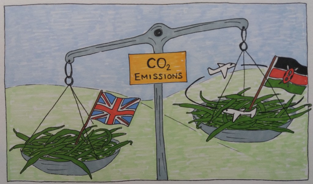
For the image I think I’m going to focus on the phrase – ‘air transported green beans from Kenya could account for less carbon dioxide than British beans’.
The final image is going to be 24 cm x 14 cm. Stylistically I decided that I wanted to try the style that both of the above illustrations are in – sketchy black line and pro marker/ felt tip pen. The images look quite fresh, or even rushed – like they’ve been drawn quickly for the paper.
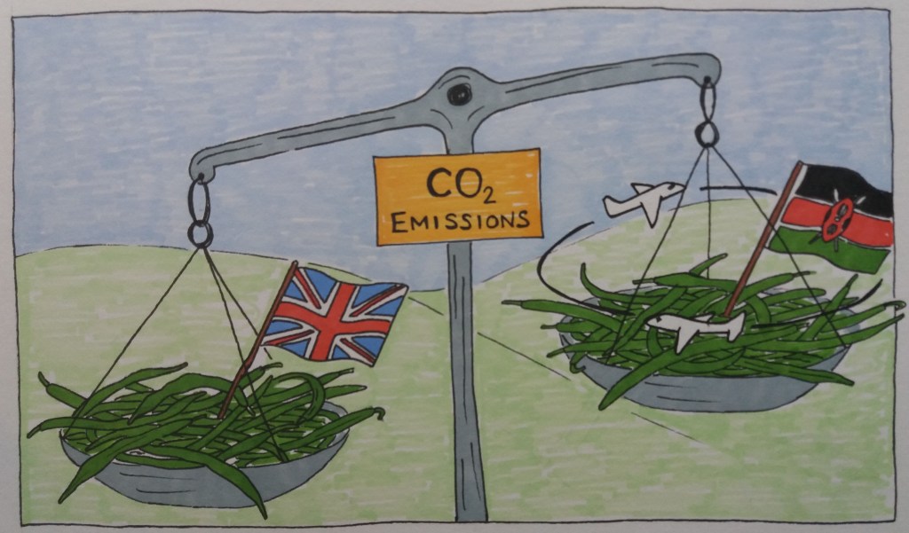
I think that the concept for my image – the CO2 scales – works; however, I don’t think that the illustration is very well executed. I think that the image would work better if it were a but busier. Maybe having the cities in which the food is consumed in the background. Exaggerating the size of some of the elements in the image e.g. the flags and the planes might also help.


