Seven days

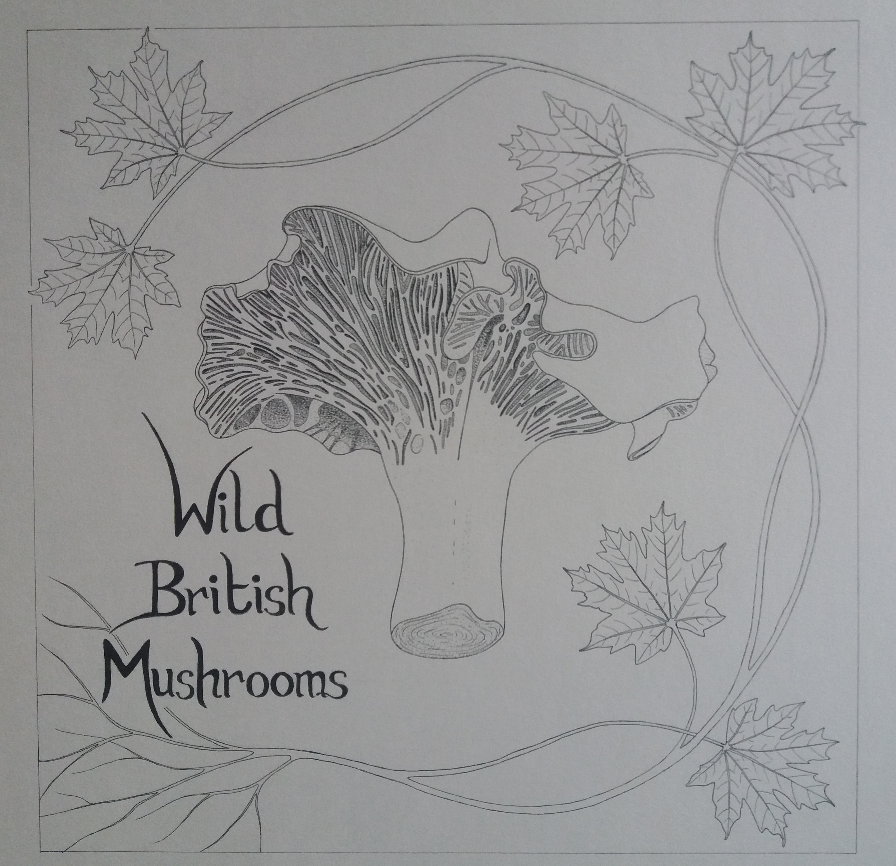
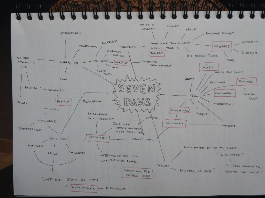
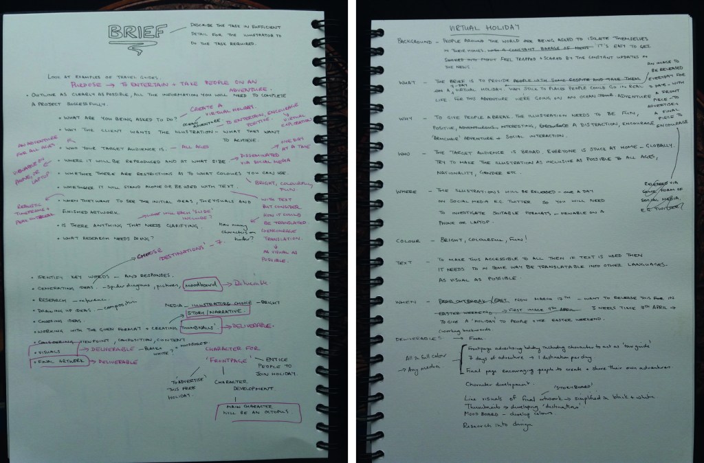
For this final assignment I need to write my own brief around the theme of seven days. The brief needs to be clear and challenging but manageable.

My brief

Initial ideas
Developing a brief

People around the world are being asked to isolate themselves in their homes. It’s easy to feel trapped, lonely and anxious.

My brief is to provide friends with a 7-day virtual holiday. As this is a virtual holiday, we’re going to abandon the usual tourist trail and instead dive into the world’s oceans led by our friendly tour guide inkfish.

The aim is to give people a happy distraction. So the most important thing is that the illustrations are fun and encourage ‘armchair’ adventure and social interaction.

The primary target audience is going to be adults, however, I would like to try to make the illustrations of broad appeal. Therefore the illustrations should be as inclusive as possible and strongly focus on visual communication.

The illustrations will be released one per day on social media e.g. twitter, so I’ll need to investigate suitable formats that are viewable on a phone or laptop.

The illustrations should be bright, colourful and fun! There are no colour restrictions.

To make my virtual holiday as widely accessible as possible if text is used then it needs to be in some way ‘translatable’ into other languages.

The holiday will take place across Easter weekend, which gives me three weeks to put together the holiday.

The deliverables are as follows:

  • Research to provide a ‘destination’ for each day of the holiday.
  • Thumbnails that develop these destinations.
  • Sketches to develop the character of inkfish.
  • Moodboards to develop colour and style.
  • Thumbnails to develop a storyboard.
  • Simple, black and white client visuals of the final artwork.
  • Final pieces, published on social media, which should include: A ‘frontpage’ advertising the holiday and illustrations for 7 days of adventure, one to be published each day.

Generating ideas

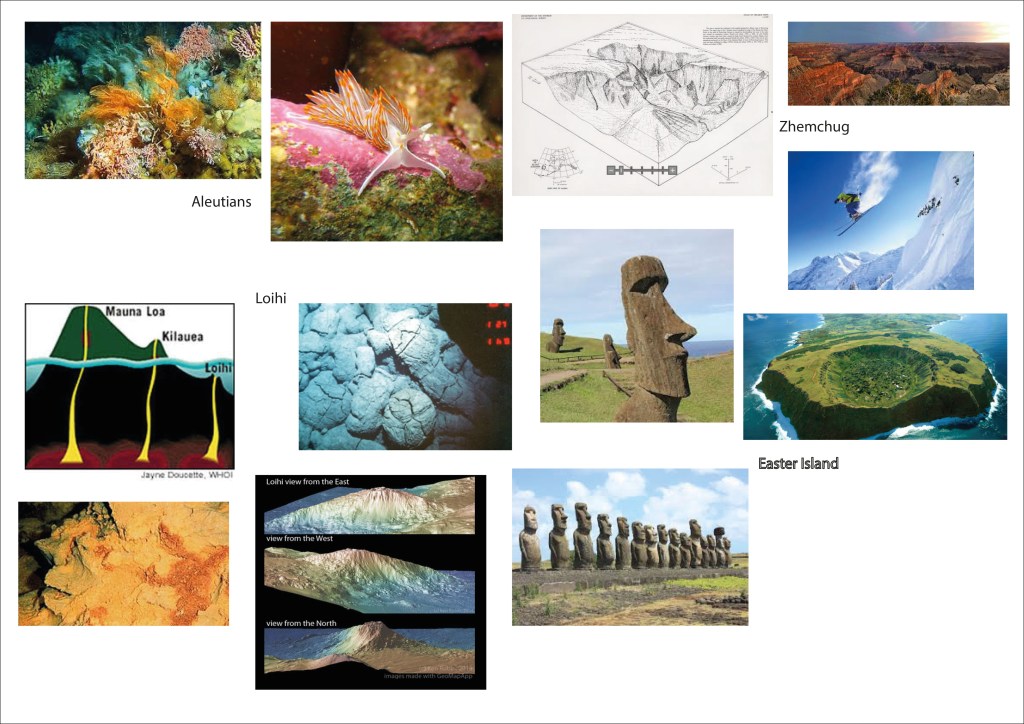
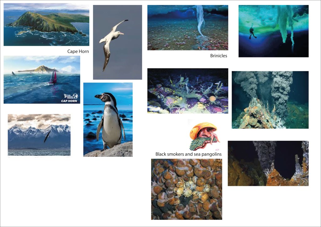
In order to make this a social activity I used existing whatsapp groups to ask friends ‘if they could visit anywhere, or anyone in the oceans where would they go and who would it be’. My plan is to select seven of the destinations and join them together into some kind of logical itinerary. Here is the list that I received:

  • An underwater frozen waterfall – brinicle.
  • The Galapagos – to meet Darwin – natural history.
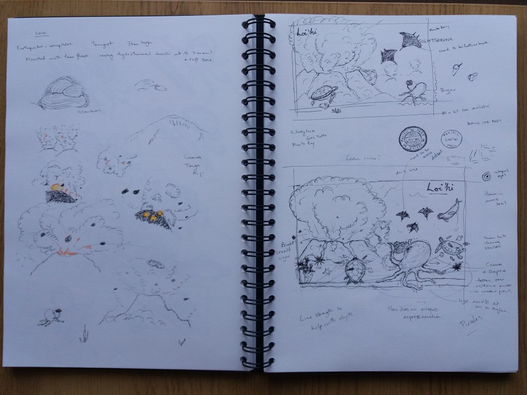
  • The island of Loihi in Hawaii to witness the birth of a new volcano – hiking?
  • Borabora – to meet mantaray, leopard eels and happy little crabs. – relaxing.
  • Mermaids.
  • Kraken.
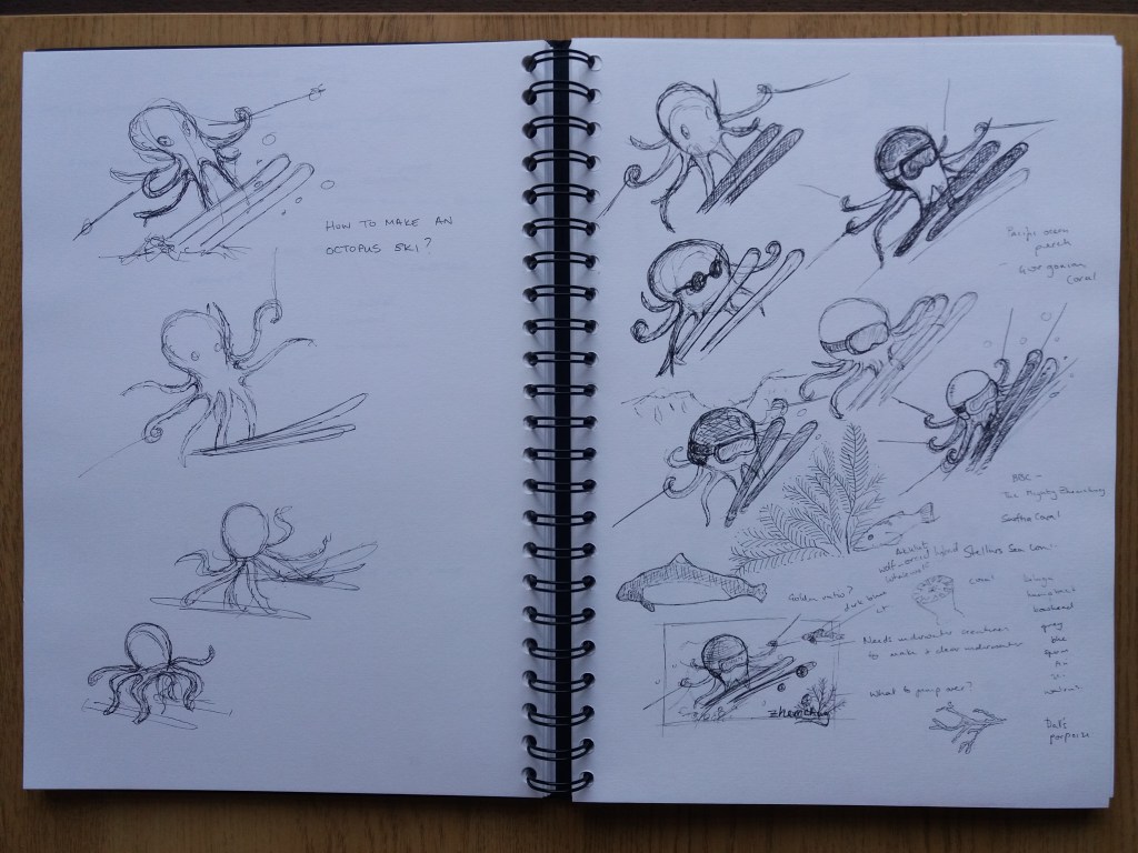
  • Underwater skiing on marine snow – downhill on canyon sides and cross country over the abyssal plane.
  • Giant squid.
  • whale shark.
  • narwhal – arctic.
  • metallic scaly foot snail.
  • Atlantis – historical day out.
  • Hydrothermal vent e.g. the lost city.
  • Tropical islands.
  • Sponge gardens of the Aleutian Islands.
  • Beagle Channel.
  • Easter and Christmas Islands.
  • Sea dragons.
  • Sea Pangolins at hydrothermal vents.
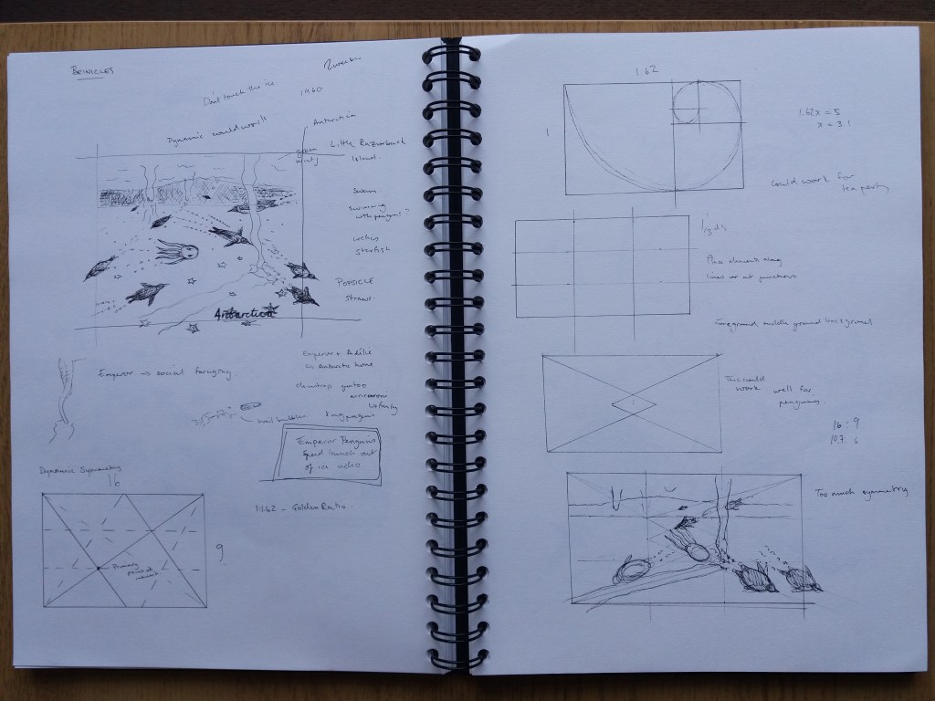
  • Icebergs and penguins.
  • Kelp forests.
  • Moonfish.

The itinerary

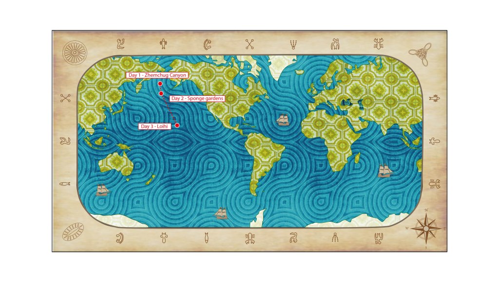
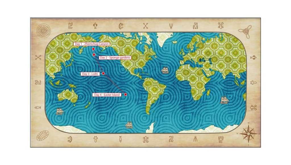
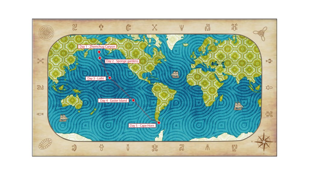
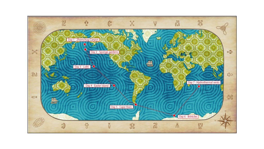
I plotted the locations of the suggested destinations onto a map. I gradually whittled it down to seven destinations that follow on from one another in terms of location and also are varied in their activities. I think that this hangs together as a ‘story’ much better than visiting random destinations on each day.

Choosing an itinerary
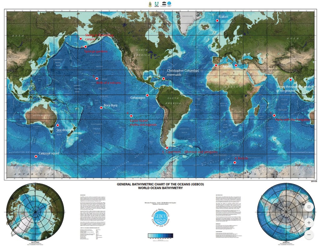
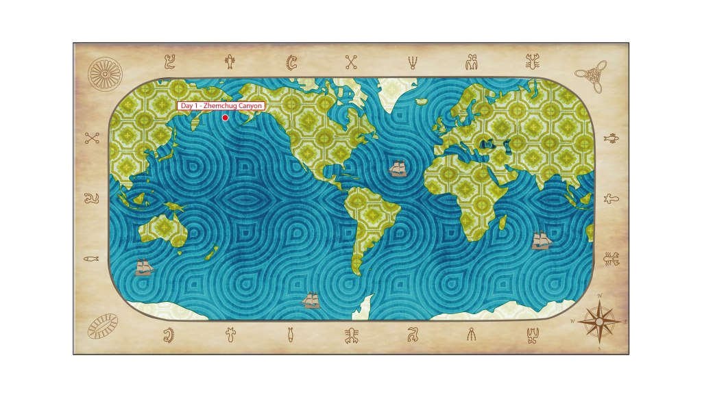
  • Day 1 – Downhill skiing through Zhemchug Submarine Canyon.
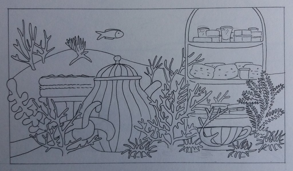
  • Day 2 – Afternoon tea in the sponge gardens of the Aleutian Islands.
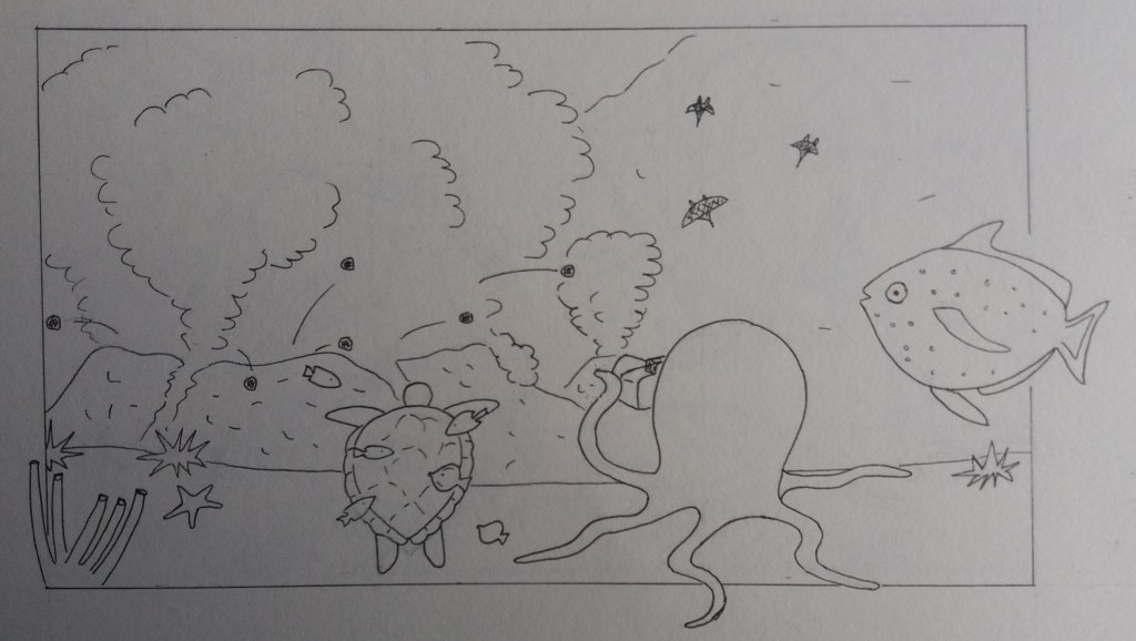
  • Day 3 – Witnessing the birth of a new volcano at Lo’ihi Seamount, Hawai’i.
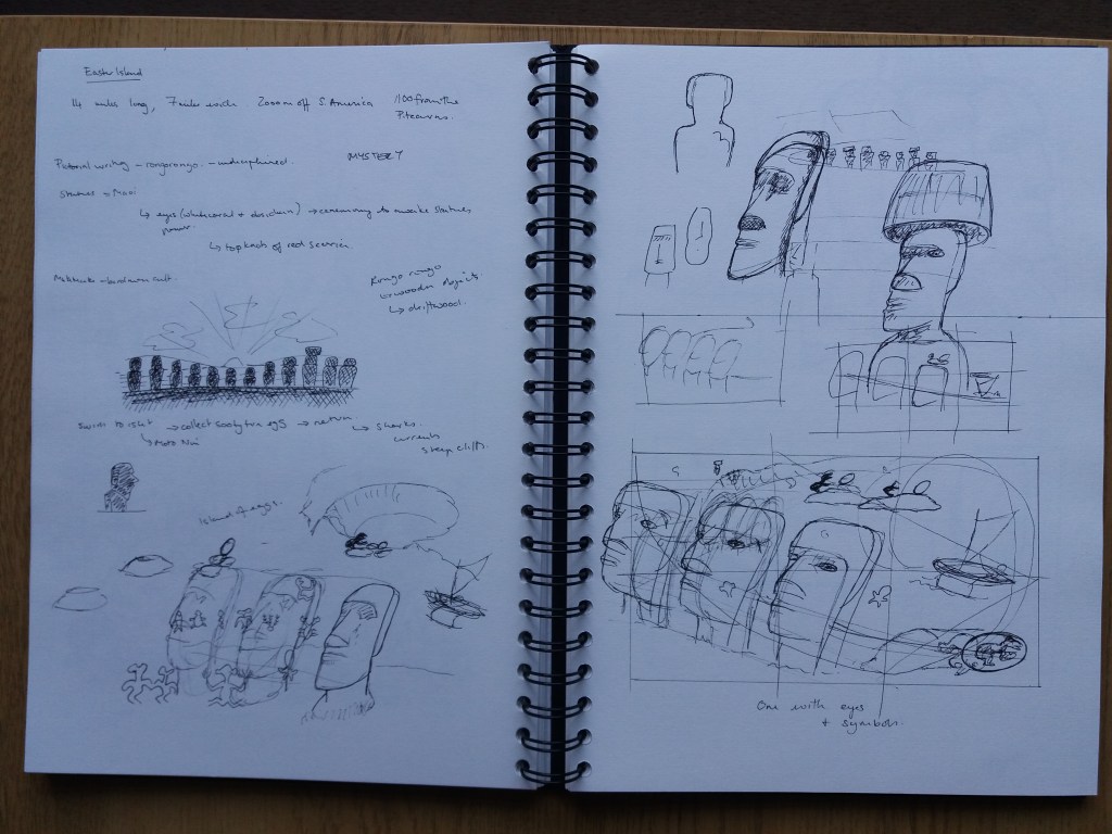
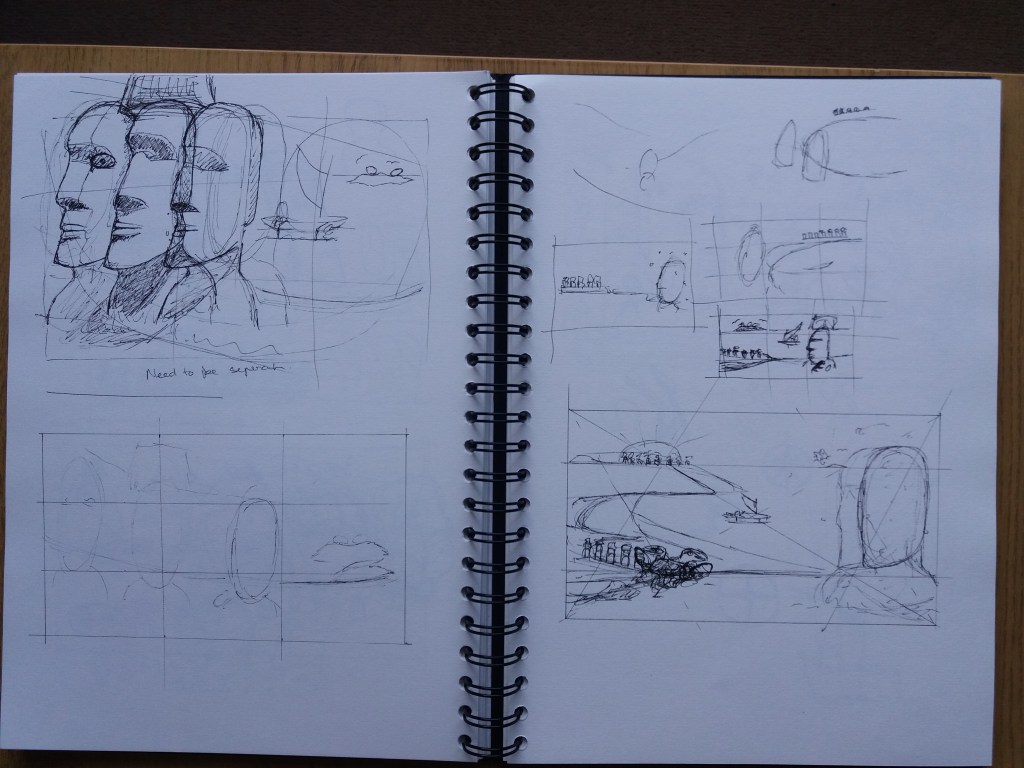
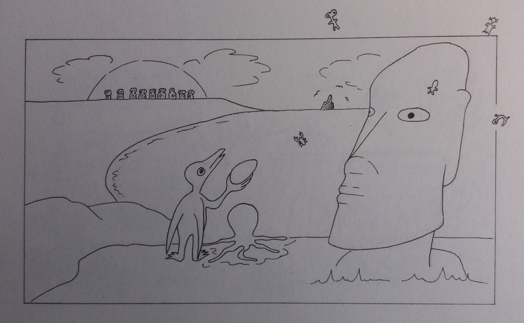
  • Day 4 – Myths and legends of Easter Island (Easter Day).
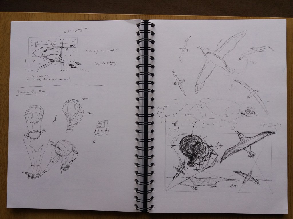
  • Day 5 – Rounding Cape Horn with albatross.
  • Day 6 – Diving beneath the Antarctic sea ice.
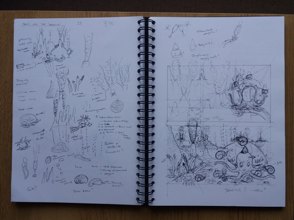
  • Day 7 – Party with the pangolins at a hydrothermal vent.

Moodboards

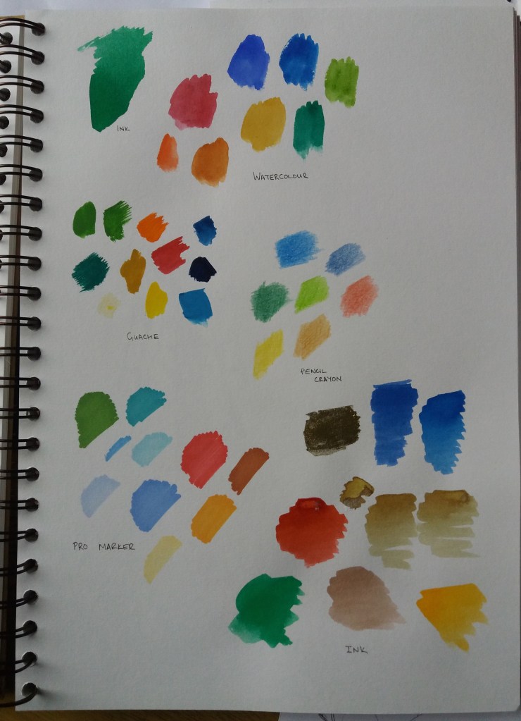
In order to start thinking about colour and I decided to start drawing together images from the different destinations.

The key colours are blues, greens and oranges, albeit theres quite a bit of variability among destinations. I also started looking through my own past images to think about style.

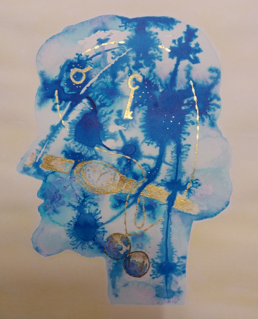
I think that digital collage might work well for this assignment. This also means that I won’t need to try to access new materials during this coronavirus epidemic – everything that I need is available online. However, I want to get some better ideas about how to create images using digital collage.

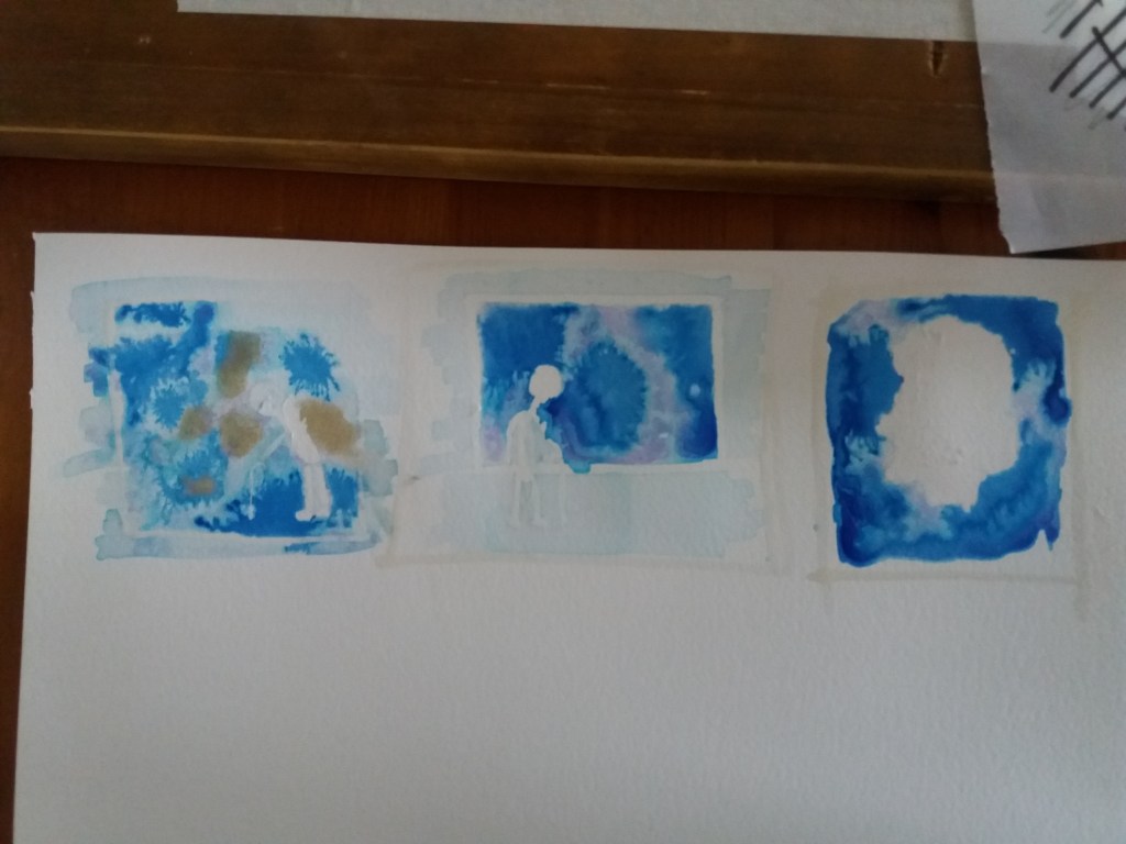
I did some research about creating interesting images with digital collage and in particular how to create depth in the image. Things that I need to consider are composition. One of the great things about digital collage is the ability to distort in interesting ways; however, the image has to hang together. It can be interesting to combine contrasting elements for example big and small or sharp and blurry. I think that I will spend time with pen and paper working out compositions before creating the digital collages for each image. This should also help me to create a unifying theme across all of the images. The choice of materials is important too – trying to create unity, or purposeful contrast, so that it doesn’t just look like a randomly thrown together collection of objects. Lighting is also important in order for the image to hang together and also to draw the eye into certain parts of the image. I also need to think about depth, which can be created by varying the sharpness and tone of objects. I have a lot to think about I’m keen to start playing but I think I need to begin by thinking about composition and how the images will hang together.

A screen grab from the Springetts website, which can be found at https://www.springetts.co.uk/our-work/monty-bojangles

During my research I looked at many images. A style that I think could really work for my adventure is something inspired by the Springetts Monty Bojangles truffle packaging. This design was apparently inspired by Terry Gilliams Monty Python illustrations. I’m not sure how these images are made. They look like digital collage bit I’m not sure that they are. I’m wondering about doing something similar – using brightly coloured collage objects and then illustrating over the top of them to create light and shade and texture. The above image makes great use of space and a plain background. The above style would work fabulously for afternoon tea in the Aleutian sponge gardens and party with the pangolins.

A little play with making shells in the Bojangles style.

I had a quick play in adobe illustrator with drawing lines over plain colours. For my illustrations I’m wondering about using digital ‘found’ materials with overlain drawing in illustrator. This should also be a relatively quick and easy way to create shadow and add volume to the images.

Social media

I had to decide which social media platform that I will use to ‘provide’ my holiday. I have very little experience of social media. After a bit of googling it seemed like either twitter or instagram could be appropriate platforms to use. In the end I have decided to use twitter because within my community I am aware of more people who use twitter than instagram. Given that I have made this project primarily to share with my friends then twitter seems the better platform to use. This helps to further constrain my brief. A tweet can contain up to four images and 280 characters plus links. So this is the maximum length of caption that I can include with each of my images.
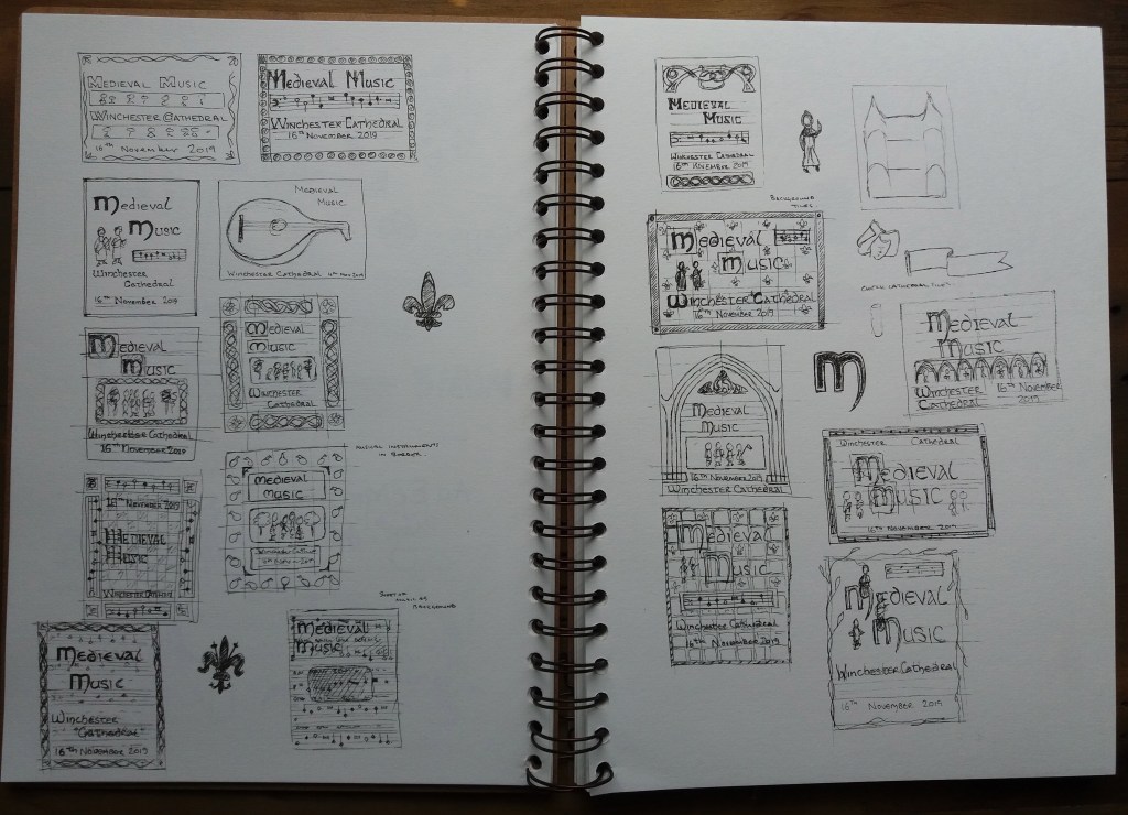
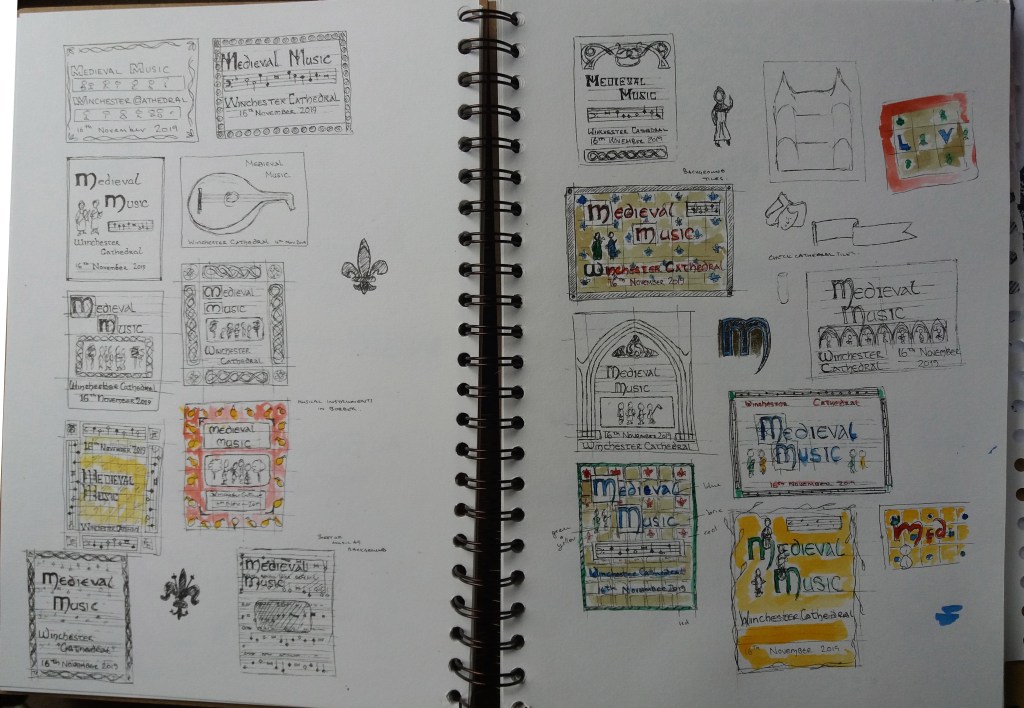
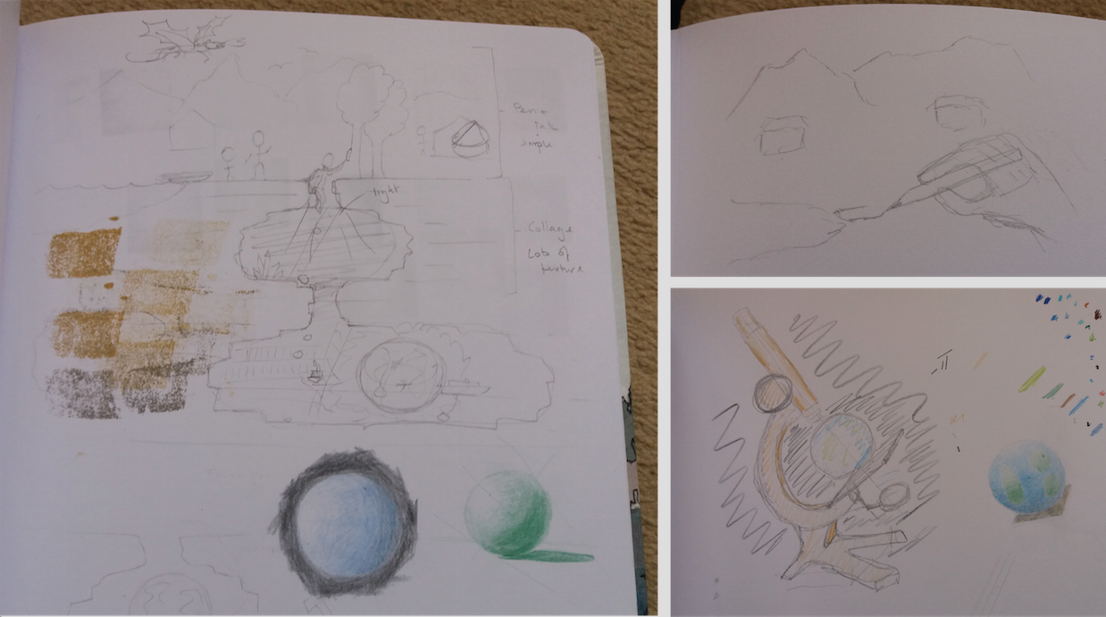
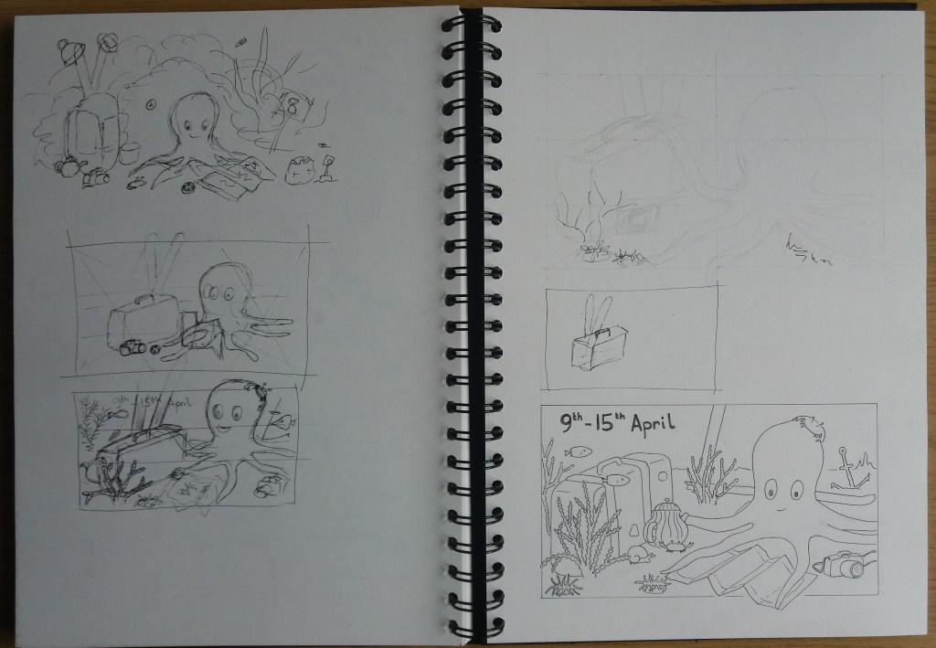
Thumbnails

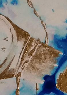
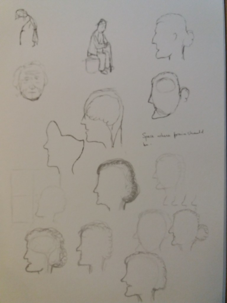
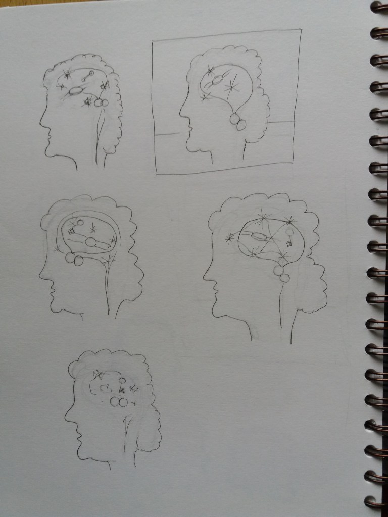
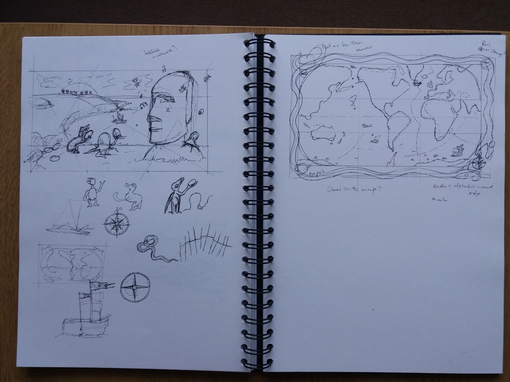
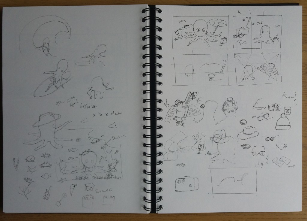
I began the process of creating images by researching each of the destinations, noting down key words and sketching key images. For each destination this evolved into an image. This was a fun process, it felt like I discovered the images rather than creating them. With the exception of the ‘afternoon tea in the sponge gardens’, I didn’t have a preconceived idea about what the image should look like.

I began with some initial ideas for all of the days
Then I spent some time working out how to get an Octopus to ski. My character developed alongside/ within these initial sketches.
Most of the images began with some research into the destination that gradually evolved into an image.

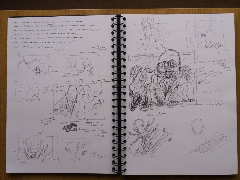
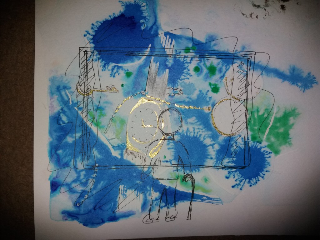
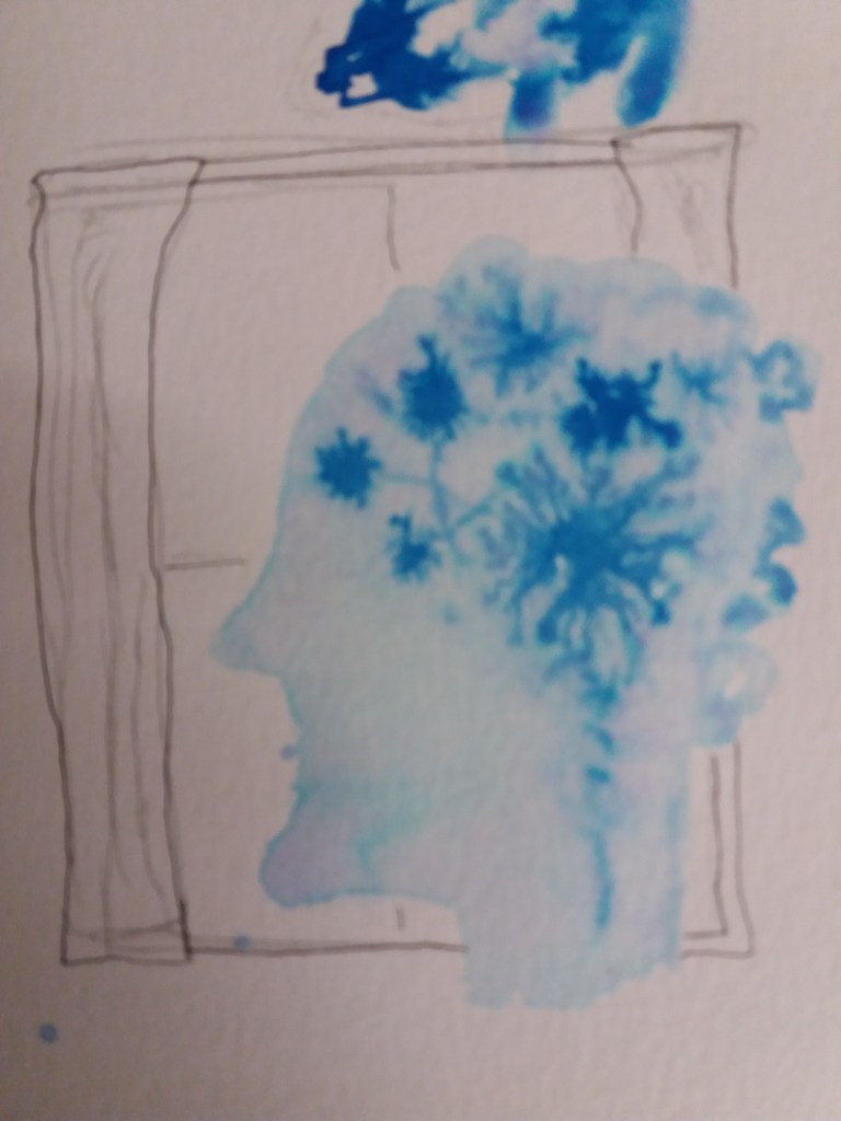
Part way through the thumbnailing process – when I was working on the Brinicles image, I decided that I should learn a little more about composition. One important thing was to decide on the size of the final images, so that I could start thumbnailing images with the correct dimensions. A little research revealed that the ideal size for a twitter image, in order to avoid cropping, is to have an aspect ratio of 16:9.

I also need to think more about the hierarchy of elements within the image i.e. which elements are essential to telling the story and which are supporting elements and then position them and colour them appropriately.

I learnt about different ways for positioning the elements within images – dynamic symmetry, golden ratios and rules of thirds. I hadn’t realised that the purpose of these techniques is to create imbalance in images and thus force the eye to wander around the image. As well as positioning elements according to hierarchy, I learnt about using distinctive colours to draw the eye to the most important elements in the image and reserving pure blacks and whites for focal points. Apparently, high contrast works well for small images (as these will be) and using different tones and sharpness in the foreground, middle ground and background to create depth.

Different methods of composition.
I experimented with composition techniques whilst making the initial sketches – this definitely helped.
How to party?
I couldn’t get my initial plan of having the Maoi (stone figure) on the left hand side of the image to work.
But on the right hand side it’s a little boring.
As I was sketching the map, I realised that it could hold clues to the different destinations, so I’m going to hold off making ithe map until I have the client visuals for each day.

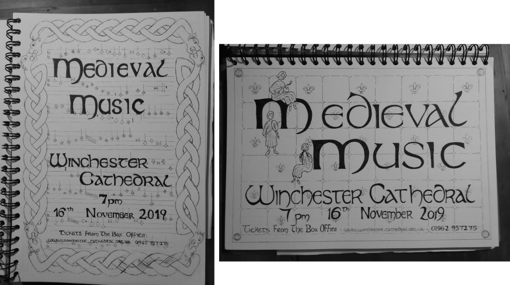
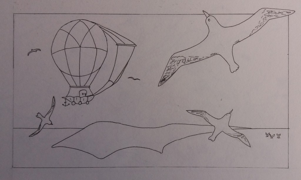
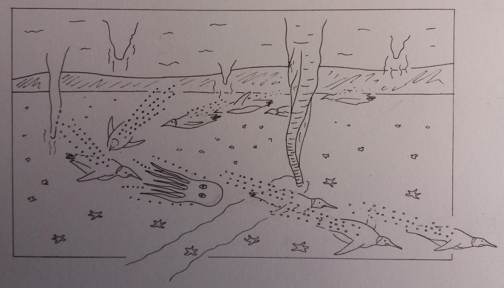
Client visuals for each day

Once I had ideas for each of the days, I created my client visuals. I generally prefer my initial sketches to the client visuals. The initial sketches have more energy; the client visuals look a bit like pictures from a colouring book. However, the client visuals are also going to be useful templates for creating the digital collages. Hopefully I can inject energy back into the final images.

Day 1 – Downhill skiing in Zhemchug Submarine Canyon.
Day 2 – Afternoon tea in the sponge gardems of the Aleutian Islands.
Day 3 – Witnessing the birth of a new volcano, Loi’hi, Hawai’i
Day 4 – Myths and legends of Easter Island.
Day 5 – Rounding Cape Horn with the Wandering Albatross.
Day 6 – Beneath the Antarctic sea ice.
Day 7 – Party with the sea pangolins.

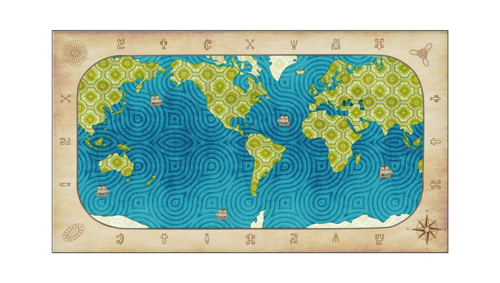
I haven’t yet made the client visuals for the ‘front page’ advertising the holiday or the map to locate the destination each day. My feeling is that it is good to let the map evolve alongside the final images, so that I can add clues to the destinations into the map.

Front page advertising image

I began by researching some images advertising holidays.

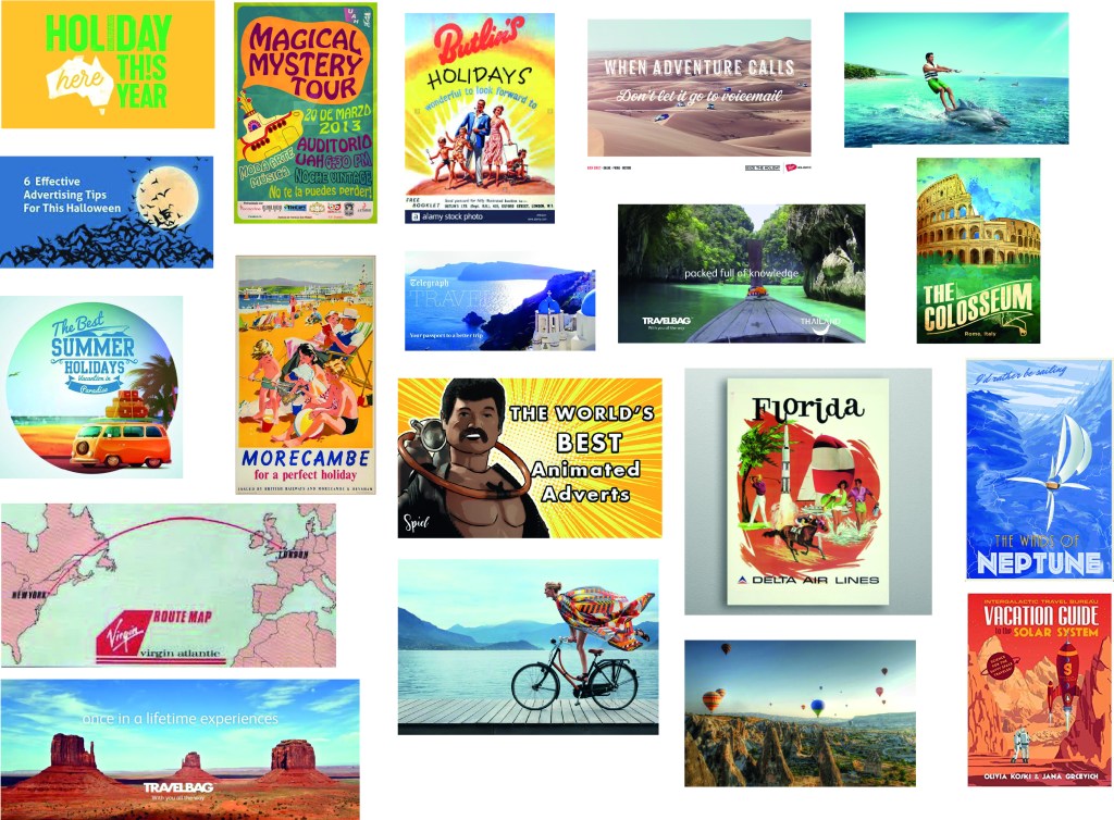
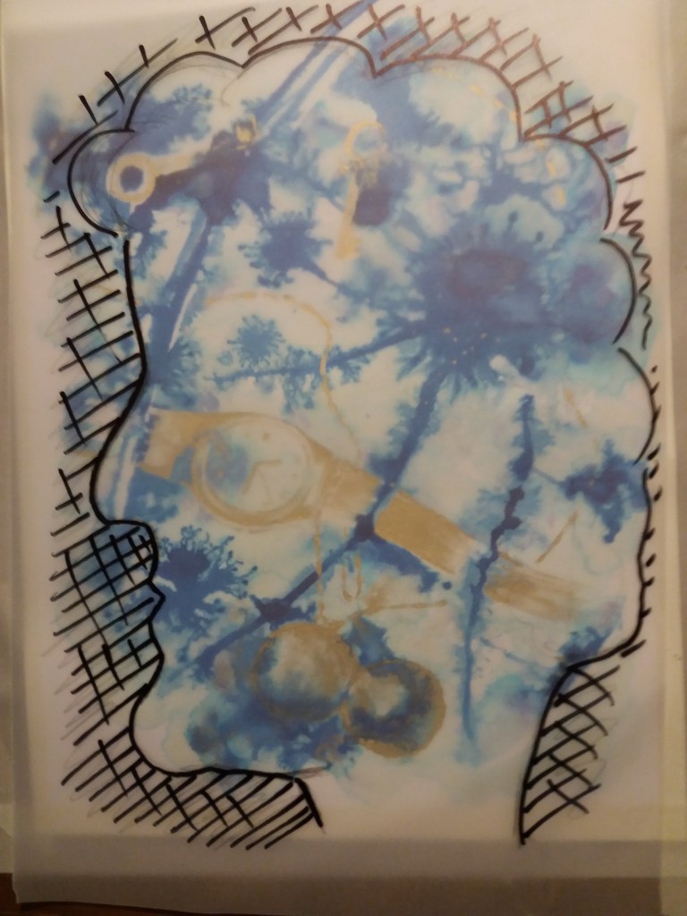
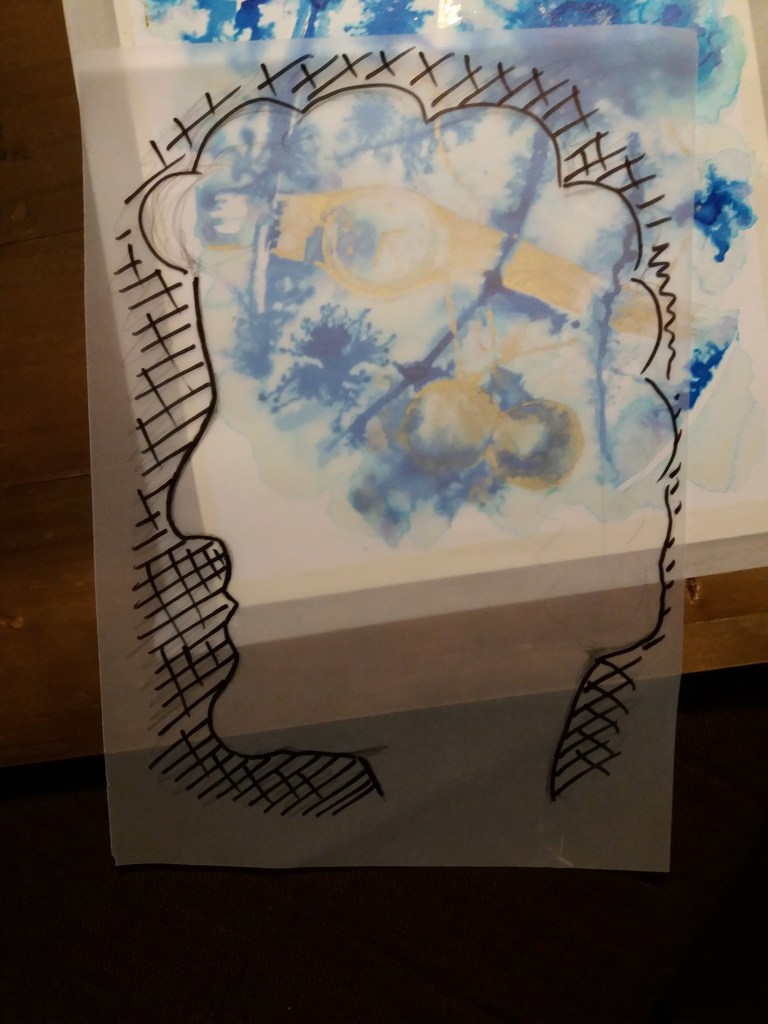
My advert definitely needs to include inkfish, it needs to demonstrate that the holiday is in the oceans. I’d also like it to include something whimsical, in order to provide a feel of what the adventure wil be like. However, I’m unsure about including text. I’ve generally been avoiding text in my images, in order to make them inclusive. The colours will ultimately be bright and in the same size as the rest of the images. I could include some things from the trip, however, I also don’t want to give the game away on where we’ll be going. So my aim with this image is to give people a feel for what the adventure is, where we’re going, and the style of the holiday.

Sketchbook pages
Sketchbook pages

The design I came up with for the front page prominently features the character inkfish, who is packing and preparing for her holiday. I think that I will include the dates of the holiday in this image but will save the rest of the text for the captions.
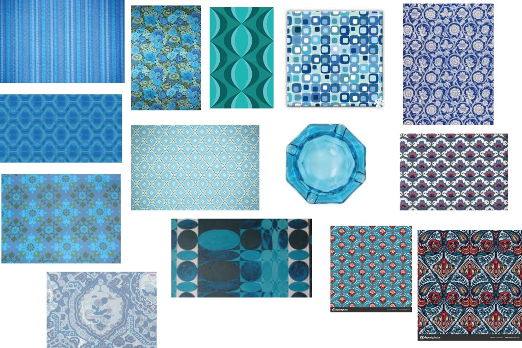
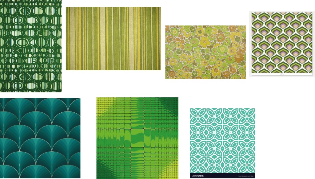
Client visuals for the first illustration which aims to advertise the holiday.

Colour scheme

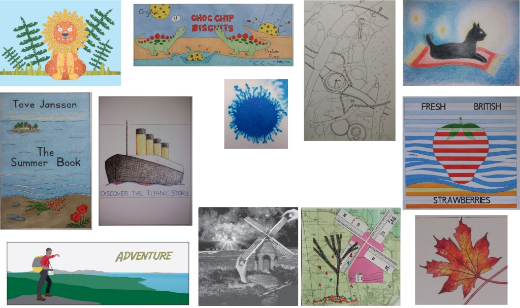
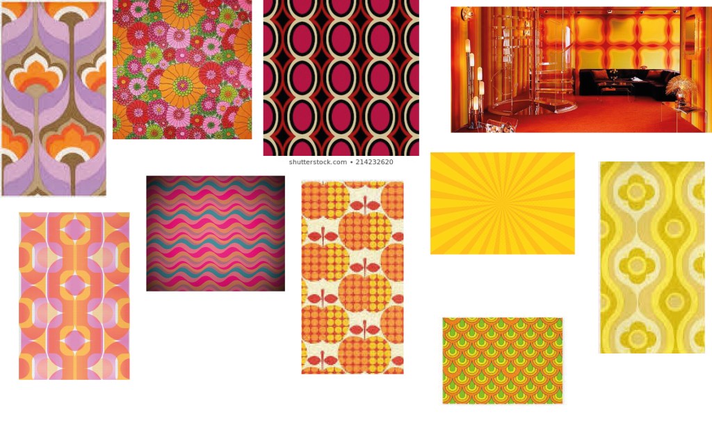
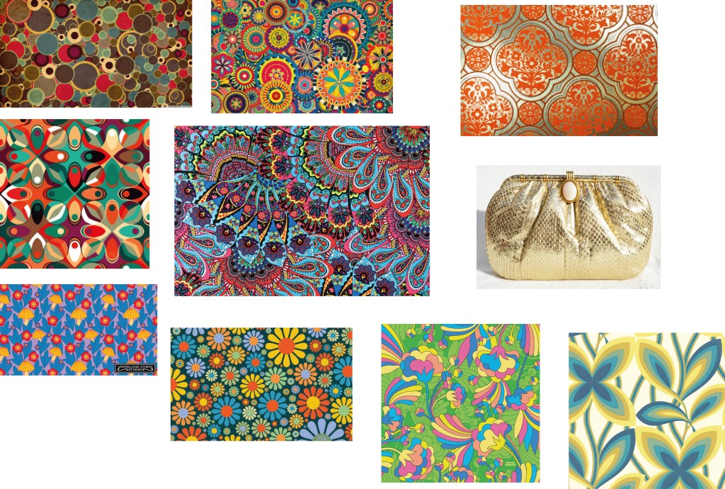
I’m going to follow the 1970s wallpaper colour scheme of my lion from a previous exercise. I like the happy, childish fun theme of this piece. I think that the kind of adults that I’m trying to appeal to, will quite like these ‘nostalgic’ images. They’re fun and happy.

So, my first task is to rummage through the internet finding 1970’s wall paper swatches.

Final images

In this section I’ve presented my final images with their twitter captions. Beneath each image I evaluate what I think works well about the image and what I think could be improved.

Need a holiday but can’t leave the comfort of your own home?

Then join Inkfish on an ocean adventure.

Yes, there really is such a thing as a free holiday! All you need to do is sit back, relax … oh and invite as many friends as you like – the more the merrier!

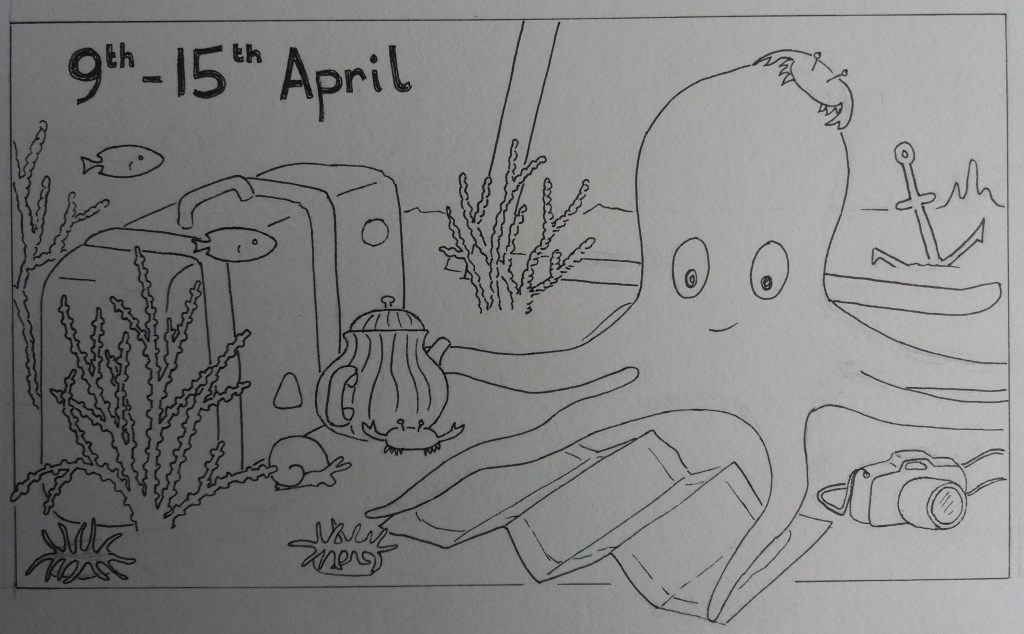
I think that this image works quite well in terms of introducing the character of Inkfish and providing hints towards the nature of the adventure. The composition is simple. I chose to make Inkfish red in order that people’s eyes will be drawn to her in each image. I considered whether her colour might change among images – as octopus do – however, it felt more coherent to keep her the same colour throughout. Something I found tricky whilst making this image, was integrating different styles of ‘paper’. In particular I think that the gold teapot and the plain coloured camera stick out a bit and aren’t that well integrated into the image. I did also struggle with getting the balance of colours right across the image and not overloading the image with patterns.

From Antarctica to Atlantis, from penguins to sea pangolins, there are so many options of where to go and who to meet.

Inkfish has made her decisions and packed her bags. She looks forward to seeing you all tomorrow … have a big breakfast, day one will be energetic.

I think that the style of the map is quite effective and the different patterns and limited colour palette integrate well. Although, I wonder if it would look better to have the swirly sea pattern at a similar scale to the pattern used for the green of the land. I would have liked to include more ornamentation on the map, for example by including sea monsters etc but I didn’t have time. The little ships were also rather rushed and their style isn’t quite in keeping with the rest of the image.

Day 1 and we’re skiing through Zhemchug seafloor canyon.

We’ll be descending over 2.5km to the bottom of the deepest canyon on Earth – this one makes the Grand Canyon look like a baby!

Luckily for us the marine snow conditions are excellent at this time of year!

I like the composition that I used for this image, it has lots of energy and in general I think that the colours and patterns work well. I played around with different colours for the coral and fish in the bottom right of the image and never quite got it to work. My biggest frustration is that the angle of the skis isn’t correct for the orientation of Inkfish’s legs – this error is carried over from the client visual stage.

Day 2 and we’re in the Sponge gardens of the Aleutian Islands. A perfect place to relax sore muscles and enjoy a spot of afternoon tea.

Who’s that little punk rocker who wants to join us? Why I think it’s a nudibranch – I’ve heard that they’re partial to Victoria sponge cake.

This is one of my favourite images. I like it’s whimsy. I remember really struggling with the colouring of this image. It was hard to make the colours varied – as I wanted them to be – but not totally incoherent. I think this image is very flat; especially the cake stand. I’m not sure that this is such a negative as it’s clearly not meant to be a realistic image. I could probably make it more three dimensional quite easily by thinking more about the lighting and adding some shadows.

Day 3 and it’s time for some sightseeing – we’ll be beneath the waves, witnessing the birth of a new volcano at Loihi seamount, Hawaii.

If you’re in need of freshening up after a couple of days travel, then the cleaner fish will be happy to oblige.

I think that this is an image where the lightiing and depth work quite well. I tried to make it that the volcano was a light source. I also consciously made everything in the foreground bright. In this image and many of the others I began by colouring in Inkfish, then added the background colours and then chose the colours of the other characters. I think that the background is a little too dark, so that it is difficult to pick out the mantaray in the background. I was never fully satisfied with how I created the smoke from the volcano – probably making the pattern smaller would have helped. I think it does work to reserve the only pure white in the image for the volcano.

If you have a little time on your hands, then the Easter Island rongorongo hieroglyphs are yet to be deciphered … you’ll find them decorating the edge of this map … hopefully Inkfish didn’t write anything offensive ….!
Day 4 and we’re amongst the Moai on Easter Island.

The Easter Islanders would select their new chieftan via a swimming race to collect an egg from the islet in the distance …hopefully your Easter eggs were a little easier to procure!

Happy Easter everyone!

With the Easter Island image, I really like the structure of the original ‘client visual’ for the image. However, I don’t like the colours in the final image – they’re too bright. I think the structure and contents are fighting each other. It’s all a bit too cartoony, whereas I’d rather it were mystical. I think the water works well and the pattern of horizontal lines gives the image stability. I like the light on the water and the bright white egg that attracts the eye. However, the green used in the foregroud is maybe too bright. The sun is a little too ‘cornflakes packet’. Making the hieroglyphs brightly coloured, draws attention to them, however retrospectively I think it would maybe have been better to choose a single colour for them.

Day 5 and we’re rounding Cape Horn in style with an escort of albatross. It’s safer by far up here, than with Inkfish’s distant relative in the treacherous waters below.

Where next … should we head north into warm Atlantic waters, or south into the infamous Southern Ocean …?

This is one of my favourite images. I really like the composition. It’s very simple and I like that the view is from a height. I think saving the bright colours for the balloon works well. I love the pattern that I found for the sea. I think the colours of the sea and sky are the wrong way round in terms of which is dark and which is light. The land may be a little too plain and it might have been good to have an overlay to make it appear more hazy and distant. The original image didn’t have the kraken and ship – these elements add to the story but I don’t think that they benefit the composition.

Our penultimate day and we’re taking a fast-paced tour beneath the Antarctic sea ice with emperor penguins. It’s beautiful down here!

Just one thing … don’t touch the brinicles (icy stalactites) – unless you fancy becoming a popsicle!

I think that my main satisfaction in this image is the ice. I was quite satisfied with the semi-translucent ice effect in the end – made from layering images of blue and green glass and altering their translucency. Retrospectively, I think that there’s too much empty space in this image. The characters would benefit from being larger, certainly in the foreground. I think that a lot of the patterns that I used in this image – particularly the penguin textures – are lost because they are so small. I quite like the idea of my composition in this image – mirroring triangles with the shape of the penguin path and the brinicles. However, I didn’t really pull it off. The purple seafloor may also have been a step too far, the overall colour scheme ended up a bit disney princess.

Our last day and we’re at a hydrothermal vent – it’s time to party with the sea pangolins – the most bling snails in the ocean!

And as with many a good party, it’s not long before Inkfish has a crab sitting on her head, boogying along to the YMCA …

… enjoy!

Inkfish would like to thank you for joining her on this adventure – you were great company!
Thank you to the lovely people who suggested destinations. Finally, special thanks to the designers of 1970s wallpaper, without whom this adventure would not have been possible!

I like the liveliness of this final image. However, I think it would benefit from being more colourful. It’s all a bit too brown. The composition is also not particularly exciting. I think the addition of the glasses with their bubbles is an improvement on the client visual, as well as including a lot more crabs. Maybe I should have shifted further away from reality and made the image much more colourful.

It was quite an interesting and fun process making these images. I ended up making the final images a day ahead of publishing them on twitter. This meant that I had to veer away from wanting everything to be perfect and instead find quick methods for doing things. My biggest struggle with the images was trying to get the colour schemes and balance of colour across the images to work, particularly in the busier images. This is definitely something for me to learn more about in the future. I probably need to think about colour from an earlier stage in image development. It was also quite challenging for the patterns to be a key part of the feel of the images without them taking over completely.

It was a lot of fun. I had a good holiday and it seemed like other people did too.

Magazine illustration

Lost memories

The brief for this assignment is to produce an illustration on one of the following topics: lost; disaster; discovery; or guilty secret. The illustration should be based on a still life for which I can select the items. The rest of the content, the method used to produce it and the colours are my choice.

For this assignment I have decided to work with the theme ‘lost’.

Selection of objects for still life on the theme of lost

The first thing that I need to consider is what objects to use for the still life that evoke the theme of lost.

Brainstorming ‘lost’

I found the brainstorming process quite interesting. I began by thinking about quite obvious objects – mazes, lost children, decaying flowers and gradually things became more metaphorical – empty bottles, time, death etc. Retrospectively, these are all quite negative, whereas I actually find getting lost in nice places a form of freedom. The process of thinking about objects to use for the still life, also made me start to think about materials and colours – white for empty, black for death, watery pale colours to represent things not quite being clear.

For the still life I chose a locket that belonged to my Great Grandmother, with a photograph of my Grandmother as a teenager inside it. By the time this photograph was taken my Grandmother had lost both of her parents. My Grandmother died several years ago having suffered from alzheimers for many years. So for me this is an object tied up in the theme of lost. In the early stages of alzheimers my Grandmother described this disease as like all of the hooks in her brain coming loose. For my objects, I decided to use: an image from a book of the maze of neurons in the brain; and a watch to represent the passing of time. The subject matter seems rather dark at the moment. I’m hoping that at some point in the process I can introduce this idea of ‘lost’ and ‘loss’ actually being quite freeing … I’m unsure how.

For the next stage of this exercise I’m going to take photographs of the objects from different angles – probably slightly disorientating angles and try focussing on different objects and where the edges of the image are. I’ll use this to help me to make thumbnails for producing the objective drawing. The brief does not state anything about the shape of the final image, other than it should be smaller than A3. I’m already quite excited about distorting this image. Maybe having some of the neurons wrapping around the object in the image, or ‘falling’ out of the book.

In terms of the composition I think that it should be a bit chaotic and disorientating so that it makes you feel lost when you look at it – the book is upside down; the chain of the locket is tangled up around the watch (a happy accident from trying to get the locket to stay put and not slide off the book). I’ve included some crumpled white cloth, for texture and to signify emptiness.

I experimented with photographing the objects from different angles and rearranging them. I think that this first image is interesting, it focuses on the watch and locket. However, I’m not sure that it is clear that the background image is of neurons.

Still life objects

The second image clearly shows the neurons in the background image; however, the composition is boring.

Still life objects

I like that the image below is out of focus. I think that this could be a useful way of distorting the image to give a feeling of being lost. I also like that this image shows more of the background image of neurons and has more of a sense of space. I also like that the locket is almost held by the neurons.

Still life objects

This image zooms out to show more of the book. I don’t think it is as interesting as the close up images of the watch and locket.

Still life objects

For the thumbnails, I began by drawing a set of different shaped spaces in which to work. This was to force myself to try different compositions. However, as I progressed I found it easier to draw sections of the still life and then choose portions of the drawn image.

Thumbnails

As I progressed I began to distort the image. In particular by making the locket and the watch larger than in real life and then tangling them among the neurons. On the page shown below I like the composition in the top image. However, I’m wondering how easy it would be to introduce a character or sense of place into this image because the objects are being viewed directly from above. I’m wondering about having a character who is lost, wandering around the chaos of the image and I think that this would be easier with an image viewed from the side. Another idea would be for this to be the contents of a cupboard, the view through a window, or a map. Going back to the photographs I think it would be interesting to have parts of the image out of focus, or being erased to symbolise memory loss. Maybe I could just have the figure, or silhouette of somebody sat with this image as a backdrop.

Thumbnails

I tried to make the image more 3D. I’m starting to quite like this design and it’s chaos. When I was drawing the version below, I decided that it would benefit from another object, so I added in an old key. I’m wondering about rotating the image for the final design so that the perspective is all wonky and disorientating to add to the lost feeling. This is turning into an image abut losing your mind and your memories. I wonder about having this image as the view through a window but partially obscured with a landscape and people wandering through the landscape also wandering through this image.

Thumbnails

Below is my objective drawing of the keys, watch and locket wrapped in the neurons from the photograph in the book.

Distorted objective drawing on the theme ‘lost’

I tried to make this initial drawing in quite a detailed scientific style. I really like the maze of neurons in this image – I think this gives it a disorientating maze-like feel. I think the sketchier thumbnail versions actually work better – they give the image more movement and I like that they aren’t contained within their boundaries. I ended up making the objects in the image bolder as they did initially get a bit too lost. I think that making these items bolder helps to lead the eye around the image. However, I am concerned as to whether somebody looking at the image for the first time would understand that these are neurons and what the image is about.

I think for the tonal image I want to make the neurons a bit more styalistically neuron like, or else just make it clear that they form a network and have that network starting to fall apart. I’m wondering whether to use bleeding water colours for the neurons. then superimposing the objects in collage. Another idea is to have a play with masking and water colour and either have the neurons in white, or else the objects, maybe with some sketchy lines here and there to highlight bits of objects.

Tonal drawing of still life

Before I make the tonal image I’m going to do a little research into ‘dreamlike’ images and memory loss to see if that helps with my choice of materials.

Several of the dreamlike images use characters in either black or white, silhouetted against a colourful background in pastel shades of blue and pink. The night sky is also used to symbolise the dream theme. I also like the out of focus hands, this gives a feel of both dreamlike and things feeling a bit lost. I could do something similar to the bright white stars in the night sky to represent the neurons in my image. However, maybe they shouldn’t be so clear and bright if they’re decaying.

I looked up some other peoples’ images of neurons. One of the surprising things that struck me is that blue is quite a common colour used in these images. I think I’m going to move away from the scientific drawings of neurons and try to do something simpler and more irregular. I don’t have much experience in using watercolours, or ink, so I think I need to have a play with different effects. I really like the white neuron. However, I’m wondering if I have white neurons and white objects if there will be too much white in my image. I think the black head filled with a network of colourful and white lines is effective in explaining the image. I’m wondering about rather than having a character in my image, instead having the image contained within a head to give it location.

The images about memory loss are quite interesting. Again, it’s common and effective to use the outline shape of a head. They are all fragmenting in some way. I could make use of this in my image, have it gradually fragmenting at one side or something. I wonder if I could use something like this for my images. Have them silhouetted in white but with some line drawing with in them that is becoming jumbled and fragmented in some way.

I think the next step is to have a play with some inks and watercolours and pen and ink drawing. I think these should be really effective media for making the image free and not quite retained within its edges.

Playing with watercolour ink and wet paper

I played around with watercolours ink and wet paper. I found that blue ink on hot press watercolour paper made the most effective and interesting dendritic patterns that could represent the neurons in the image. I also found it most effective to paint using a dropper, rather than a paint brush. I played around with masking – both using it as a boundary to stop the bleeding ink and also to mask out areas where the objects are.

Dendritic blob in blue ink.

One of my favourite images to come out of this experimentation is this image of a head. I think this might be quite helpful for ‘explaining’ the neurons. I don’t think that on their own it is obvious what these dendritic blobs are meant to represent. However, giving a vague head shape to the image helps.

Head

One thing that I learnt from the image below is to be a bit sketchy with the masking fluid, rather than creating big blobs of white because this helps integrate the objects into the mess of neurons. I tried adding sketchy lines and pencil crayon to help bring out the objects. The pencil crayon didn’t work at all and I tink it’s much better to leave the objects whole – it makes them a bit more empty and lost. The image below also has far too much ink in it. I like the amount of white that is left in the image above. I think that it makes for a more interesting and effective image.

Objects

To create the final tonal image I’m going to produce a sketchy version of my line drawing from earlier. Then I’m going to roughly and sketchily go over some of the pencil lines using masking fluid. I’ll then apply a pale green wash and then add the blue ink but be more sparing than in the image above. One of the things I quite like about working with the ink and wet paper is that it has a bit of a life of its own that I then have to accomodate and work with – sometimes with good effect, sometimes not.

Tonal image in progress
Tonal image

I think the blue ink on wet paper and masking of the objects in the tonal image works quite well. I’m still not sure how much sense this image makes without context. I decided to sketch/ colour the objects using gold ink. Partly to give the image a slightly dreamlike non-real feel and also because the image is about lost memories and memories are precious.

Detail of chain and watch in tonal image

I particularly like areas where the gold ink is mixed with water. I think that it gives a print-like finish. I’d like to try to have more of this style in the final image, rather than the thick and goopy gold paint. I also added roman numerals to the watch face to give it a feeling of age.

Character and location development

I think this is the real challenge now, how to make it clearer that the image is about lost memories and how to suggest a narrative. Originally I was thinking about having a small character, maybe a little girl exploring within the image – sort of lost within the image. Another idea is to silhouette an old person over an area of the image – again so that they are lost within the image. I like the head that I made earlier but I wonder whether for this to work the neuron illustration should just be within the brain area. Alternatively I might have the image in a window or doorway – to give a feeling of the disorientation and lost feeling of dementia.

Window

An initial idea is to roughly sketch over the image in ink, with an old person looking out of a window at a chaotic mess of memories. As a result of this I started to think about body positions for old people – stooped over, or sitting. At the same time I was quite interested in developing the head idea and roughly sketched in pencil and also in ink, different head shapes that might imply that the person is old and also different techniques in ink.

Old people
Experiments with ink and masking

I like the effect of a head with the neurons and objects superimposed on this I also played with the idea of including a window behind them. However, I decided that once the detail was inside the head then this would lead to a complicated image. I also played with different colour washes that might go behind the head. I think the yellow complements the blue well.

Head with window

I then returned to the idea of having masked figures in front of the neuron-object artwork. It’s been helpful in this exercise to make thumbnails in ink – previously I’ve tended to thumbnail in pen and then add some watercolour.

Masked figures

Something that I notice about the previous images that I collected on the theme of memory loss is that where theres a head involved there is some kind of horizontal horizon line that gives the head a sense of place, rather than floating.

I decided that I prefer the image with a head containing the artwork, rather than an image of a person within the artwork. Therefore I set about experimenting as to whether to restrict the artwork to the brain area of the head, or to included the artwork within the whole head.

Sketchbook heads

Line visual of final artwork

Ultimately I decided that the whole head should contain the artwork but to include a concentration of neurons within the brain area.

Line drawing of final artwork

Final artwork

Lost memories

I’m really pleased with the way that I represented the neurons in the image. In earlier images I’m not sure that it was clear what they were; however, by placing them inside a head I think that becomes clearer. I love this technique of dropping ink onto wet paper, I like the slight unpredictability of what happens and the interesting marbled colours that it produces.

I’m somewhat unsure about how well making the objects in gold ink works. For the final image I struggled to recreate the print effect that I liked in the earlier image. Below is the final image in progress, before I applied the gold ink. I find this simpler image produced in a single colour quite effective.

Final image before applying the gold ink.

I tried to include a horizon line in the final image by changing the tone of the yellow wash in the background; however, this wasn’t particlarly effective. It also doesnt make complete sense to have a horizon line for a disembodied head. Maybe the head should have shoulders so that it doesn’t float around the page.

The original brief for this piece was to convey the theme of lost. As the image evolved it became more specifically about lost memories. Having been so involved in the image and having used such personal objects, I find it difficult to decide how well the image conveys the theme. An element that hasn’t come out well is that it is meant to be the head of an old woman. Maybe it would have been useful to give the image better context, for example show an old lady sitting thinking in front of a window. However, this would have reduced the size of the head with the objects in it and potentially also distracted from the objects.

This part of the illustration course was about developing my own style. However, rather than clarifying what my style is, it has illustrated to me that I am enjoying experimenting with different materials and don’t yet really have my own style. I do really like taking quite a technical or scientific image and turning it into something more free and artistic. I think this is potentially quite an interesting way to represent scientific concepts.

I really enjoyed the process of producing the images for this assignment. At the outset I had no idea what the final illustration would look like. I enjoyed the way that it gradually evolved – I felt like I discovered the final image as I went along.

A poster

Medieval music poster

For this assignment I am to produce a poster for either an Early Music Concert, a Jazz evening, or a pop group. I’ve decided to make a poster for an Early Music Concert, this is an area of music that I know very little about. However, based on the little I know, I think that this period (Medieval through to Renaissance) has beautiful art that it will be interesting to learn more about and incorporate into the poster design.

Preliminary research

I began the assignment by doing some preliminary research into the Medieval and Renaissance periods in order to decide whether to focus on the Medieval or the Renaissance period. I read articles online, searched images and watched videos and noted down elements that I thought were characteristic of these periods that might work well in a poster design. I made notes by sketching ideas.

Sketches based on preliminary research

In general it was quite interesting to see the evolution of art from the Medieval to the Renaissance period. Renaissance art has quite a modern look to it, which I think is partly because perspective is depicted accurately within artworks. I think that the wonky perspective, or complete lack of perspective in Medieval artwork is a potentially useful tool to make a poster ‘look Medieval’. Medieval artwork also looks quite flat due to the lack of perspective. Both Medieval and Renaissance artwork use vibrant colours. Medieval art appears to have a more limited colour pallette than Renaissance art and this might be another useful tool in giving the poster a Medieval feel. I’ve not focussed on this for now but I think this will come out clearly when I put materials together for a mood board.

Both periods have beautiful fonts and scripts that I am keen to not just incorporate into the poster but to make a key element of the poster. I am particularly excited by the potential to include illuminated writing, which I think is more characteristic of the Medieval than the Renaissance period. It was also interesting to see that musical notation looks different in the Medieval and Renaissance periods relative to today. Some brief reading on this suggests that this was a period when musical notation was evolving. Notes have an angular, rather than rounded form, and the the muscial scripts are often elaborate and include colour, calligraphy and illuminated writing.

Based on my initial research I’m excited at the idea of experimenting with illuminated writing, wonky perspective, celtic knotwork and musical notation in the poster. I have therefore decided to focus on the Medieval period.

Mood board

Medieval music moodboard

I gathered together relevant colours textures and images into a moodboard. This should both help me to understand the detail of elements that I might incorporate into the poster and also to get a feel for the colour scheme of the poster.

I think that Medieval colours come out quite clearly in the moodboard – I should focus on reds, blues, yellows and greens. I was already aware of incorporating musical scripts and illuminated writing into the poster, the moodboard also made me think about patterns. In particular the use of patterns for backgrounds and borders. I think one issue with this poster will be giving the lively, colourful, Medieval feel without it being too busy and unreadable.

The elements that I’m thinking about experimenting with in thumbnails include: Medieval fonts and illuminated writing; musical notation; medieval people; patterns; maybe architecture – cathedrals or castles. I have rather a lot to play with.

Poster design

Before continuing I decided to run back through this section of the course and my blog entries in order to make a few notes to help me with the poster design.

Thumbnails – reduce content to it’s simplest form, play with scale, position, tone contrast, shape, the space between elements. The poster needs to be organised so that the reader can extract information from a distance – clear horizontal and vertical lines will help with this. I also know that I want the design to be colourful and flat to reflect Medieval art. I maybe need to be a bit careful to not make the whole poster brightly coloured but use bright colours in the parts of the poster that I want the reader to be drawn to.

Thumbnails

I experimented with a range of designs during the thumbnailing process. I did realise afterwards that there was some information that I had missed off – the time of the concert and how to buy tickets. I’ll rectify this at the line visual stage.

I used the thumbnails to experiment with what content to include and how to arrange it. I maybe didn’t experiment with viewpoints particularly but this is in part because I want the poster to appear quite flat to reflect Medieval art. I’m really keen that the writing is a key element of the poster because Medieval fonts are very distinctive and recognisable.

For the line visuals: one of the posters will have musical notation in the background, a border of Medieval knotwork and plain, bold writing in a Medieval font; the other poster will have Medieval tiles in the background, a small panel of musical notation and the centrepiece will be ornate writing with Medieval musicial characters playing on it. It will be interesting to see whether the latter is too busy.

Roughs

I produced two A4 roughs of my preferred two thumbnails. There is overlap between the two designs in the font used. I gradually developed this font whilst I was experimenting with thumbnails – it is an amalgamation of different medieval alphabets that I found. I think the font works well in both designs. I think that I may have gotten a little bogged down in detail for the line visuals. It was tricky as the writing needed to be included as it is a key element of the design.

With the first design, I think that the musical notation in the background works well – without the knotwork border I think that this would give the poster quite a contemporary design. I don’t like the knotwork border in the first design – it is too large and overpowers the image. The border might work if scaled down but I’m worried about it looking quite kitschy.

With the right hand design, I think that the tiles make a nice background – they were also inspired by tiles that I had seen in Winchester Cathedral, which gives a nice tie between the poster and the venue for the concert. I think that the figures in this design work well – I ‘d consider making them larger or including more of them in the final design. I think that the writing at the bottom of this poster could do with spacing out a little more as curently it appears quite cramped. I’m also undecided whether to have a plain border or ornament this is some way.

I showed both designs to friends for a little feedback. In general the right hand design was prefered. The most popular elements of the designs were the figures, tiles and musical notation. I may consider trying to integrate the musical notation into the right hand design.

At this stage I went back to my moodboard in order to think about colour. I decided to limit my colour pallet to dominantly reds, blues and pale browns with small additions of vibrant greens and yellows. This seems in keeping with the moodboard. I also experimented with some of these colours on my thumbnails from earlier.

Experimenting with colour on the thumbnail sketches.

I also experimented with different materials to try to decide which would work best for colouring the final design. I did consider making the poster in adobe illustrator but decided that I wanted to try to use more ‘medieval style’ techniques. Of the different media that I tried I really liked the vbrancy of using ink. I think the vibrancy is reminiscent of the bright colours used in medieval illuminated manuscripts.

Experimenting with different media.

Finally I worked on the final design, which was produced on watercolour paper. I started with a pencil outline design, then went over this with black ink and finally coloured the design in ink.

I was quite concerned when I started painting the tiles with the pale brown ink that I couldn’t produce a smooth gradation in colour across the individual tiles. Ultimately I think that this has given the final design some texture. I think that the final design might have worked better with a blue, rather than a red border. I think the red border makes the poster look a little disjointed. I also think that the writing towards the bottim of the poster should be larger in order to be more legible. I had to modify my font for writing the web address. Medieval fonts mix up what we would currently consider capital and lower-case letters – which is problematic when writing a web address. I think that I could have been more bold with the figures and made them bigger. I also wonder if I should have used musical notation for the border of the poster – although this might have made the poster too cluttered. All in all I think that the poster meets the brief and the colours, font and flat design make it instantly recognisable as having a medieval theme.

Evolution of the final poster

Point of sale display

Final pieces – Summer strawberries and Autumn mushrooms.

The brief

The brief for this assignment is to create two ‘point of sale’ displays for a supermarket that promote summer and autumn fruit and vegetables. The images will be used within a campaign to promote a range of seasonal foods. The supermarket want to promote a notion of the quality of their food. The final reproduction size will be 12 x 12 inches.

The aim of the assignment is to consolidate the skills and knowledge gained from the projects and exercises so far, with a focus on research and gathering and evolving ideas.

Review of feedback from previous exercises and assignment

An important area of feedback from the exercises and assignment for part 1 was that I was too shy in documenting my activity in my learning log. My tutor suggested that I should include more of the messy work in progress that shows how I arrived at the final image and that I should spend longer reflecting on my own work and that of other practitioners. I have made improvements during the exercises for part 2; however, there is definitely a need to include more of my thoughts within the learning log. This is something that I think would be much easier to do within a physical learning log, rather than posting blogs online. Towards the end of the part 2 exercises I have changed the way that I approach the learning log blog. I have started writing the blog entries as I work through an exercise, rather than documenting the exercise at the end. This way I am less likely to miss writing down some of my thought processes and ideas.

I also need to find the time to reflect and write about other people’s work that I have been looking at. I do look at other illustrators’ work but rarely note this in my learning log. Part of this is that I don’t want the learning log to be something that I do simply because it is a requirement for the course. However, I did learn a lot about approaches and techniques in the first exercise of part 1 – analysing and trying to draw in the style of other illustrators. Therefore this is something that there would be value in me spending more time doing in the future. Maybe it would be a way of also developing my sketchbook practice – regularly looking at other illustrators’ work and having a go at creating images in their style.

A second area of feedback was that I should continue to keep mixing media and experimenting with different materials. I have tried to do this within part 2; however, I have a definite affinity for materials with which I can make accurate drawings and am uncomfortable with more ‘informal’ materials. I am not quite sure how to get away from this, some materials I find really frustrating. Maybe I should commit myself to doing a short course in these – to force me to learn about them.

Generating initial ideas

Based on my experiences in previous exercises, a really good way for me to start generating ideas is to brainstorm words and pictures to generate a lot of ideas quickly and not worry too much about the quality of my sketches. Then to flesh these out with a bit of colour so that I’m starting to think about what colours are associated with the themes.

Brainstorming summer and autumn fruit and vegetables.

I found this brainstorming exercise useful. It strikes me that the colour schemes of both the summer and autumn fruit and veg are currently surprisingly similar. This is something that I probably want to consider carefully going forward as I want the summer and autumn displays to be distinct.

I think that mushrooms, pumpkins and squashes are very evocative of autumn. These vegetables may also help to give the display a feeling of ‘quality’ by making use of some more unusual varieties of the vegetables.

Before I did this brainstorming exercise I was thinking of trying to stick with British varieties of vegetables due to current awareness of food miles etc. However, the vegetables in the image that I find most summery are the strawberries, watermelon and citrus fruits, many of which aren’t grown in the UK. I’m going to continue thinking about the seasons of summer and autumn before deciding which vegetables to use.

Shopping bag design from previous exercise.

Whilst brainstorming I also started to think about possibilities for the overall design of the piece. I have previously produced a design for a supermarket bag with fruit on it. For this bag I went for a geometric design. However, I’m wondering if illustrating fruit and vegetables in some sort of natural setting may help to provide a feeling of quality.

I decided to continue my brainstorming thinking about what objects, themes and colours I associate with summer and autumn.

Brainstorming summer and autuumn

The main thing that I am taking from brainstorming summer and autumn is to use bold primary colours in the summer illustration – blues, yellows, red, greens; and lots of yellows, reds and oranges in the autumn piece. I think that the summer piece should have a sense of fun and energy and play; whereas the autumn piece is more about cosiness.

I was a little undecided at this point as to whether it is a good idea to continue researching general themes e.g. summer/ autumn, or to begin the observational drawing side of the assignment. I think that it will be beneficial to start the observational drawings alongside collecting together moodboards on the topics of summer and autumn. I think that doing these things simultaneously may help me to start considering possibilities for the composition and materials that I want to use in the final piece.

I have decided to make my autumn point of sale display about Wild British Mushrooms. I think that this vegetable is not only seasonal but offers fabulous textures and has the feel of quality that the supermarket want to promote. I found deciding the fruit or vegetable for the summer display more challenging; however, ultimately I decided to continue the British theme by using Fresh British Strawberries.

Objective illustrations

My next step was to select different types of mushroom to sketch. Naively I thought that most UK mushrooms grow in autumn; however, I discovered that different mushrooms grow in different seasons. So in the interests of accuracy I selected chanterelles, ceps (porcini) and field blewits… Disappointingly this meant not illustrating the rather wonderful looking morel mushroom.

Sketchbook – experimenting with mushroom textures and colours.

I initially sketched the mushrooms in black fineliner. It took a little experimentation in my sketchbook to work out how to represent some of the textures of the mushrooms, particularly the irregular gills on the chanterelle. I experimented with various types of hatching, stippling and using different strengths of line. Ultimately I found that I got the most satisfying results using solid lines and stippling.

Objective drawings of mushrooms in black ink.

I decided to add a little colour to the image using watercolour. I think this helped to give the images a little more depth. I tried to keep the colours vibrant but within the realms of what is realistic for mushrooms. This is something that I will need to consider for my final piece – how to make sure the overall images isn’t dominted by brown.

I’m satisfied with the results for the chanterelle and the field blewit. I think the Porcini isn’t a particularly interesting image. Therefore for the final piece I’ll probably concentrate on the chanterelle and the field blewit.

Objective illustrations of mushrooms in black ink and watercolour.

I thought that drawing strawberries was going to be easy relative to the mushrooms but in fact found quite the opposite. I decided to make the illustrations in the same style as the mushrooms – using black ink and then adding some colour. The major difficulty that I have found with the strawberries is trying to accurately represent their skin. I found that it didn’t work trying to draw the pores of the strawberries using lines (see sketchbook); therefore I tried to use shades of colour.

Sketchbook – experimenting with strawberry textures and colours.
Objective illustrations of strawberries in black ink and watercolour (left) and black ink and pencil crayon (right).

I am not very satisfied with the results. The left hand image in watercolour is quite bold and the strawberries have volume; however, I haven’t managed to accurately represent the skin. I decided to try using pencil crayon to better represent the skin (right hand image). I did manage to capture the texture a little better using pencil crayon; however, the image is quite flat and lacks vibrancy. In the interests of time I’m going to move on to thinking about the final piece. If I have time I’d like to try using some different techniques and media to try to better represent the strawberries. I do like the strawberry flowers and am keen to try to incorporate these within the final piece.

When I drew the mushrooms I had to use photographs of the mushrooms. With the strawberries I used a combination of photographs and real fruit. I noticed that I found it easier when drawing real fruit because it is easier to analyse and explore the detail.

Design and composition – Summer

I am now going to start thinking more about the colour schemes, textures and media that I will use for the final pieces of work, before moving on to thinking about composition.

Moodboard – Summer

The moodboards helped me to think about the colours and textures that I would like to use in my final images. I was already aware from brainstorming autumn and summer about the colour schemes that I would like to use.

I quite quickly hit upon a fresh idea that I really liked – incorporating the patterns of deckchairs with a simple traditional British postcard composition into the summer design. I therefore googled examples of deckchair stripes and postcards and noted some of the key features of both in my sketchbook. This also made me think about the typeface that I’ll use on the final piece. I like the simple typface used on some of the cards that is similar to the iconic London Underground ‘Johnston’ typeface. I like the idea for this design it will be really simple and bold. I think it will work well for a point of sale display.

Sketchbook – playing with ideas for composition and texture
Results from a previous exercise – converting a black and white image into simple colours.

In my sketchbook I played around with different designs for the overall composition and also for how to represent the strawberry. In a previous exercise about using black and white I had had a play around using simple bold colours. I decided to use a similar technique here but with stripes – a simple background image that uses primary colours. In the end the composition of my final piece is a combination of the image from a previous exercise and images that I found researching old seaside postcards.

I decided that I would like to make the fruit really large and central in order that it can be seen from a distance. I spent sometime thinking about how to represent the strawberry. Should I keep the stripes in the same orientation as the background seaside scene? Should the lines of the strawberry be straight or should I try to gve the strawberry some volume? In the end I decided to keep it all very graphic.

Final work – Summer point of sale display

Summer – final piece

The final piece was produced in black fineliner and marker pen. I think it is a fun bold design that captures summer really well. I had intended to colour the strawberry in red and pink stripes. However, whilst I was making the illustration I realised that I quite liked that the red and white stripes remind me of old fashioned bathing suits. I think that the offset stripe pattern and curving the stripes to represent the sea works well. I’m unsure that I made a good choice of font. My decision was based on some of the fonts that I had seen on old postcards, however, it is maybe a bit austere set against an otherwise fun design. I’d consider either removing the text, or else choosing a more rounded, fun font.

I’m not sure that this final design makes good use of the objective drawings that I made earlier. I also became concerned that I was meant to represent the fruit in an objective way in the final piece. However, rereading the brief this is not stated, although there is an implication that maybe this was wanted. In future it would probably be sensible to ask for clarification on the brief when there is ambiguity. All in all, I’m very pleased with this final piece.

Design and composition – Autumn

Moodboard – Autumn

I struggled with deciding upon a composition and colour scheme for the autumn mushrooms. I decided to focus upon a single mushroom because the display is for a supermarket and so is likely to be viewed from a distance. I chose to illustrate the chanterelle because it’s texturally the most interesting of the three mushrooms that I made objective illustrations of earlier. One of the tricky elements of this design is the colour scheme – the mushroom is very pale and combined with the reds and browns of autumn this could make for quite a brown design.

Sketchbook – playing with ideas for composition
Working out how to colour leaves and what colour might work for the background.

I was genreally pleased with the design in black and white. Interestingly, I drew the piece without the outer border and once I added this border I felt that the design looked a little cramped and also that the writing is in a slightly odd position.

I experimented with how to paint the autumn leaves and also with different background colours to try to brighten up the design and make it more eye catching as a point of sale display.

Final piece without coloured background.
Autumn – final piece

In general I like the design of the final piece. I think that it represents autumn well and emphasizes quality, which was part of the original brief. I’m really pleased with the leaves; I did struggle a little painting the mushroom. I think that it worked well to use ink and watercolour. However, I’m unsure that it was a good idea to add the green around the edge of the mushroom. Maybe I should extend this further and have it fade out. My summer strawberries and autumn mushroom designs are very different from one another in style but I think that this helps to emphasize the different seasons. I have tried to tie the two designs together with the text, albeit this was not required as part of the brief.

Assignment one – Say hello

Finished piece.

The brief for this piece was to design a greetings card introducing myself and my work to my tutor. The lower half of the image shows the Earth, enclosed in a cave, being studied under a microscope. This represents my current career as a lecturer in geology – studying the Earth in great detail.  Hopefully this also illustrates that I find this a slightly claustrophobic activity that is somewhat detached from the real world. The upper half of the image shows me (up the ladder), having escaped from my cave and drawing myself a new world, which my friends are colourfully painting for me. This upper image combines: the types of activities that I value; my desire to be more creative; and the importance of my friends in my life. This upper image is meant to be a work in progress.

Selected images from sketchbook.

I chose to use a variety of media (ink, printed collage, colouring pencils) because I don’t yet have a particular style or preferred media but these are some that I am comfortable with. Perhaps I should have been more experimental in the upper half of the image as during this course I would like to push myself to use media that I am less comfortable with.

I think that the narrative of the image could be improved. It may not be clear that I have climbed out of the lower cave to draw my new world. I tried different things in early sketches – my hand drawing the world, and me just emerging from the cave. I could also have created a series of panels showing the steps in the story.