Getting the gist.
The category containing all posts for part 1.
This exercise explores how illustration has evolved over the past 50 years by considering the work of an early 20th century illustrator and a contemporary illustrator and producing an illustration in the style of each artist. I chose to investigate the work of Eric Ravilious a landscape illustrator and war artist from the early twentieth century and Matt Sewell a present-day wildlife illustrator.
Eric Ravilious’ subject matter is primarily rural English landscapes that include human-made elements such as buildings and vehicles. He worked in watercolour paint as well as engraving and woodblock printing. A common feature of his work, regardless of media, is the use of bold geometric shapes to represent features such as trees and buildings and intricate lines to add texture. A feature that I really like about his woodblock prints is that they don’t have straight borders but instead use the shape of elements in the landscape to define the edge of the print. Ravilious’ printed works are typically either monochrome or a single bold colour. I think that the apparent simplicity of Ravilious work and the use of bold shapes and colours gives the work a contemporary feel. Indeed, some of his woodblock prints that were originally produced to advertise destinations for Transport for London have recently been reused to decorate buses in the Brighton area.
I happened upon a book called ‘spotting and jotting’ by Matt Sewell. I was attracted to its brightly coloured, quirky watercolour illustrations of birds. The illustrations are unusual for a natural history guidebook because they are not accurate representations of the animals. Instead, the illustrations show the key features that would enable recognition of a bird and capture something of the character of the bird. I think that this is clever – to be both quirky but also distil the essence of the subject.
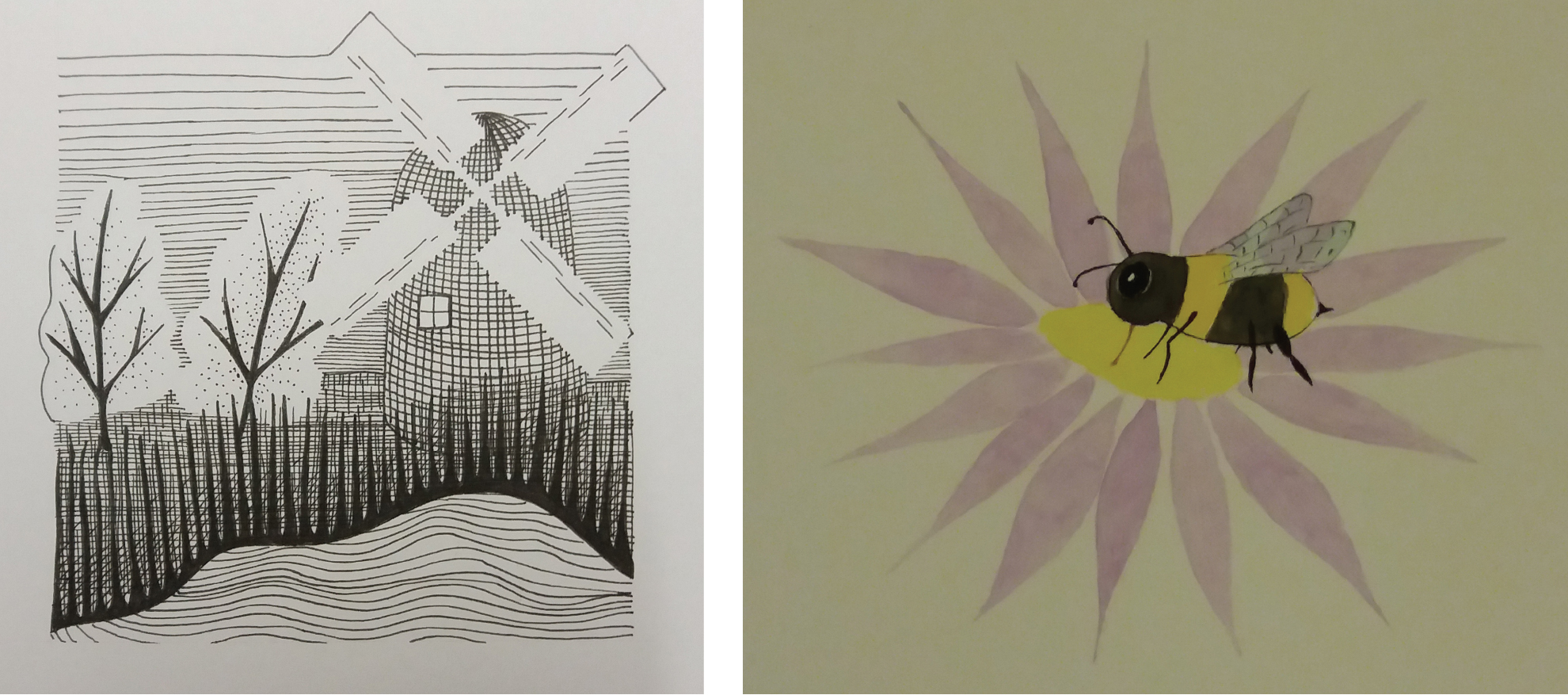
For my illustration in the style of Ravilious I chose to focus on the style that he used in his woodblock prints. I used elements from my local landscape for the subject matter. Instead of block printing I chose to draw the illustration in black ink but tried to capture the style of block printing. I am pleased with my use of white space to create the trees and sails of the windmill. However, I think that the image would benefit from more detail in the mid field, particularly between the trees and the lake.
For my illustration in the style of Matt Sewell I chose to illustrate a bee. I found this illustration challenging as I have little experience of painting. Overall I am pleased with the result although I don’t think that I managed to get much of the character of the bee into the image.
