The aim of this exercise is to use one of my existing images to develop a commercially viable, or appealing object within an area of authorial practice (children’s publishing, decorative illustration, fanzines and artists books, editorial, prints and artwork, fashion and accessories).
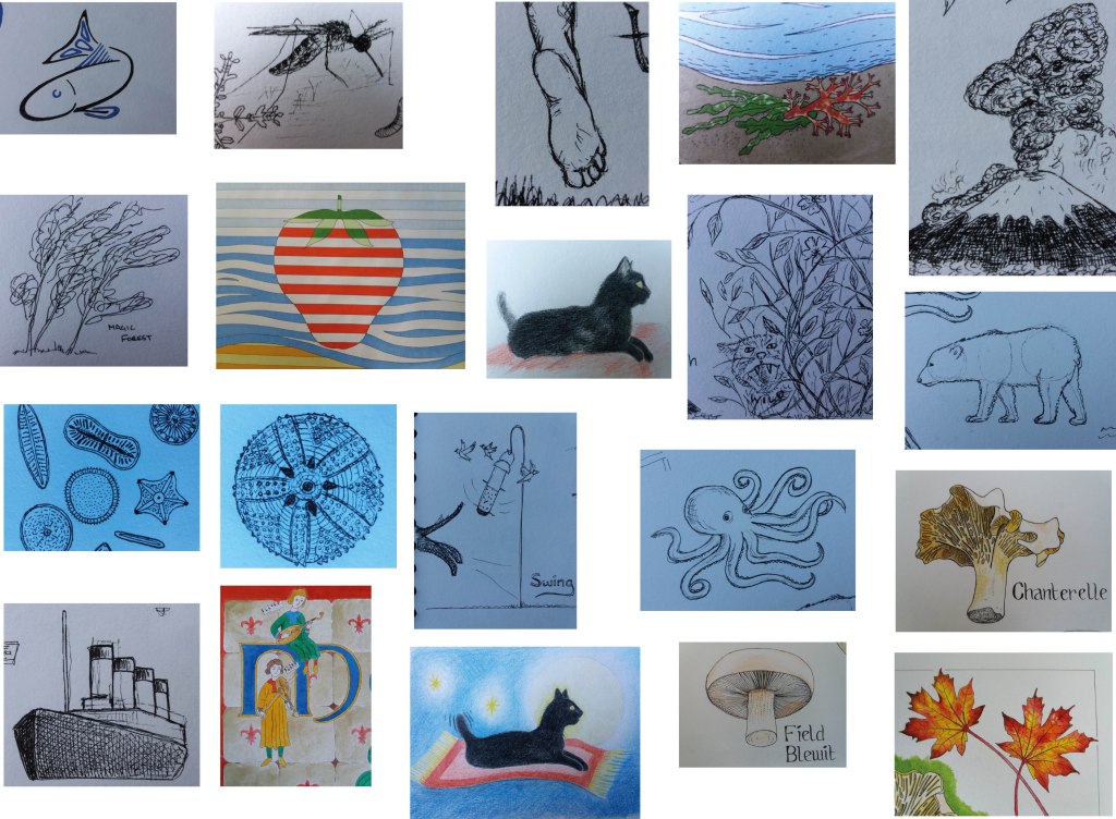
I began by assembling a gallery of my work from my sketchbooks and coursework from this module that might be suitable – I realised that I quite like a lot of my rough sketchbook images. Several of these come from the inktober exercises and maybe I should start doing this again – sketching a random word per day.
I think that it would be really useful for me to learn about the process of making greetings cards as this seems like a small first step towards making a little money from illustration.
Several of the images strike me as appropriate for cards – the bright summery strawberry, the volcano and the sketches of animals. These are certainly the type of greetings cards that I might buy. So for now my audience is me. I’m going to produce some cards, with the purpose of learning about the process of getting cards printed, that I can then give to people rather than buying cards, or producing one off cards for people. Once I understand the process then maybe I could develop more images, and more cards, with other audiences in mind.
I did some research into card printing. For all of the companies that I looked at, the smallest sized card that they would print is A6, which is bigger than I had anticipated but useful to know before the design stage. Different companies clearly had different markets – which was reflected in their minimum print run. I did find a small company that specialises in printing for illustrators, fine artists etc. They do small print runs, try to use sustainable materials etc, provide a photoshop template for the design. I think this is a good place to start.
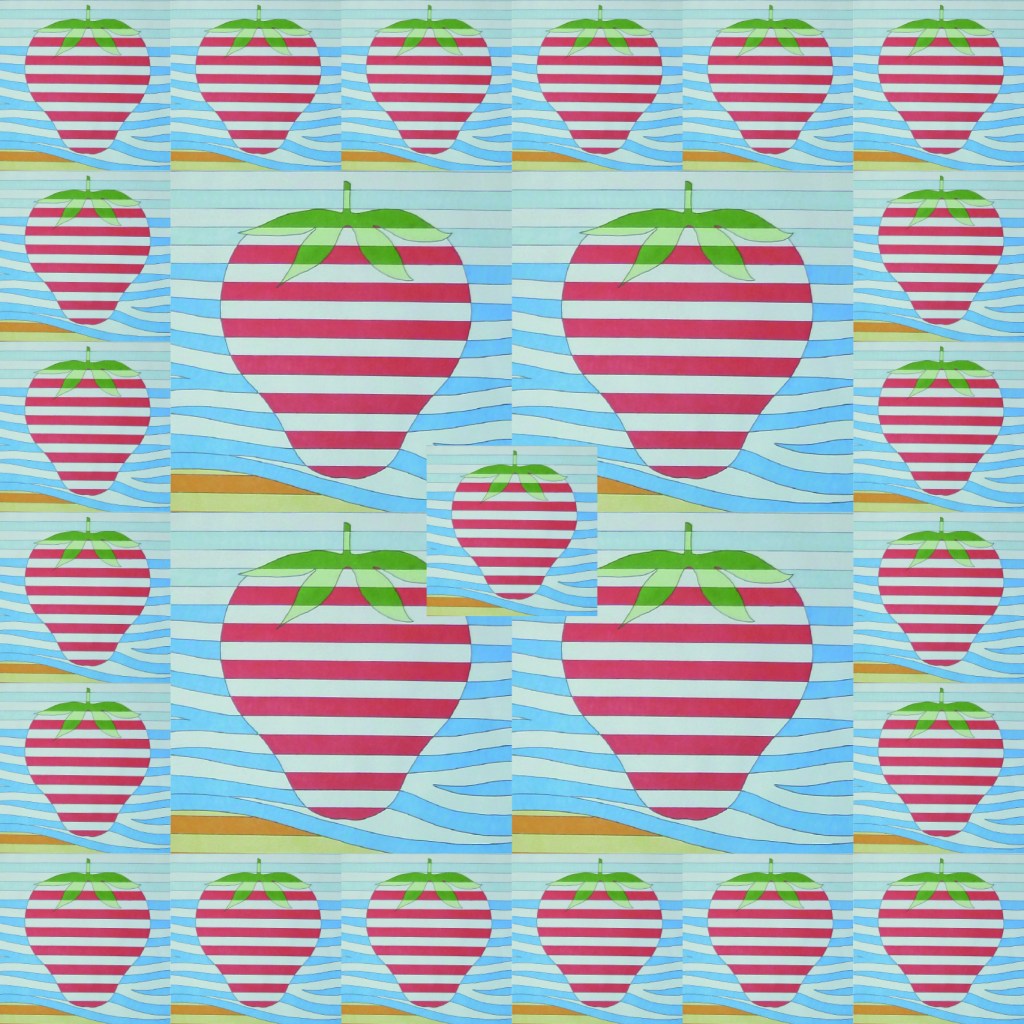
One thing that I quickly realised when playing around with my images in illustrator is the need to have good quality photos of them. It’s really hard to get the light even across the image. I can really see the value of a scanner at this stage.
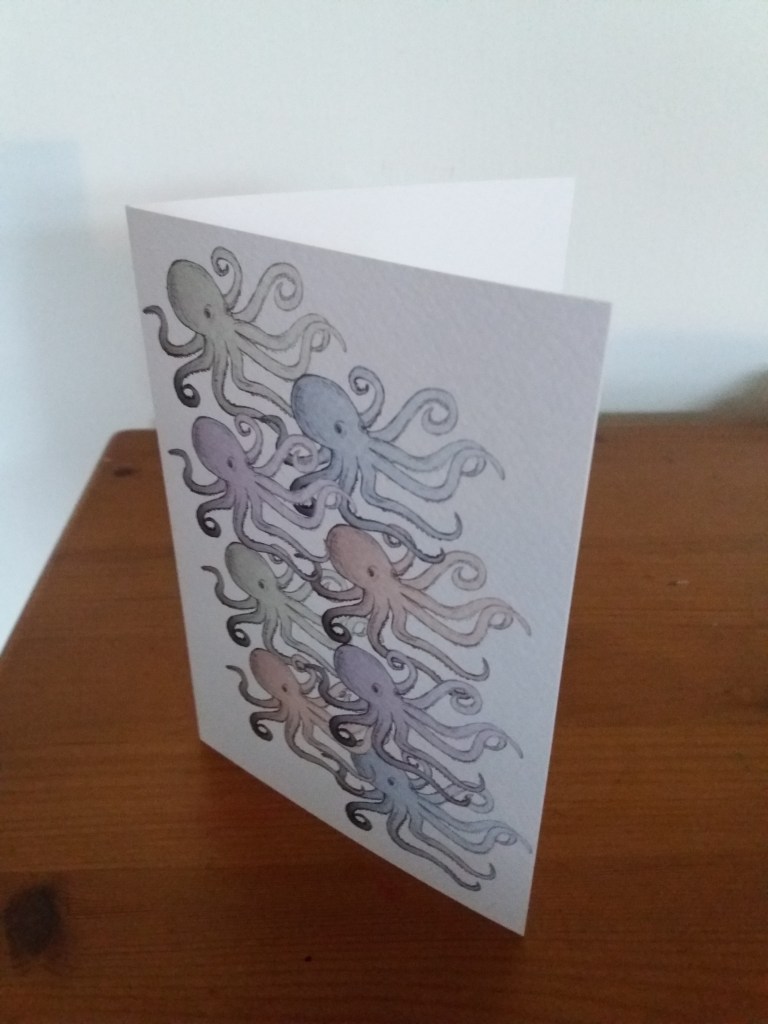
I played around with a fragment of my strawberry image from a previous assignment and also the octopus sketch from a children’s book cover exercise.
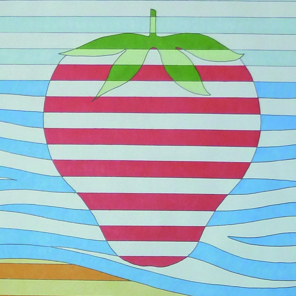

I quite like the chintzy strawberry design but think the octopus design is more the type of thing that I would buy.
This was a really useful exercise for helping me to understand the process of both manipulating my work in illustrator and photoshop and also the process of producing a ‘professional’ card. This has given me a lot more confidence in using photoshop to manipulate and alter hand drawn images. I think some of my methods are still a little clunky; however, if I put in effort to do more of this, I’m sure that things will get smoother. I’m really interested and excited to see my printed card.
