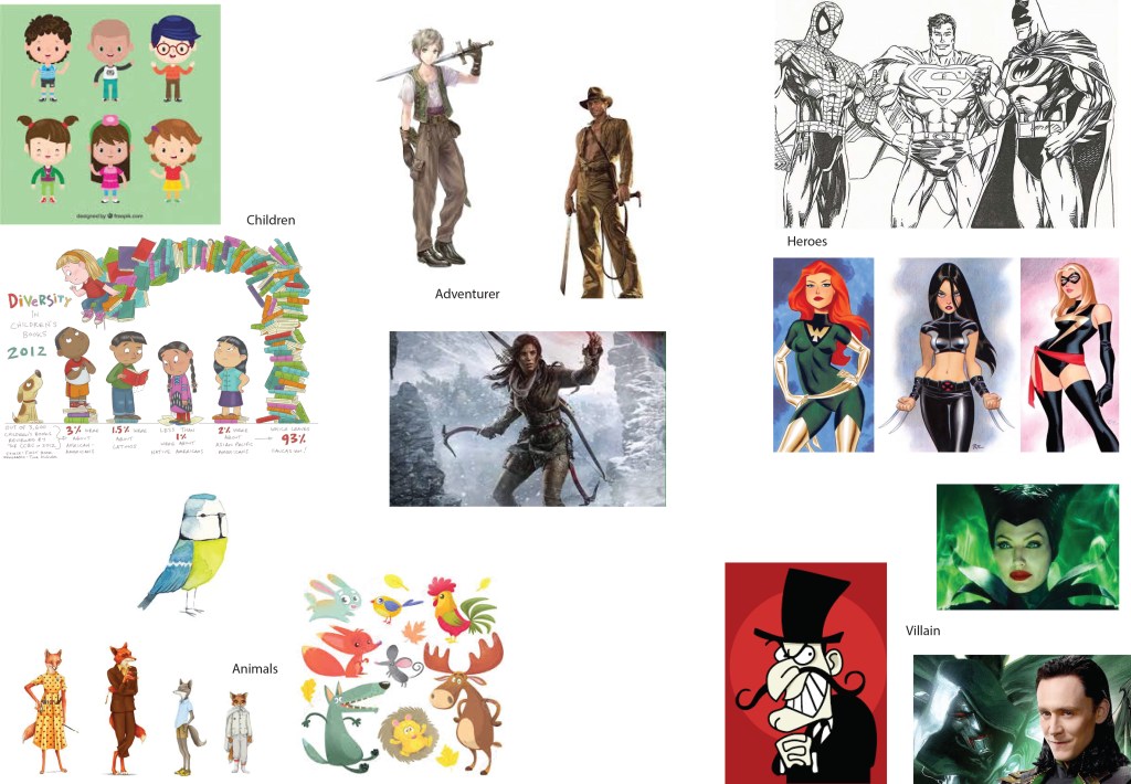
This exercise is about character development. I began by collecting together examples of different types of characters in order to understand how different character traits are portrayed visually.
Characters
Most of the characters have some aspect of their features exagerated. For example, children tend to have big heads and big eyes; whereas villains tend to have long faces and angular eyes. Superheroes and adventurers are all tall, fit or muscly and have their sexual features exagerated and highlighted, for example through being oversized, wearing tight fitting clothes and the really odd habit of male superheroes wearing their pants outside of their other clothes.
The pose that the character adopts is also important. I really love the confidence or even arrogance that it implied by the foxes and blue tit standing tall. Superheroes and adventurers have dynamic positions; whereas villains are slightly curled up to imply cunning.
The clothes and props that the characters carry help to develop the character. The villains have angular, jagged clothing. Adventurers wear clothing that is roughed up. The adventurers and superheroes often carry weapons.
The use of colour in the images is also important. For example the use of green in the images of villains may imply envy and jealousy. The use of vibrant colours for children and animals implies fun and happiness.
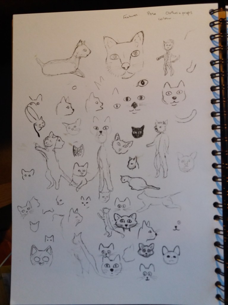
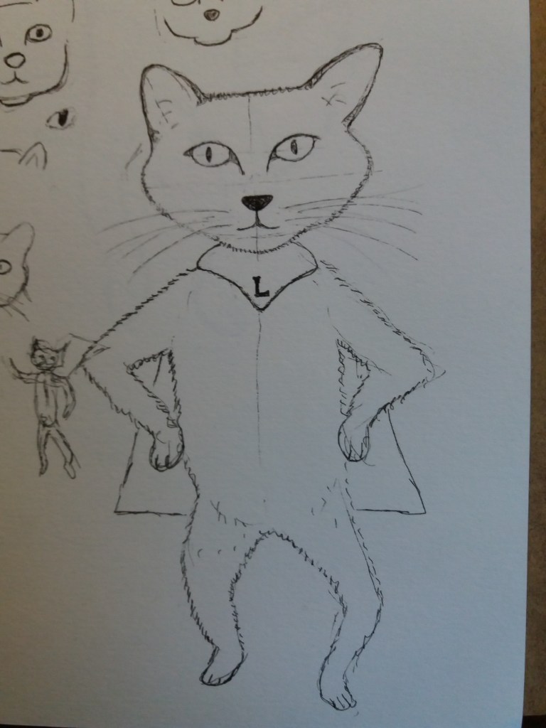
The next step of this exercise is to begin to develop a character. For this, I decided to develop the character of Lucille who accidentally appeared in the previous exercise. She is a magical, slightly whimsical superhero cat off on adventures to help save the world.
Cats heads
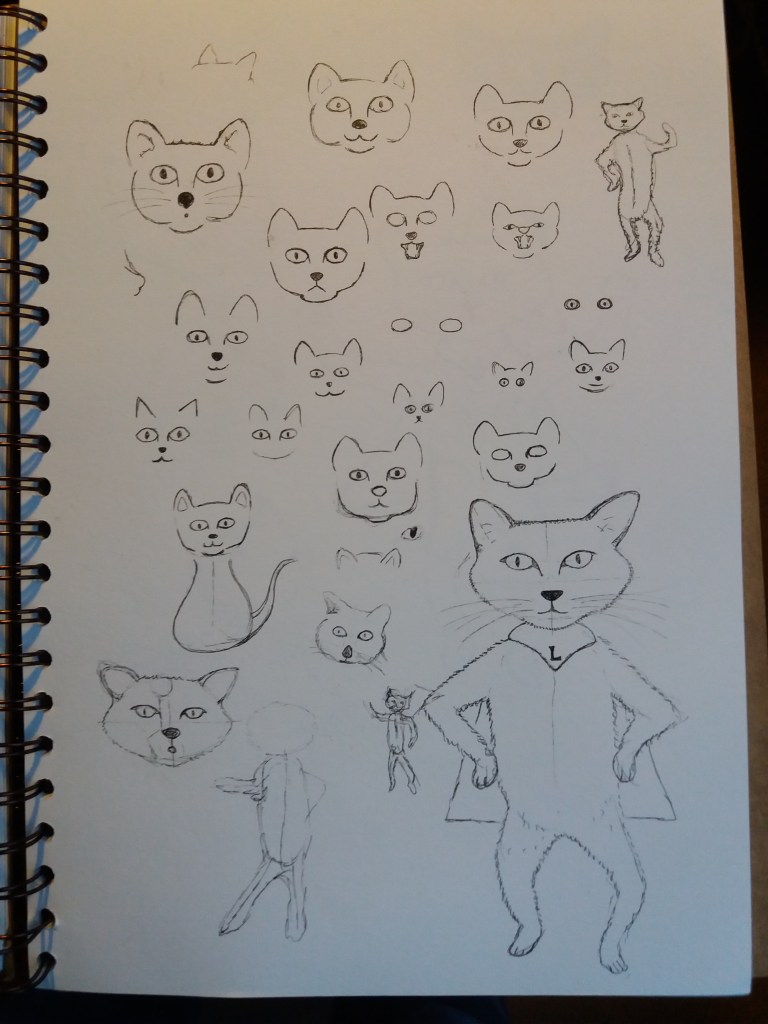
More cats heads … and finally a body
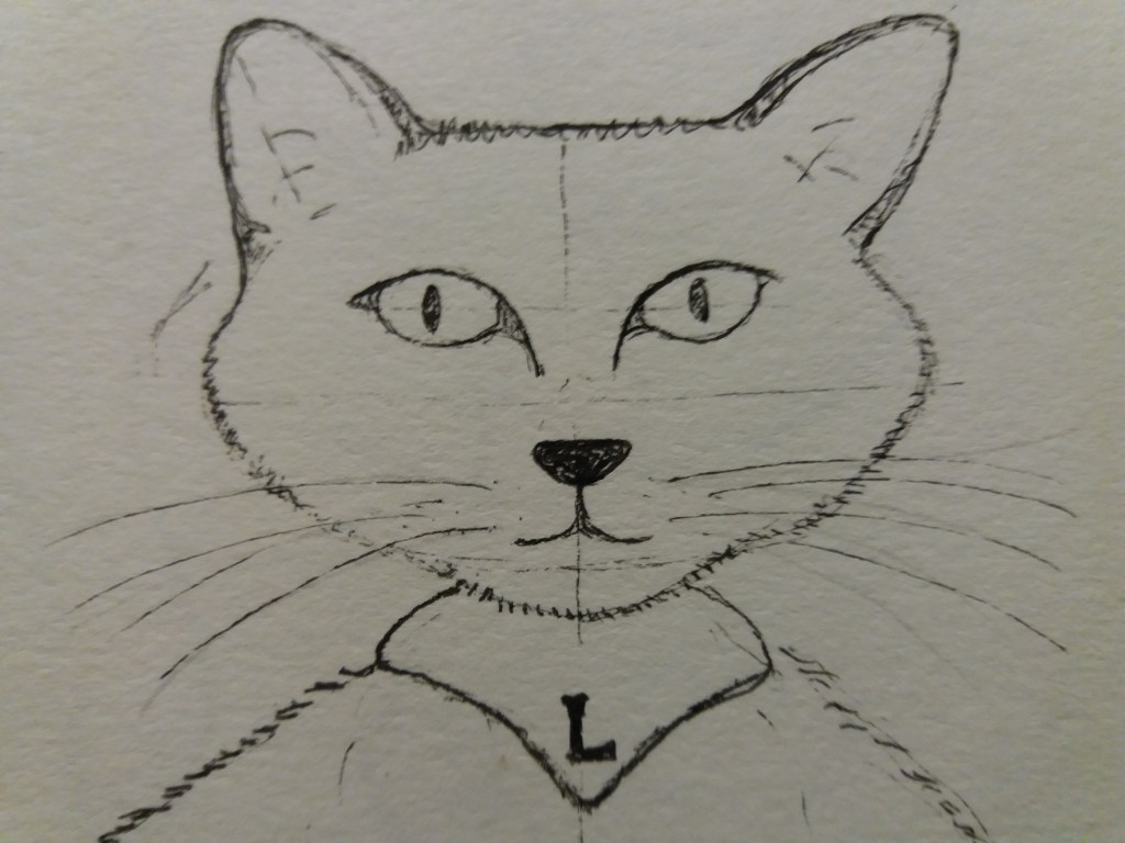
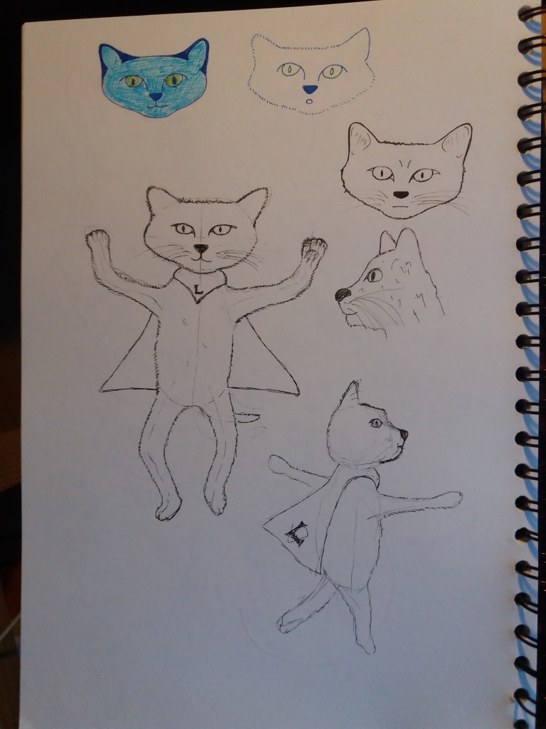
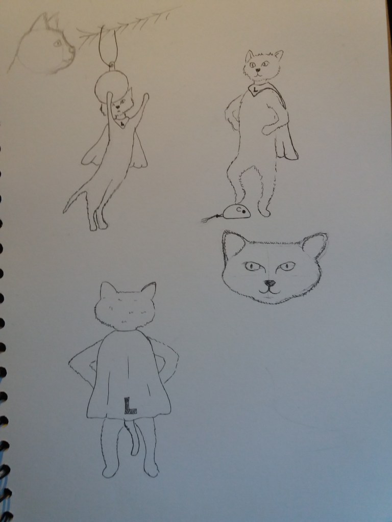
I began by thinking about Lucille’s facial features and also how anthropomorphic her body should be. Her face and body posture will be important in expressing her emotions. I tried lots of different ways of drawing the head – braking it down into a few simple lines, exagerating features, making it cartoony, trying out different expressions. In the end I settled on something semi-realistic but with exagerated features. I also tried using different colours for Lucille – she is a whimsical cat, so could be a whimsical colour.
I then thought more about Lucille’s body. I was, and still am, unsure how anthropomorphic I want Lucille to be. There seems something more whimsical about keeping her in a cat-like pose. I was reminded of the cats in Beatrix Potter books. I think that Lucille is a ‘gentle superhero’ so I don’t want her to look aggressive, carry weapons, etc. Clothing wise I compromised and gave her a little superhero cape. I also gave her a cocky but also slightly silly stance.
Lucille in her little cape.Lucille adopts different positions.Lucille from behind
This exercise did make me think more about how to develop characters. However, I’m not that pleased with the end result. I think that the character I have developed is quite generic. I wonder if I should have kept Lucille as more of a cat, rather than allowing her to walk on two legs. I also think that different media would help to give her a more whimsical feel – for example, I think that the pencil crayons in the previous exercise do this better. Maybe some light ink or watercolour washes would also work quite well. I think she would also benefit from having the magic carpet from the last exercise. I love sketching in black fineliner – it’s really quick and enables me to think while sketching. However, maybe it is also a little limiting and I should play with different media more.
This was a really fun exercise. I’m not sure that I did what was intended in the exercise but it turned out to be a really intriguing way to develop a character. The exercise was to sketch a life-like cat or dog, then produce a simple line drawing from the first image, to use this drawing to produce a collage and then to make a drawing from the collage. I think that there was meant to be more visual distortion involved but I got a little carried away when I noticed the magic carpet in the image.
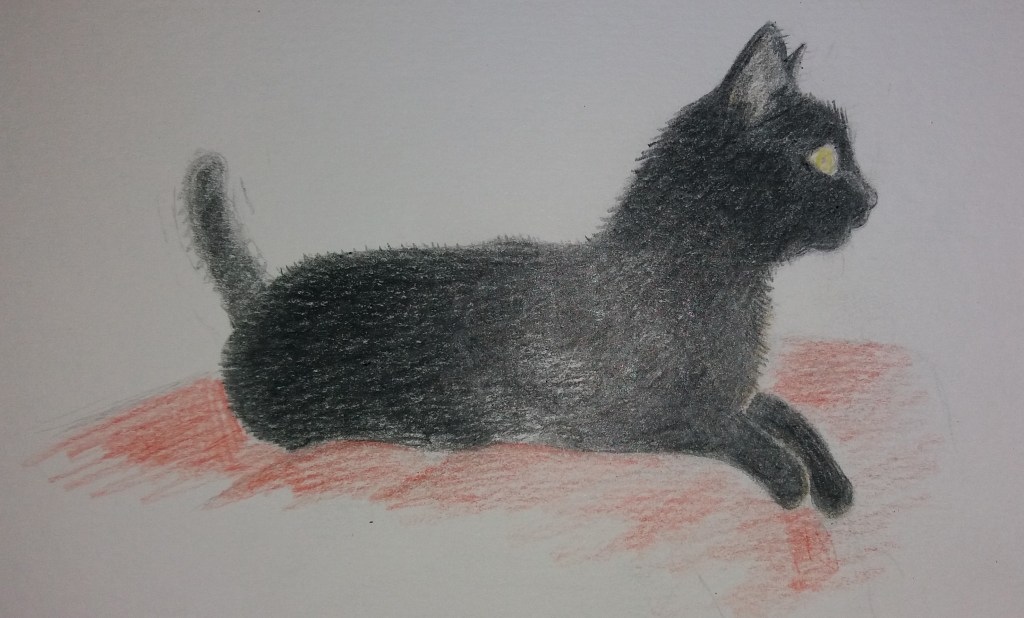
Lucy
Here’s my original drawing of my friend’s cat Lucy. It’s from a photo where she was attracted by something outside of the window. I like this picture because she is very alert and also (in the original, maybe not in this drawing) quite sphinx like. At this point I wondered about having her being intrigeued by an egyptian sphinx in the final image, or I guess she could turn into a sphinx.
Lucy in lines – discovering her magic carpet
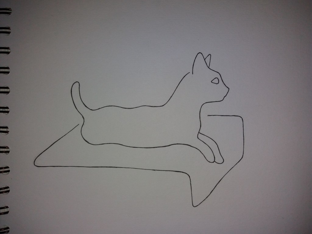
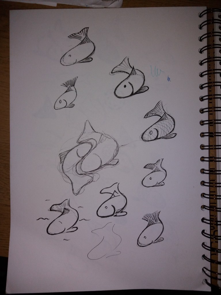
From this original image I produced a line drawing using only five lines. In this line drawing I thought that it looked like Lucy was flying on a magic carpet; which was the surprise inspiration for the images that follow.
Lucy and her magic carpet in collage
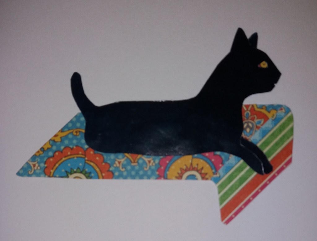
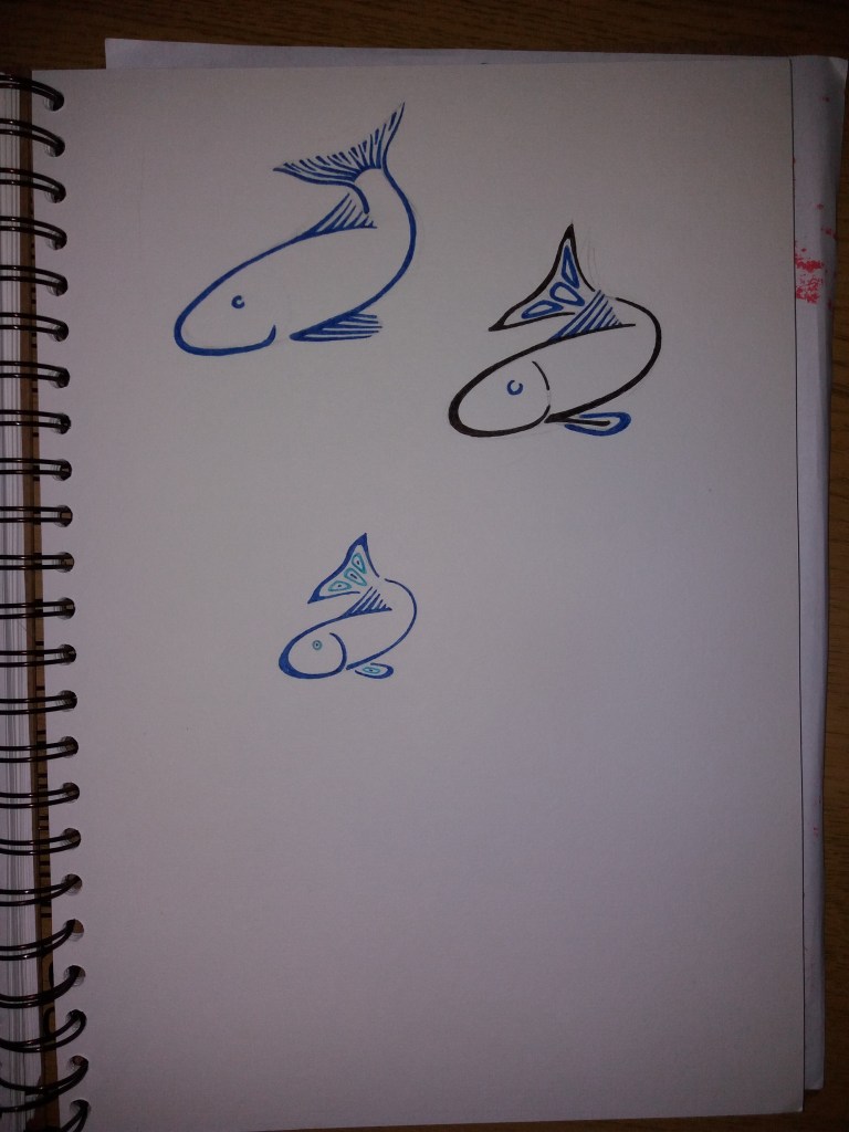
I then used the line image to make a simple collage. Lucy is actually dark blue and made from a magazine picture of shoaling fish … which I found amusing; however, this hasn’t come through in the image. I probably should have chosen an area of the magazine picture that was a little lighter. I think this is the point that I was meant to include more visual distortion. However, I was preoccupied with images of Lucy flying through the night to rid the world of evil.
Lucy’s aalter ego Lucille flys through the night on her magic carpet.
I like the final image. While I was drawing it I had in mind children’s book illustrators such as Raymond Briggs. I can imagine writing books about the adventures of Lucille … but for now I should probably move on to the next exercise.
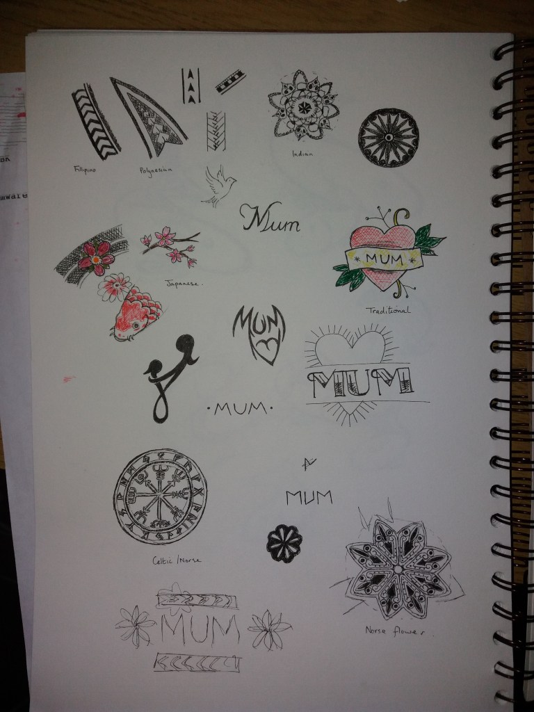
The aim of this exercise is to produce a tattoo based on the word ‘Mum’ that can also be used for a Mother’s Day card. I began by looking into the history and different styles of tattoo.
There is evidence that tatooing was already practiced in the 4th century BC. Historically, it has had signifance beyond being decorative: to brand criminals, for healing purposes, for spiritual purposes; and to identify individuals. Tatooing became more commonplace in Europe with the advent of exploration and trading with the Far East – with sailors returning with tattoos.
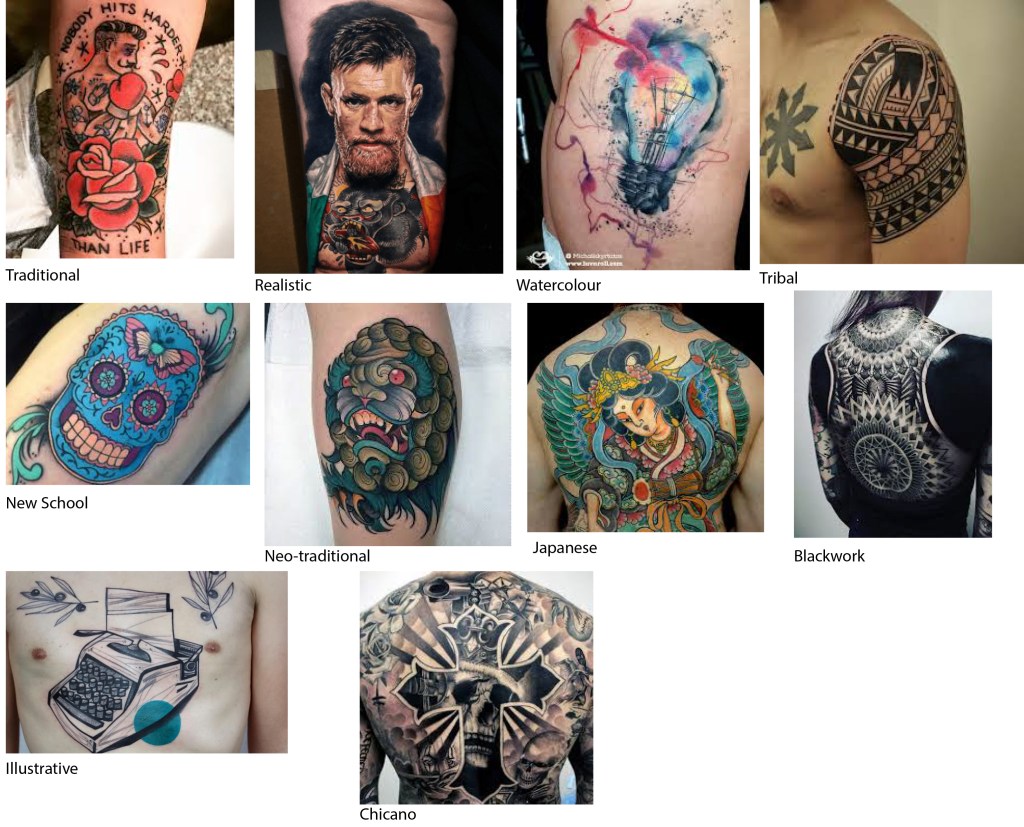
There are many different styles of tattoo. With the exception of realistic tattoos, I think that any of them would be suitable for this project. I want the image to ‘look like’ a tattoo, so I’m going to avoid the watercolour and illustrative styles. I think that the tribal, Japanese, or New School styles could work quite well. I love the geometric patterns in the tribal tattoos.
Styles of tattoo
In order to think more about what style might work well for the ‘Mum tattoo’, I started looking into tribal, Japanese and New Style tattoos more and sketching elements of them in my sketchbook. I also started looking into font styles used in tattoos and also elements that might traditionally be associated with Mother’s Day e.g. flowers etc. This is a tricky brief without knowing about more about the person the tattoo is intended for and their Mum. Working on stereotypes this is a tricky brief because it’s quite a feminine subject area but intended for a tattoo on a man.
Sketchbook – different styles of tattoo and examples of existing ‘Mum’ tattoos.
I am wondering about taking something that is a stereotypically feminine object e.g. a flower, or a heart and then using geometric patterns from tribal tattoos to make it into something a little more masculine. Maybe taking the more traditional ‘Mum’ tattoo sketched above and turning it into something more contemporary.
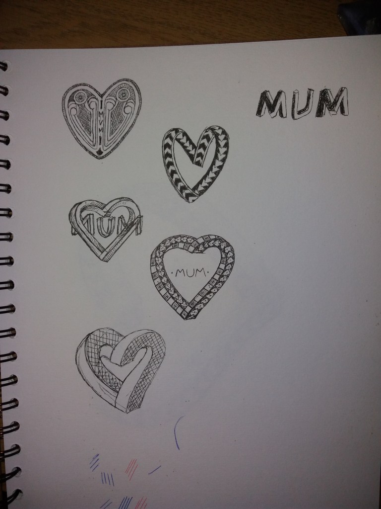
Sketchbook – playing with heart designs
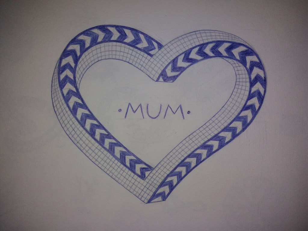
I started playing with a heart design. The top image is mainly based on patterns from Norse tattoos. The second design down based on tribal tattoos made me thing of M. C. Escher and infinite loops. So for the bottom three sketches I played with making a heart infinite loop and then playing with patterns on the different edges. I think that it makes sense to have the text ‘Mum’ within the design – this will also help to link it back to more traditional ‘Mum’ tattoos. I played with having blocky Escher-type writing; however, I decided to use a plain and traditional tattoo font. I considered using different colours for the different edges of my final design. However, in the end I decided to make it all in blue. For the final design, I drew it up in blue biro.
Mum tattoo
I think that produced at a smaller scale this tattoo could work. Retrospectively I think that the version with blocky text linked through the heart looks better better. In general there is a bit too much white space in the middle of the heart. I guess red would be a more conventional colour for a heart tattoo but I think that I prefer it being in a more subtle colour.
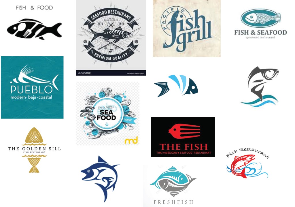
For this exercise I’ve been asked to produce an illustration for use on the menu of a sophisticated, quality fish restaurant that is part of a chain across several European cities. The menu uses fresh ingredients and the ambience of the restaurant is modern, bright and contemporary in design. The image will initially be used at a small scale on the menu (40 mm x 40 mm); however, if successful it will also be used at a larger scale in stationery and on vans. Therefore, the image needs to be simple and clear.
My initial thoughts on this are that the logo should not include any text as it is going to be used in several countries. The logo needs to convey the message of fish restaurant. I need to think about how you convey the idea of quality with a simple logo.
Examples of fish restaurant logos
I collected together a selection of fish restaurant logos. Initial observations are that, not surprisingly, blues are the dominant colour used. Most of the designs are very simple and graphic. I think the cleverest design is the fish that is both a fork and a fish. However, I think that the designs with more detail, whilst potentially less eye catching and practical, somehow suggest quality – attention to detail in the logo implies attention to detail in the food. For me the designs that work best are those that are somewhere in the middle ground with respect to detail – they are graphic, however, they illustrate quality by using a particular species of fish in the logo, rather than a generic fish. With the exception of the little red fish-fork, I don’t think that using cutlery in the design is necessary and for me doesn’t illustrate quality. I am attracted to the fish that appear to be jumping out of the sea – it gives the logo movement. I don’t think people want to see the dead fish that they will eat; they want to see a lively, fresh fish.
Given current concerns for the oceans and over fishing, I will try to use one of the more sustainable fish species in my design. According to the marine conservation society these include mackerel, monkfish, some species of salmon, trout – it’s pretty shocking when you look into it how few fish species are fished at a sustainable level. For my next step I’m going to research images of different types of fish and try to make simplified sketches of them.
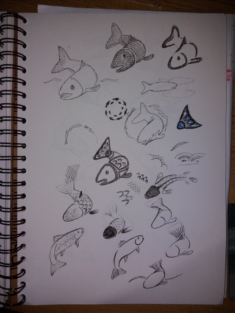
Sketchbook images
I began with a simplified sketch of a salmon and started playing with making the image more graphic. I started by blocking out solid areas of colour, I then tried reducing the image down to lines. This started to make me think about how fish are depicted in Native North American artworks. I also began to look at some of the textures used in Japanese art and to make sketches of these. I think that Japanese art has more fluidity than the native american designs and might help to give the image movement.
Sketchbook images
I was getting a bit stuck developing the origniam image, so I decided to find another image of a fish and work from there. I then kept trying to break the fish down into a few simple lines but using the ideas of thickening and thinning of the line from the native american artwork. The fish is still a bit cartoony for a high end restaurant. I wonder about making it more slender and with less well defined edges at the tail. Or maybe I could use colour to give a feeling of depth.
Sketchbook images
Finally I started to play with colour. My final design at 40 mm x 40 mm is the bottom image on this page. Retrospectively, I think that I prefer the black and blue colour scheme as it’s a bit more contemporary and eye-catching than the two tone blue colour scheme. If I had time, then I would produce this image in adobe illustrator in order to make the lines perfectly clean and the colours perfectly flat. I think the image would work well at a range of scales and fulfills the brief. It would have been good to somehow get more movement into the image – as per usual many of my sketchbook images have more movement in them than the final logo. Maybe it is a little odd to take elements of native american art into the logo for a restaurant chain in Europe, I’m not sure, as there isn’t much information about the restaurant. Maybe, I could tone this down a little.
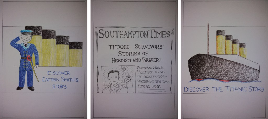
Client visuals for three museum posters aimed at children, teenagers and adults. Space has been left at the top and bottom for museum branding and information.
The aim of this exercise is to produce colour client visuals for three posters that advertise a museum and are aimed at three differentage groups: child (5-9); teenager (13-16); and a general adult audience. Each poster is to be based on an object that has been selected from the museum’s collections.
For this exercise I visited SeaCity Museum in Southampton, which has a titanic exhibition and an exhibition about other events in the history of Southampton.
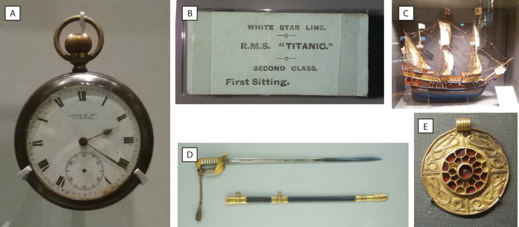
Objects from SeaCity Museum. A) A pocket watch belonging to the Storekeeper on the Titanic. B) A second class dinner ticket from the titanic. C) A model of the Mayflower. D) Sword belonging to the Captain of the Titanic. E) Saxon womans necklace.
In order to have a coherent theme running through the three posters I’m going to use the three objects from the titanic. I think that the sword will be the most interesting object for children. I’m personally drawn to the dinner ticket, I think because of it’s simplicity, therefore I’m going to use this object for adults and then the pocket watch for teenagers. Both the sword and the pocket watch belonged to specific people so I could use characters alongside the objects on the posters.
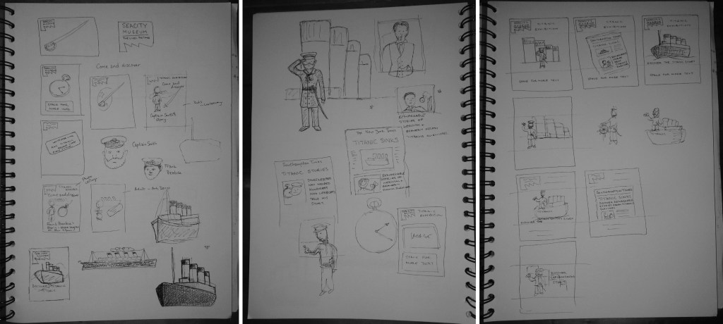
I am a little rushed for time with this exercise so I’m going to jump straignt into drafting some different poster ideas for each of the objects. The museum has a distinctive logo that I will use to help tie the three posters together. In the museum they are keen to tell the stories of individual people who survived or perished on the titanic, so I intend to include this within the posters i.e. to include the person alongside their object. I think that this will be particularly helpful with the posters for children and teenagers. I’m also thinking about including some similar text on each poster e.g. ‘ Come and discover ‘ and the name of the person and their object.
I’m thinking of using a similar layout for each poster but using a different style. Titanic sank in 1912, so for the adult poster I might try to use an art deco style. I’ll make the kids poster in a cartoon style. I’m unsure what style would appeal to teenagers. The tricky thing about all of these posters is that the museum is about a horific event in which 1500 people died so I don’t want the posters to appear flippant or disrespectful.
Poster ideas – objects, characters and thumbnails.
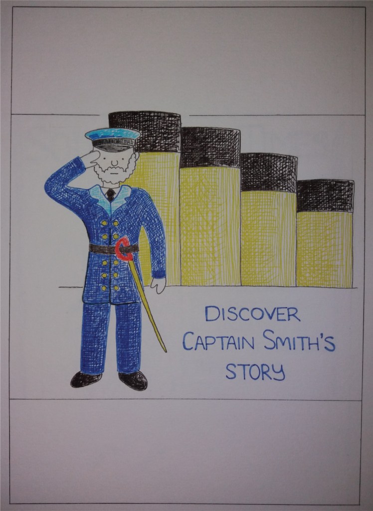
For the poster aimed at children I’ve decided to have a cartoon of the Captain, complete with sword standing on the deck of the titanic. I’ve opted to focus on the character rather than the sword because this is the focus of the museum – telling the story of the people aboard titanic. The challenges that I found with this poster was how to fill the space when you’re using a single character. I thought about including more characters but this distracted from the main character. I also experimented with having the Captain standing on a cartoon titanic but this felt a little too jovial for the topic.
For the poster aimed at teenagers I also wanted to incude a character. I played with showing the character of the storekeeper whose pocketwatch is in the museum. However, the cartoon style felt a little childish for teenagers. I also experimented with using old photos of the pocket watch the storekeeper and the titanic, however, this didn’t look interesting or coherent. However, as I was working in black and white this somehow led to the idea of using the front of a newspaper. Putting text on the newspaper also led me to think about adding a tag line to each of the posters.
For the poster aimed at adults, I started by including the image of the dinner ticket. However, I realised that for a museum about titanic it would be good to show the titanic herself. I decided to try to include an image of the ship on the poster in a simple, bold, graphic style.
I’m presuming that the final posters will be on standard-sized paper. I’ve decided to produce the client visuals at A5 scale as this is the smallest they are likely to be produced. However, my intention is that the poster could be scaled up to A0 or larger.
Client visual for the poster aimed at children aged 5-9.
I’m quite pleased with the poster aimed at children; it’s simple and bold. It will benefit from coloured banners at the top and bottom of the page. I do wonder if I could have got more movement into the cartoon, which would make it a little more exciting. I did realise retrospectively that of the characters that I chose for the posters, this person drowned with the titanic, so was maybe an inappropriate choice for the children’s poster. I quite like the funnels in the background and that this is repeated in the adult poster.
Client visual for the poster aimed at teenagers aged 13-16.
The poster for teenagers was the one that I most struggled with. I quite like the final design, although I wonder if it is a little childish. The poster definitely needs some colour in the banners, or the whole of the background to make it stand out.
I like the simple image of the titanic in the poster aimed at adults. I think it would be quite eye catching at a range of scales. I wonder if I’ve made it so simple that it’s not instantly recognisable as titanic; however, I think this would be okay once integrated into a poster with the museum’s branding etc. In the end it’s bold and graphic but it’s not particularly art deco but I’m quite happy with that.
I like using pen to make client visuals as it’s reasonably quick and feels quite free. I think the pen works well for the poster aimed at teenagers. For the poster aimed at children I’d use bolder, blockier colours – I might well make the final version digitally. For the poster aimed at adults, I actually prefer the image of titanic from my sketchbook. I’d consider using a sketchier style that gives the image a bit more movement.
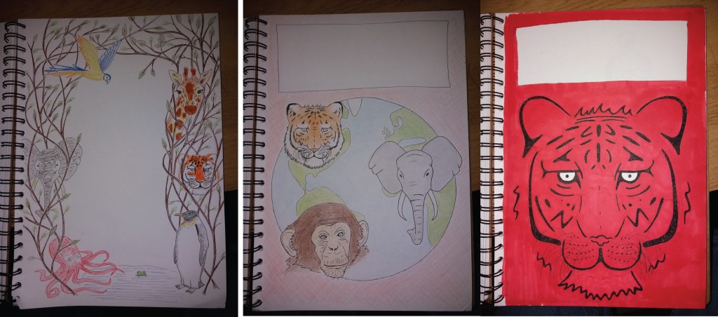
Three colour client visuals for the cover of a book entitled ‘Animals of the World’
The aim of this exercise is to produce a cover illustration for a natural history book for children aged 7-11. The book will be entitled ‘Animals from Around the World’. For this illustration, I need to consider that people have expectations of such a cover will look like but also to think aout how to attract a modern audience to the book. I need to produce three sets of coloured client visuals for the book cover and include information on the final size and format and where the type will be positioned.
NB – note in learning log decisions made through the design process.
Book covers from children’s books about animals
I began by researching designs for covers of children’s books about animals. Most books, use simple but realistic depictions of animals. The book covers that really appeal to me are the two covers that break from the mold and have bold, stylised images of a tiger and a wolf on their covers. These two alternative designs would definitely stand out on the shelf of a book shop or library. I’m unsure how appealing these covers would be to children; however they might at least appeal to the adults who are likely to be buying the book. I don’t think that the designs that include maps of the world work particularly well from a distance, although they might be quite attractive to children once up close.
I think that an important choice with the book cover design is whether to include a single animal of many animals. Using a single animal is visually eye catching, however, it doesn’t represent the content of the book particularly well.
Colours is also important in these book covers. Most of them use bold, bright colours with greens and blues dominating.
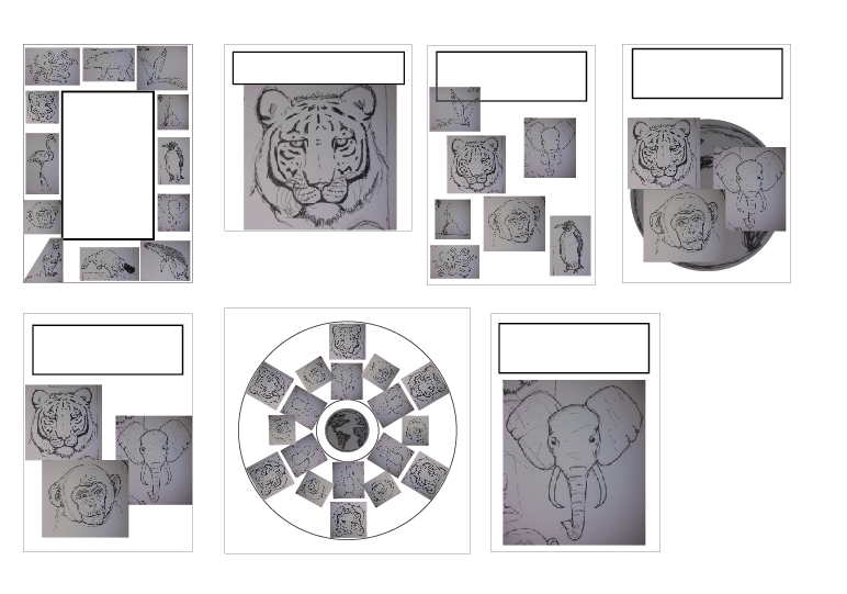
I decided to begin by loosening up and sketching lots of animals to help me to start learning how to draw animals and to think about what animals to include. I also sometimes get a bit frustrated at the research stage that I want to be drawing. At the same time I started sketching thumbnails as they came into my head. I tried to choose a range of animals that are distinctly representative of different parts of the world.
Animal sketches
I started thinking about the cover design in my sketchbook using thumbnails. However, I next decided to take a different approach to previously. I decided to digitally ‘cut out’ my sketches and play around with different designs in adobe illustrator.
I found thumbnailing in illustrator a bit limiting because I could only move the existing ‘characters’, change their position on the page, scale them and rotate them. I couldn’t play with what the characters were doing, where their legs are etc, which I can do in my sketchbook. This also led me to do a bit of research into graphics tablets as I think that these could be a really useful tool for this part f the design stage. I also found working electronically frustrating because the file sizes quickly get big and it takes a lot of time to save images.
I liked one of the designs from my illustrator thumbnails – the one with three animal faces in front of a globe. I think that having eyes looking out from the cover of a book grabs attention.
Thumbnails
At the thumbnail stage I experimented with books of different shapes and sizes. For the three final images I decided to go with an A4 book cover as this seems to be a fairly conventional size for this type of book.
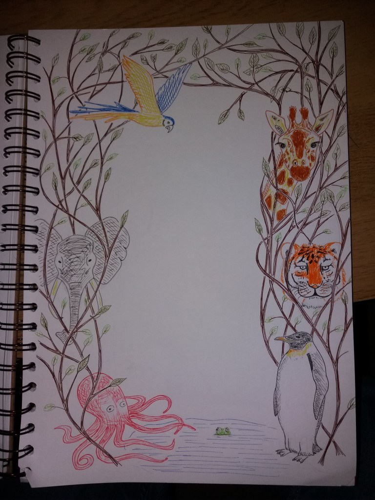
Cover 1
My first book cover is a bit of a rebellion against the constraints I felt trying to draw thumbnails in illustrator. I decided to draw freestyle animals as a border around the book title, with the animals entwined in some sort of plant. I decided to sketch this in coloured fineliner, both because this is relatively quick for producing client visuals and also because they are vibrantly coloured. I think that the design is fun; however, it probably isn’t particularly striking from a distance. If this design were used for the final book cover then it would benefit from a different colour background and maybe more animals and plants. This cover does give the impression that the book is about many types of animals. However, it is a bit boring and conventional in its design.
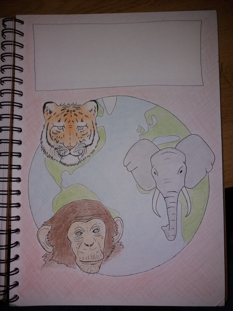
Cover 2
For the second cover design I decided that I wanted to better explain that the book is about animals from around the world. I also wanted to have several animals staring out from the cover. I originally drew the cover in black fine liner and then quickly added some colour with pencil crayon. I think that this design explains the content of the book well. I also like that by making the animal heads larger than in the first cover design, it’s possible to include a bit more detail and realism. If I were to take this on to a final cover design then I’d consider ,making the animal faces larger and also positioning appropriate animals on different parts of the globe.Whilst I’ve broken away from the traditional blues and greens with the colour of this book, I think that it would work well in attracting attention. The disadvantage in quickly shading in pencil crayons for this image is the lack of vibrancy in the colours. I think that if I used this design for a book cover then I might stick with pencil crayons but make the colours much deeper. This design is quite conventional but I think that in a modified form it would work well.
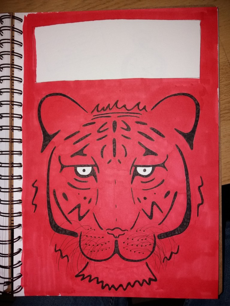
Cover 3
For my final design I decided to break from convention and go for a simplified graphic image of a tigers face. I think that it’s quite a striking image; however, it seems wholey inappropriate for the book. It doesn’t really explain what the book is about and if anything might be a bit scary – it’s a bit of a demonic tiger, particularly with the red background. I think that the image could be improved by leaving more areas of white on the tiger and using a less vibrant red for the background. I made this design using romarker and black fineliner. This didn’t work particularly well as the promarkers bled on the paper I was using. This would be a relatively easy design to create in adobe illustrator. This would have been a better approach as I could also play with the colour and tone of the background colour.
If I were the client I would opt for a modified version of the second cover design, with larger animal faces and in more vibrant colours.
This exercise has led me to wonder about how it’s best to put together colour client visuals – how much time to put into them, how rough and sketch they should or shouldn’t be
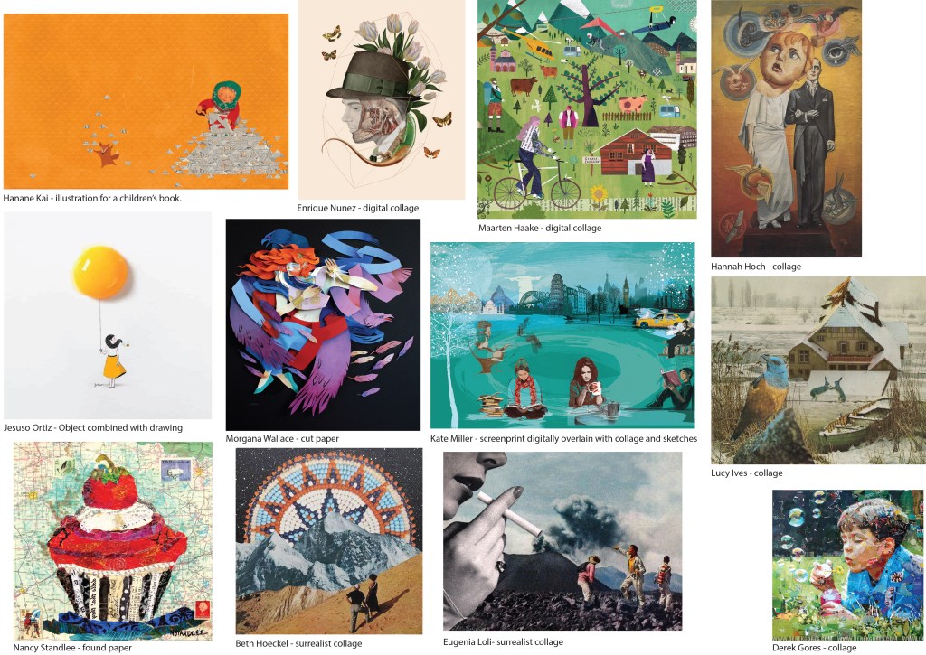
The aim of this exercise is to study and develop illustrations that use a particular medium. I have chosen to look at collage. To begin, I collected together a variety of illustrations that use collage (both traditional and digital).
Examples of collage
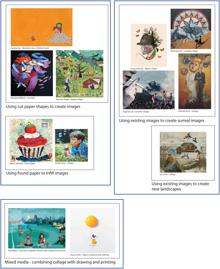
I then catalogued the images according to style. I identified two main styles. The first style uses swatches of colour to create new images; whereas the second style uses existing images to create a new image. The latter is commonly used to create surrealist images. In addition some of the examples that I chose used collage alongside other media such as printing and drawing.
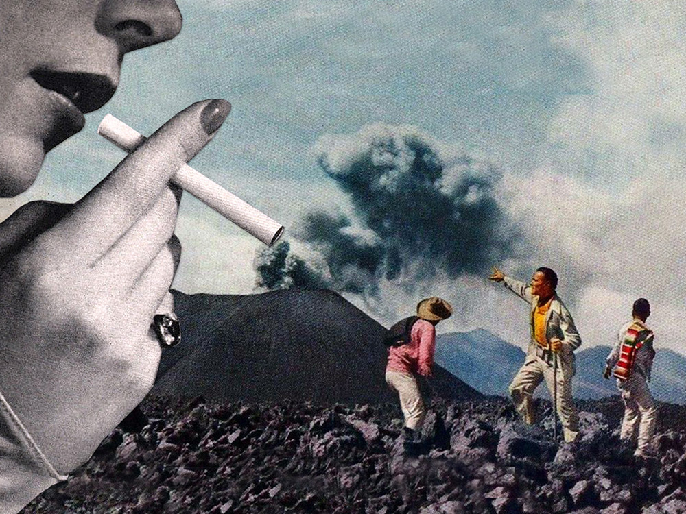
It seems quite effective in the surrealist images to use some of the found images to represent themselves e.g. the people in the image by Hannah Hoch; but then use other images to represent something other than themselves e.g. the ‘angels’ in the Hoch image are made from eyes, babies, plants etc. The surrealist images also play with scale, for example the smoking woman in the Loli collage.
Categorised collage images
I chose to look at the image by Loli in more detail. The image shows three characters observing an erupting volcano; then from the side a giant woman apprarently creating the smoke from the volcano from a cigarette. The image appears to have been made by taking a background image of a landscape and adding a layer of rock rubble in the foreground. Then the characters have been added, all of whom have are in quite dynamic positions. Then finally the giant woman smoking the cigarette comes in from the side.
All of the layers have a vintage, 1950s feel, from the colour tones in the landscape image, to the clothing that the characters are wearing, to the image of the woman smoking. This helps the image to hang together. Interestingly all of the images are in colour apart from the woman smoking. The eye is drawn to the three characters in the foreground because they are in the brightest colours.
Collage by Eugenia Loli
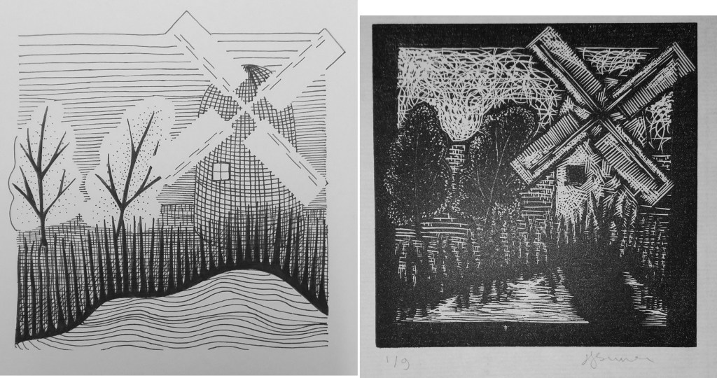
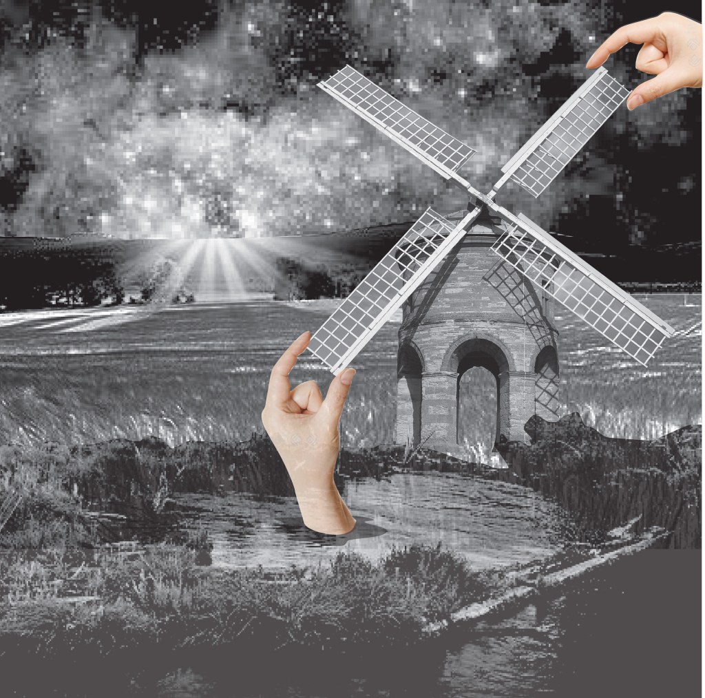
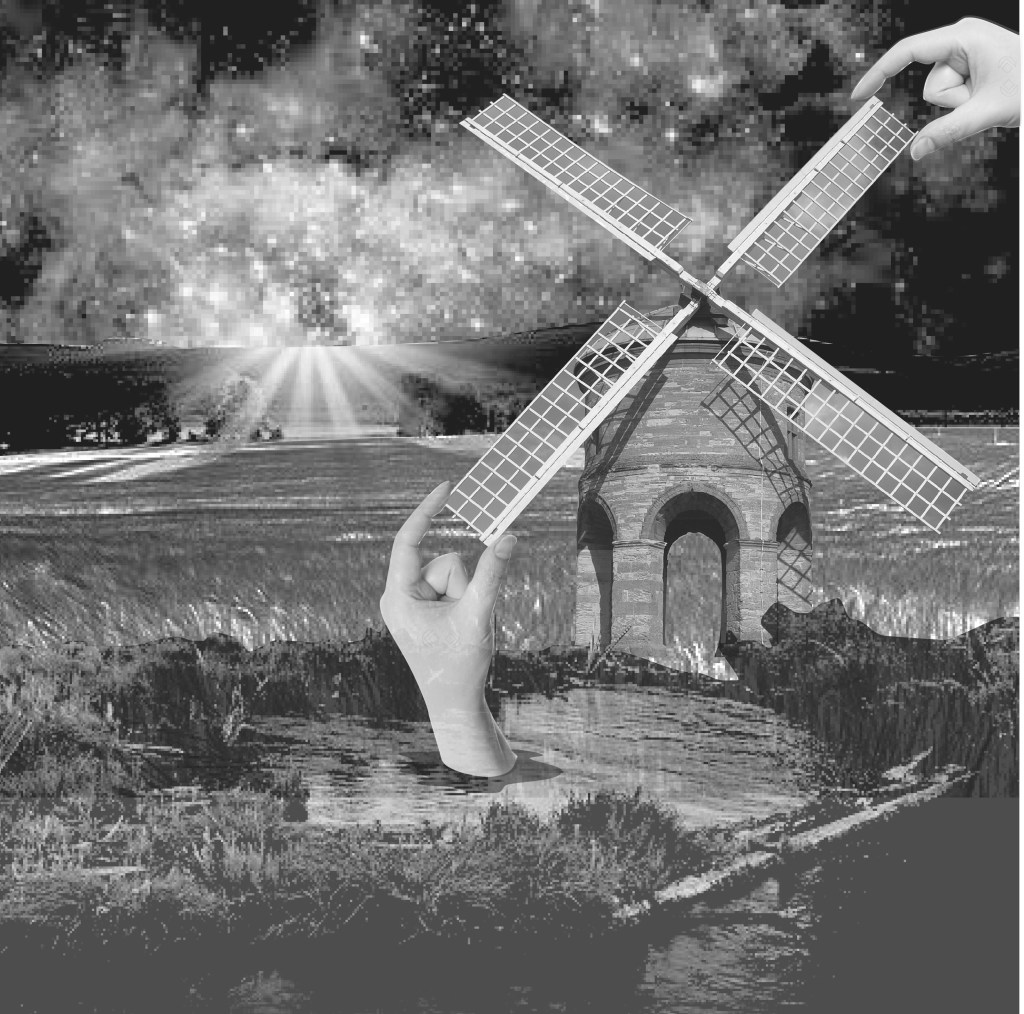
The next part of this exercise is to take an image from a previous exercise and render it using ideas from the above image. I’ve chosen to continue developing my windmill image from the first exercise of this illustration module. I decided to begin by using digital collage.
Original drawing and woodblock print
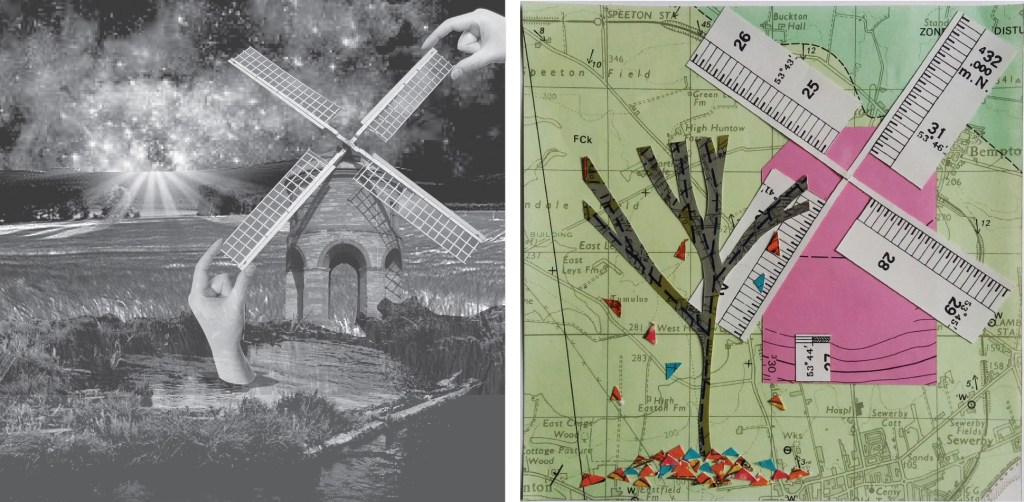
Windmill – collage
In my new collage image I chose to use black and white for everything apart from the hands. For the sky I chose to use an an image from space but to tone it down by making it greyscale. I then combined three images for the landscape to make the hills, fields and pond, and then added the windmill. I decided to convert all of these images to greyscale. I then added the hands that are placing the windmill in colour. I don’t think that my use of colour only on the hands works particularly well. I think that either the windmill needs to be in colour, or else the hands in black and white.
I prefer the image all in greyscale – the hands are less gratuitous. I do like this element of digital media – being able to make adjustments very quickly and easily and convert them back again if they don’t work. I like that scale is unclear in this image – is the windmill a toy, or are the hands giant.
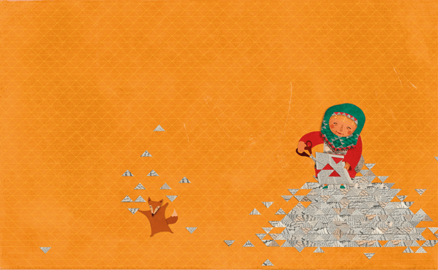
Next I decided to try the same image with a totally different form of collage – to use something like the simple, colourful style of Hanane Kai which uses cut shapes in colourful paper to create the image. The image from Hanane Kai below is from a children’s book.
Image from children’s book – Hanane Kai.
I really like the simplicity of this image – a plain background with no distractions that makes you focus on the characters. Putting the main character in the corner of the image somehow makes the composition more interesting than if the character were centered. I think that the positioning is also quite important to prevent the figures from floating around the image. The colour scheme of this image is also very simple – a few shades of orange and red, green and white.
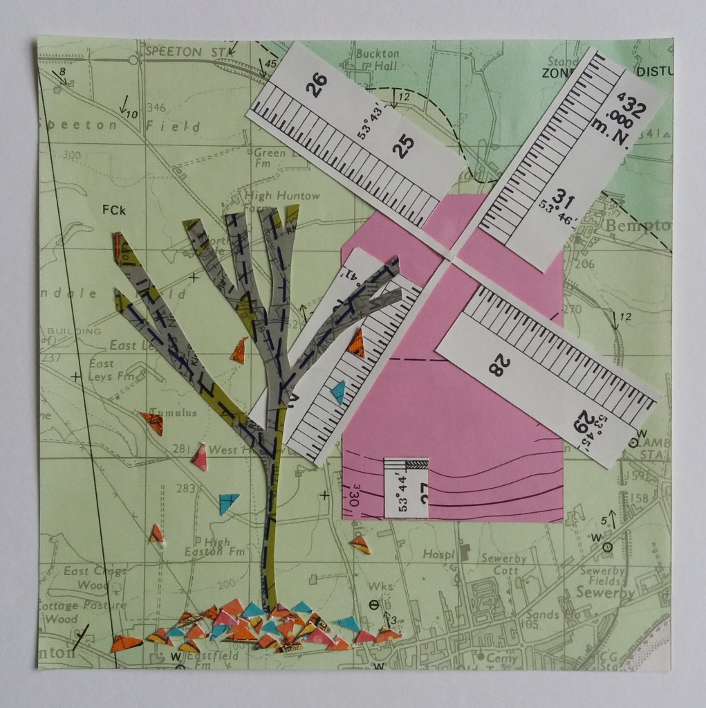
Windmill collage
My windmill image is made from pieces of old geological maps that were being thrown away at work. I thought that I was being clever using the scale on the border of the maps for the windmill sails; however, I think that this detail detracts from the tree in the foreground. I don’t think that I had really decided what I wanted the focus of the image to be before I started making this image. I had a play in photoshop at making the colours a little more vibrant, which I think improves the image. If I were remaking the image, I think that I might make the windmill less bright, maybe a more natural grey or brown colour, so that the tree, with its brightly coloured leaves would become the focus of attention.
For this assignment I am to produce a poster for either an Early Music Concert, a Jazz evening, or a pop group. I’ve decided to make a poster for an Early Music Concert, this is an area of music that I know very little about. However, based on the little I know, I think that this period (Medieval through to Renaissance) has beautiful art that it will be interesting to learn more about and incorporate into the poster design.
Preliminary research
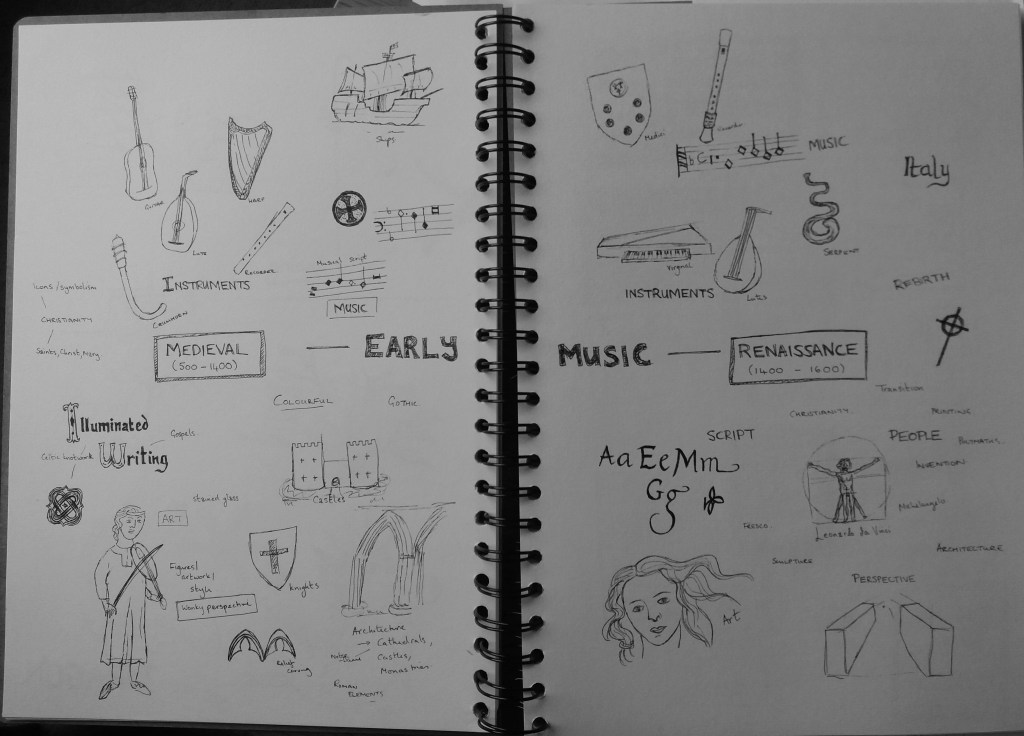
I began the assignment by doing some preliminary research into the Medieval and Renaissance periods in order to decide whether to focus on the Medieval or the Renaissance period. I read articles online, searched images and watched videos and noted down elements that I thought were characteristic of these periods that might work well in a poster design. I made notes by sketching ideas.
Sketches based on preliminary research
In general it was quite interesting to see the evolution of art from the Medieval to the Renaissance period. Renaissance art has quite a modern look to it, which I think is partly because perspective is depicted accurately within artworks. I think that the wonky perspective, or complete lack of perspective in Medieval artwork is a potentially useful tool to make a poster ‘look Medieval’. Medieval artwork also looks quite flat due to the lack of perspective. Both Medieval and Renaissance artwork use vibrant colours. Medieval art appears to have a more limited colour pallette than Renaissance art and this might be another useful tool in giving the poster a Medieval feel. I’ve not focussed on this for now but I think this will come out clearly when I put materials together for a mood board.
Both periods have beautiful fonts and scripts that I am keen to not just incorporate into the poster but to make a key element of the poster. I am particularly excited by the potential to include illuminated writing, which I think is more characteristic of the Medieval than the Renaissance period. It was also interesting to see that musical notation looks different in the Medieval and Renaissance periods relative to today. Some brief reading on this suggests that this was a period when musical notation was evolving. Notes have an angular, rather than rounded form, and the the muscial scripts are often elaborate and include colour, calligraphy and illuminated writing.
Based on my initial research I’m excited at the idea of experimenting with illuminated writing, wonky perspective, celtic knotwork and musical notation in the poster. I have therefore decided to focus on the Medieval period.
Mood board
Medieval music moodboard
I gathered together relevant colours textures and images into a moodboard. This should both help me to understand the detail of elements that I might incorporate into the poster and also to get a feel for the colour scheme of the poster.
I think that Medieval colours come out quite clearly in the moodboard – I should focus on reds, blues, yellows and greens. I was already aware of incorporating musical scripts and illuminated writing into the poster, the moodboard also made me think about patterns. In particular the use of patterns for backgrounds and borders. I think one issue with this poster will be giving the lively, colourful, Medieval feel without it being too busy and unreadable.
The elements that I’m thinking about experimenting with in thumbnails include: Medieval fonts and illuminated writing; musical notation; medieval people; patterns; maybe architecture – cathedrals or castles. I have rather a lot to play with.
Poster design
Before continuing I decided to run back through this section of the course and my blog entries in order to make a few notes to help me with the poster design.
Thumbnails – reduce content to it’s simplest form, play with scale, position, tone contrast, shape, the space between elements. The poster needs to be organised so that the reader can extract information from a distance – clear horizontal and vertical lines will help with this. I also know that I want the design to be colourful and flat to reflect Medieval art. I maybe need to be a bit careful to not make the whole poster brightly coloured but use bright colours in the parts of the poster that I want the reader to be drawn to.
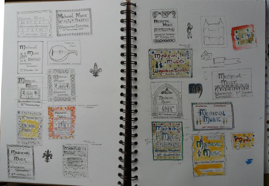
Thumbnails
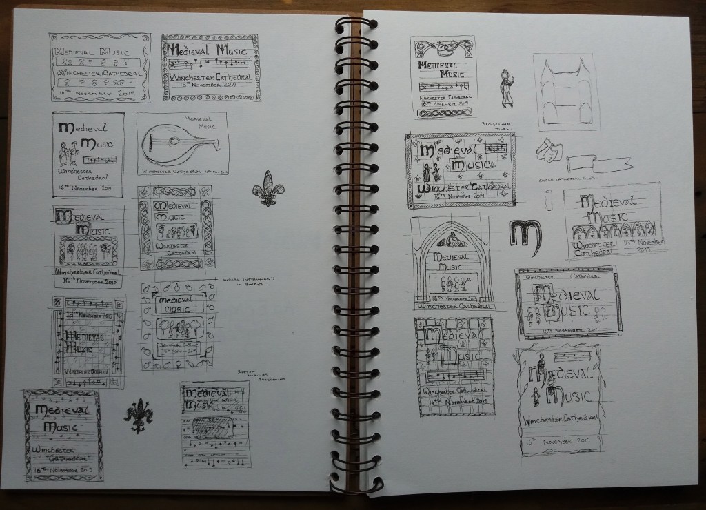
I experimented with a range of designs during the thumbnailing process. I did realise afterwards that there was some information that I had missed off – the time of the concert and how to buy tickets. I’ll rectify this at the line visual stage.
I used the thumbnails to experiment with what content to include and how to arrange it. I maybe didn’t experiment with viewpoints particularly but this is in part because I want the poster to appear quite flat to reflect Medieval art. I’m really keen that the writing is a key element of the poster because Medieval fonts are very distinctive and recognisable.
For the line visuals: one of the posters will have musical notation in the background, a border of Medieval knotwork and plain, bold writing in a Medieval font; the other poster will have Medieval tiles in the background, a small panel of musical notation and the centrepiece will be ornate writing with Medieval musicial characters playing on it. It will be interesting to see whether the latter is too busy.
Roughs
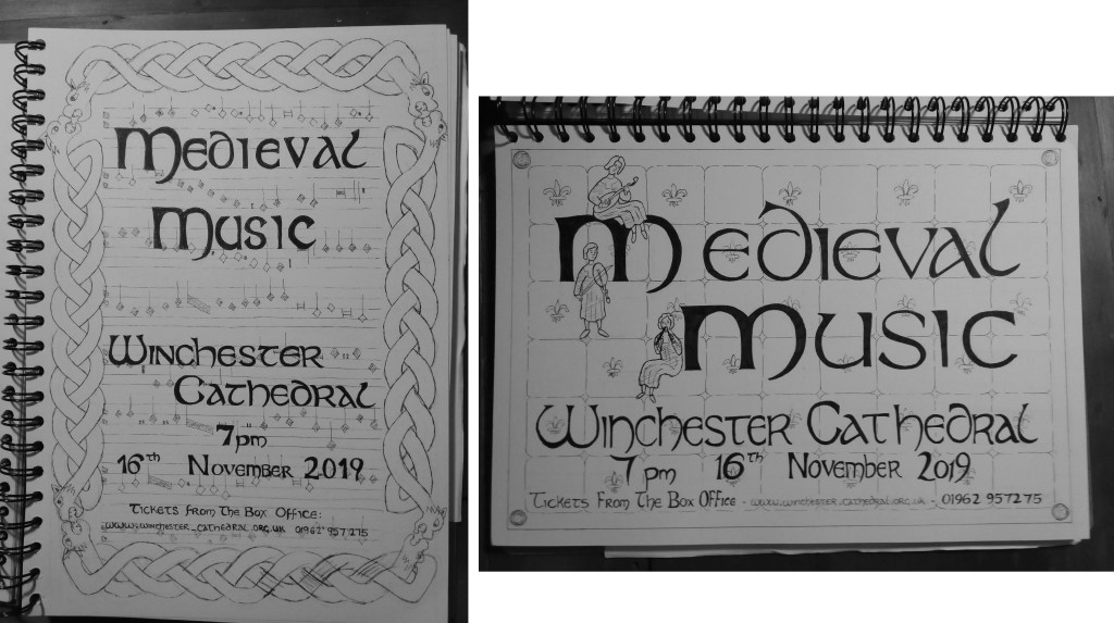
I produced two A4 roughs of my preferred two thumbnails. There is overlap between the two designs in the font used. I gradually developed this font whilst I was experimenting with thumbnails – it is an amalgamation of different medieval alphabets that I found. I think the font works well in both designs. I think that I may have gotten a little bogged down in detail for the line visuals. It was tricky as the writing needed to be included as it is a key element of the design.
With the first design, I think that the musical notation in the background works well – without the knotwork border I think that this would give the poster quite a contemporary design. I don’t like the knotwork border in the first design – it is too large and overpowers the image. The border might work if scaled down but I’m worried about it looking quite kitschy.
With the right hand design, I think that the tiles make a nice background – they were also inspired by tiles that I had seen in Winchester Cathedral, which gives a nice tie between the poster and the venue for the concert. I think that the figures in this design work well – I ‘d consider making them larger or including more of them in the final design. I think that the writing at the bottom of this poster could do with spacing out a little more as curently it appears quite cramped. I’m also undecided whether to have a plain border or ornament this is some way.
I showed both designs to friends for a little feedback. In general the right hand design was prefered. The most popular elements of the designs were the figures, tiles and musical notation. I may consider trying to integrate the musical notation into the right hand design.
At this stage I went back to my moodboard in order to think about colour. I decided to limit my colour pallet to dominantly reds, blues and pale browns with small additions of vibrant greens and yellows. This seems in keeping with the moodboard. I also experimented with some of these colours on my thumbnails from earlier.
Experimenting with colour on the thumbnail sketches.
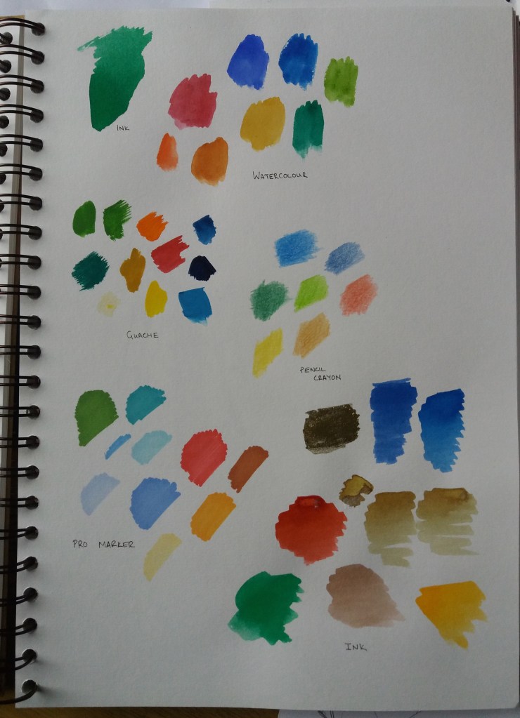
I also experimented with different materials to try to decide which would work best for colouring the final design. I did consider making the poster in adobe illustrator but decided that I wanted to try to use more ‘medieval style’ techniques. Of the different media that I tried I really liked the vbrancy of using ink. I think the vibrancy is reminiscent of the bright colours used in medieval illuminated manuscripts.
Experimenting with different media.
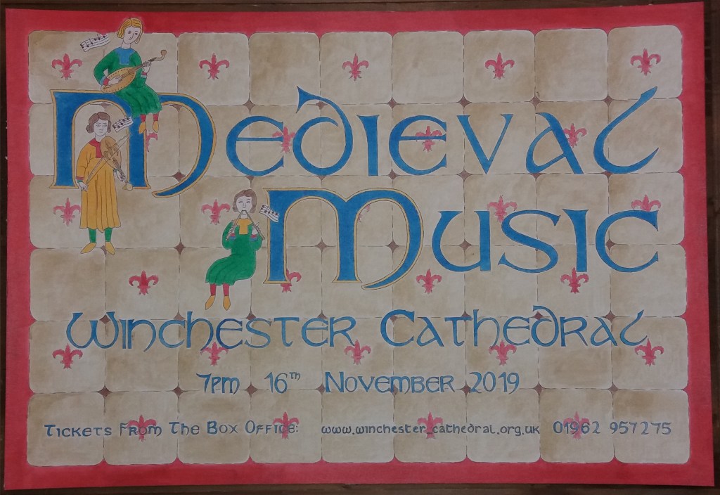
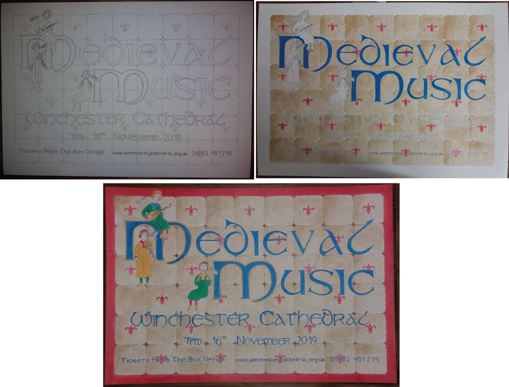
Finally I worked on the final design, which was produced on watercolour paper. I started with a pencil outline design, then went over this with black ink and finally coloured the design in ink.
I was quite concerned when I started painting the tiles with the pale brown ink that I couldn’t produce a smooth gradation in colour across the individual tiles. Ultimately I think that this has given the final design some texture. I think that the final design might have worked better with a blue, rather than a red border. I think the red border makes the poster look a little disjointed. I also think that the writing towards the bottim of the poster should be larger in order to be more legible. I had to modify my font for writing the web address. Medieval fonts mix up what we would currently consider capital and lower-case letters – which is problematic when writing a web address. I think that I could have been more bold with the figures and made them bigger. I also wonder if I should have used musical notation for the border of the poster – although this might have made the poster too cluttered. All in all I think that the poster meets the brief and the colours, font and flat design make it instantly recognisable as having a medieval theme.
I really enjoyed the inktober sketching. I didn’t quite manage it every day, however, it did start getting me into the habit of sketching random things more frequently. I also enjoyed trying to create single coherent images from combinations of random words.
This weekend I did a woodblock engraving course with Kate Dicker at Badger Press in Bishop’s Waltham. Fantastic course! I was undecided at the begining of the weekend what to engrave. Flicking back through my sketchbooks I found a drawing that I had made that was inspired by Ravilious’ woodblock prints.
One key thing that I learnt that I think will influence my drawing is creating images without outlining shapes. I was really surprised at how ‘freestyle’ I got with the engraving. I really like the sky, which was a product of being rushed for time. I think that having to rush and not worry about it really helped. I’m also pleased with the water – it started off terribly – I was using wavy lines. However, with a little tuition about representing flat surfaces with horrizontal lines, it came out alright in the end. I actually quite like the slightly crazy, chaotic nature of the image and think that I might quite like to try the same image another time with brightly coloured paint.