The aim of this exercise was to draw the same object using different media and different types of papers. I found it extremely hard to break away from the types of media that I like – anything that allows me to make accurate marks. I did enjoy the looseness of thumbprinting overlain with some obsessive markmaking (#5); despite this image least resembling what I was drawing. I hated trying the pastels and graphite, they were just frustrating, I guess they are intended for larger drawings. I think what I learnt from this exercise is that I need to loosen up and be more adventurous … easier said than done!
This weekend I caught the last day of an exhibition of sketches by Leonardo da Vinci at Southampton Art Gallery. The sketches were beautiful, detailed drawings of anatomy, plants, technology and pictographs. It was mindblowing that they had been drawn over 500 years ago with an ink quill, or chalk. One of the elements of these drawings that interested me most in terms of how they were made was the amount of marks that were being used outside of the key object in the drawing rather than within it.
I really loved that many of these drawings were clearly a method to better understand how different objects (e.g. human bodies) work; while other drawings were using this understanding to design new technologies. Despite the drawings being in one sense very functional they were equally beautiful works of art.
One of the drawings stood out as very different to the rest. This drawing depicted a storm reaping destruction on a landscape. Apparently towards the end of Leonardo da Vinci’s life, he began to use the same techniques that he’d used to understand how objects work to think about death and destruction. I really like this use of drawing to think; not just to explain.
The purpose of this exercise was to collect reference
material in order to build up a picture of the 1950s from a visual perspective
and then to produce an illustration that would give a modern teenager an idea
of the 1950s.
‘The 1950s’
The 1950s
Prior to doing this research I had thought of the 1950s as being quite a boring and drab post war era. However, my research revealed that many of the bold colourful designs of the 1960s were beginning to evolve albeit with a somewhat subdued colour pallette.
The 1950s seems to be an era in which people were beginning to
have disposable income. House interiors are becoming more colourful; furniture
is sleek and no longer purely functional; and colourful geometric patterns are
common for wallpaper and soft furnishings.
Much of the advertising that I found from the 1950s was for
the latest household gadgets. Advertising is bold and colourful and relies on
illustration rather than photography. My main impressions of the 1950s from
advertising are that everybody is terrifyingly happy despite the grotesque gender
stereotyping that is being depicted.
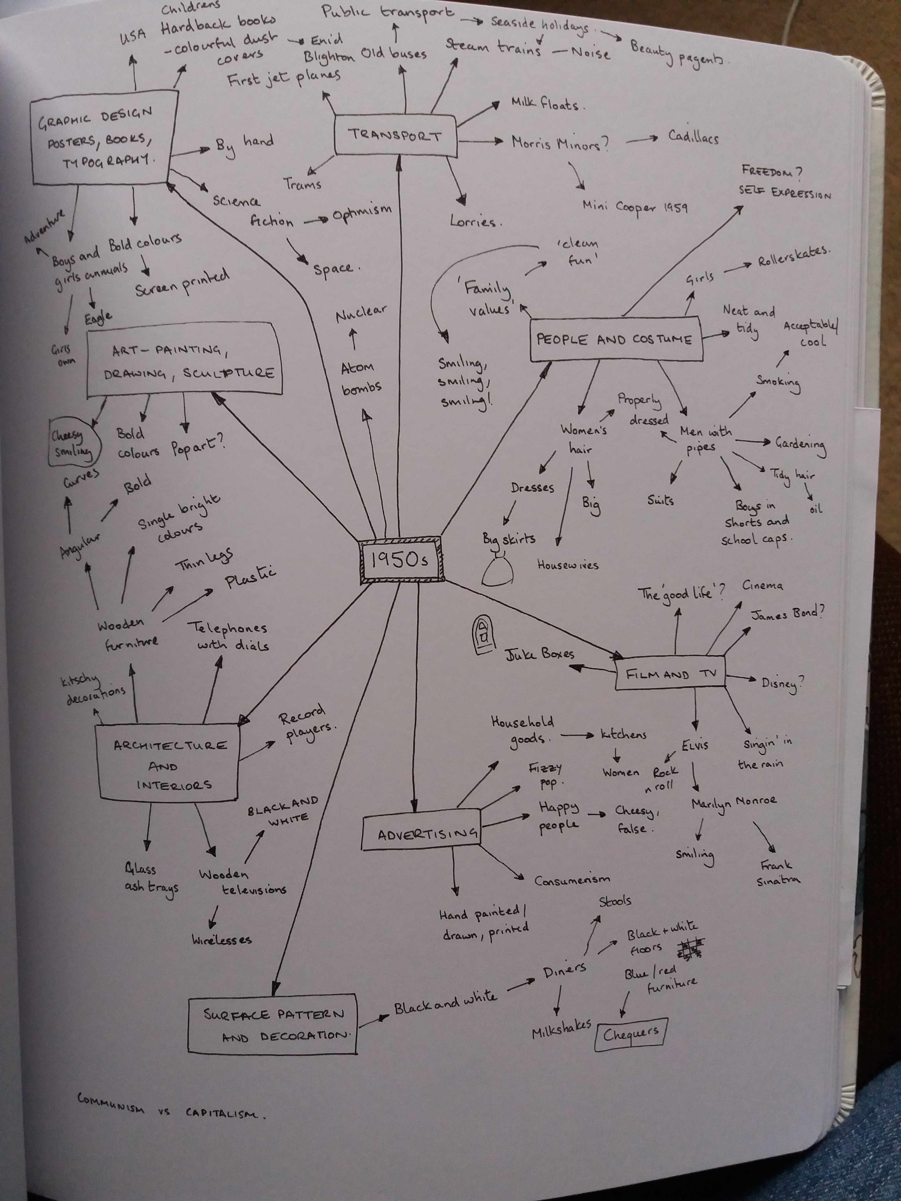
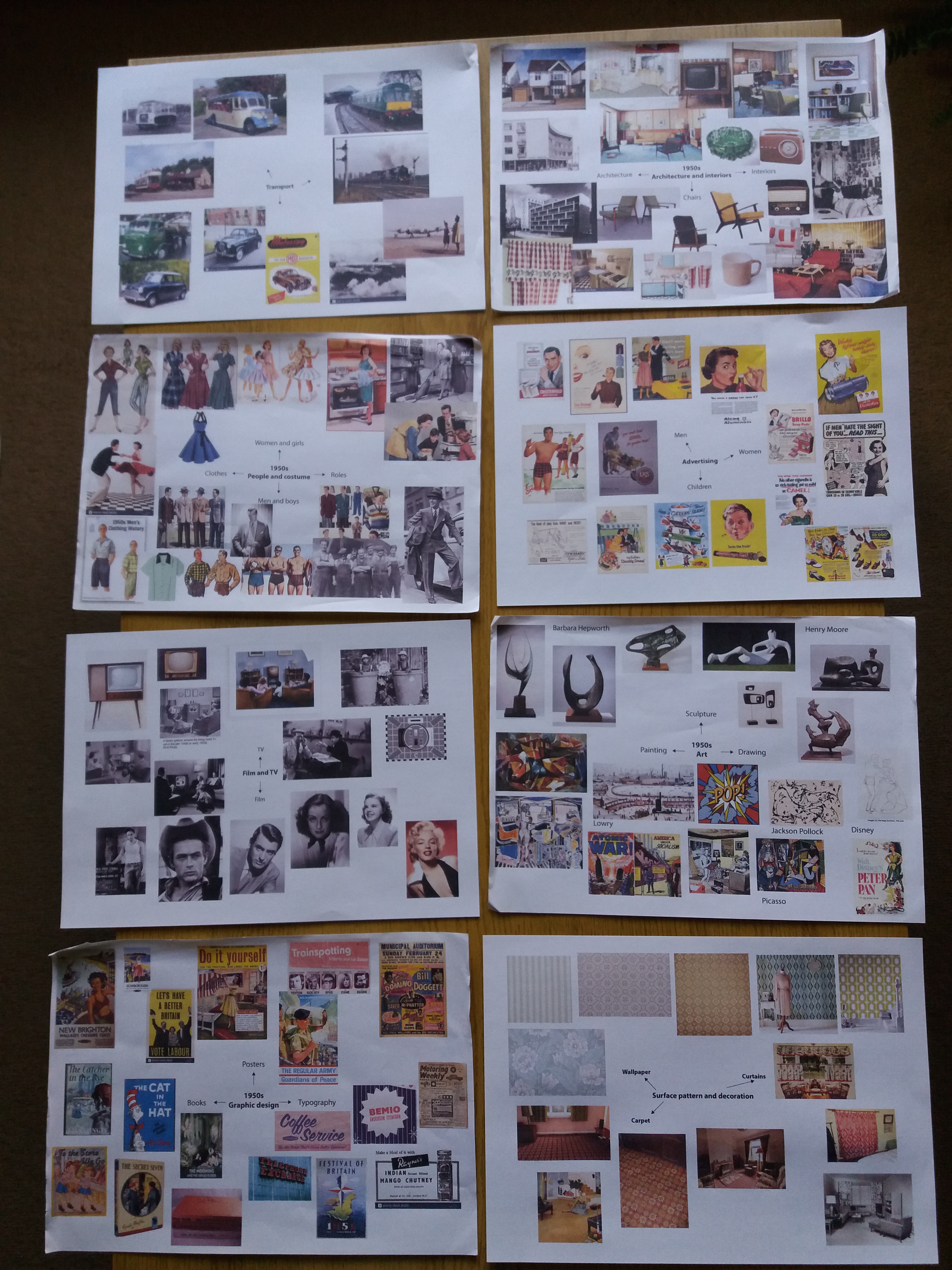
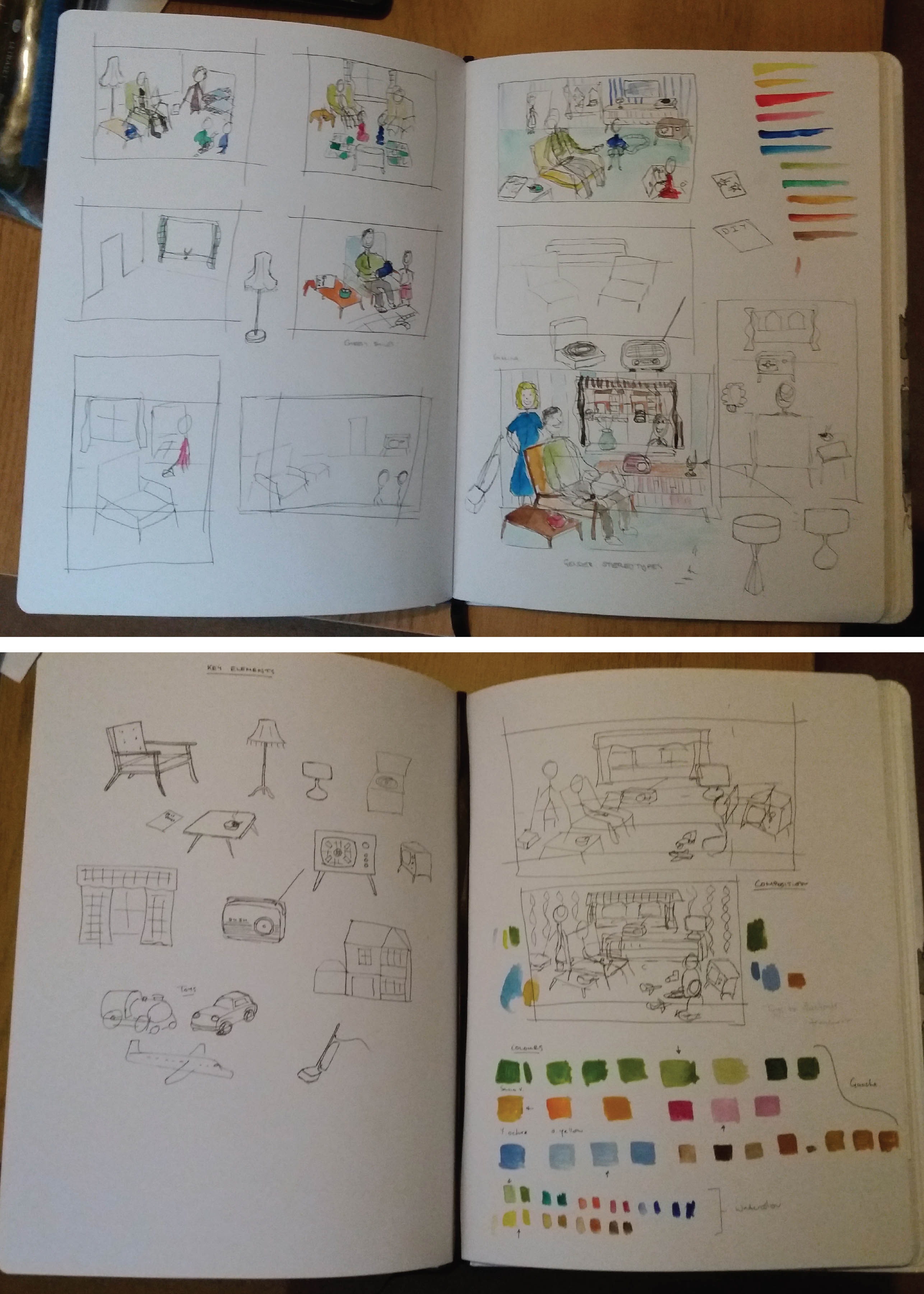
Research
I began by brainstorming my pre-existing knowledge of the 1950s before pulling together moodboards on the topics of: people and costume; architecture and interioirs; art; graphic design; advertising; transport; film and TV; and surface pattern.
Mindmapping
Moodboards
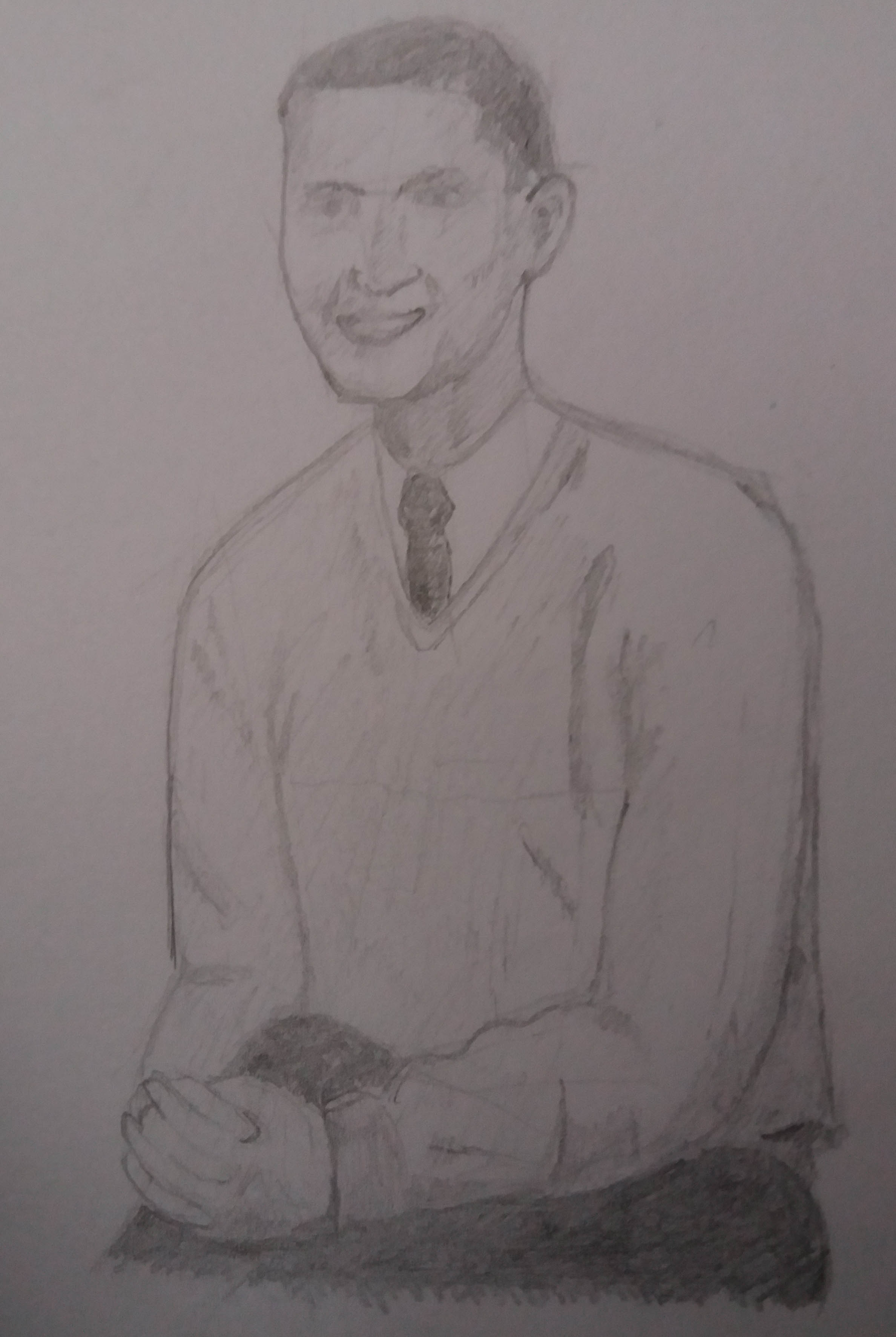
I also incorporated 1950s themes into my sketching practice.
One of my aims with this course is to experiment with different media, so I bought myself some watercolour paints and began to play around with using these to add colour to pen and ink drawings. I really liked how quickly they enabled colour to be added to rough sketches.
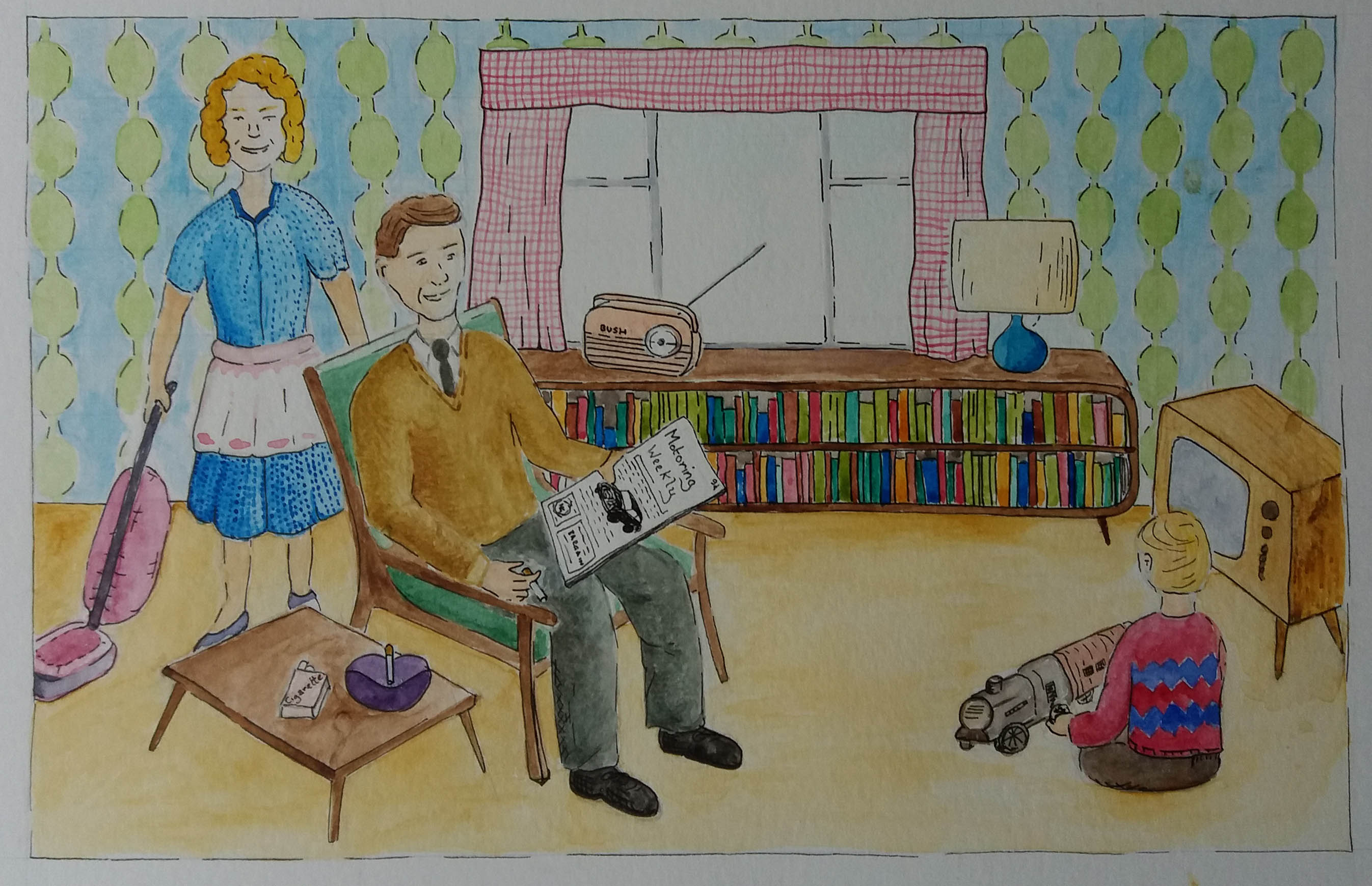
I thought about key objects that I felt represented the 1950s. I considered a range of compositions for the piece. I was keen to include reference to the gender stereotyping that I had discovered in 1950s advertising and the ubiquitous smiling. I considered different ways to illustrate objects from outside the home, for example by showing architecture and transport through the window or having a child play with toy cars and trains. In the end I decided to include the car in the magazine that the man is reading and a toy steam train that the child is playing with. In my draft compositions I also considered getting elements of 1950s art into the illustration by for example including a Hepburn style ornament, or some other artwork. However, this disapeared in the final piece because it felt too busy.
Composition and colour1950s illustration
The original brief was to make an illustration of somebody sitting in a chair surrounded by typical artefacts to give a teenager an idea of the 1950s.
I really enjoyed using watercolours for this illustration. Originally I had planned to exclusively use paint; however, I ended returning to my ‘safety net’ of black ink in order to highlight different objects. I think that the illustration probably does a better job of illustrating gender stereotypes than really answering the brief. I think that I should have gone the whole hog on 1950s gratuitous smiling. Retrospectively I’m not sure that this scene would necessarily appeal to a teenage audience and maybe I should have opted for the character to be a teenager in a different setting, maybe their bedroom. If I were to spend more time on the illustration I think that it would be a fun challenge to make the illustration in the style of a 1950s advertising poster.
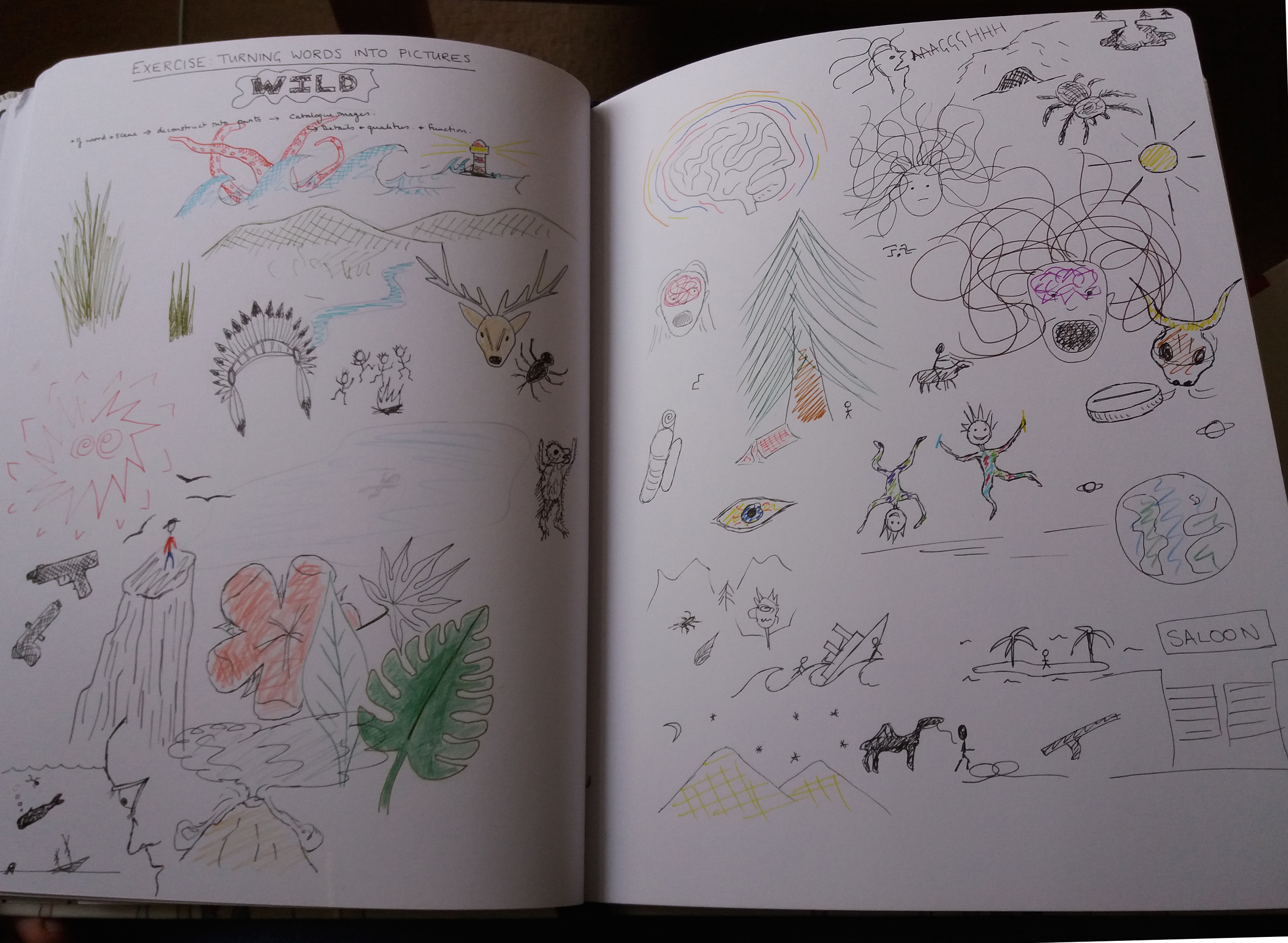
In this exercise I created a moodboard to further develop the word ‘wild’ from the previous exercise. The moodboard proved particularly useful in quickly developing ideas for colour (vibrant oranges and greens) and textures. I also found it interesting how very different ‘objects’ have similar forms, for example the human hair looks similar to tangled plants. I have not included an image of the moodboard here because it contains images under copyright.
In this exercise I experimented with using pictures, rather
than words, to generate ideas. I did this exercise twice because I felt that I
learnt a lot about how I could approach this task (i.e. how not to do it) the
first time I tried it and wanted to test whether a different approach might
work better.
Brainstorming the word ‘wild’ using pictures.
The first word that I chose to brainstorm was ‘wild’. I found that focussing on what my pictures ‘should’ look like was hindering me from developing new ideas quickly. I also found that trying to use different colours and media was interrupting my flow of ideas. Based on this experience I decided to take a different approach with a different word. With the second word I decided to work quickly using black pen for as long as I could rapidly generate new images, and only then to add colour. I decided not to worry how pictures looked and not to allow myself to google, or look anything up. I also decided to put pictures that form natural groups together on the page.
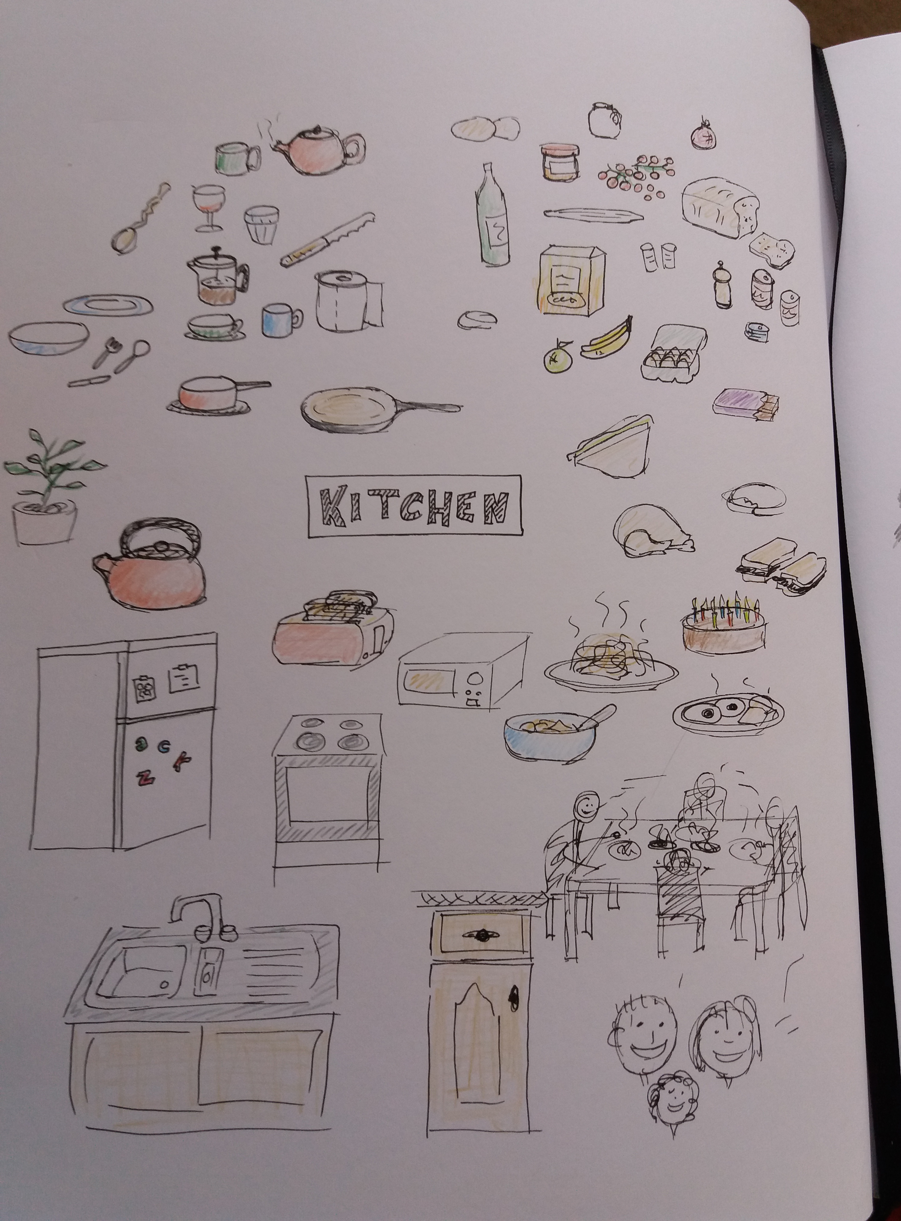
Brainstorming the word ‘kitchen’ using pictures.
The second word that I chose to brainstorm was ‘kitchen’.
Admittedly, ‘kitchen’ is probably an easier word to brainstorm because it is
less abstract than ‘wild’. I felt that starting by working solely in black pen
helped me to generate ideas quickly. Grouping words together made it easier to
come back to different topics as new ideas appeared in my mind. Oddly, I also found that standing up when I
got stuck, almost instantly generated new ideas.
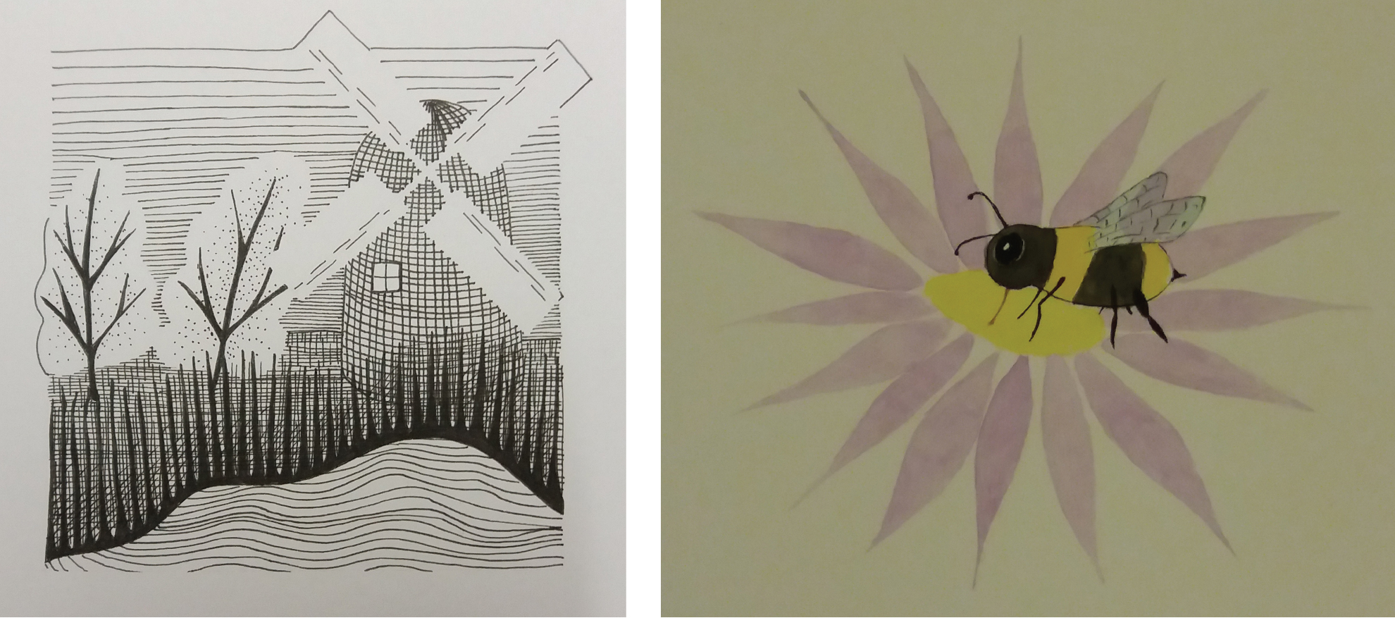
Ilustrations in the style of Eric Ravilious and Matt Sewell.
This exercise explores how illustration has evolved over the past 50 years by considering the work of an early 20th century illustrator and a contemporary illustrator and producing an illustration in the style of each artist. I chose to investigate the work of Eric Ravilious a landscape illustrator and war artist from the early twentieth century and Matt Sewell a present-day wildlife illustrator.
Eric Ravilious’ subject matter is primarily rural English
landscapes that include human-made elements such as buildings and vehicles. He
worked in watercolour paint as well as engraving and woodblock printing. A
common feature of his work, regardless of media, is the use of bold geometric
shapes to represent features such as trees and buildings and intricate lines to
add texture. A feature that I really like about his woodblock prints is that
they don’t have straight borders but
instead use the shape of elements in the landscape to define the edge of the
print. Ravilious’ printed works are typically either monochrome or a single
bold colour. I think that the apparent simplicity of Ravilious work and the use
of bold shapes and colours gives the work a contemporary feel. Indeed, some of
his woodblock prints that were originally produced to advertise destinations
for Transport for London have recently been reused to decorate buses in the
Brighton area.
I happened upon a book called ‘spotting and jotting’ by Matt Sewell. I was attracted to its brightly coloured, quirky watercolour illustrations of birds. The illustrations are unusual for a natural history guidebook because they are not accurate representations of the animals. Instead, the illustrations show the key features that would enable recognition of a bird and capture something of the character of the bird. I think that this is clever – to be both quirky but also distil the essence of the subject.
For my illustration in the style of Ravilious I chose to focus on the style that he used in his woodblock prints. I used elements from my local landscape for the subject matter. Instead of block printing I chose to draw the illustration in black ink but tried to capture the style of block printing. I am pleased with my use of white space to create the trees and sails of the windmill. However, I think that the image would benefit from more detail in the mid field, particularly between the trees and the lake.
For my illustration in the style of Matt Sewell I chose to
illustrate a bee. I found this illustration challenging as I have little
experience of painting. Overall I am pleased with the result although I don’t
think that I managed to get much of the character of the bee into the image.