I really enjoyed the inktober sketching. I didn’t quite manage it every day, however, it did start getting me into the habit of sketching random things more frequently. I also enjoyed trying to create single coherent images from combinations of random words.
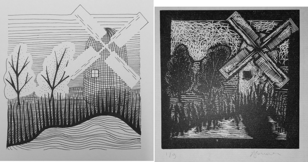
This weekend I did a woodblock engraving course with Kate Dicker at Badger Press in Bishop’s Waltham. Fantastic course! I was undecided at the begining of the weekend what to engrave. Flicking back through my sketchbooks I found a drawing that I had made that was inspired by Ravilious’ woodblock prints.
One key thing that I learnt that I think will influence my drawing is creating images without outlining shapes. I was really surprised at how ‘freestyle’ I got with the engraving. I really like the sky, which was a product of being rushed for time. I think that having to rush and not worry about it really helped. I’m also pleased with the water – it started off terribly – I was using wavy lines. However, with a little tuition about representing flat surfaces with horrizontal lines, it came out alright in the end. I actually quite like the slightly crazy, chaotic nature of the image and think that I might quite like to try the same image another time with brightly coloured paint.
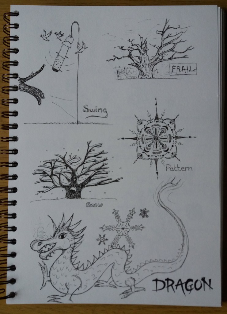
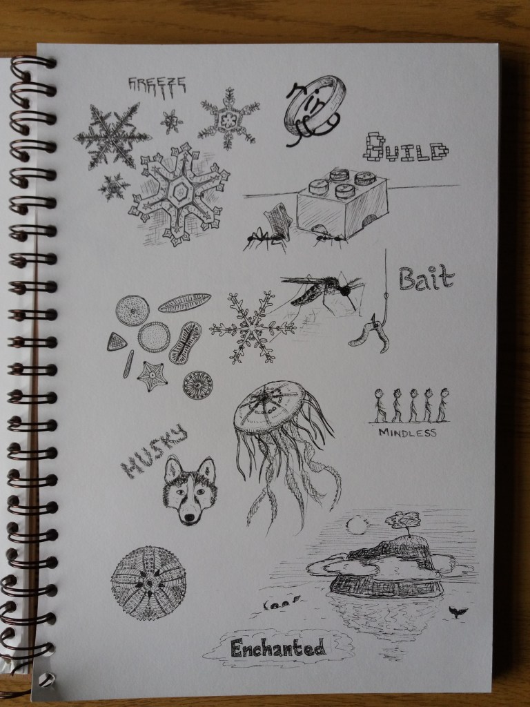
I read in the OCA newsletter about Inktober. There are a list of 31 words and each day you make a pen drawing to represent the word for that day. Here are my first seven words … I got a little carried away and drifted into drawings of diatoms, jelly fish and echinoids. This has been a really fun exercise for me and it’s getting me in the habit of spending a few minutes sketching everyday.
In the feedback for Part 2 of this course my tutor suggested many different illustrators, animators and styles for me to take a look at the work of. Having scanned through their work I chose a few illustrators to look at in more detail in order to try to understand their style and produce some sketches in a similar style.
Noma Bar
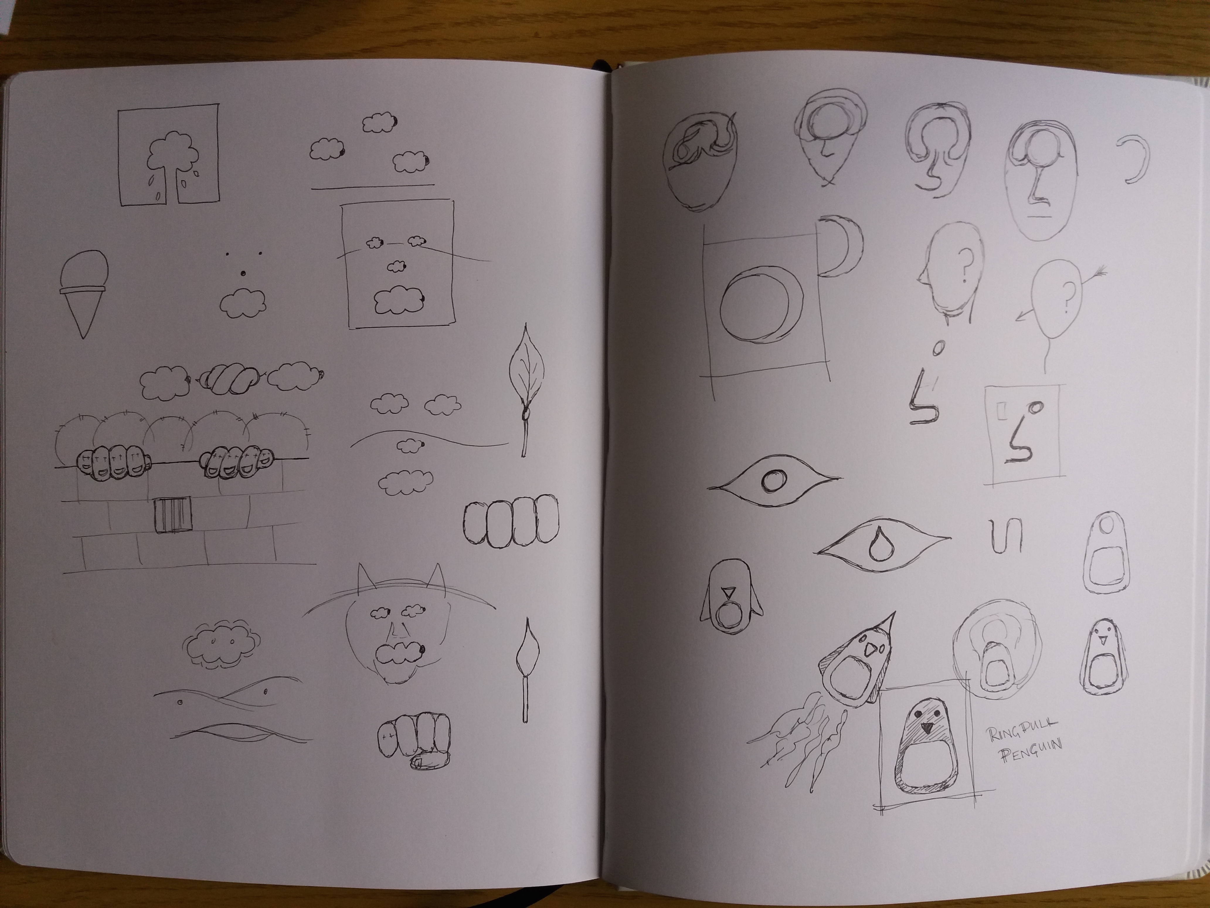
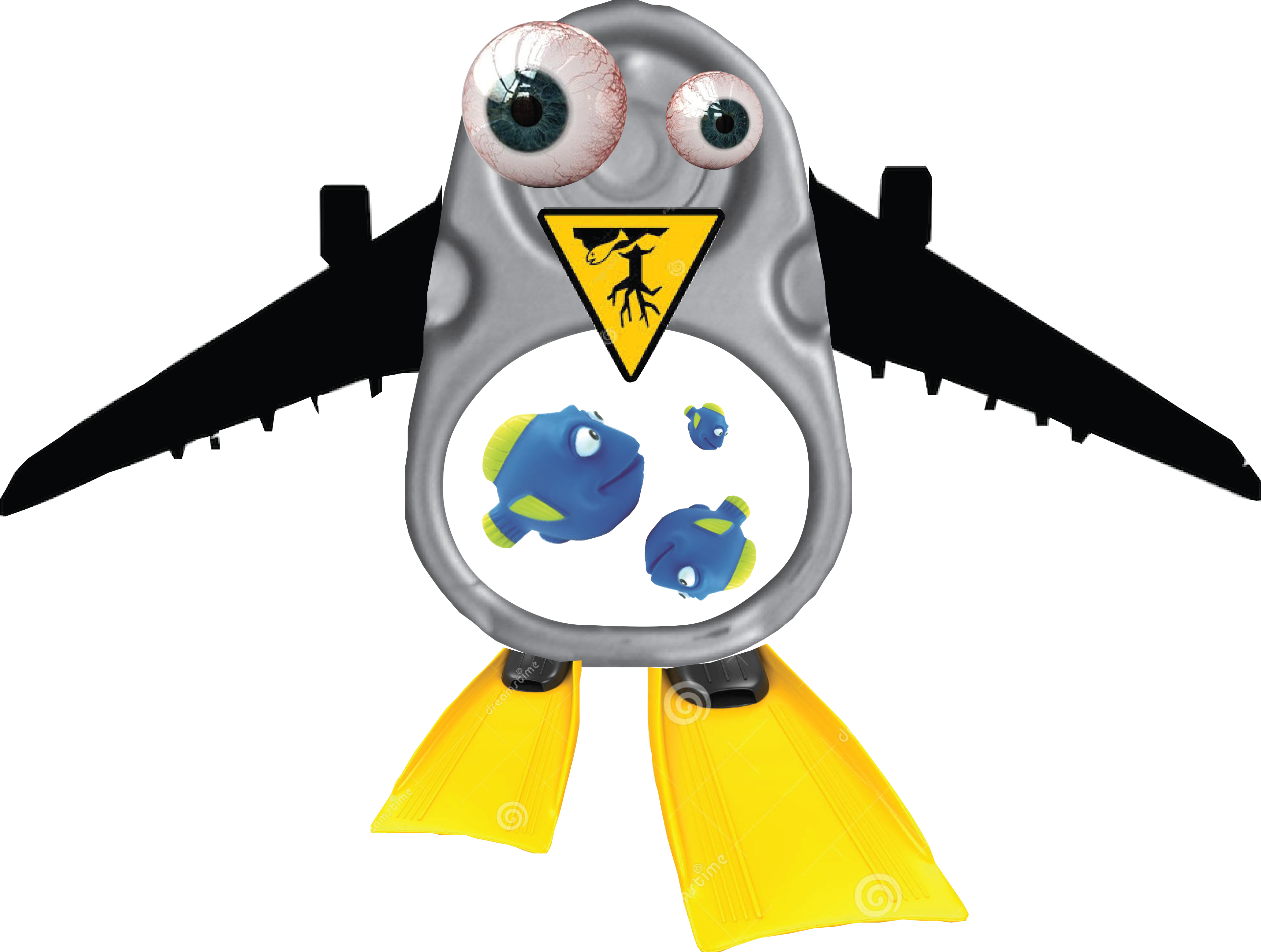
Based on the graphic style that I’ve used in some of my illustrations, and also use of metaphor, my tutor suggested taking a look into the work of Noma Bar. Noma Bar’s work looks simple but is really clever. There is usually more than one image that can be seen in each illustration – one object transforms into something else. The style is really simple and graphic and there’s typically a simple colour scheme with less than three colours. One quote that I saw from him stated that he’s aiming for ‘maximum communication with minimal elements’. Some of his work is political, some of it is witty. I decided to brainstorm ideas of objects that can be transformed into something else. My favourite from these sketches is ‘Ringpull Penguin’.
Sketchbook pages
Hannah Hoch
In the ‘Choosing content’ exercise in part two I used a ‘found’ background and drew my illustration of a wartime detective on top of this. My tutor suggested taking this further and using parts of the background texture as elements of the character. He suggested taking a look at the work of Hannah Höch.
Hannah Höch used photomontage to creat whimsical images that typically feature people in some form or another. I find the images quite disturbing – partly because different elements in her images can be at very different scales, which is unsettling.
In order to have a play with this style. I decided to take ‘Ringpull penguin’ from my previous sketches and develop it further using photomontage.
Ringpull Penguin
I find Ringpull Penguin quite disturbing. I did not make things as out of proportion as in the work of Hannah Höch as I already found the process of making Ringpull Penguin uncomfortable. I could imagine this style being quite powerful if you were trying to make a statement – for example in this case it could be an environmental statement about the impact of human populations on the natural world.
Op art
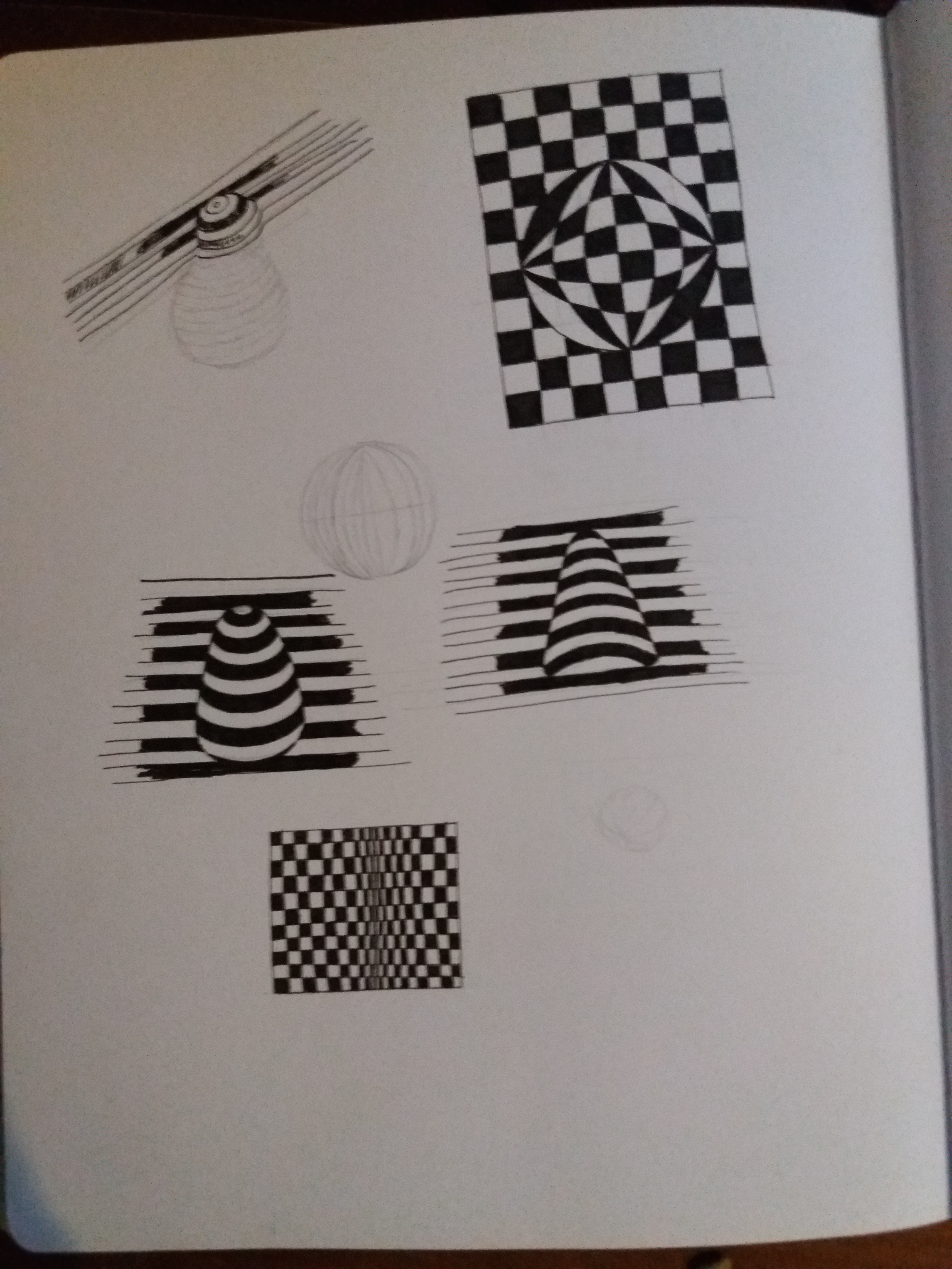
In my assignment for Part 2 I created an image of a strawberry using offset lines. My tutor suggested that it might be interesting for me to take a look into Op Art (optical art). Op Art is a form of abstract art that uses optical illusions to create special effects within an image. These special effects include making the image appear three-dimensional, hiding images withing images, or making elements of the image move. A lot of Op Art is created in black and white varying the thickness of lines, changing the scale of patterns or offsetting black and white lines. Other Op Art makes use of colours to create optical illusions. I had a play in my sketchbook with some basic Op Art techniques. I’m not sure any were particularly successful – more time and effort needed – however, I think these techniques are useful to be aware of to incorporate into future illustrations.