In this exercise I created a moodboard to further develop the word ‘wild’ from the previous exercise. The moodboard proved particularly useful in quickly developing ideas for colour (vibrant oranges and greens) and textures. I also found it interesting how very different ‘objects’ have similar forms, for example the human hair looks similar to tangled plants. I have not included an image of the moodboard here because it contains images under copyright.
Category: Coursework
The parent category for coursework.
Turning words into pictures
In this exercise I experimented with using pictures, rather than words, to generate ideas. I did this exercise twice because I felt that I learnt a lot about how I could approach this task (i.e. how not to do it) the first time I tried it and wanted to test whether a different approach might work better.
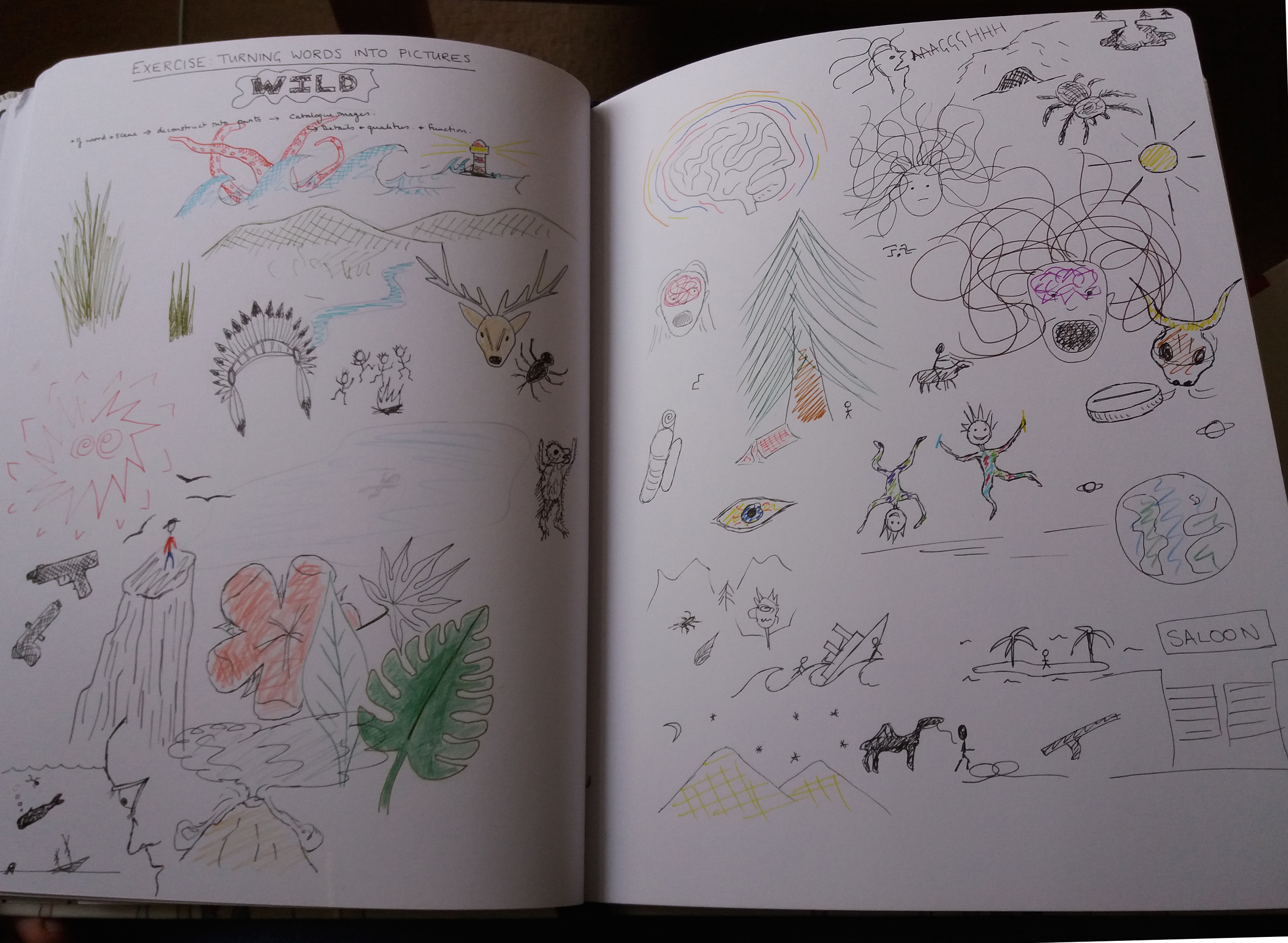
The first word that I chose to brainstorm was ‘wild’. I found that focussing on what my pictures ‘should’ look like was hindering me from developing new ideas quickly. I also found that trying to use different colours and media was interrupting my flow of ideas. Based on this experience I decided to take a different approach with a different word. With the second word I decided to work quickly using black pen for as long as I could rapidly generate new images, and only then to add colour. I decided not to worry how pictures looked and not to allow myself to google, or look anything up. I also decided to put pictures that form natural groups together on the page.
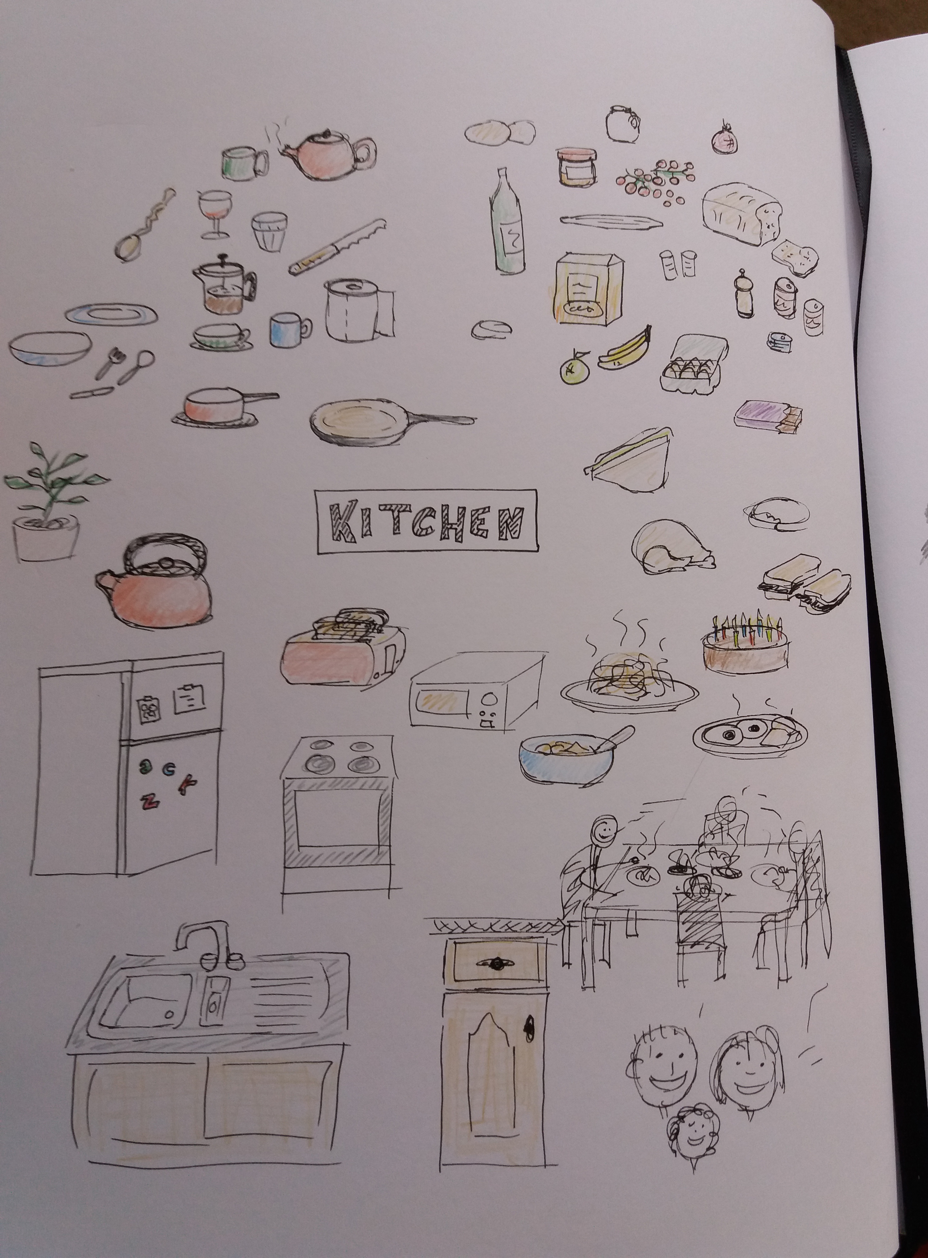
The second word that I chose to brainstorm was ‘kitchen’. Admittedly, ‘kitchen’ is probably an easier word to brainstorm because it is less abstract than ‘wild’. I felt that starting by working solely in black pen helped me to generate ideas quickly. Grouping words together made it easier to come back to different topics as new ideas appeared in my mind. Oddly, I also found that standing up when I got stuck, almost instantly generated new ideas.
Spider diagrams

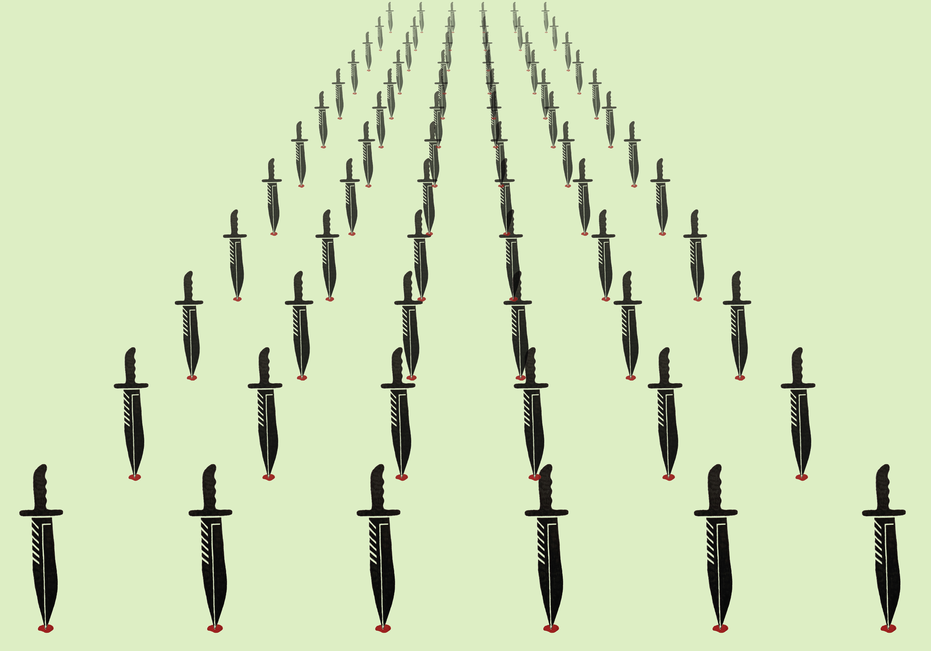
This exercise was about generating ideas for different words by creating a spider diagram for each of the following words: ‘seaside’; ‘childhood’; ‘angry’; and ‘festival’. I noticed that my mood changed depending upon the word I was working with; which is something that I was also aware of during a previous exercise illustrating an editorial on knife crime. I noticed that it was much easier and faster for me to generate ideas for words that I interpret as positive words e.g. ‘seaside’ and ‘festival’; rather than words that for me have negative associations e.g. ‘anger’ and ‘childhood’. I also noticed that for words that are more personally significant for me, for example, ‘childhood’ I found it more challenging to go beyond my experiences and explore the word more generally. I found looking up synonyms to words and googling images useful techniques for generating ideas.
Writing a brief
The aim of this exercise was to create a brief for an existing illustration. I chose to use a poster advertising Sequoia National Park in the USA. This poster is one of many 1930s-40s style iconic posters advertising the U.S. National Parks. Prior to this exercise I had assumed that all of these posters were reproductions of originals, which were produced by the U.S. Works Progress Administration in the 1930s as a means of supporting artists through the great depression. However, during this exercise I discovered that only 14 original posters were produced and most of the hundreds that exist today are more recent productions in the style of the original posters. An example of the poster that I chose to use for this exercise can be found here.
Sequoia National Park Poster Brief:
The brief is to produce a poster advertising the Ranger Naturalist Service and Sequoia National Park for the U.S. National Parks Service. The poster should capture the uniqueness and grandeur of Sequoia National Park and should appeal to and inspire a sense of adventure in the ‘average American’. The poster will be produced at a variety of scales from tabloid upwards and will be displayed in a range of public spaces e.g. train stations. The poster should be in the style of the iconic 1930s-40s National Park Posters using a palette of up to three colors, with up to three shades of each color plus black and white. The poster will be screen printed and should be suitable for mass production. The poster will include the following text: ‘Ranger Naturalist Service’ ‘Grove of the Giants’ ‘The Crystal Cave’ ‘Horseback Rides’ ‘Camping and Hiking’ ‘Sequoia National park’ ‘U.S. Department of the Interior’ ‘National Park Service’. The text should be in the ‘1935 National Park Font’.
Getting the gist.
The history of illustration.
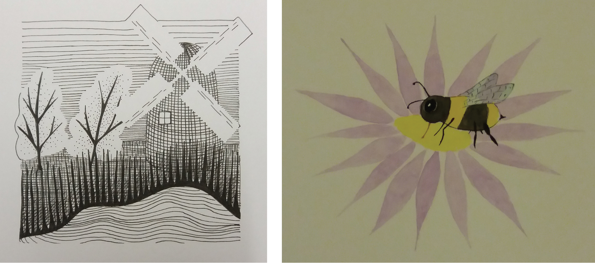
This exercise explores how illustration has evolved over the past 50 years by considering the work of an early 20th century illustrator and a contemporary illustrator and producing an illustration in the style of each artist. I chose to investigate the work of Eric Ravilious a landscape illustrator and war artist from the early twentieth century and Matt Sewell a present-day wildlife illustrator.
Eric Ravilious’ subject matter is primarily rural English landscapes that include human-made elements such as buildings and vehicles. He worked in watercolour paint as well as engraving and woodblock printing. A common feature of his work, regardless of media, is the use of bold geometric shapes to represent features such as trees and buildings and intricate lines to add texture. A feature that I really like about his woodblock prints is that they don’t have straight borders but instead use the shape of elements in the landscape to define the edge of the print. Ravilious’ printed works are typically either monochrome or a single bold colour. I think that the apparent simplicity of Ravilious work and the use of bold shapes and colours gives the work a contemporary feel. Indeed, some of his woodblock prints that were originally produced to advertise destinations for Transport for London have recently been reused to decorate buses in the Brighton area.
I happened upon a book called ‘spotting and jotting’ by Matt Sewell. I was attracted to its brightly coloured, quirky watercolour illustrations of birds. The illustrations are unusual for a natural history guidebook because they are not accurate representations of the animals. Instead, the illustrations show the key features that would enable recognition of a bird and capture something of the character of the bird. I think that this is clever – to be both quirky but also distil the essence of the subject.
For my illustration in the style of Ravilious I chose to focus on the style that he used in his woodblock prints. I used elements from my local landscape for the subject matter. Instead of block printing I chose to draw the illustration in black ink but tried to capture the style of block printing. I am pleased with my use of white space to create the trees and sails of the windmill. However, I think that the image would benefit from more detail in the mid field, particularly between the trees and the lake.
For my illustration in the style of Matt Sewell I chose to illustrate a bee. I found this illustration challenging as I have little experience of painting. Overall I am pleased with the result although I don’t think that I managed to get much of the character of the bee into the image.
