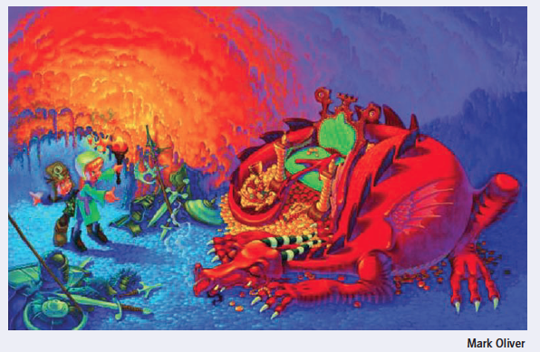
Image taken from: Key Steps in Illustration Handbook p. 55 published by the OCA.
The aim of this exercise was to analyse the above image and answer guided questions about this image.
The key elements of this image are: a sleeping dragon; two children; treasure; and a cave. The image suggests that the two children have entered the cave, or dragons lair, they have found treasure, which maybe they want to take away, and they are trying not to wake the dragon who is potentially dangerous. This interpretation of the story being told in the image is heavily based on common themes in stories involving children and dragons.
In terms of colour palette, the image strongly contrasts hot reds, oranges and yellows, with cold blues and neutral greens. Tone is used to highlight areas of the image that are in bright torchlight, or else in the shadows. The dragon and the children are the characters in the story and thus important; they are bathed in light, highlighting their presence.
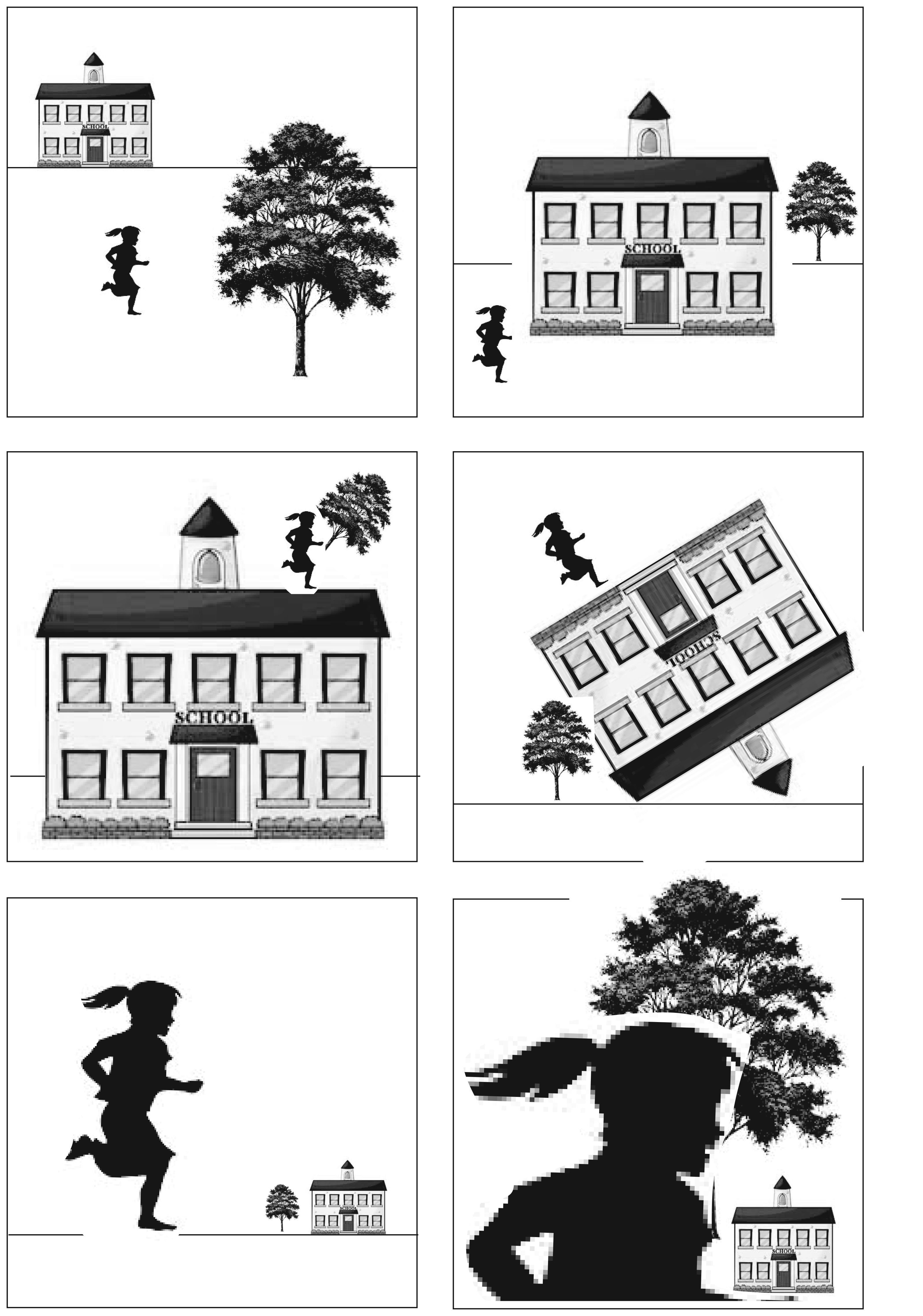
The aim of this exercise was to take three objects (a tree, a child and a building) convert them to greyscale and experiment with composition.
Experiments with composition
When the child is smaller than the house and tree then it makes the image look realistic – i.e. everything appears to scale. These images are quite boring; whereas I think that the images where the child is larger than the other elements are more interesting and more dynamic. In the case of the bottom left image, either the child is monstrously large, or the building and tree are toys.
When the elements of the image are aligned with the horizontal and vertical then it gives the image a feeling of order – everyting is where your brain expects it to be. When the elements are at angles to the frame rather than being aligned with the horizontal and vertical then this gives the image a feeling of chaos, or quirkiness. Things are not quite right, what has gone on to create that scene?
My favourite composition is the bottom left image where the child is large relative to the building and tree. I think that I find this image interesting because the figure, who is naturally the character in the image, is dominant. I like the possibilities of this image – what has happened to make the elements out of scale with one another?
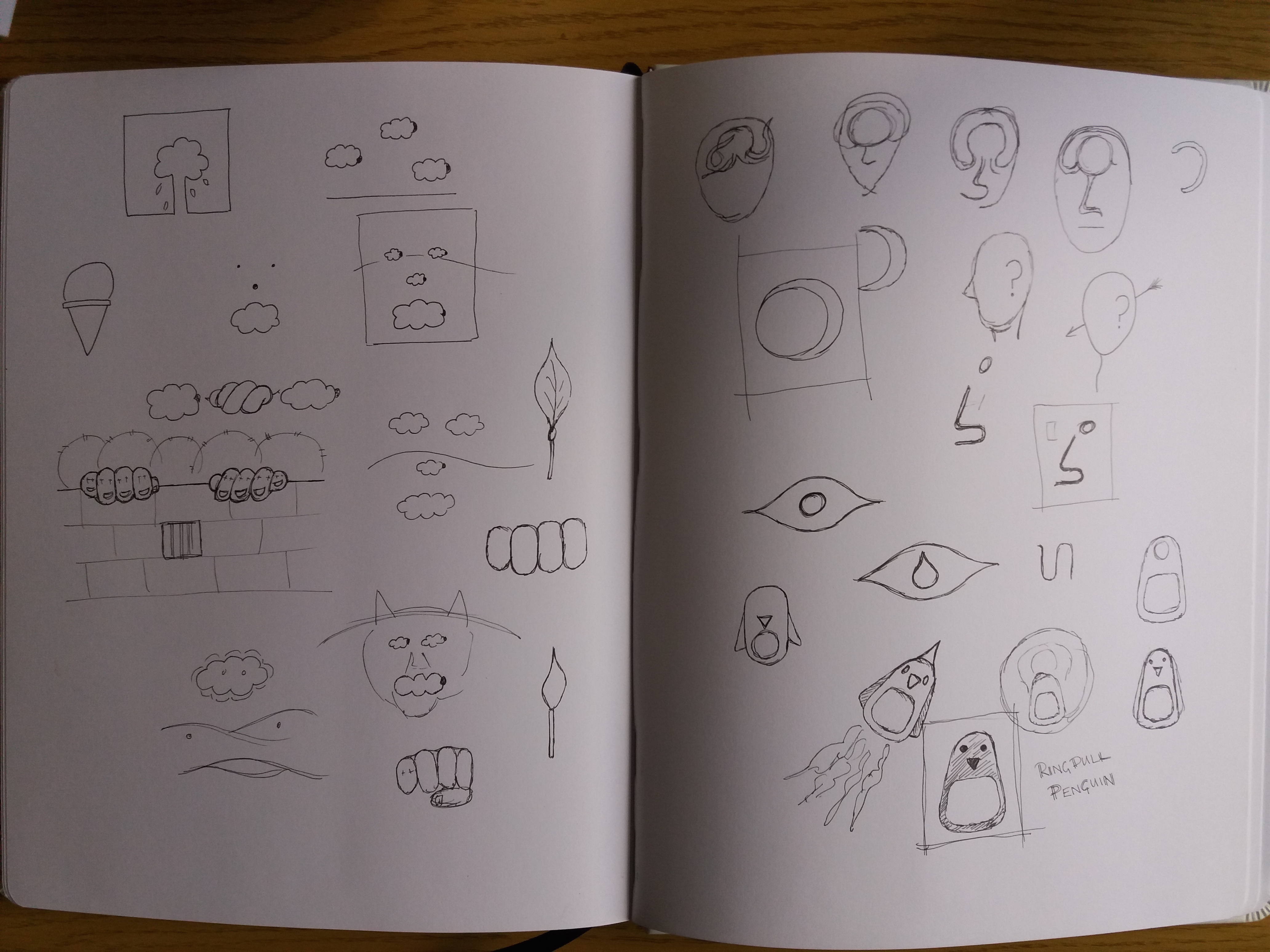
In the feedback for Part 2 of this course my tutor suggested many different illustrators, animators and styles for me to take a look at the work of. Having scanned through their work I chose a few illustrators to look at in more detail in order to try to understand their style and produce some sketches in a similar style.
Noma Bar
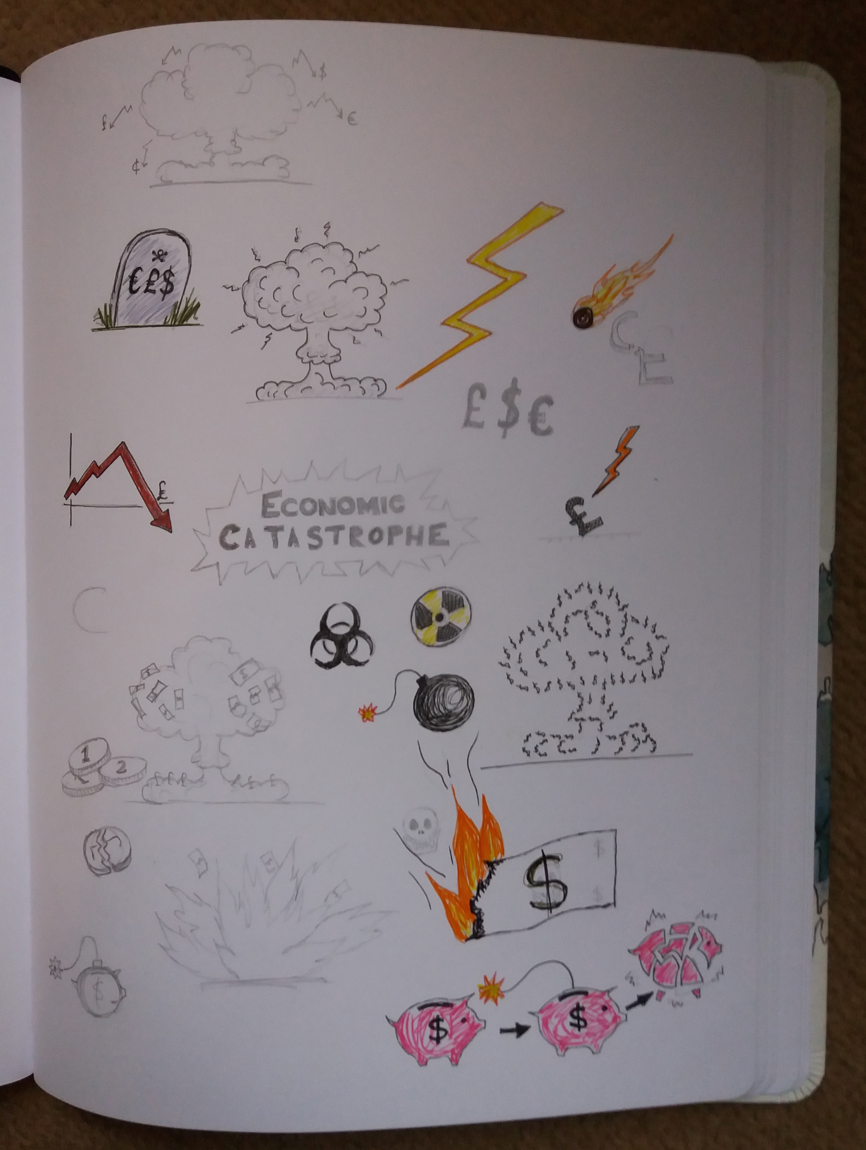
Based on the graphic style that I’ve used in some of my illustrations, and also use of metaphor, my tutor suggested taking a look into the work of Noma Bar. Noma Bar’s work looks simple but is really clever. There is usually more than one image that can be seen in each illustration – one object transforms into something else. The style is really simple and graphic and there’s typically a simple colour scheme with less than three colours. One quote that I saw from him stated that he’s aiming for ‘maximum communication with minimal elements’. Some of his work is political, some of it is witty. I decided to brainstorm ideas of objects that can be transformed into something else. My favourite from these sketches is ‘Ringpull Penguin’.
Sketchbook pages
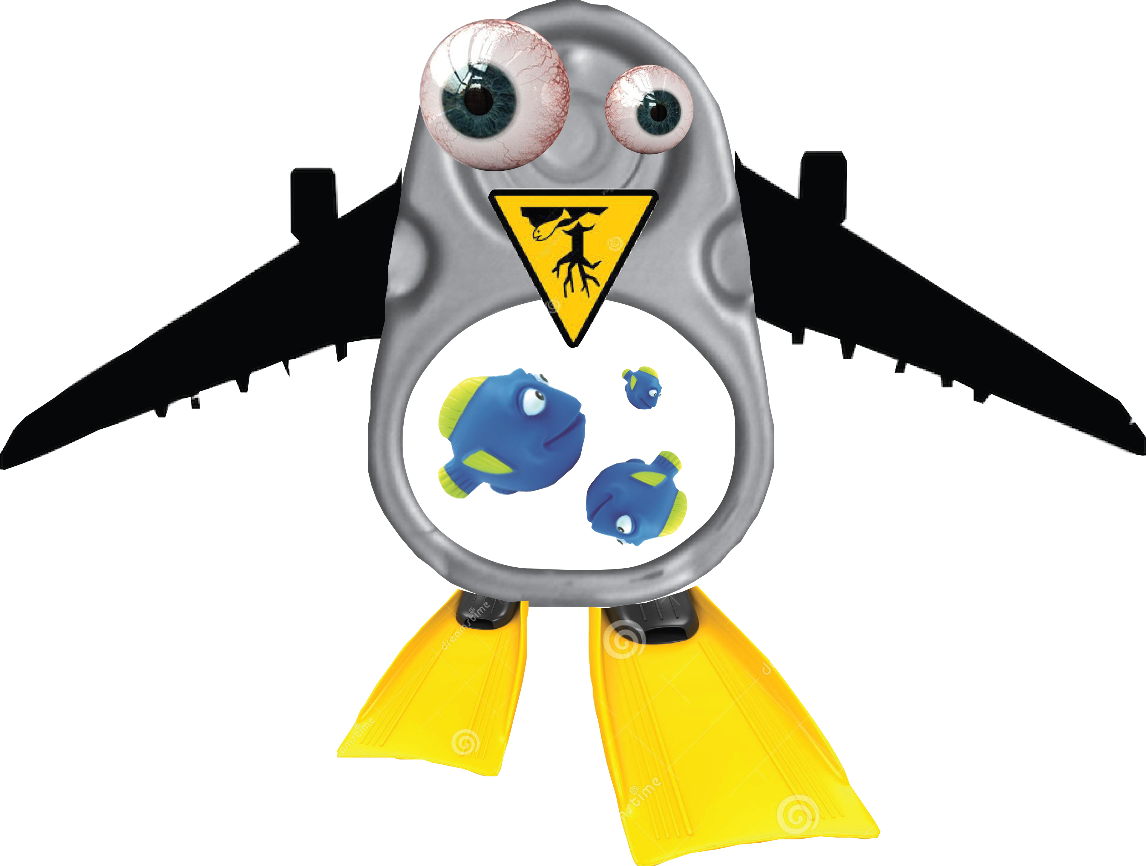
Hannah Hoch
In the ‘Choosing content’ exercise in part two I used a ‘found’ background and drew my illustration of a wartime detective on top of this. My tutor suggested taking this further and using parts of the background texture as elements of the character. He suggested taking a look at the work of Hannah Höch.
Hannah Höch used photomontage to creat whimsical images that typically feature people in some form or another. I find the images quite disturbing – partly because different elements in her images can be at very different scales, which is unsettling.
In order to have a play with this style. I decided to take ‘Ringpull penguin’ from my previous sketches and develop it further using photomontage.
Ringpull Penguin
I find Ringpull Penguin quite disturbing. I did not make things as out of proportion as in the work of Hannah Höch as I already found the process of making Ringpull Penguin uncomfortable. I could imagine this style being quite powerful if you were trying to make a statement – for example in this case it could be an environmental statement about the impact of human populations on the natural world.
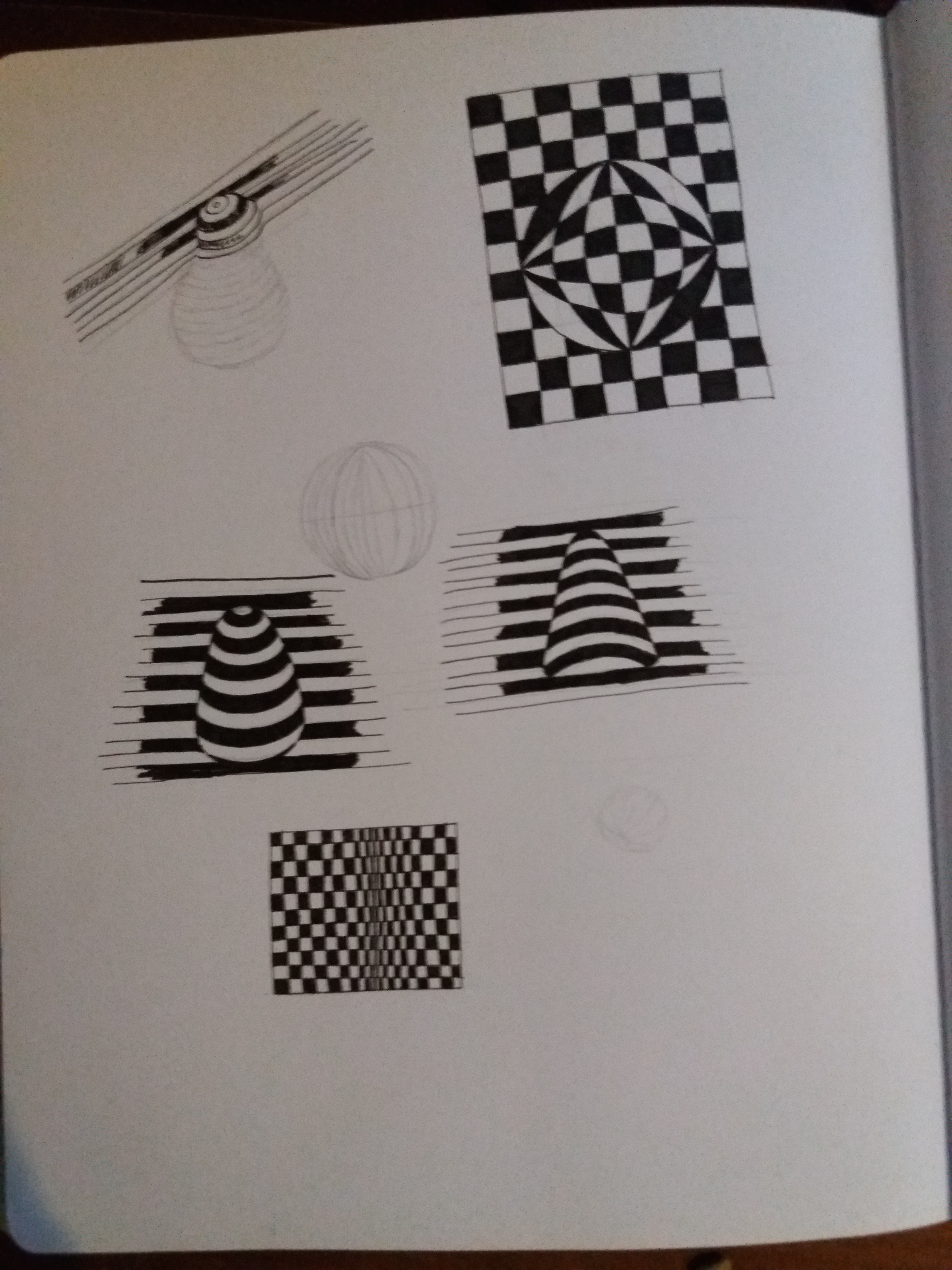
Op art
In my assignment for Part 2 I created an image of a strawberry using offset lines. My tutor suggested that it might be interesting for me to take a look into Op Art (optical art). Op Art is a form of abstract art that uses optical illusions to create special effects within an image. These special effects include making the image appear three-dimensional, hiding images withing images, or making elements of the image move. A lot of Op Art is created in black and white varying the thickness of lines, changing the scale of patterns or offsetting black and white lines. Other Op Art makes use of colours to create optical illusions. I had a play in my sketchbook with some basic Op Art techniques. I’m not sure any were particularly successful – more time and effort needed – however, I think these techniques are useful to be aware of to incorporate into future illustrations.
This exercise is about choosing content to produce a simple portrait of the character represented in the following exerpt of text.
The room was void and unquickened; it was like a room in a shop window but larger and emptier; and the middle-aged man who sat at the desk had never thought to impress himself upon what he entered every day. Comfort there was none nor discomfort; only did the occupant deign to qualify the pure neutrality of his surroundings, it would surely be austerity that would emerge. The spring sunshine turned bleak and functional as it passed the plate glass of the tall-uncurtained windows.
The windows were large; the big desk lay islanded in a creeping parallelogram of light; across this and before the eyes of the man sitting motionless passed slantwise and slowly a massive shaft of shadow.
Perhaps twenty times it passed to and fro, as if outside some great joy wheel oscillating idly in the derelict amusement park. And the man rose, clasped hands behind him and walked to a window – high up in New Scotland Yard. He looked out and war-time London lay beneath … on his brow was fixed a contraction; this he carried from desk to window, and now there was neither hardening nore relaxation as he looked out … during 15 years he had controlled the file of police papers which dealt with the abduction and subsequent history of feeble minded girls. Here lay his anger as he looked out over London … year by year the anger had burst deeper until now it was the innermost principle of the man.
Michael Innes Adapted from The Daffodil Affair.
Questions
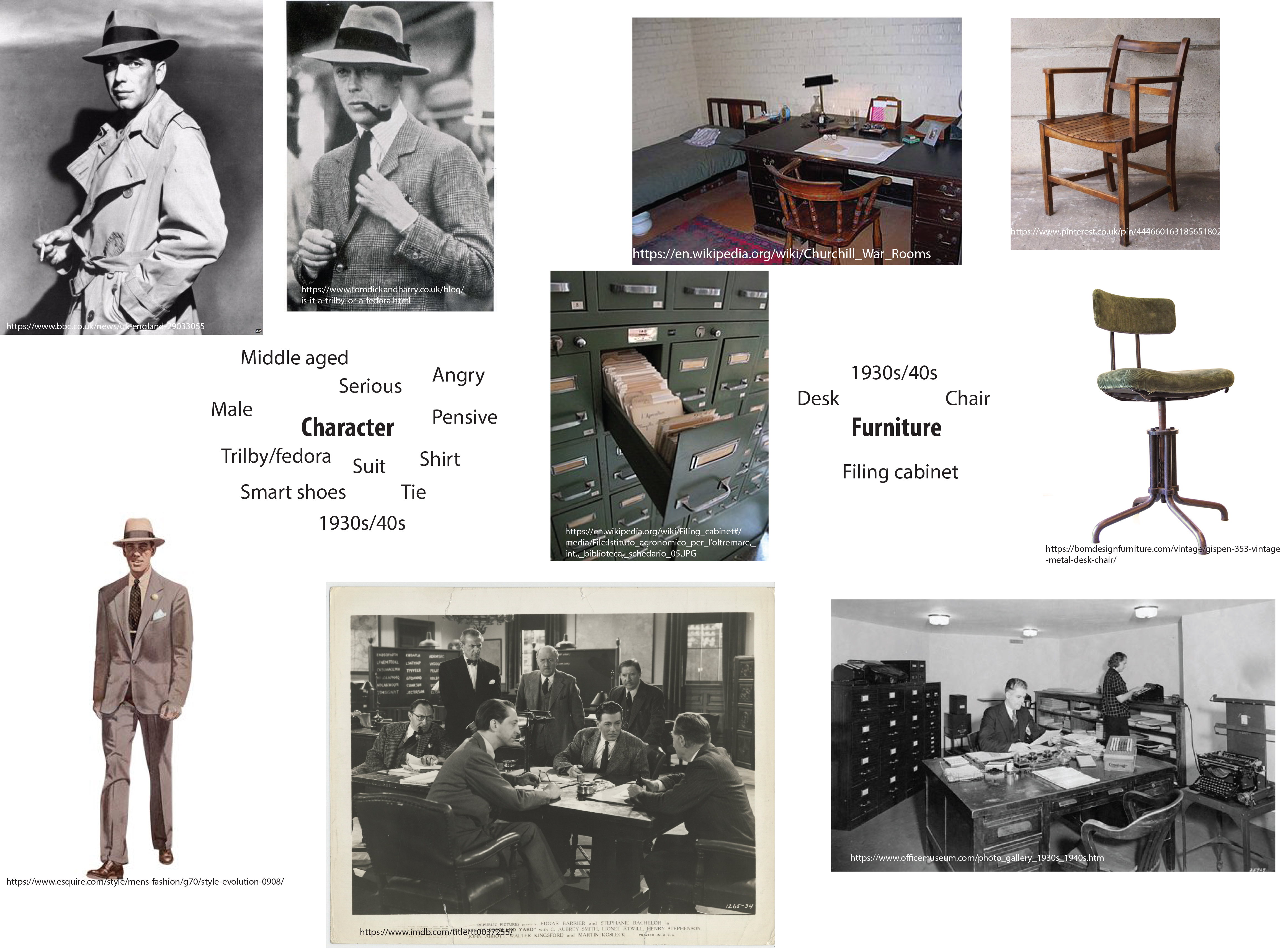
If this were to be made into a film what would the main character be like?
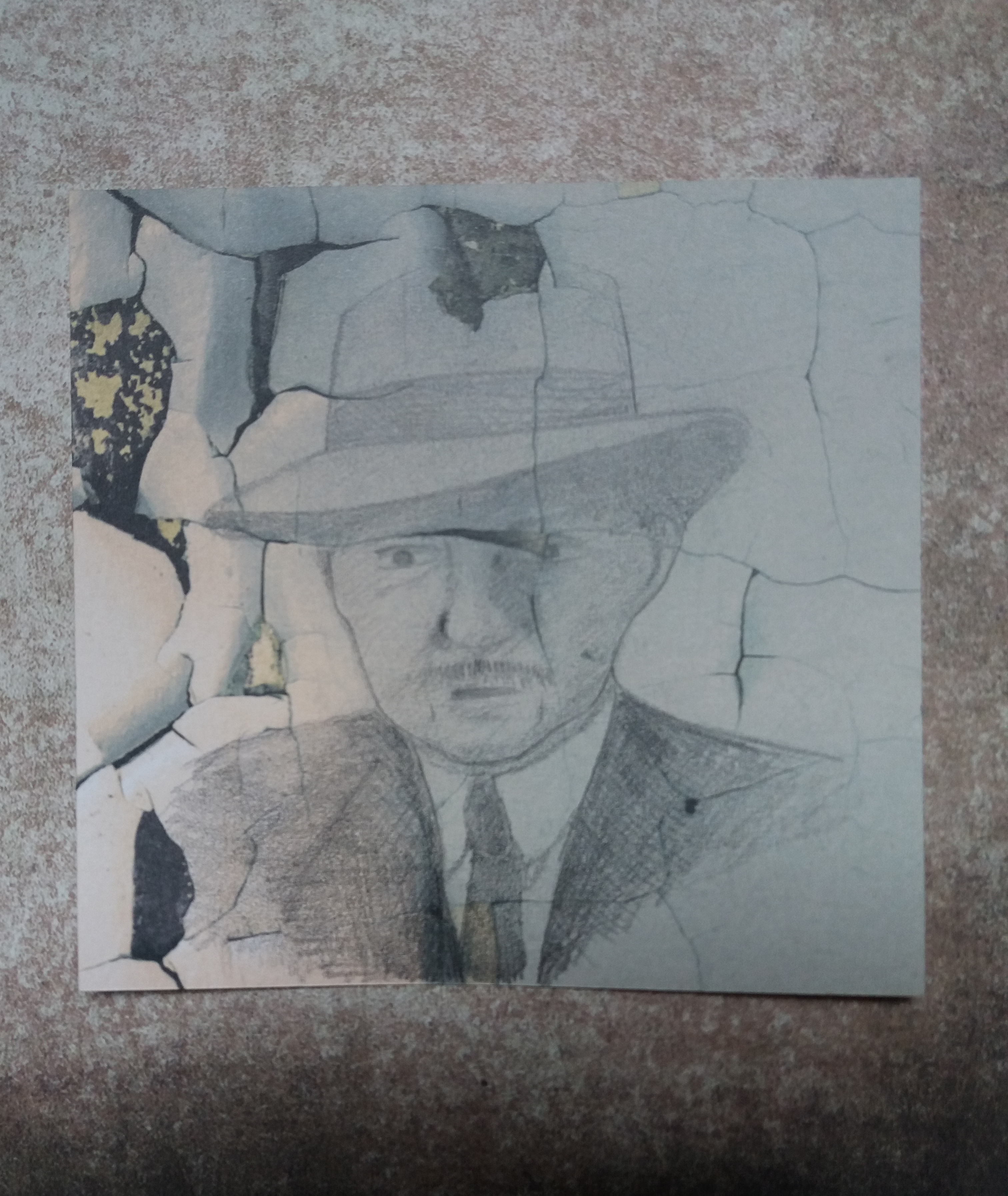
Trilby/fedora hat. Suit, shirt, tie. Shoes. Trench coat.
What furniture is in the main area where the action takes place?
Table/ desk. One or more chairs. Maybe a filing cabinet. Very little furniture. Plain, functional furniture from the 1930s/40s.
Collect visual reference material for the items on your list
Initial visual reference material (sources provided on individual photographs).
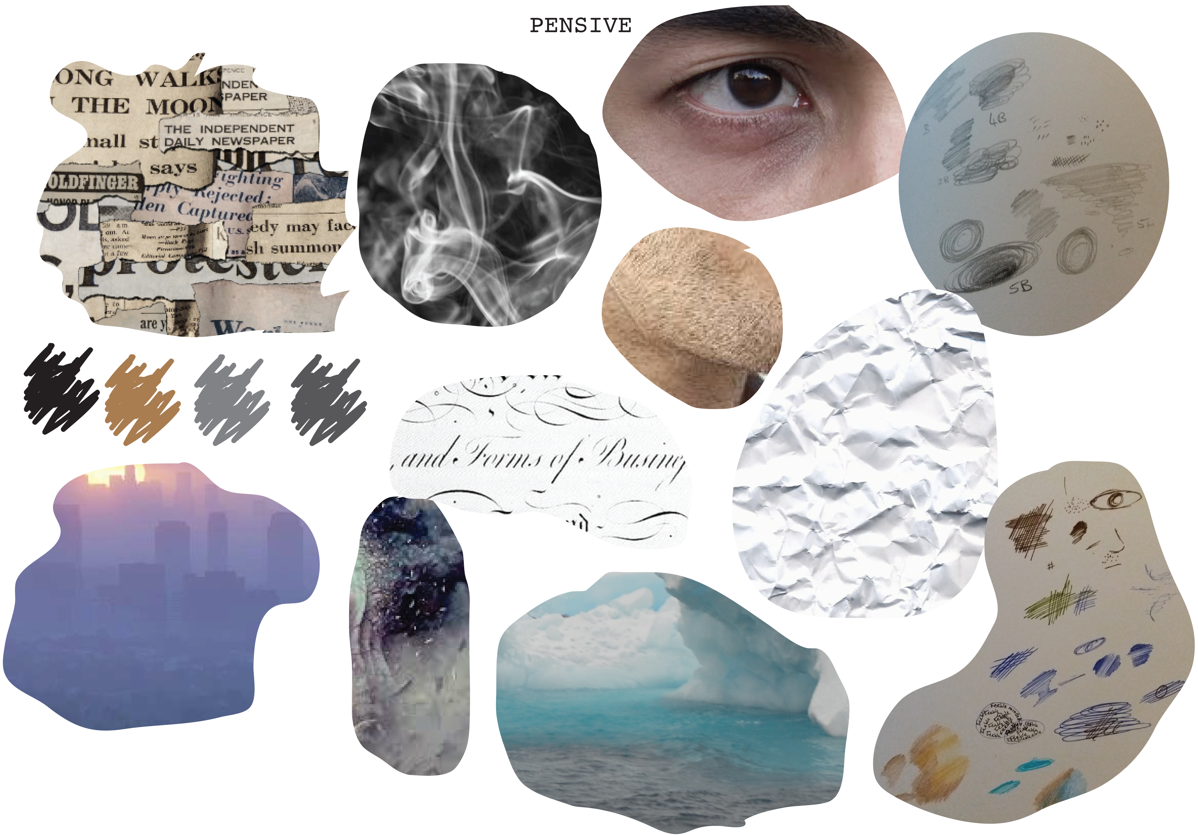
Textural and visual brainstorming and idea generation
I created a moodboard for the word ‘pensive’. Interestingly this moodboard highlighted quite cold colours, pale blues, greys and brown. I also quite like the idea of incorporating the crumpled paper, or old typed text into the image in order to convey the frustration that I think is present in the text. Maybe using old newsprint to fill in the image with collage, or alternatively as a background.
Final piece
I used part of an image of paint flaking off a wall for the background and made a rough sketch of the character in front of this. I wanted the character to be shadowy and blend into the background somewhat. I think that it is quite a bleak image of the character staring out of the window down onto wartime London.
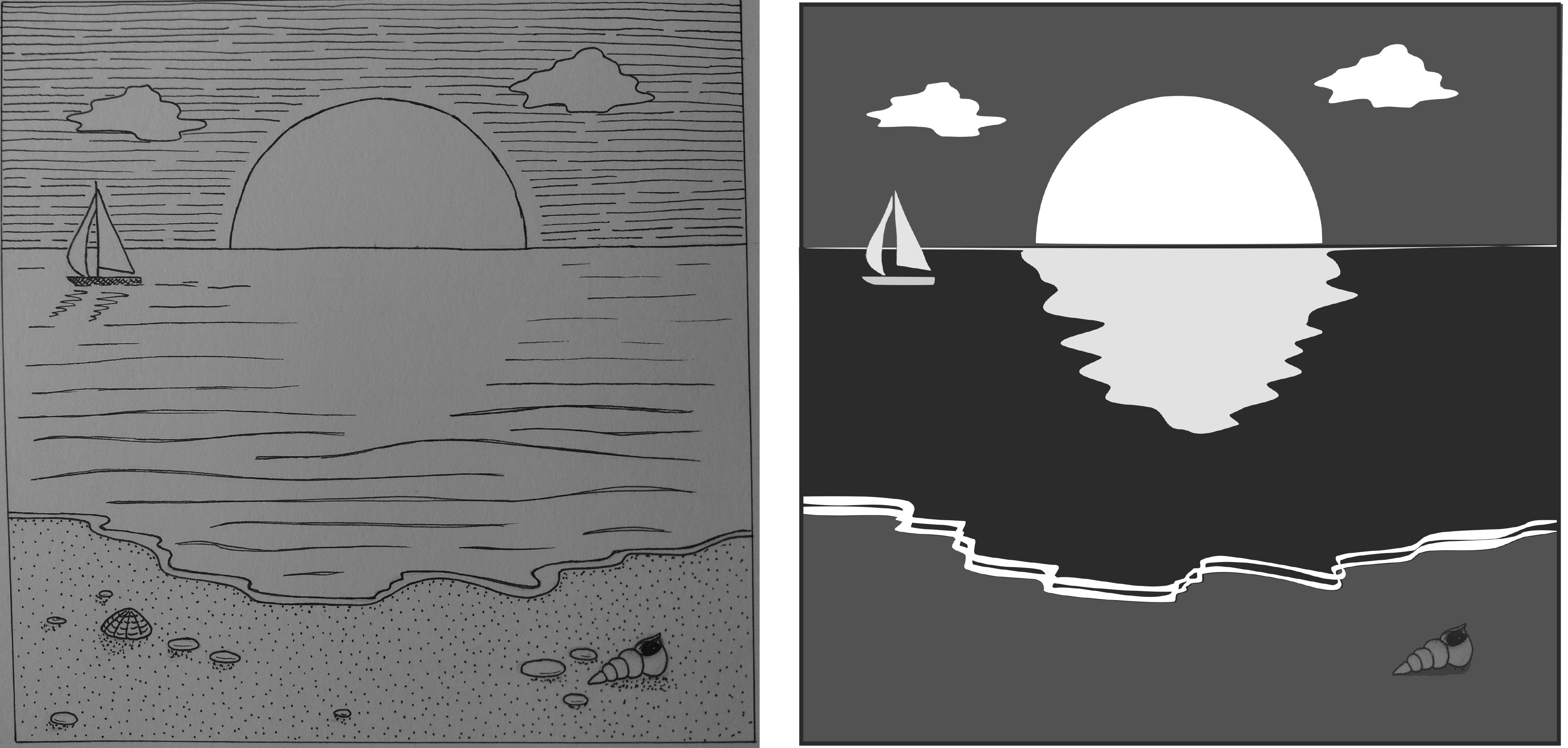
The aim of this exercise was to produce a line image around the word ‘sea’, then to invert the image and use shapes cut from the inverted image to fill in the original image.
Original line image and final black and white image.
My original line image did not work well for this exercise as there were too many different marks in it. Therefore when I inverted the original image using adobe photoshop I removed a lot of these detailed marks from the image. As I didn’t have access to a printer I decided to do the ‘cutting and sticking’ using adobe illustrator.
I like how bold the final image is when compared to the original. I cheated a little by using different tones for the sea, sky and sand, rather than sticking rigidly to black and white. A disadvantage of doing this task digitally is that I lost the ragged edges and texture that I would have got from cutting and sticking paper.
The final image has a very different feel to the original – day has turned to night and the sun has become the moon. The final image reminds me of a monochrome version of the types of images used on the US National Park posters that I discussed in an earlier post – simple, graphic, bold.
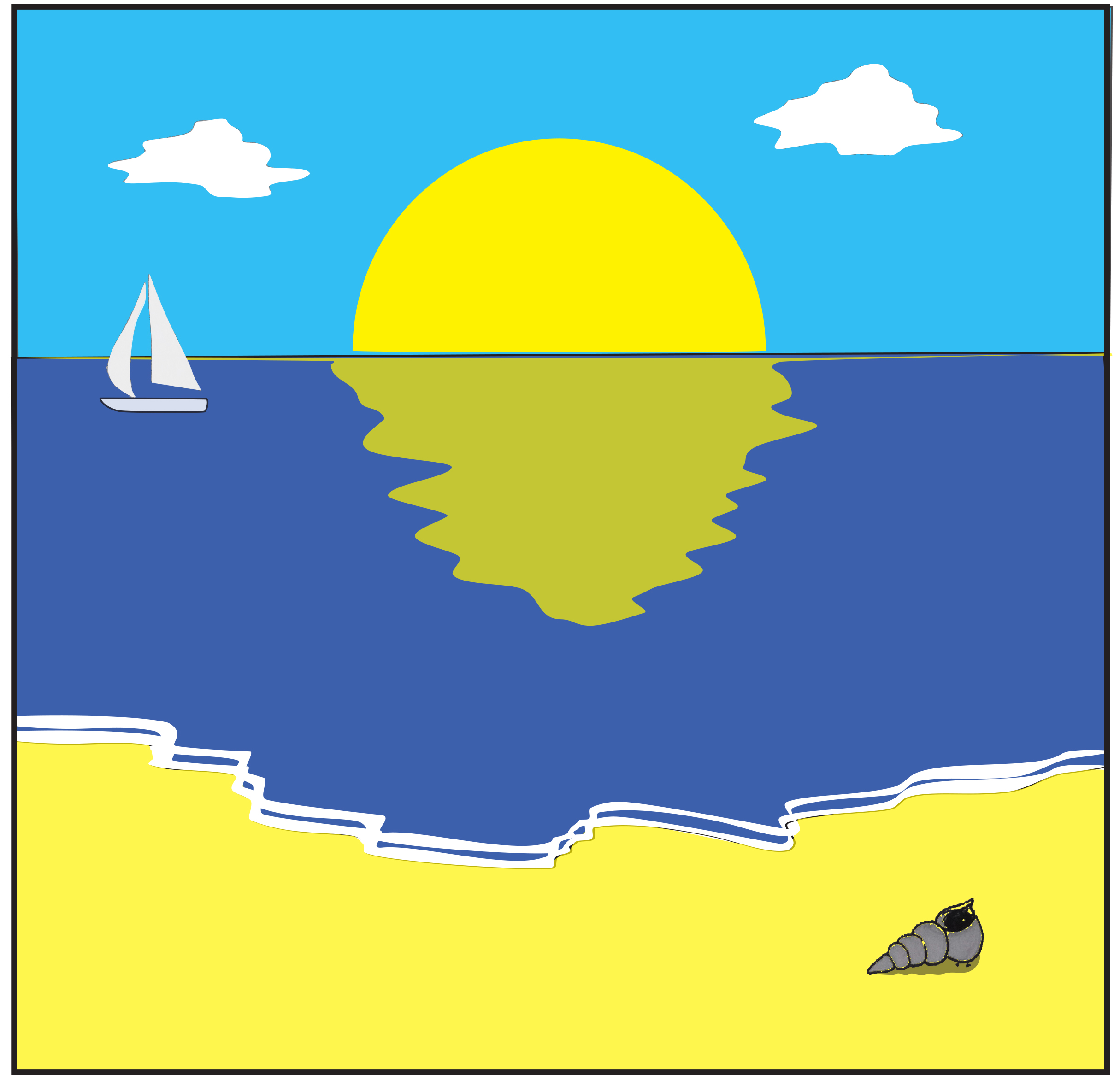
As I produced the final image in illustrator I decided to have a quick play with converting the monochrome image to colour but with a limited colour palette.
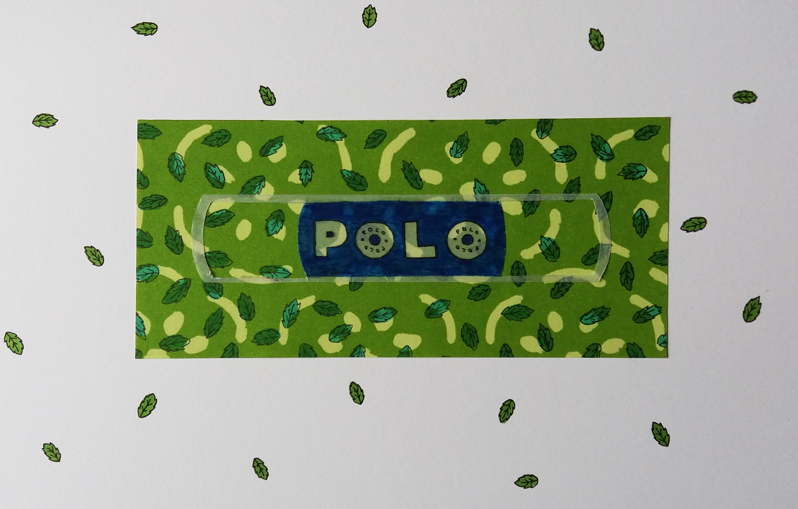
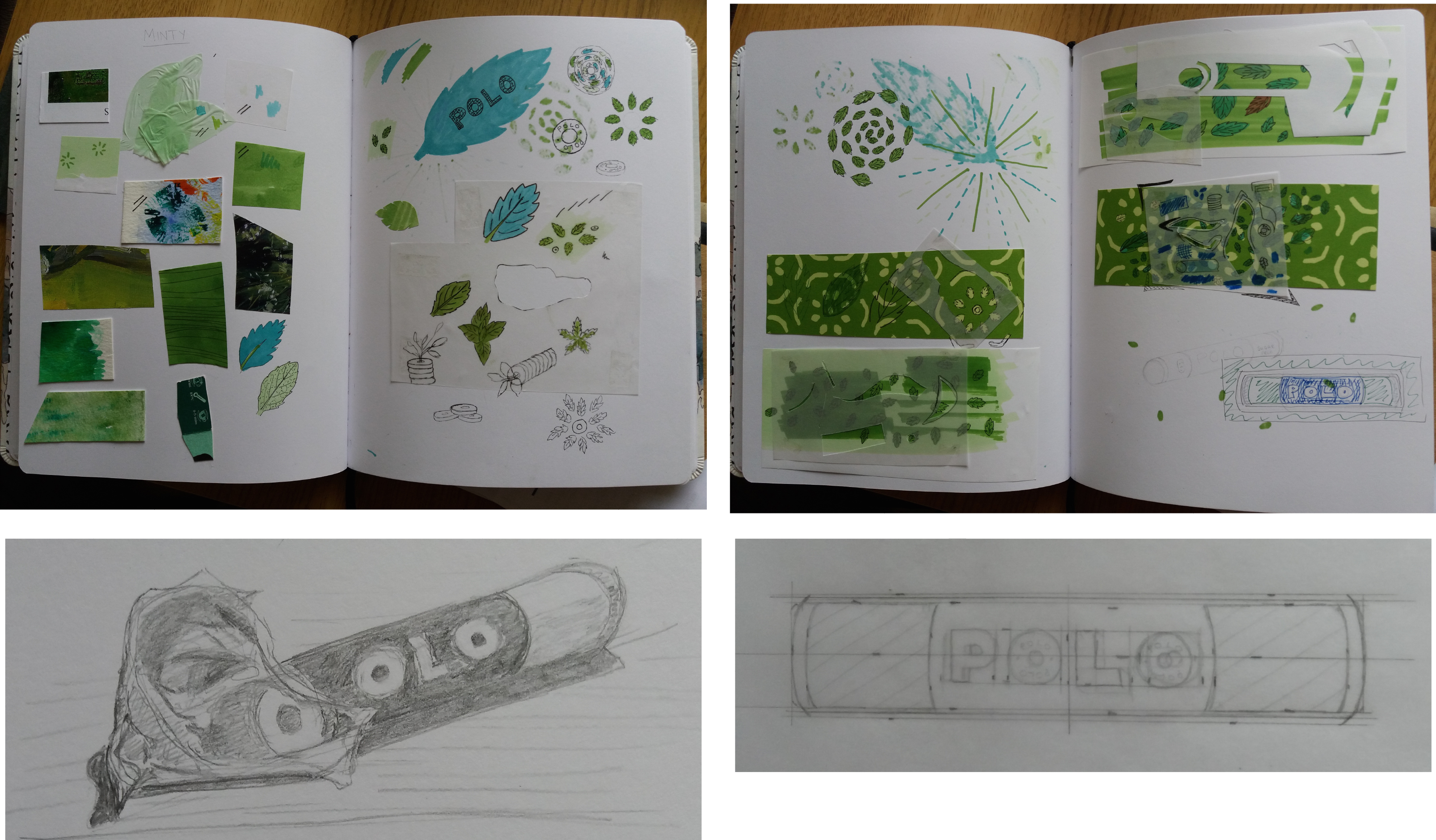
The aim of this exercise was to produce an illustration that illustrates an object, whilst highlighting a quality of the object. For this exercise I chose a packet of polo mints and wanted to highlight their ‘mintiness’. For the final illustration I combined collage using found materials with markerpen and fineliner.
Final piece – minty polos.
I began by creating a moodboard to investigate different materials, which included, plastics, found papers from magazines and wrapping papers, different paints and pens on different papers. I gradually developed the idea of having a silhouette of the polo tube on a piece of green wrapping paper decorated with mint leaves in pen. I used tracing paper for the silhouette as I wanted to be able to see the decoration underneath. Finally once I’d completed the image I liked the idea of the leaves going beyond the edge of the image in order to highlight them further.
Moodboards and images from sketchbooks.
I like the simplicity of the final piece however, I think that it is a little boring. I think that it might have been more interesting to choose a different shape for the background block of colour and also to vary the size of the drawn leaves for example by making some of them bigger.
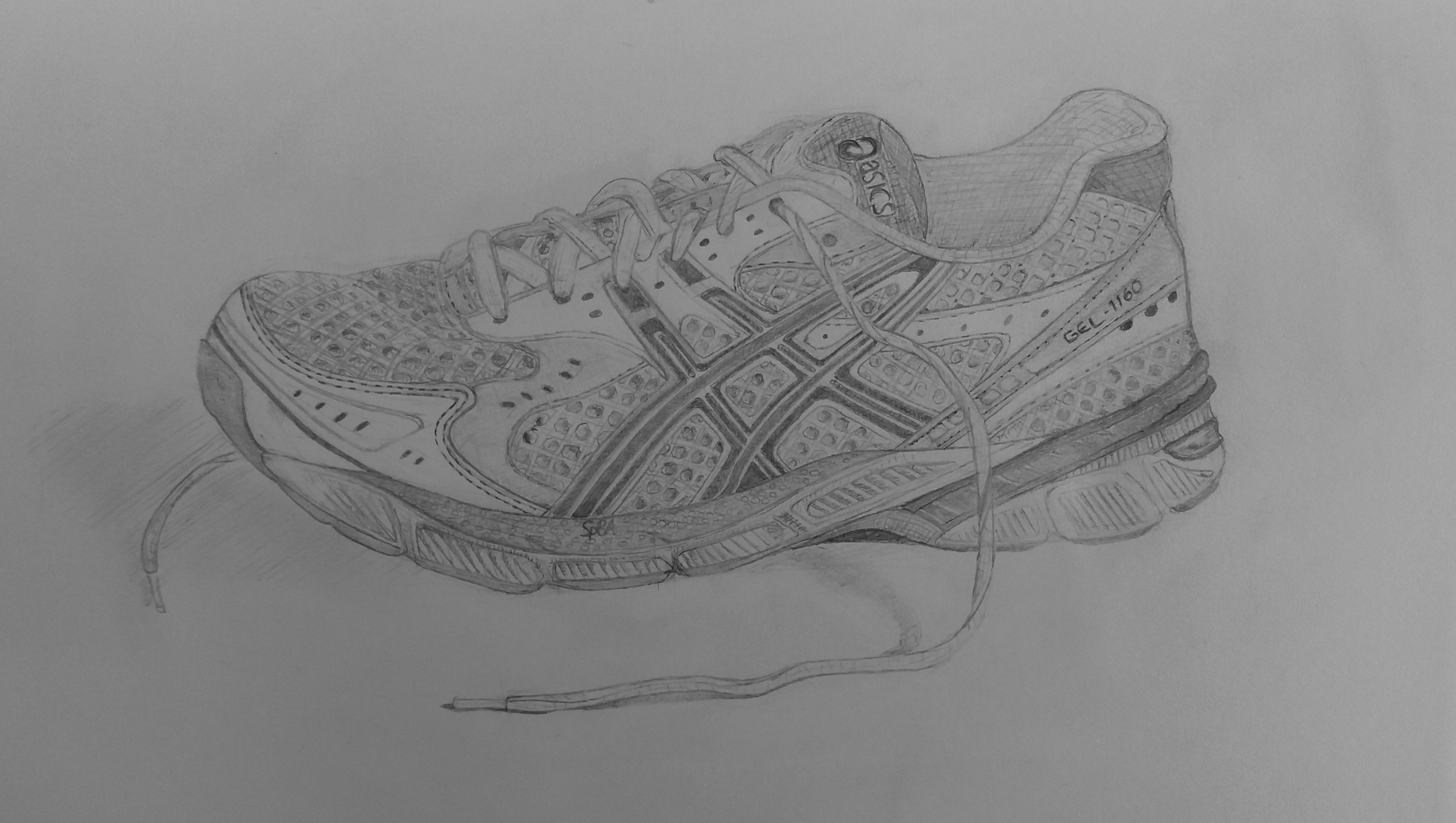
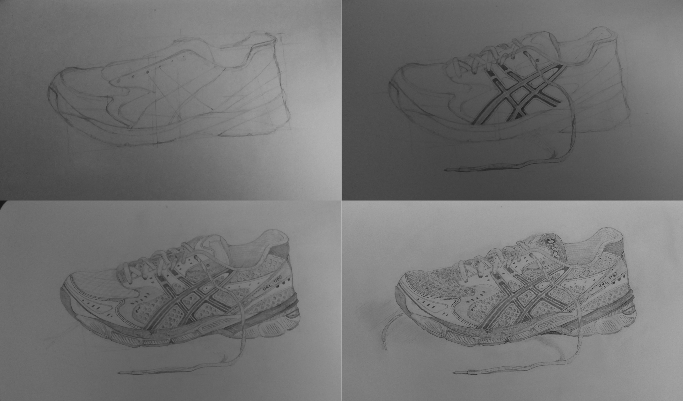
The aim of this exercise was to use either pencil or fineliner to produce an objective drawing with a high degree of visual accuracy. I produced my drawing with a range of pencils from HB through to 2B.
I really enjoyed this exercise and I am quite pleased with the result. This exercise made me really look at the object and think about proportion. There are a lot of geometric patterns within the trainer design that I had never previously noticed. I chose this shoe because it has a lot of different textures, which made me experiment with shading and mark making to try to represent these textures e.g. smooth leather, versus rough webbing. The exercise also made me look carefully at the relative tones of different parts of the shoe in order to convert from the colour that I was seeing on the object to different shades of grey in the drawing.
The aim of this exercise was to draw the same object using different media and different types of papers. I found it extremely hard to break away from the types of media that I like – anything that allows me to make accurate marks. I did enjoy the looseness of thumbprinting overlain with some obsessive markmaking (#5); despite this image least resembling what I was drawing. I hated trying the pastels and graphite, they were just frustrating, I guess they are intended for larger drawings. I think what I learnt from this exercise is that I need to loosen up and be more adventurous … easier said than done!
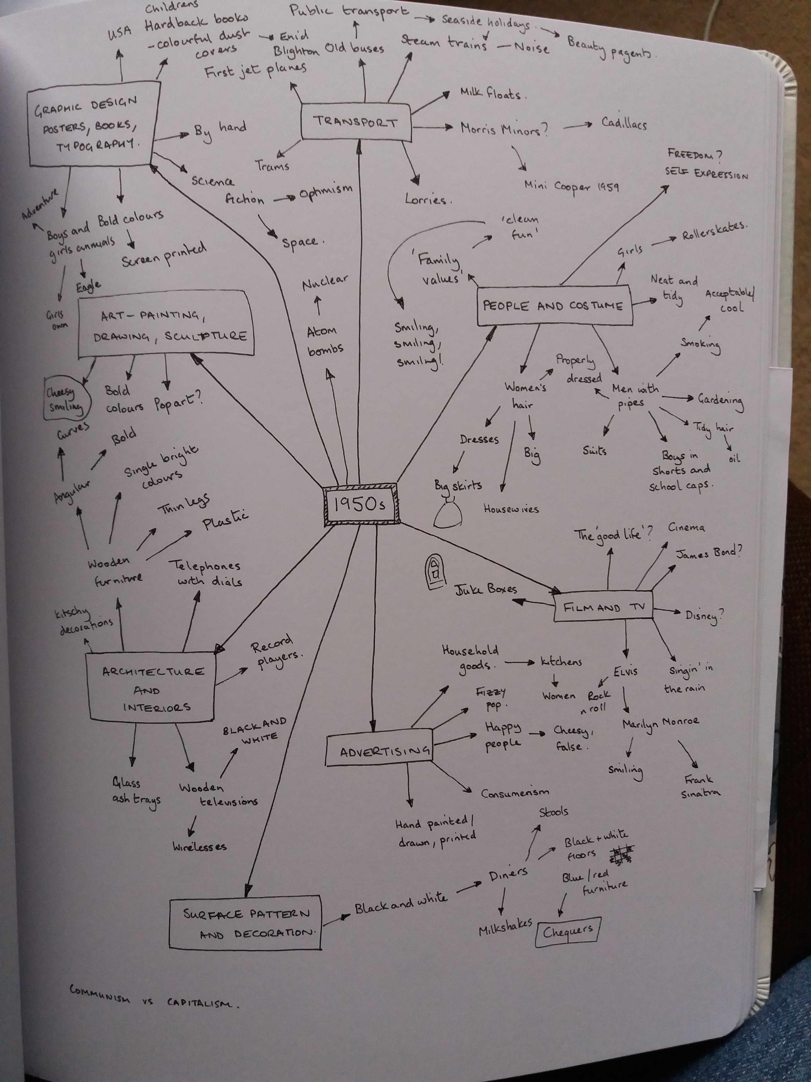
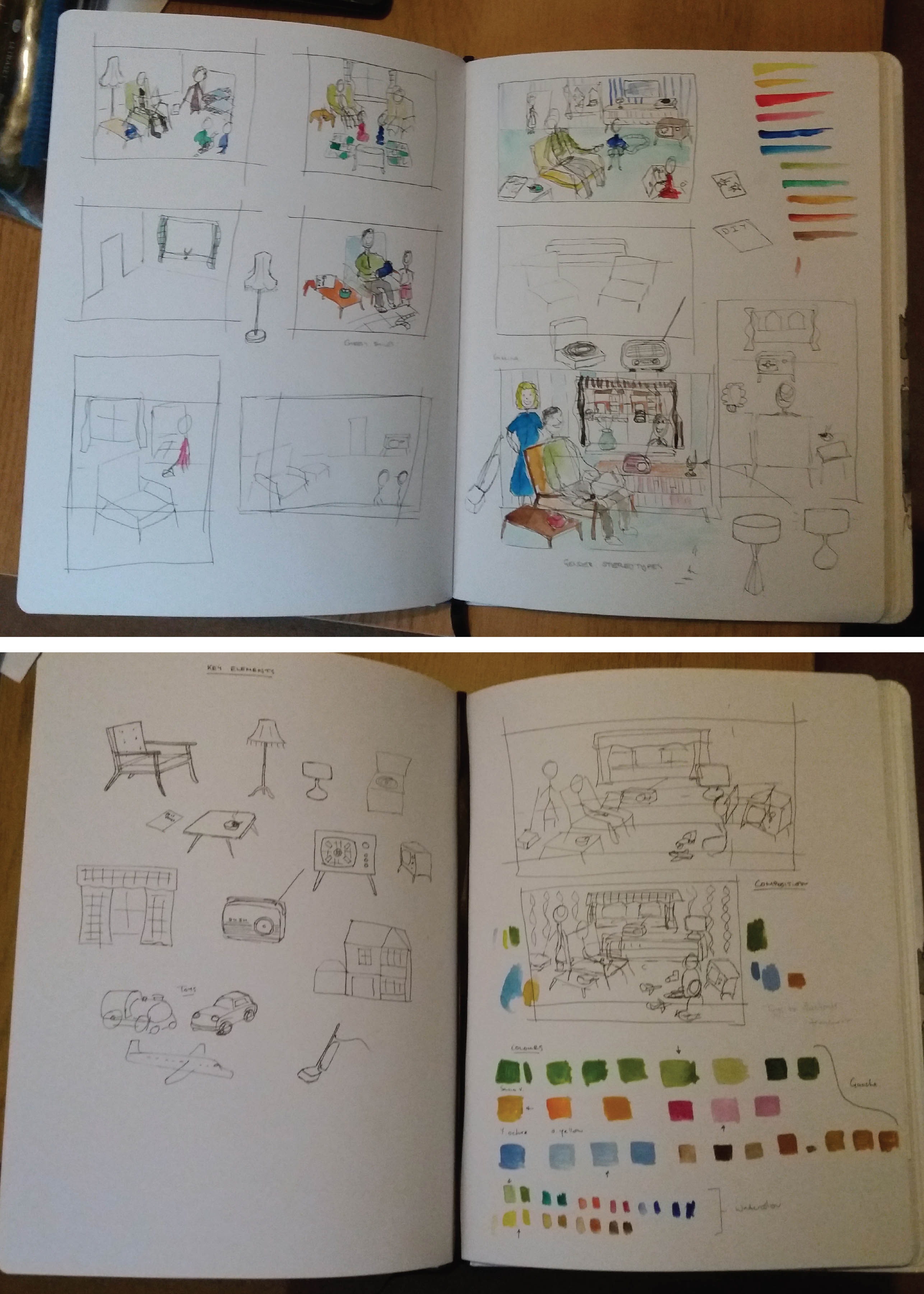
The purpose of this exercise was to collect reference
material in order to build up a picture of the 1950s from a visual perspective
and then to produce an illustration that would give a modern teenager an idea
of the 1950s.
‘The 1950s’
The 1950s
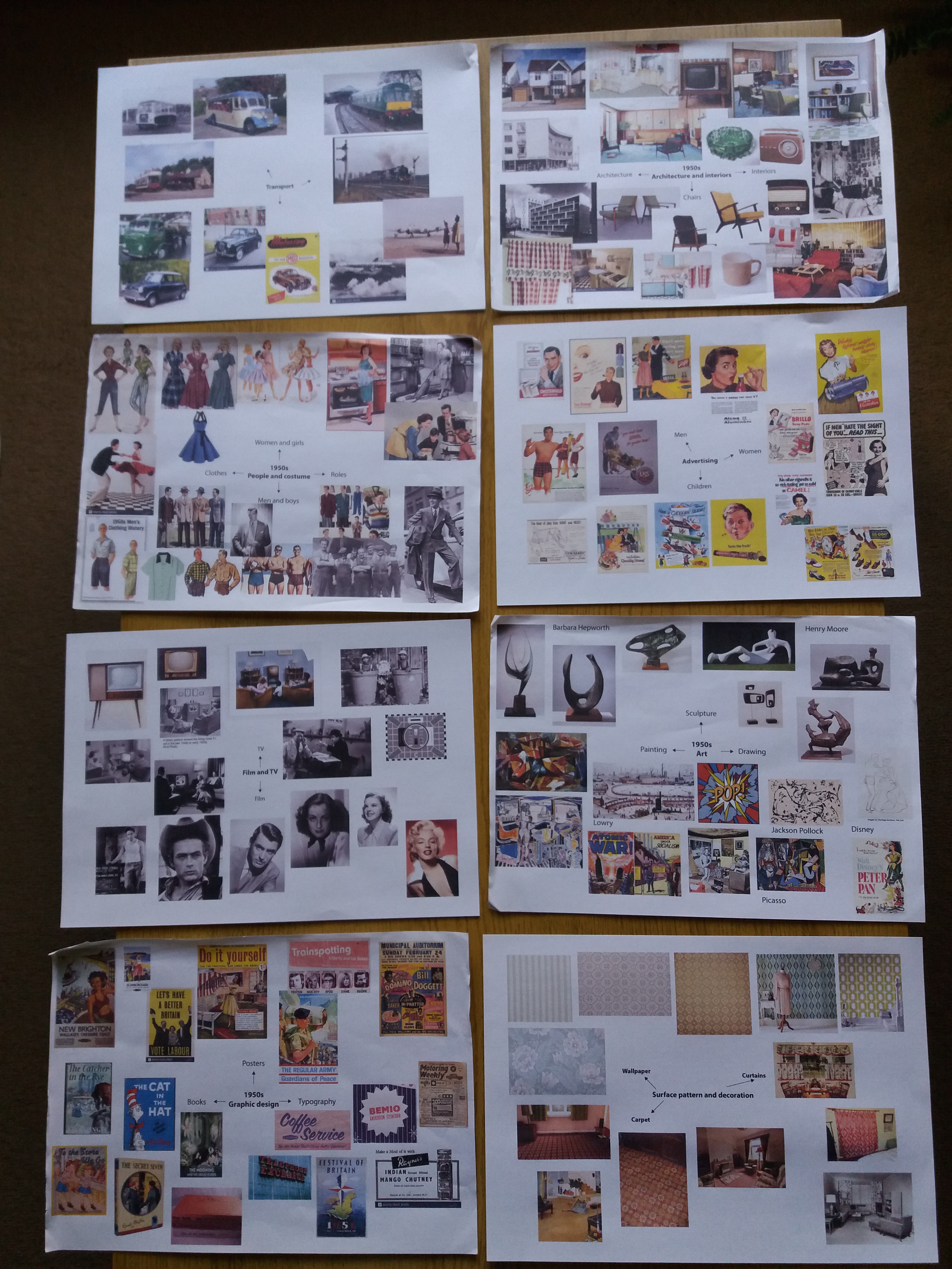
Prior to doing this research I had thought of the 1950s as being quite a boring and drab post war era. However, my research revealed that many of the bold colourful designs of the 1960s were beginning to evolve albeit with a somewhat subdued colour pallette.
The 1950s seems to be an era in which people were beginning to
have disposable income. House interiors are becoming more colourful; furniture
is sleek and no longer purely functional; and colourful geometric patterns are
common for wallpaper and soft furnishings.
Much of the advertising that I found from the 1950s was for
the latest household gadgets. Advertising is bold and colourful and relies on
illustration rather than photography. My main impressions of the 1950s from
advertising are that everybody is terrifyingly happy despite the grotesque gender
stereotyping that is being depicted.
Research
I began by brainstorming my pre-existing knowledge of the 1950s before pulling together moodboards on the topics of: people and costume; architecture and interioirs; art; graphic design; advertising; transport; film and TV; and surface pattern.
Mindmapping
Moodboards
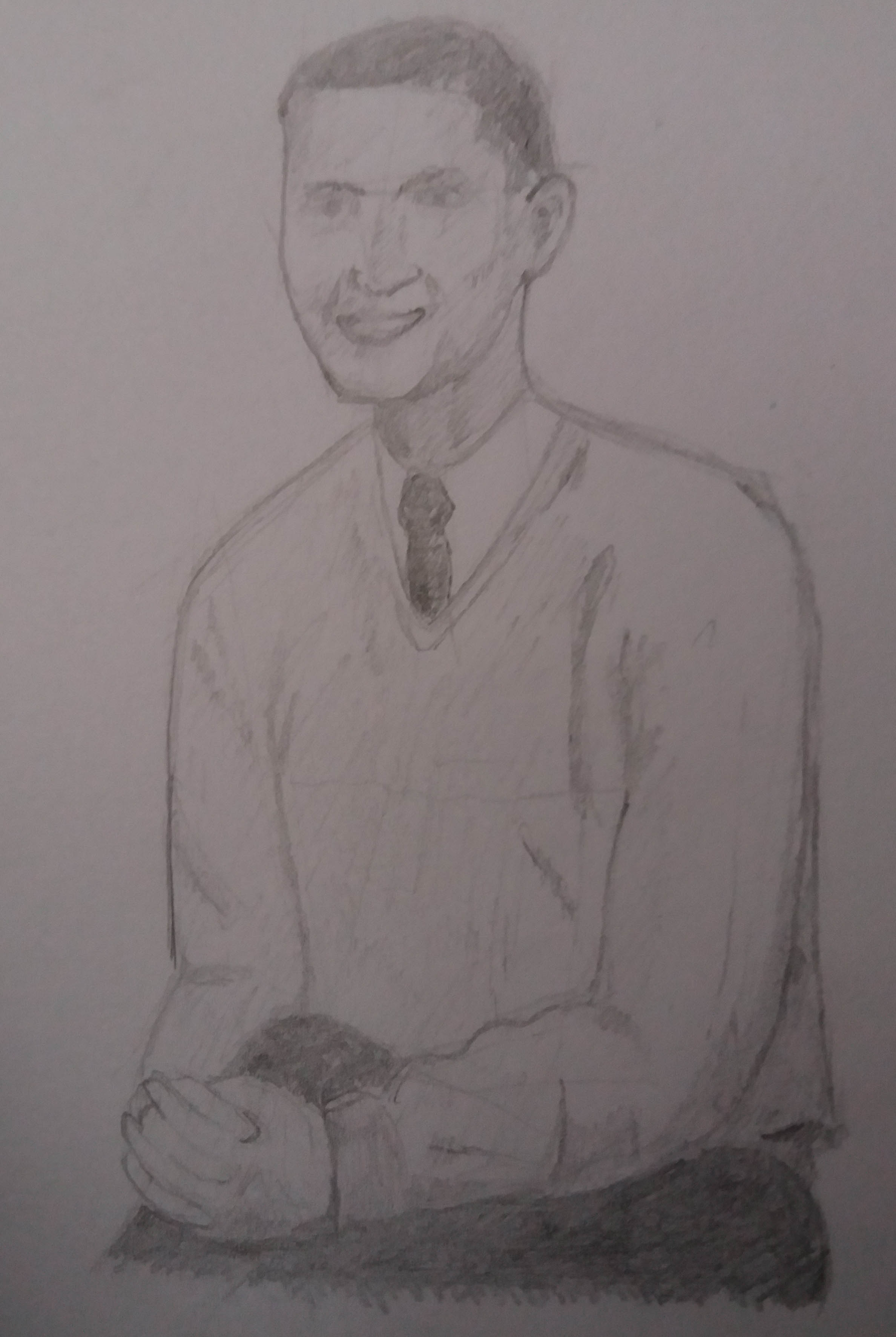
I also incorporated 1950s themes into my sketching practice.
One of my aims with this course is to experiment with different media, so I bought myself some watercolour paints and began to play around with using these to add colour to pen and ink drawings. I really liked how quickly they enabled colour to be added to rough sketches.
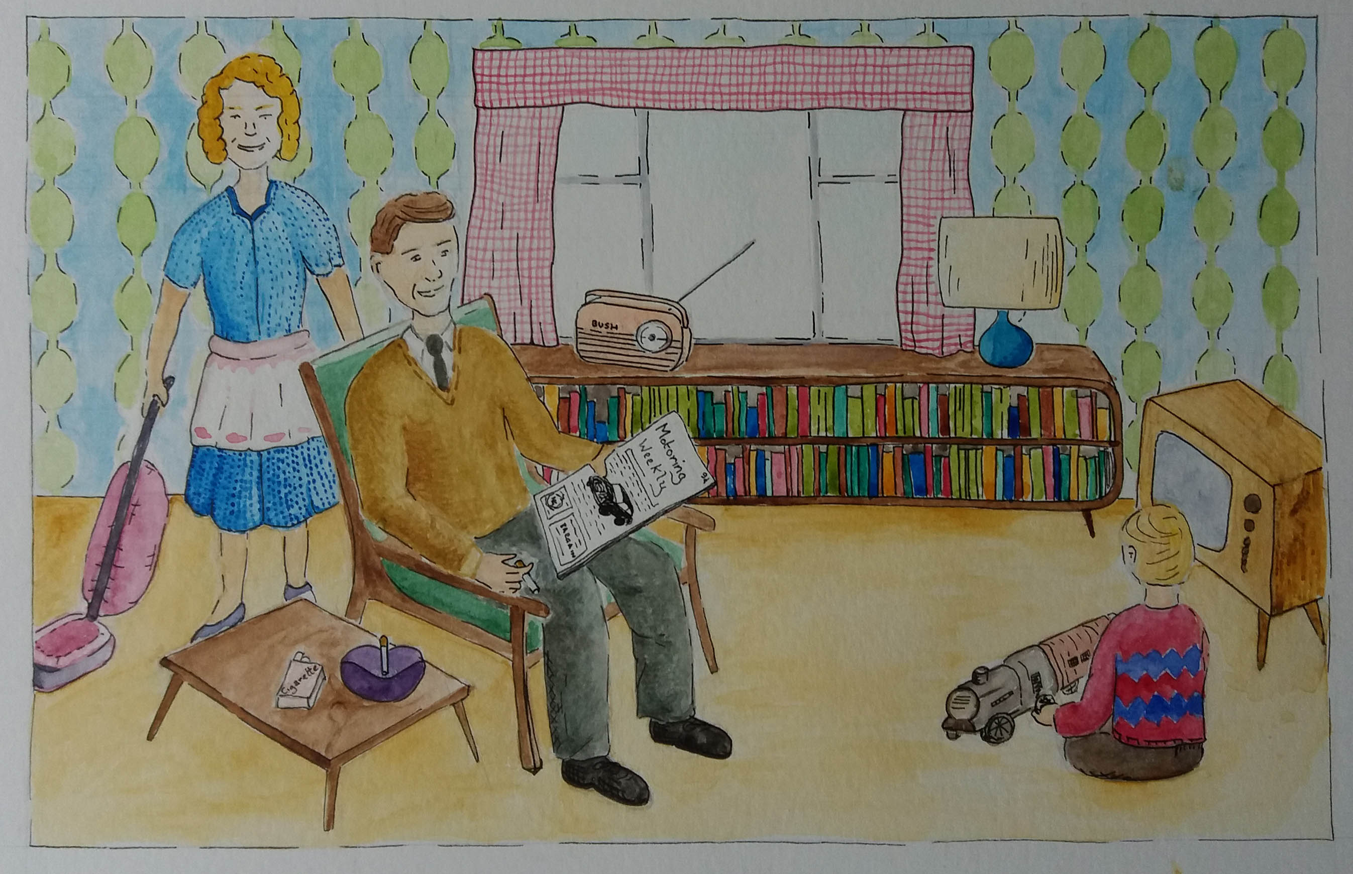
I thought about key objects that I felt represented the 1950s. I considered a range of compositions for the piece. I was keen to include reference to the gender stereotyping that I had discovered in 1950s advertising and the ubiquitous smiling. I considered different ways to illustrate objects from outside the home, for example by showing architecture and transport through the window or having a child play with toy cars and trains. In the end I decided to include the car in the magazine that the man is reading and a toy steam train that the child is playing with. In my draft compositions I also considered getting elements of 1950s art into the illustration by for example including a Hepburn style ornament, or some other artwork. However, this disapeared in the final piece because it felt too busy.
Composition and colour1950s illustration
The original brief was to make an illustration of somebody sitting in a chair surrounded by typical artefacts to give a teenager an idea of the 1950s.
I really enjoyed using watercolours for this illustration. Originally I had planned to exclusively use paint; however, I ended returning to my ‘safety net’ of black ink in order to highlight different objects. I think that the illustration probably does a better job of illustrating gender stereotypes than really answering the brief. I think that I should have gone the whole hog on 1950s gratuitous smiling. Retrospectively I’m not sure that this scene would necessarily appeal to a teenage audience and maybe I should have opted for the character to be a teenager in a different setting, maybe their bedroom. If I were to spend more time on the illustration I think that it would be a fun challenge to make the illustration in the style of a 1950s advertising poster.