For this exercise I’ve been asked to produce an illustration for use on the menu of a sophisticated, quality fish restaurant that is part of a chain across several European cities. The menu uses fresh ingredients and the ambience of the restaurant is modern, bright and contemporary in design. The image will initially be used at a small scale on the menu (40 mm x 40 mm); however, if successful it will also be used at a larger scale in stationery and on vans. Therefore, the image needs to be simple and clear.
My initial thoughts on this are that the logo should not include any text as it is going to be used in several countries. The logo needs to convey the message of fish restaurant. I need to think about how you convey the idea of quality with a simple logo.
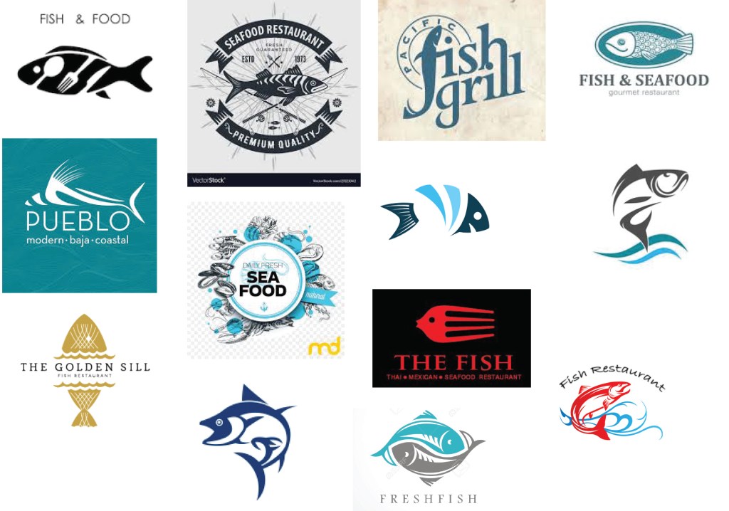
I collected together a selection of fish restaurant logos. Initial observations are that, not surprisingly, blues are the dominant colour used. Most of the designs are very simple and graphic. I think the cleverest design is the fish that is both a fork and a fish. However, I think that the designs with more detail, whilst potentially less eye catching and practical, somehow suggest quality – attention to detail in the logo implies attention to detail in the food. For me the designs that work best are those that are somewhere in the middle ground with respect to detail – they are graphic, however, they illustrate quality by using a particular species of fish in the logo, rather than a generic fish. With the exception of the little red fish-fork, I don’t think that using cutlery in the design is necessary and for me doesn’t illustrate quality. I am attracted to the fish that appear to be jumping out of the sea – it gives the logo movement. I don’t think people want to see the dead fish that they will eat; they want to see a lively, fresh fish.
Given current concerns for the oceans and over fishing, I will try to use one of the more sustainable fish species in my design. According to the marine conservation society these include mackerel, monkfish, some species of salmon, trout – it’s pretty shocking when you look into it how few fish species are fished at a sustainable level. For my next step I’m going to research images of different types of fish and try to make simplified sketches of them.
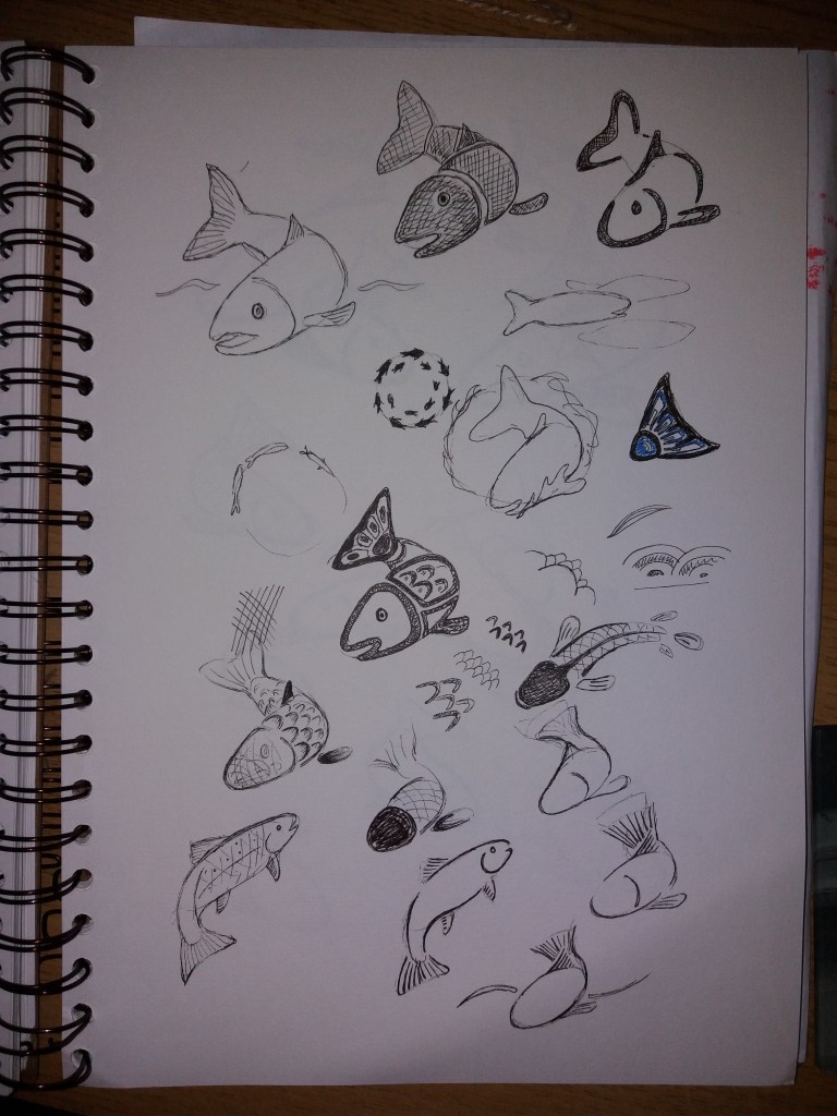
I began with a simplified sketch of a salmon and started playing with making the image more graphic. I started by blocking out solid areas of colour, I then tried reducing the image down to lines. This started to make me think about how fish are depicted in Native North American artworks. I also began to look at some of the textures used in Japanese art and to make sketches of these. I think that Japanese art has more fluidity than the native american designs and might help to give the image movement.
I was getting a bit stuck developing the origniam image, so I decided to find another image of a fish and work from there. I then kept trying to break the fish down into a few simple lines but using the ideas of thickening and thinning of the line from the native american artwork. The fish is still a bit cartoony for a high end restaurant. I wonder about making it more slender and with less well defined edges at the tail. Or maybe I could use colour to give a feeling of depth.
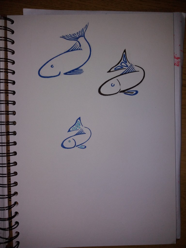
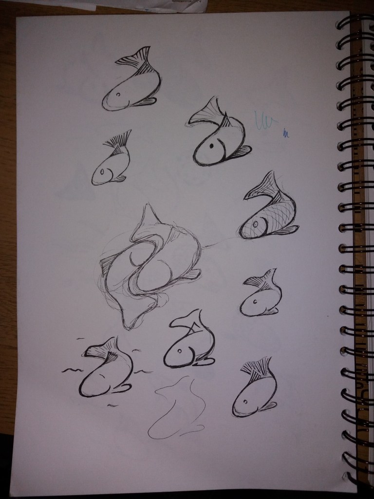
Finally I started to play with colour. My final design at 40 mm x 40 mm is the bottom image on this page. Retrospectively, I think that I prefer the black and blue colour scheme as it’s a bit more contemporary and eye-catching than the two tone blue colour scheme. If I had time, then I would produce this image in adobe illustrator in order to make the lines perfectly clean and the colours perfectly flat. I think the image would work well at a range of scales and fulfills the brief. It would have been good to somehow get more movement into the image – as per usual many of my sketchbook images have more movement in them than the final logo. Maybe it is a little odd to take elements of native american art into the logo for a restaurant chain in Europe, I’m not sure, as there isn’t much information about the restaurant. Maybe, I could tone this down a little.