For this assignment I am to produce a poster for either an Early Music Concert, a Jazz evening, or a pop group. I’ve decided to make a poster for an Early Music Concert, this is an area of music that I know very little about. However, based on the little I know, I think that this period (Medieval through to Renaissance) has beautiful art that it will be interesting to learn more about and incorporate into the poster design.
Preliminary research
I began the assignment by doing some preliminary research into the Medieval and Renaissance periods in order to decide whether to focus on the Medieval or the Renaissance period. I read articles online, searched images and watched videos and noted down elements that I thought were characteristic of these periods that might work well in a poster design. I made notes by sketching ideas.
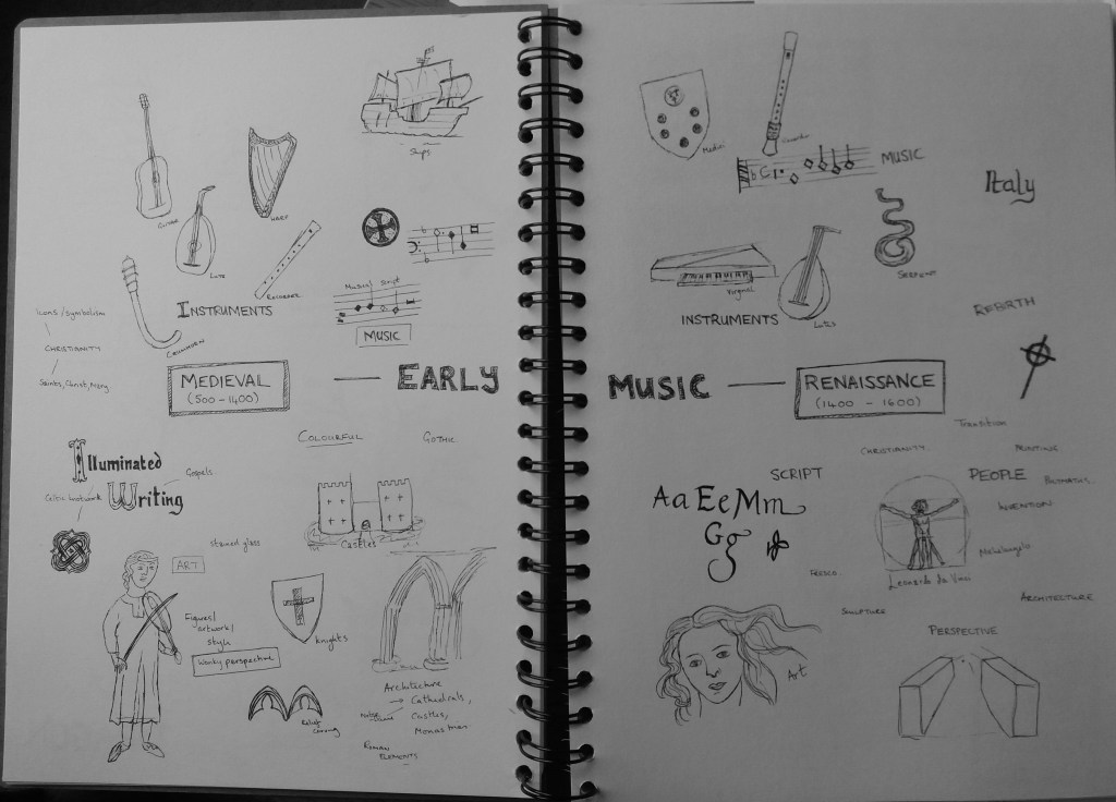
In general it was quite interesting to see the evolution of art from the Medieval to the Renaissance period. Renaissance art has quite a modern look to it, which I think is partly because perspective is depicted accurately within artworks. I think that the wonky perspective, or complete lack of perspective in Medieval artwork is a potentially useful tool to make a poster ‘look Medieval’. Medieval artwork also looks quite flat due to the lack of perspective. Both Medieval and Renaissance artwork use vibrant colours. Medieval art appears to have a more limited colour pallette than Renaissance art and this might be another useful tool in giving the poster a Medieval feel. I’ve not focussed on this for now but I think this will come out clearly when I put materials together for a mood board.
Both periods have beautiful fonts and scripts that I am keen to not just incorporate into the poster but to make a key element of the poster. I am particularly excited by the potential to include illuminated writing, which I think is more characteristic of the Medieval than the Renaissance period. It was also interesting to see that musical notation looks different in the Medieval and Renaissance periods relative to today. Some brief reading on this suggests that this was a period when musical notation was evolving. Notes have an angular, rather than rounded form, and the the muscial scripts are often elaborate and include colour, calligraphy and illuminated writing.
Based on my initial research I’m excited at the idea of experimenting with illuminated writing, wonky perspective, celtic knotwork and musical notation in the poster. I have therefore decided to focus on the Medieval period.
Mood board

I gathered together relevant colours textures and images into a moodboard. This should both help me to understand the detail of elements that I might incorporate into the poster and also to get a feel for the colour scheme of the poster.
I think that Medieval colours come out quite clearly in the moodboard – I should focus on reds, blues, yellows and greens. I was already aware of incorporating musical scripts and illuminated writing into the poster, the moodboard also made me think about patterns. In particular the use of patterns for backgrounds and borders. I think one issue with this poster will be giving the lively, colourful, Medieval feel without it being too busy and unreadable.
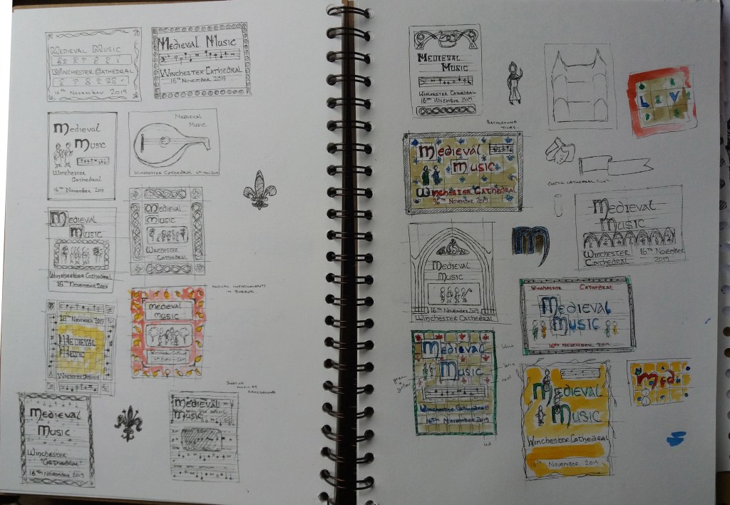
The elements that I’m thinking about experimenting with in thumbnails include: Medieval fonts and illuminated writing; musical notation; medieval people; patterns; maybe architecture – cathedrals or castles. I have rather a lot to play with.
Poster design
Before continuing I decided to run back through this section of the course and my blog entries in order to make a few notes to help me with the poster design.
Thumbnails – reduce content to it’s simplest form, play with scale, position, tone contrast, shape, the space between elements. The poster needs to be organised so that the reader can extract information from a distance – clear horizontal and vertical lines will help with this. I also know that I want the design to be colourful and flat to reflect Medieval art. I maybe need to be a bit careful to not make the whole poster brightly coloured but use bright colours in the parts of the poster that I want the reader to be drawn to.
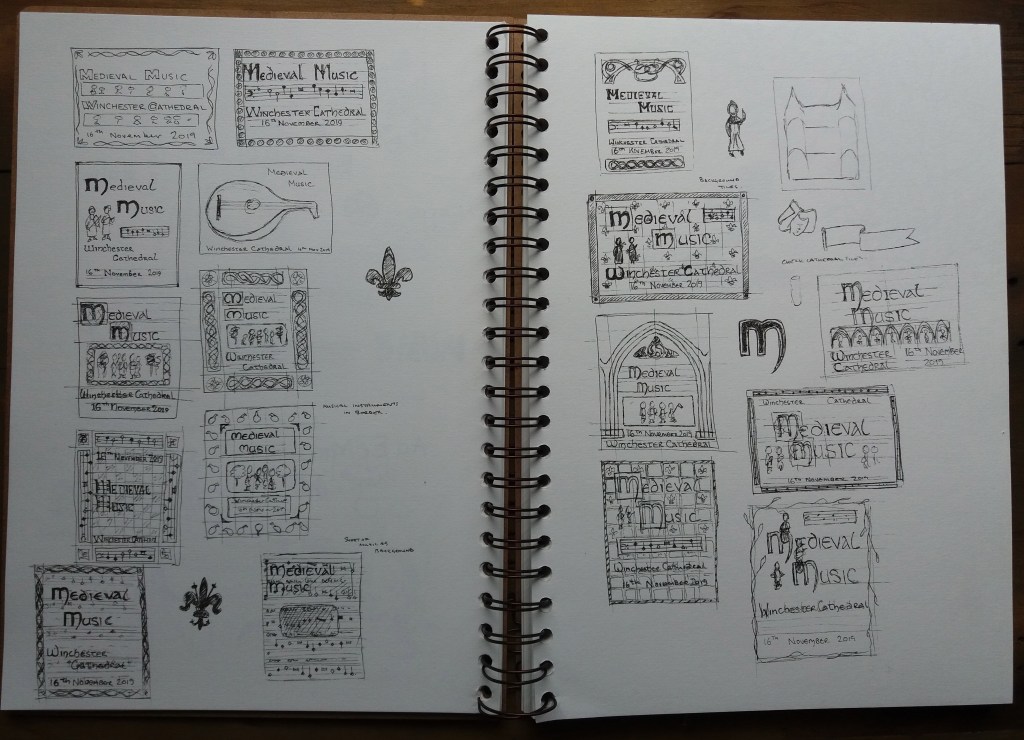
I experimented with a range of designs during the thumbnailing process. I did realise afterwards that there was some information that I had missed off – the time of the concert and how to buy tickets. I’ll rectify this at the line visual stage.
I used the thumbnails to experiment with what content to include and how to arrange it. I maybe didn’t experiment with viewpoints particularly but this is in part because I want the poster to appear quite flat to reflect Medieval art. I’m really keen that the writing is a key element of the poster because Medieval fonts are very distinctive and recognisable.
For the line visuals: one of the posters will have musical notation in the background, a border of Medieval knotwork and plain, bold writing in a Medieval font; the other poster will have Medieval tiles in the background, a small panel of musical notation and the centrepiece will be ornate writing with Medieval musicial characters playing on it. It will be interesting to see whether the latter is too busy.
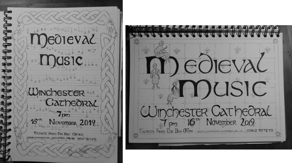
I produced two A4 roughs of my preferred two thumbnails. There is overlap between the two designs in the font used. I gradually developed this font whilst I was experimenting with thumbnails – it is an amalgamation of different medieval alphabets that I found. I think the font works well in both designs. I think that I may have gotten a little bogged down in detail for the line visuals. It was tricky as the writing needed to be included as it is a key element of the design.
With the first design, I think that the musical notation in the background works well – without the knotwork border I think that this would give the poster quite a contemporary design. I don’t like the knotwork border in the first design – it is too large and overpowers the image. The border might work if scaled down but I’m worried about it looking quite kitschy.
With the right hand design, I think that the tiles make a nice background – they were also inspired by tiles that I had seen in Winchester Cathedral, which gives a nice tie between the poster and the venue for the concert. I think that the figures in this design work well – I ‘d consider making them larger or including more of them in the final design. I think that the writing at the bottom of this poster could do with spacing out a little more as curently it appears quite cramped. I’m also undecided whether to have a plain border or ornament this is some way.
I showed both designs to friends for a little feedback. In general the right hand design was prefered. The most popular elements of the designs were the figures, tiles and musical notation. I may consider trying to integrate the musical notation into the right hand design.
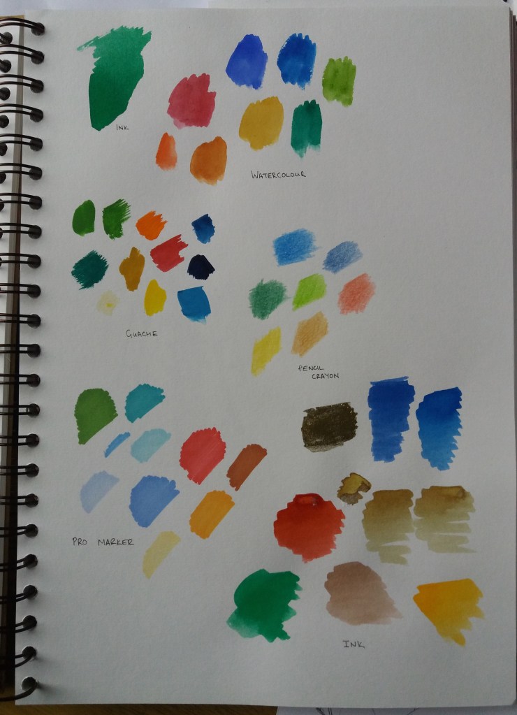
At this stage I went back to my moodboard in order to think about colour. I decided to limit my colour pallet to dominantly reds, blues and pale browns with small additions of vibrant greens and yellows. This seems in keeping with the moodboard. I also experimented with some of these colours on my thumbnails from earlier.
I also experimented with different materials to try to decide which would work best for colouring the final design. I did consider making the poster in adobe illustrator but decided that I wanted to try to use more ‘medieval style’ techniques. Of the different media that I tried I really liked the vbrancy of using ink. I think the vibrancy is reminiscent of the bright colours used in medieval illuminated manuscripts.
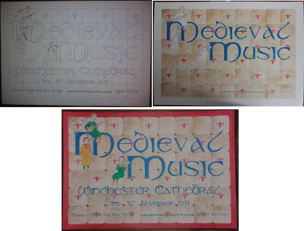
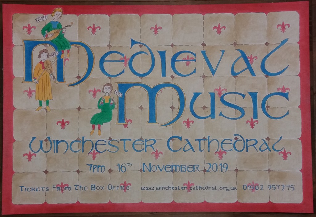
Finally I worked on the final design, which was produced on watercolour paper. I started with a pencil outline design, then went over this with black ink and finally coloured the design in ink.
I was quite concerned when I started painting the tiles with the pale brown ink that I couldn’t produce a smooth gradation in colour across the individual tiles. Ultimately I think that this has given the final design some texture. I think that the final design might have worked better with a blue, rather than a red border. I think the red border makes the poster look a little disjointed. I also think that the writing towards the bottim of the poster should be larger in order to be more legible. I had to modify my font for writing the web address. Medieval fonts mix up what we would currently consider capital and lower-case letters – which is problematic when writing a web address. I think that I could have been more bold with the figures and made them bigger. I also wonder if I should have used musical notation for the border of the poster – although this might have made the poster too cluttered. All in all I think that the poster meets the brief and the colours, font and flat design make it instantly recognisable as having a medieval theme.