The brief
The brief for this assignment is to create two ‘point of sale’ displays for a supermarket that promote summer and autumn fruit and vegetables. The images will be used within a campaign to promote a range of seasonal foods. The supermarket want to promote a notion of the quality of their food. The final reproduction size will be 12 x 12 inches.
The aim of the assignment is to consolidate the skills and knowledge gained from the projects and exercises so far, with a focus on research and gathering and evolving ideas.
Review of feedback from previous exercises and assignment
An important area of feedback from the exercises and assignment for part 1 was that I was too shy in documenting my activity in my learning log. My tutor suggested that I should include more of the messy work in progress that shows how I arrived at the final image and that I should spend longer reflecting on my own work and that of other practitioners. I have made improvements during the exercises for part 2; however, there is definitely a need to include more of my thoughts within the learning log. This is something that I think would be much easier to do within a physical learning log, rather than posting blogs online. Towards the end of the part 2 exercises I have changed the way that I approach the learning log blog. I have started writing the blog entries as I work through an exercise, rather than documenting the exercise at the end. This way I am less likely to miss writing down some of my thought processes and ideas.
I also need to find the time to reflect and write about other people’s work that I have been looking at. I do look at other illustrators’ work but rarely note this in my learning log. Part of this is that I don’t want the learning log to be something that I do simply because it is a requirement for the course. However, I did learn a lot about approaches and techniques in the first exercise of part 1 – analysing and trying to draw in the style of other illustrators. Therefore this is something that there would be value in me spending more time doing in the future. Maybe it would be a way of also developing my sketchbook practice – regularly looking at other illustrators’ work and having a go at creating images in their style.
A second area of feedback was that I should continue to keep mixing media and experimenting with different materials. I have tried to do this within part 2; however, I have a definite affinity for materials with which I can make accurate drawings and am uncomfortable with more ‘informal’ materials. I am not quite sure how to get away from this, some materials I find really frustrating. Maybe I should commit myself to doing a short course in these – to force me to learn about them.
Generating initial ideas
Based on my experiences in previous exercises, a really good way for me to start generating ideas is to brainstorm words and pictures to generate a lot of ideas quickly and not worry too much about the quality of my sketches. Then to flesh these out with a bit of colour so that I’m starting to think about what colours are associated with the themes.
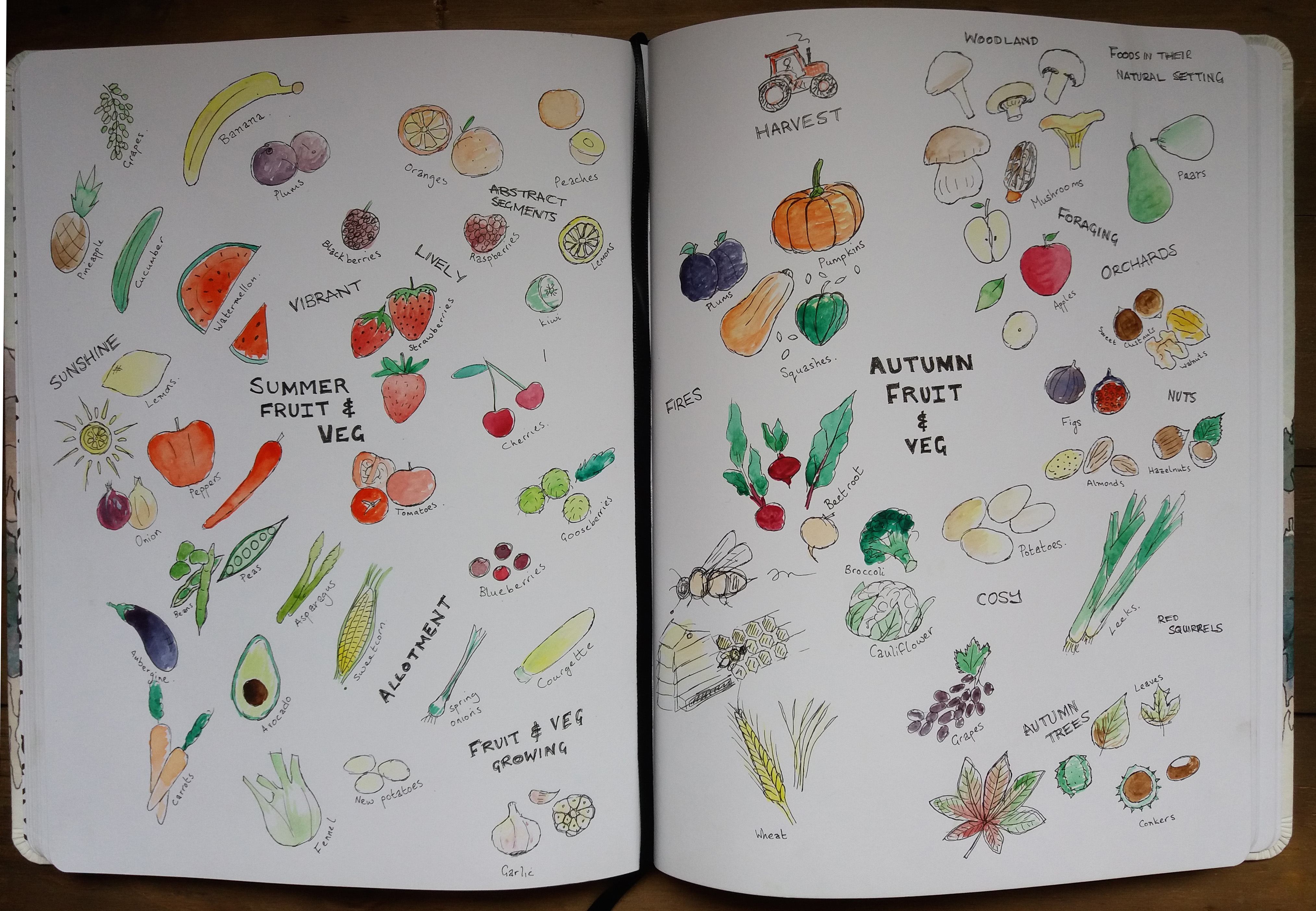
I found this brainstorming exercise useful. It strikes me that the colour schemes of both the summer and autumn fruit and veg are currently surprisingly similar. This is something that I probably want to consider carefully going forward as I want the summer and autumn displays to be distinct.
I think that mushrooms, pumpkins and squashes are very evocative of autumn. These vegetables may also help to give the display a feeling of ‘quality’ by making use of some more unusual varieties of the vegetables.
Before I did this brainstorming exercise I was thinking of trying to stick with British varieties of vegetables due to current awareness of food miles etc. However, the vegetables in the image that I find most summery are the strawberries, watermelon and citrus fruits, many of which aren’t grown in the UK. I’m going to continue thinking about the seasons of summer and autumn before deciding which vegetables to use.
Whilst brainstorming I also started to think about possibilities for the overall design of the piece. I have previously produced a design for a supermarket bag with fruit on it. For this bag I went for a geometric design. However, I’m wondering if illustrating fruit and vegetables in some sort of natural setting may help to provide a feeling of quality.
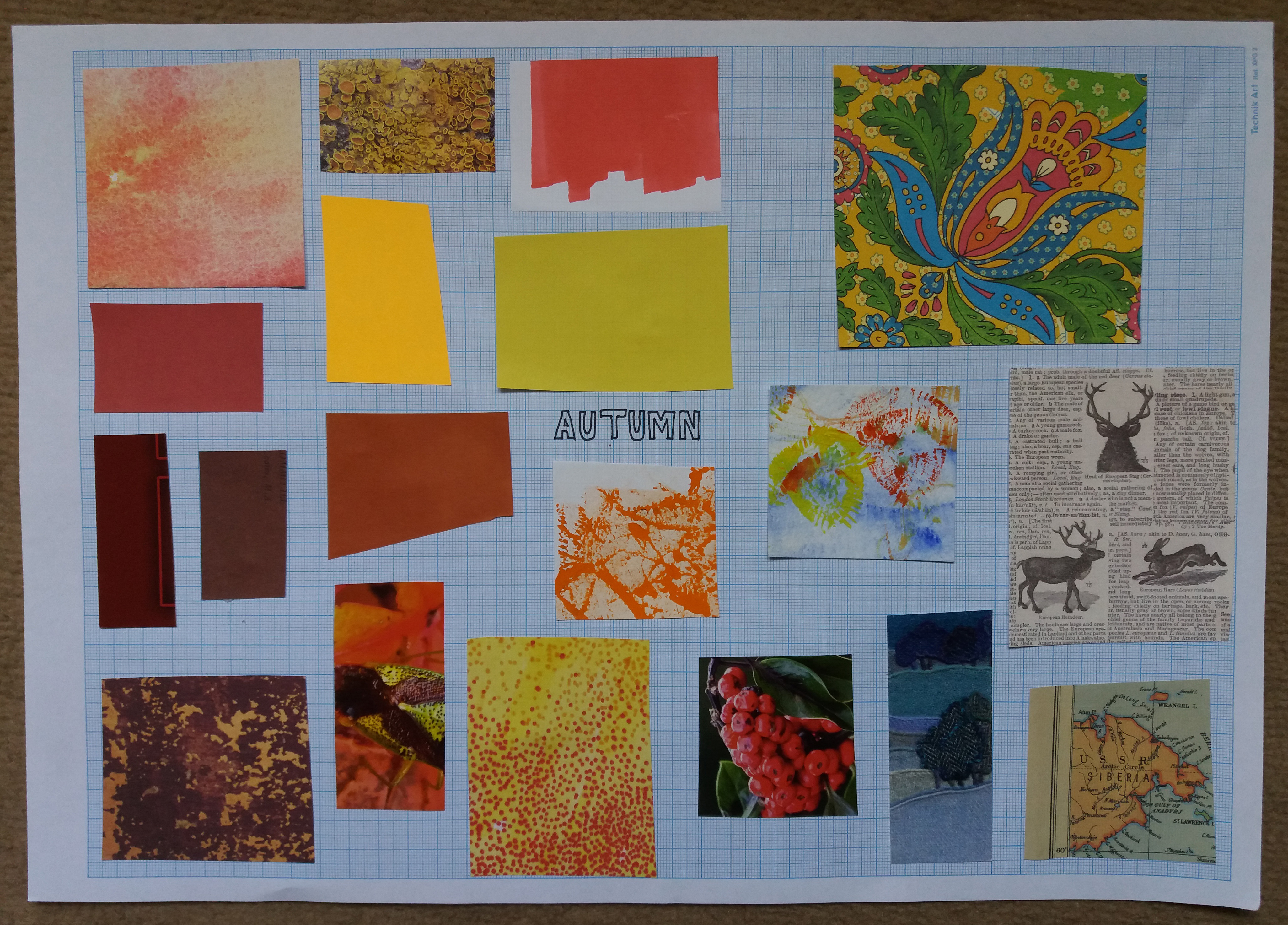
I decided to continue my brainstorming thinking about what objects, themes and colours I associate with summer and autumn.
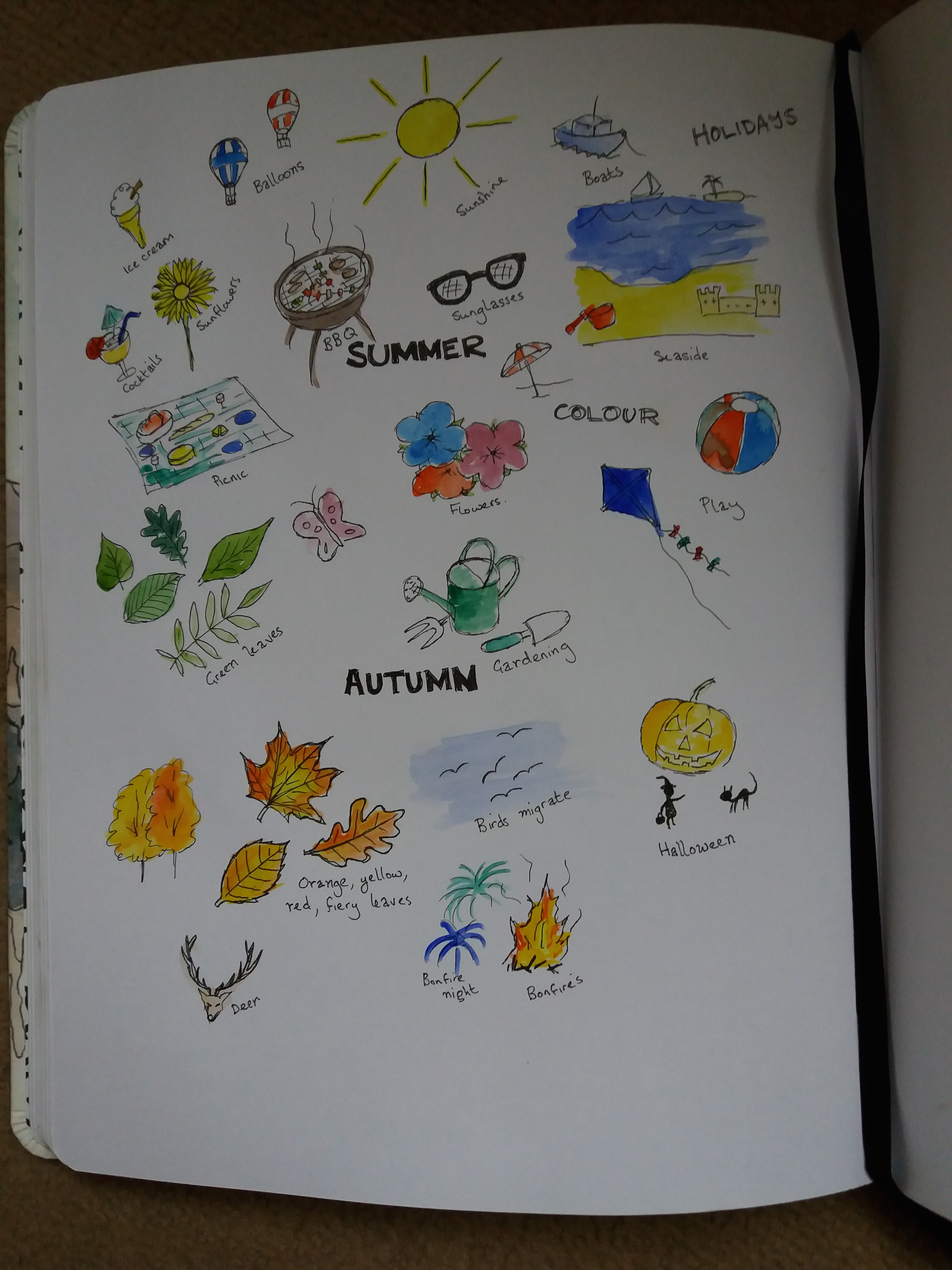
The main thing that I am taking from brainstorming summer and autumn is to use bold primary colours in the summer illustration – blues, yellows, red, greens; and lots of yellows, reds and oranges in the autumn piece. I think that the summer piece should have a sense of fun and energy and play; whereas the autumn piece is more about cosiness.
I was a little undecided at this point as to whether it is a good idea to continue researching general themes e.g. summer/ autumn, or to begin the observational drawing side of the assignment. I think that it will be beneficial to start the observational drawings alongside collecting together moodboards on the topics of summer and autumn. I think that doing these things simultaneously may help me to start considering possibilities for the composition and materials that I want to use in the final piece.
I have decided to make my autumn point of sale display about Wild British Mushrooms. I think that this vegetable is not only seasonal but offers fabulous textures and has the feel of quality that the supermarket want to promote. I found deciding the fruit or vegetable for the summer display more challenging; however, ultimately I decided to continue the British theme by using Fresh British Strawberries.
Objective illustrations
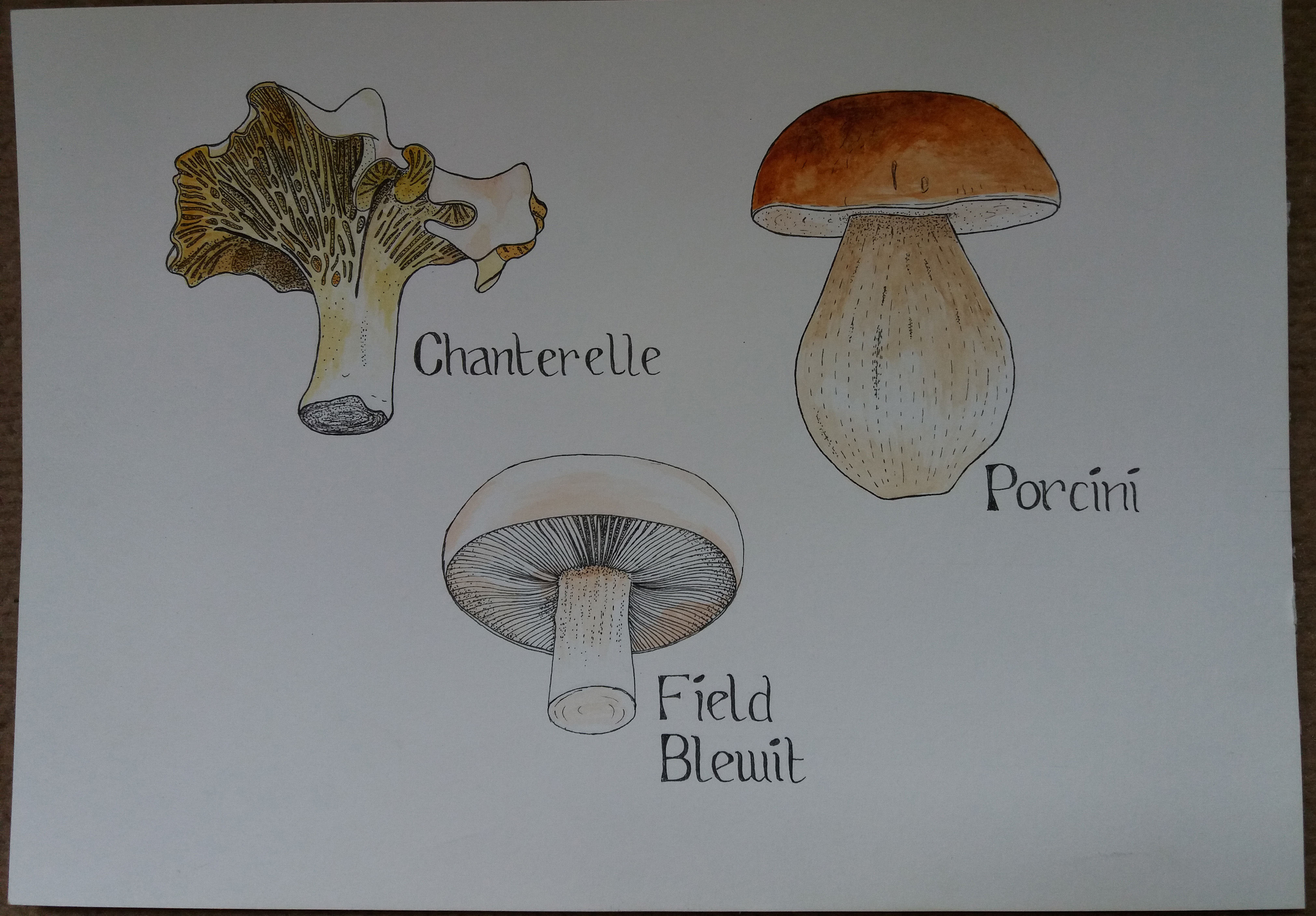
My next step was to select different types of mushroom to sketch. Naively I thought that most UK mushrooms grow in autumn; however, I discovered that different mushrooms grow in different seasons. So in the interests of accuracy I selected chanterelles, ceps (porcini) and field blewits… Disappointingly this meant not illustrating the rather wonderful looking morel mushroom.
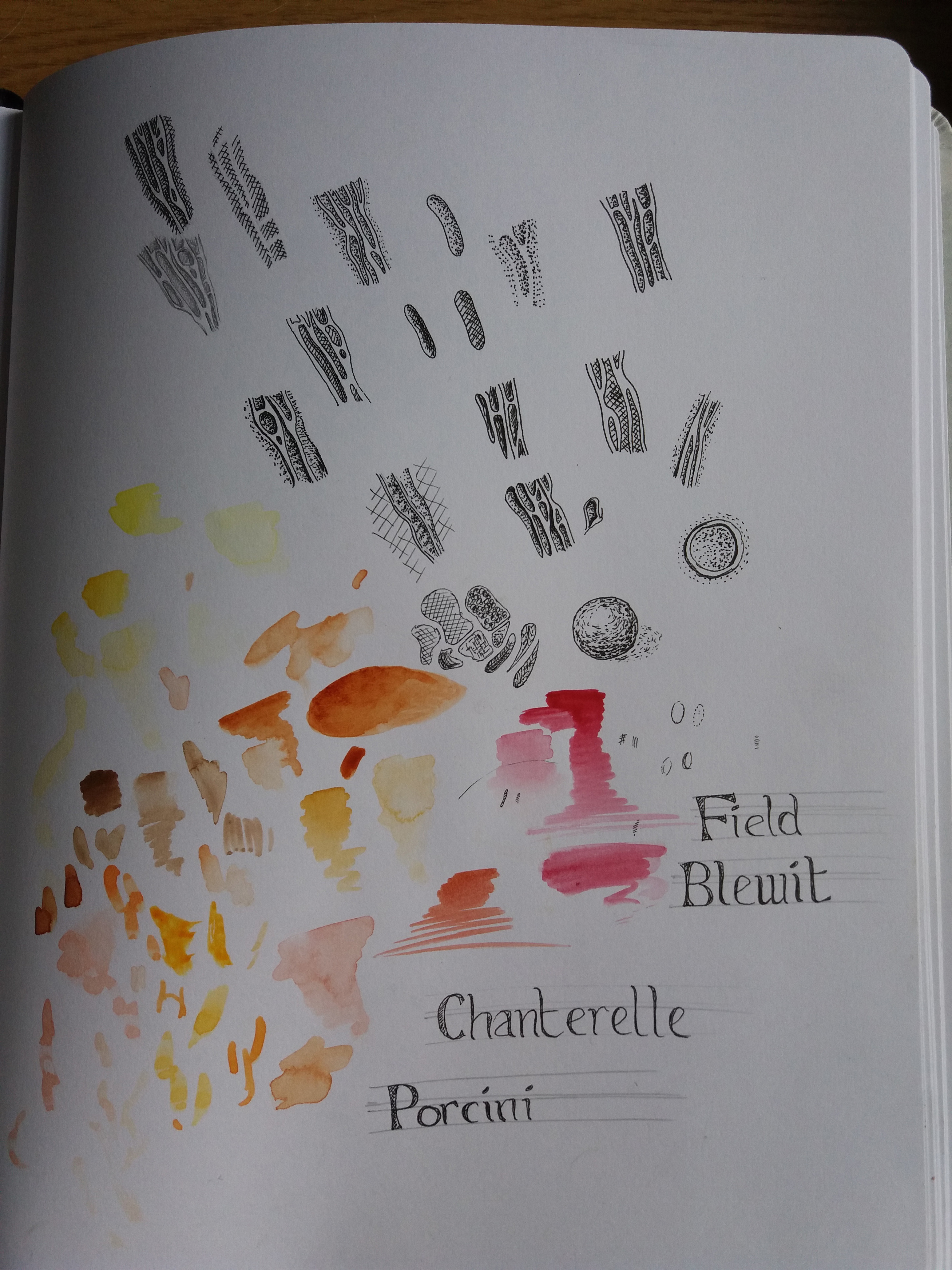
I initially sketched the mushrooms in black fineliner. It took a little experimentation in my sketchbook to work out how to represent some of the textures of the mushrooms, particularly the irregular gills on the chanterelle. I experimented with various types of hatching, stippling and using different strengths of line. Ultimately I found that I got the most satisfying results using solid lines and stippling.
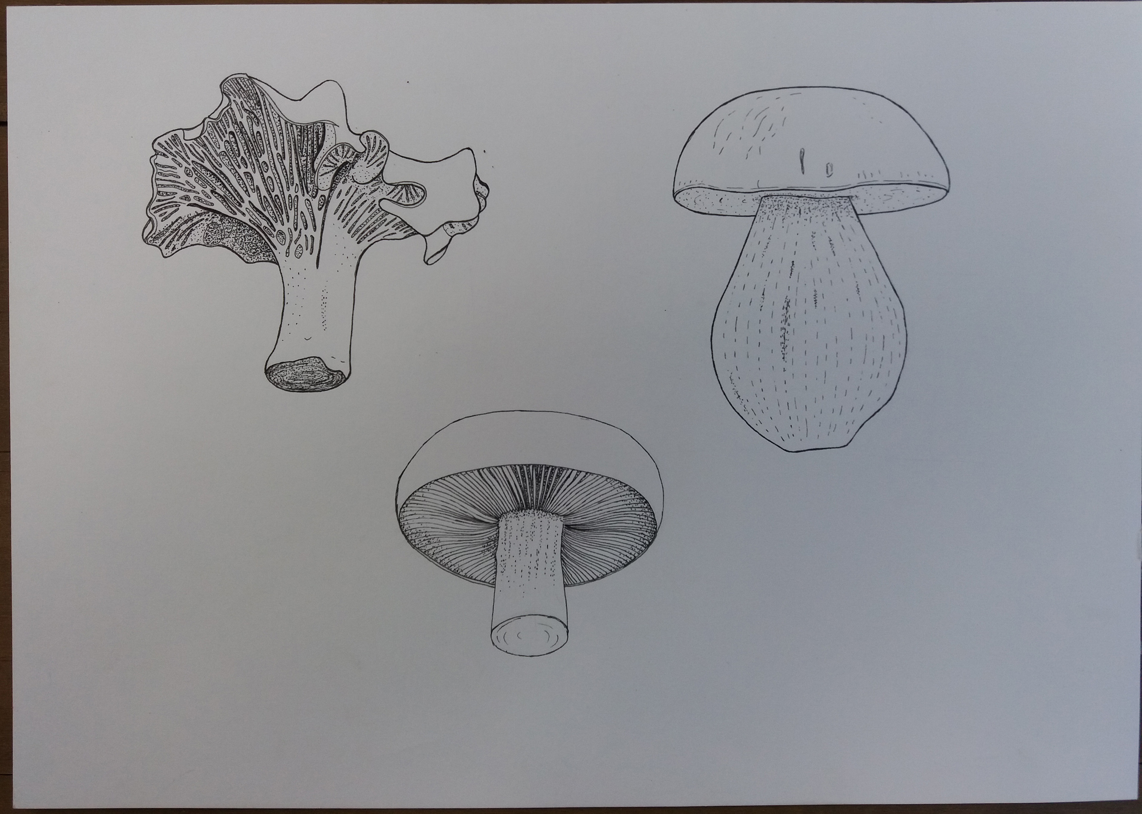
I decided to add a little colour to the image using watercolour. I think this helped to give the images a little more depth. I tried to keep the colours vibrant but within the realms of what is realistic for mushrooms. This is something that I will need to consider for my final piece – how to make sure the overall images isn’t dominted by brown.
I’m satisfied with the results for the chanterelle and the field blewit. I think the Porcini isn’t a particularly interesting image. Therefore for the final piece I’ll probably concentrate on the chanterelle and the field blewit.
I thought that drawing strawberries was going to be easy relative to the mushrooms but in fact found quite the opposite. I decided to make the illustrations in the same style as the mushrooms – using black ink and then adding some colour. The major difficulty that I have found with the strawberries is trying to accurately represent their skin. I found that it didn’t work trying to draw the pores of the strawberries using lines (see sketchbook); therefore I tried to use shades of colour.
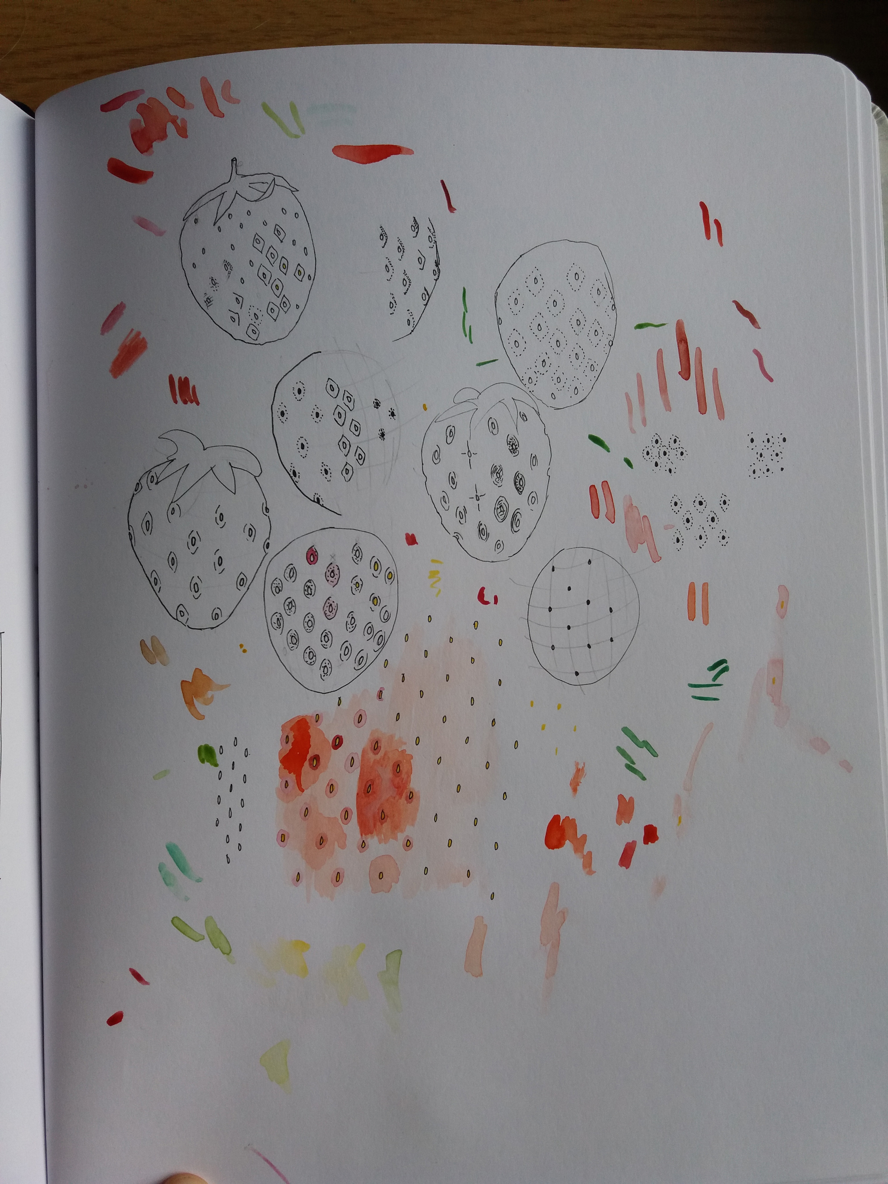
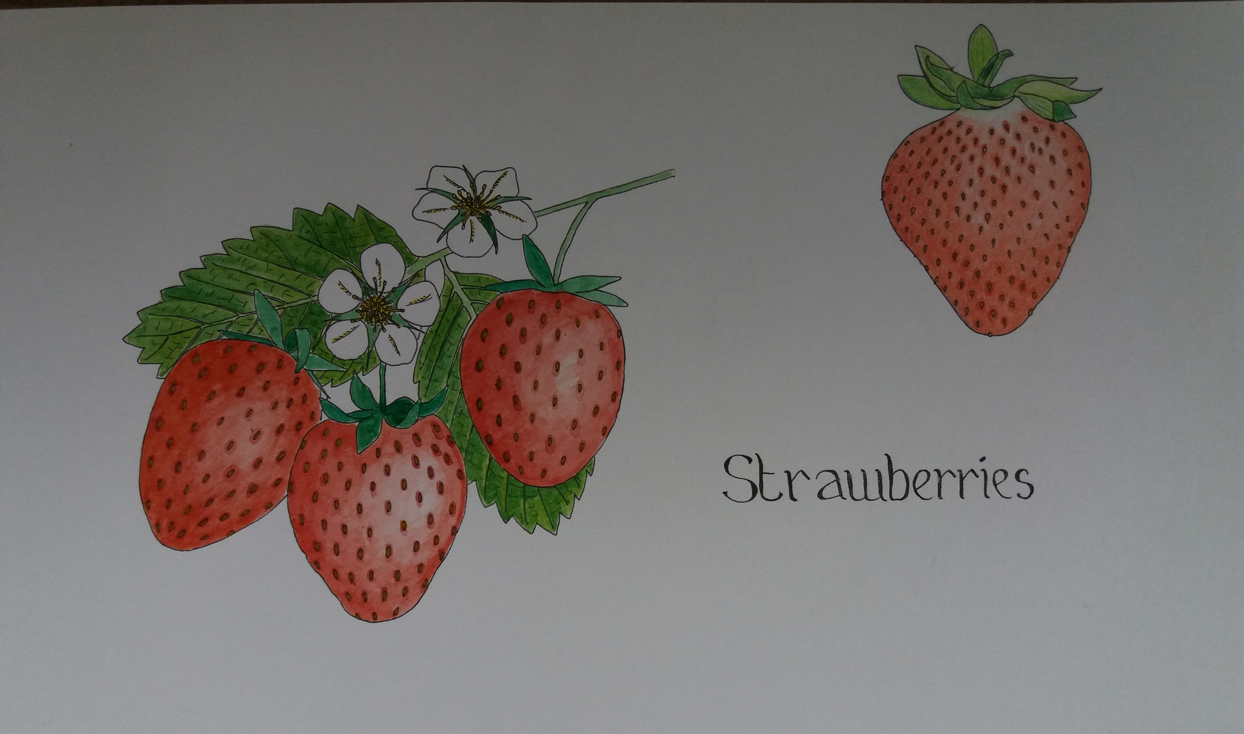
I am not very satisfied with the results. The left hand image in watercolour is quite bold and the strawberries have volume; however, I haven’t managed to accurately represent the skin. I decided to try using pencil crayon to better represent the skin (right hand image). I did manage to capture the texture a little better using pencil crayon; however, the image is quite flat and lacks vibrancy. In the interests of time I’m going to move on to thinking about the final piece. If I have time I’d like to try using some different techniques and media to try to better represent the strawberries. I do like the strawberry flowers and am keen to try to incorporate these within the final piece.
When I drew the mushrooms I had to use photographs of the mushrooms. With the strawberries I used a combination of photographs and real fruit. I noticed that I found it easier when drawing real fruit because it is easier to analyse and explore the detail.
Design and composition – Summer
I am now going to start thinking more about the colour schemes, textures and media that I will use for the final pieces of work, before moving on to thinking about composition.
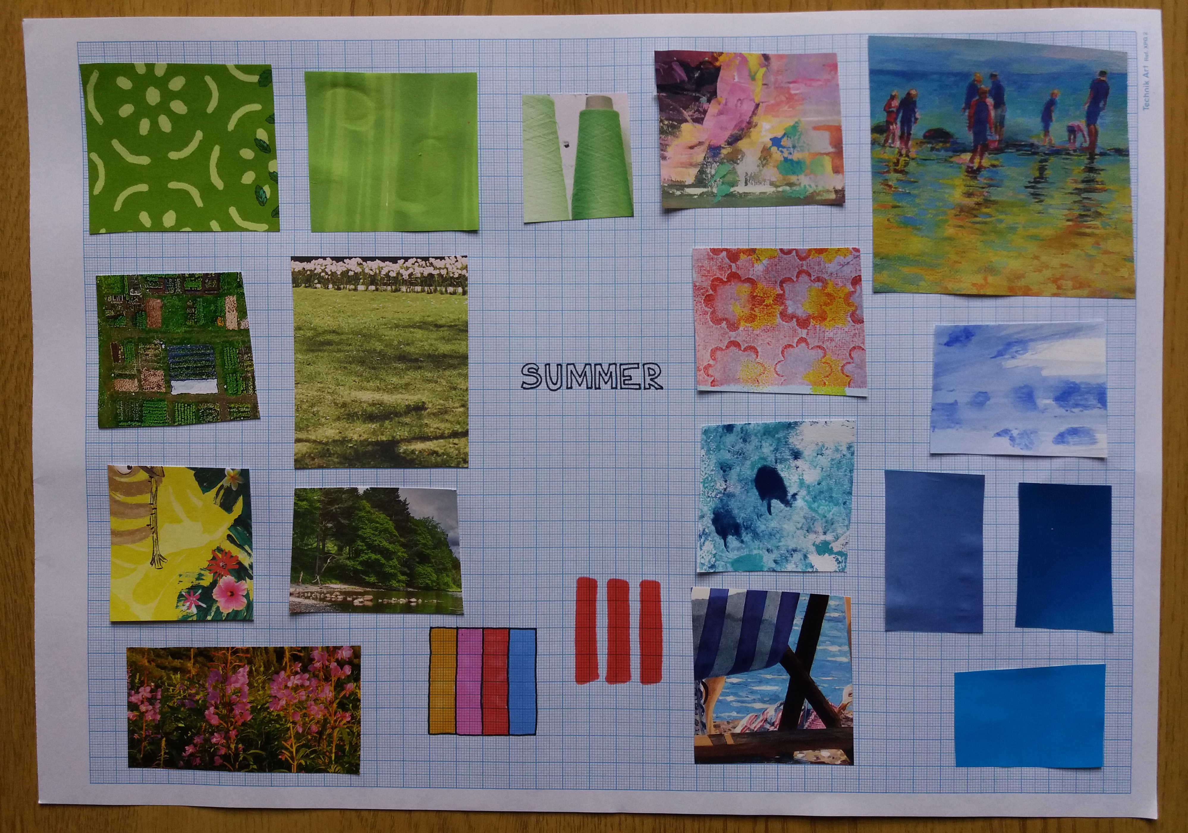
The moodboards helped me to think about the colours and textures that I would like to use in my final images. I was already aware from brainstorming autumn and summer about the colour schemes that I would like to use.
I quite quickly hit upon a fresh idea that I really liked – incorporating the patterns of deckchairs with a simple traditional British postcard composition into the summer design. I therefore googled examples of deckchair stripes and postcards and noted some of the key features of both in my sketchbook. This also made me think about the typeface that I’ll use on the final piece. I like the simple typface used on some of the cards that is similar to the iconic London Underground ‘Johnston’ typeface. I like the idea for this design it will be really simple and bold. I think it will work well for a point of sale display.
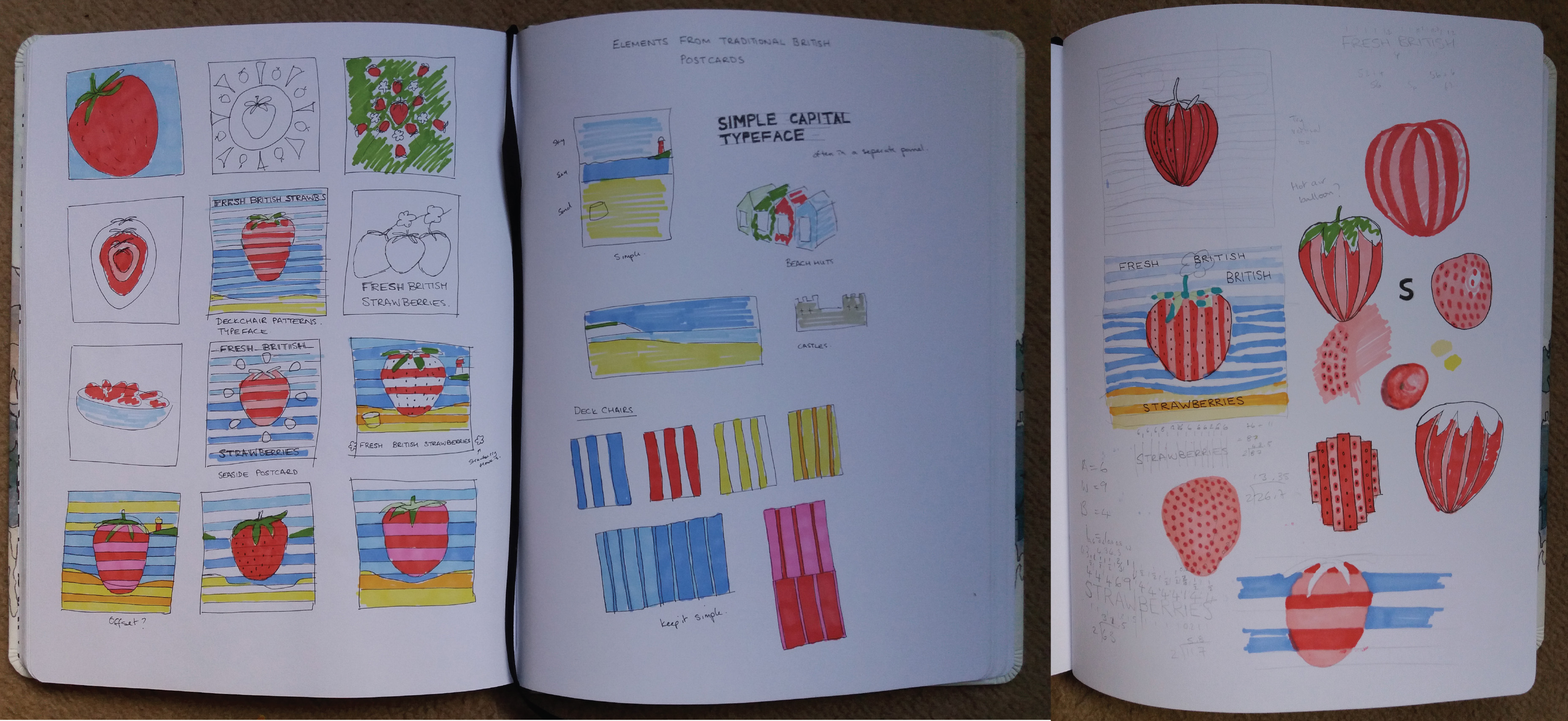
In my sketchbook I played around with different designs for the overall composition and also for how to represent the strawberry. In a previous exercise about using black and white I had had a play around using simple bold colours. I decided to use a similar technique here but with stripes – a simple background image that uses primary colours. In the end the composition of my final piece is a combination of the image from a previous exercise and images that I found researching old seaside postcards.
I decided that I would like to make the fruit really large and central in order that it can be seen from a distance. I spent sometime thinking about how to represent the strawberry. Should I keep the stripes in the same orientation as the background seaside scene? Should the lines of the strawberry be straight or should I try to gve the strawberry some volume? In the end I decided to keep it all very graphic.
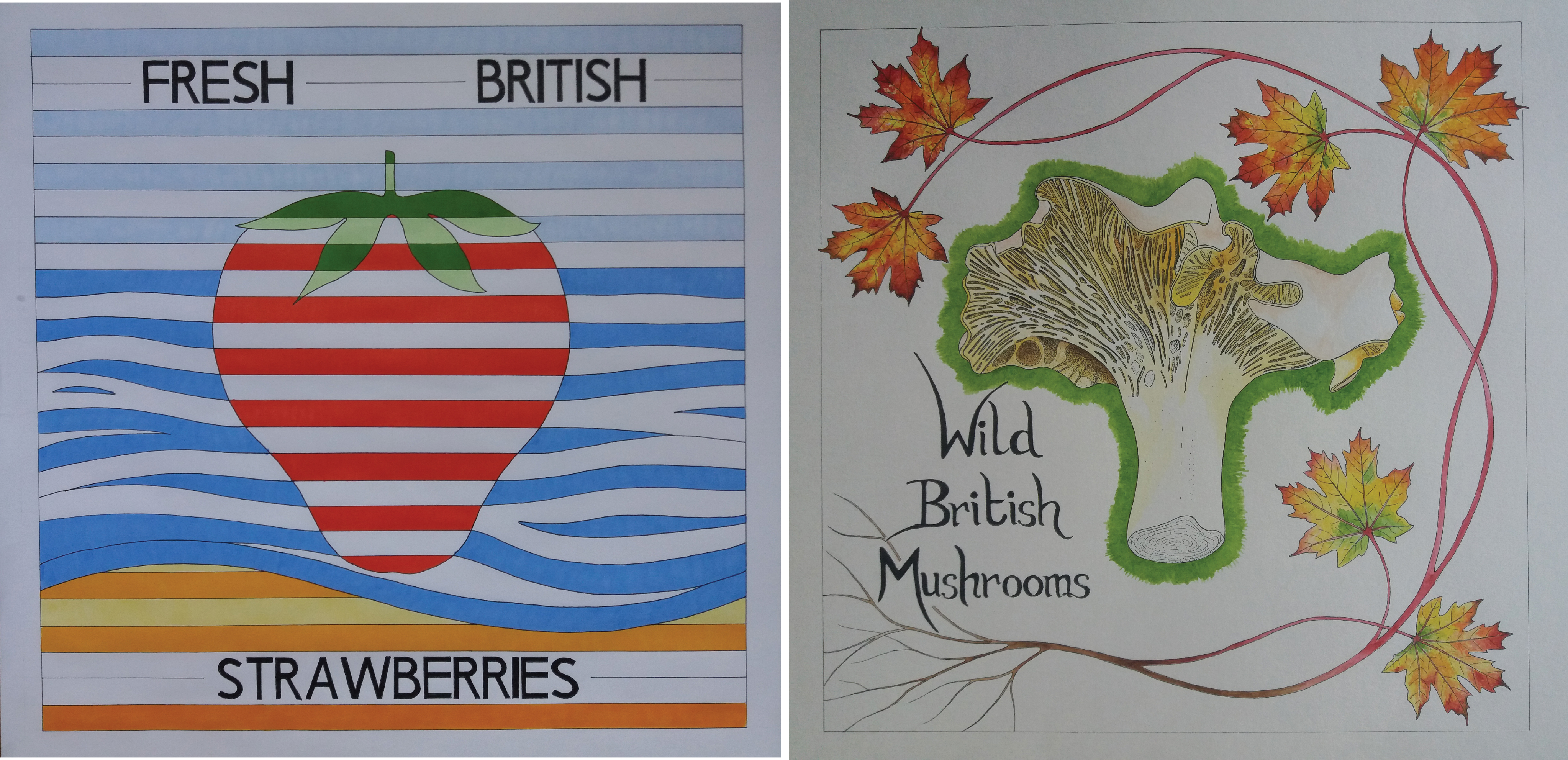
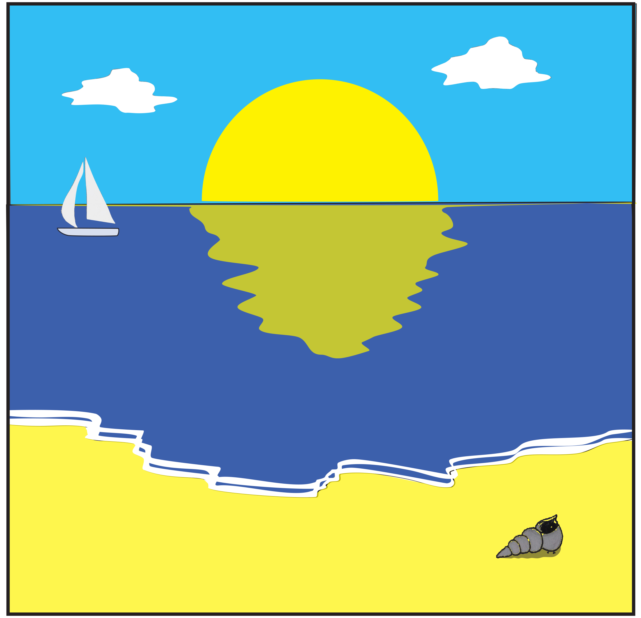
Final work – Summer point of sale display
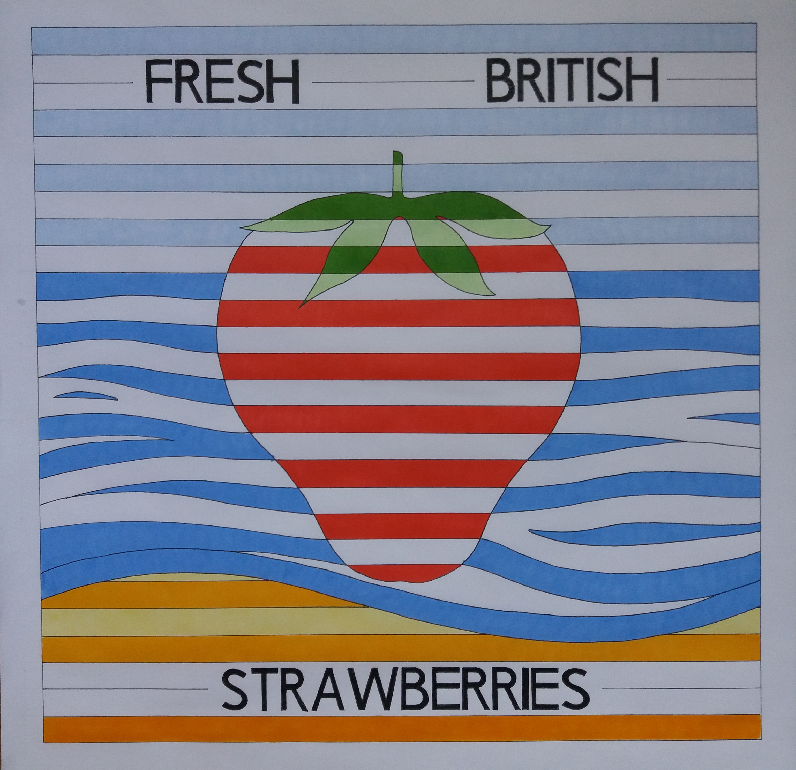
The final piece was produced in black fineliner and marker pen. I think it is a fun bold design that captures summer really well. I had intended to colour the strawberry in red and pink stripes. However, whilst I was making the illustration I realised that I quite liked that the red and white stripes remind me of old fashioned bathing suits. I think that the offset stripe pattern and curving the stripes to represent the sea works well. I’m unsure that I made a good choice of font. My decision was based on some of the fonts that I had seen on old postcards, however, it is maybe a bit austere set against an otherwise fun design. I’d consider either removing the text, or else choosing a more rounded, fun font.
I’m not sure that this final design makes good use of the objective drawings that I made earlier. I also became concerned that I was meant to represent the fruit in an objective way in the final piece. However, rereading the brief this is not stated, although there is an implication that maybe this was wanted. In future it would probably be sensible to ask for clarification on the brief when there is ambiguity. All in all, I’m very pleased with this final piece.
Design and composition – Autumn
I struggled with deciding upon a composition and colour scheme for the autumn mushrooms. I decided to focus upon a single mushroom because the display is for a supermarket and so is likely to be viewed from a distance. I chose to illustrate the chanterelle because it’s texturally the most interesting of the three mushrooms that I made objective illustrations of earlier. One of the tricky elements of this design is the colour scheme – the mushroom is very pale and combined with the reds and browns of autumn this could make for quite a brown design.
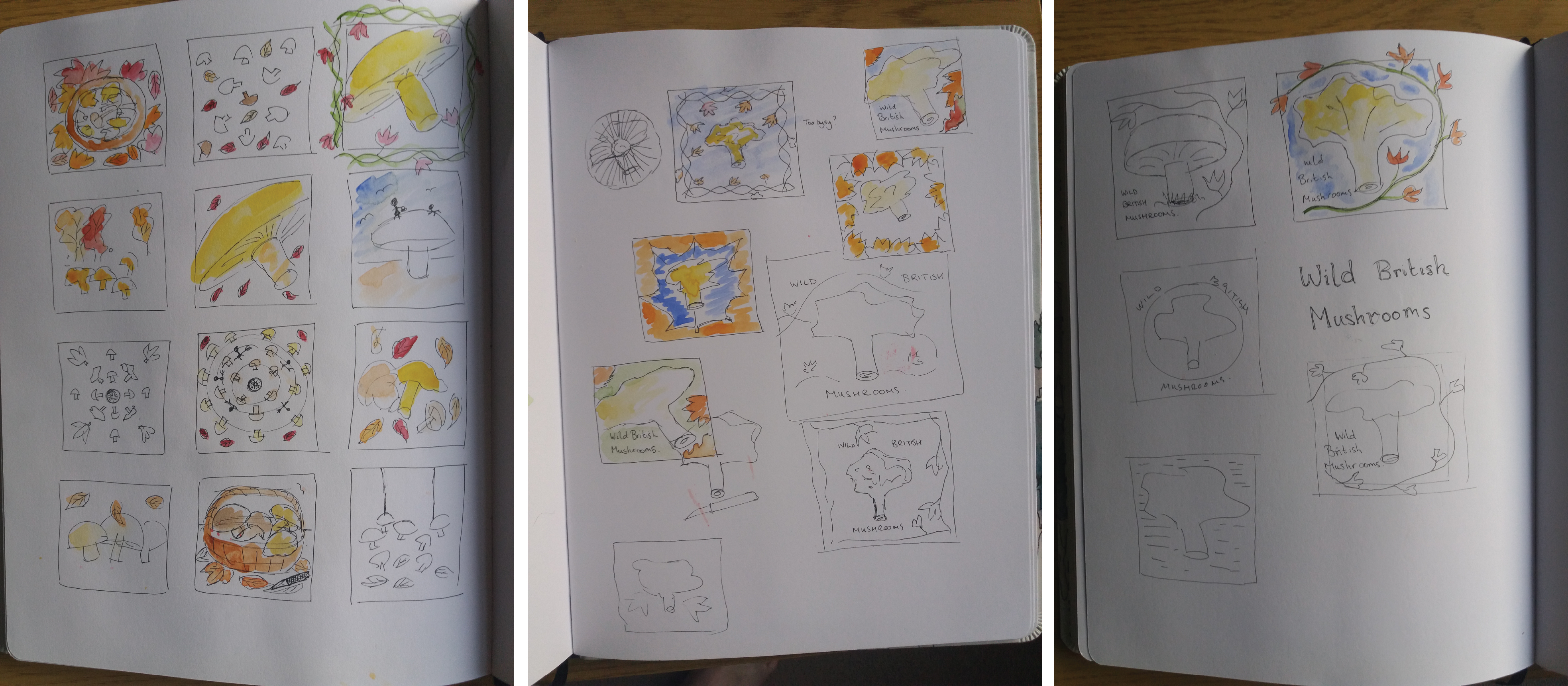
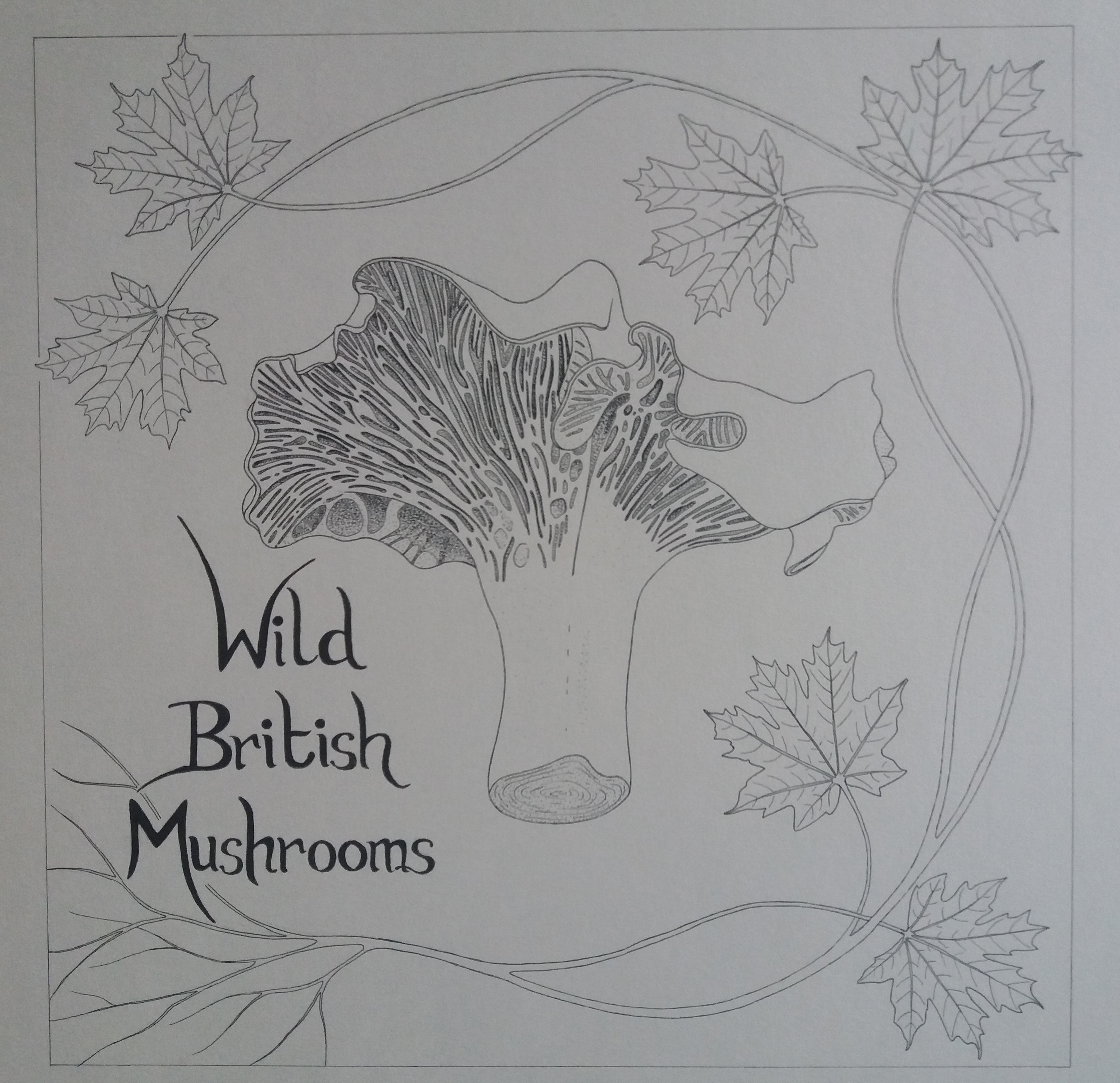
I was genreally pleased with the design in black and white. Interestingly, I drew the piece without the outer border and once I added this border I felt that the design looked a little cramped and also that the writing is in a slightly odd position.
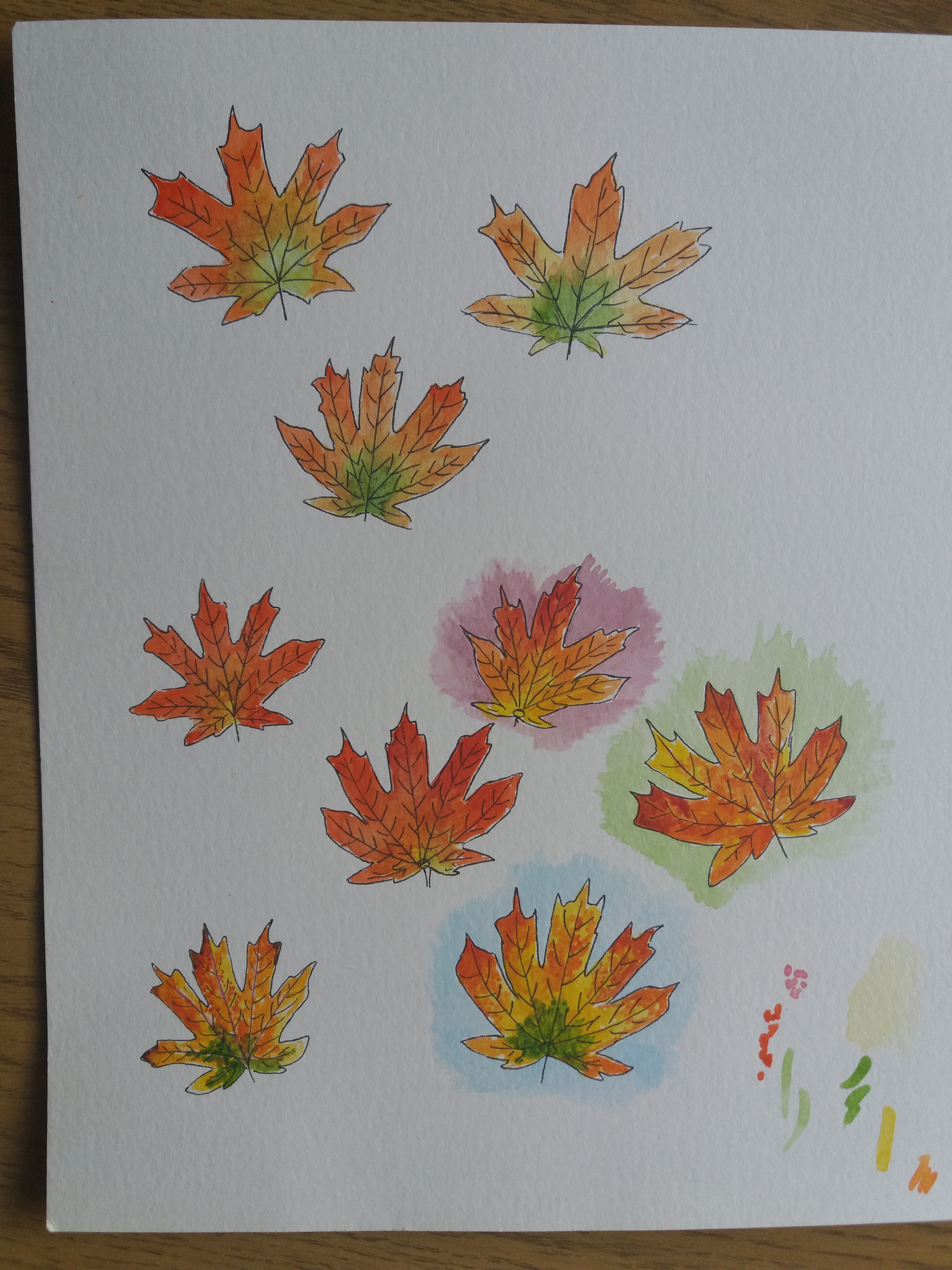
I experimented with how to paint the autumn leaves and also with different background colours to try to brighten up the design and make it more eye catching as a point of sale display.

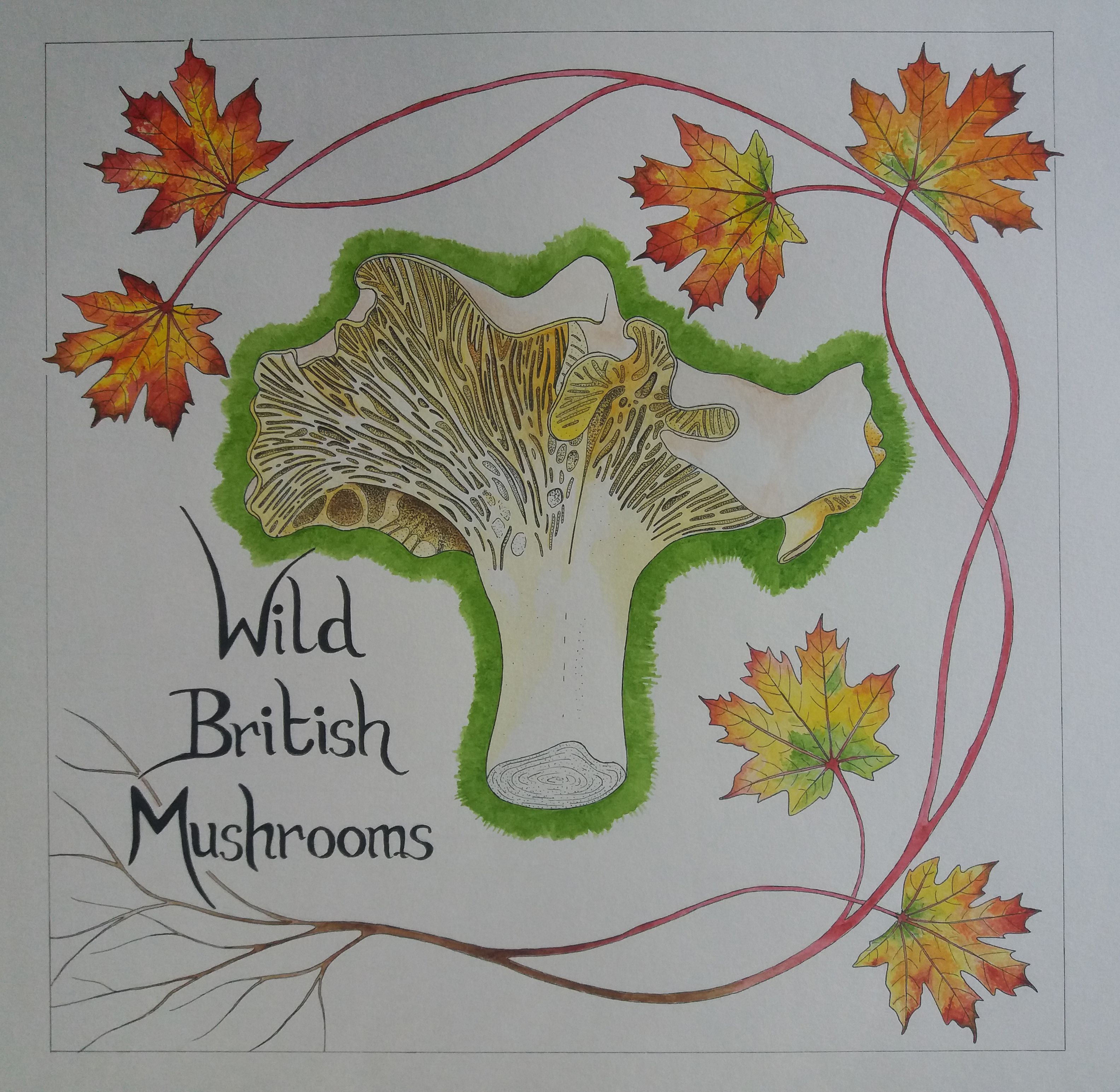
In general I like the design of the final piece. I think that it represents autumn well and emphasizes quality, which was part of the original brief. I’m really pleased with the leaves; I did struggle a little painting the mushroom. I think that it worked well to use ink and watercolour. However, I’m unsure that it was a good idea to add the green around the edge of the mushroom. Maybe I should extend this further and have it fade out. My summer strawberries and autumn mushroom designs are very different from one another in style but I think that this helps to emphasize the different seasons. I have tried to tie the two designs together with the text, albeit this was not required as part of the brief.
