This exercise is about thinking about appropriate visuals for different age groups of children. The exercise begins with an exploration of the different styles used for different age groups. Then choosing words and characters and brainstorming images appropriate to different age groups.
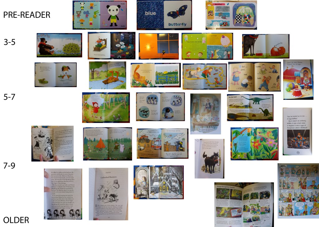
I began by taking a trip to my local library in order to look at a wide range of children’s books. The books for younger readers are very strongly character based. The illustration is often just of the character, in bold colours, with no surrounding scenery. In contrast for 7-9 year olds there is often detailed and complex scenery that can be explored. For older readers, there is a move away from images, towards text, images are often in black and white and decorate the text, rather than depicting the text. There are exceptions to this with formats such as graphic novels. It wasn’t always obvious to me when looking through the library books, what age range the book was intended for, I guess that varies among different children.
For the next stage of this exercise I chose to brainstorm illustration for the word ‘wild’ for pre-school readers (3-5 years) and for established readers (7-9 years).
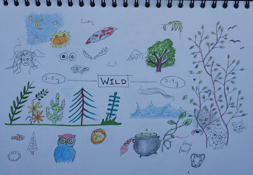
I began with some brainstorming of ideas around the word wild. Many of these came out with natural themes of plants and animals. It doesn’t come across well in the images that I tried to keep the images for the younger age group fun and not scary.
For the next stage of this exercise I’m going to introduce the character of a lion. I’ve chosen this as it came up in the previous brainstorming exercise.
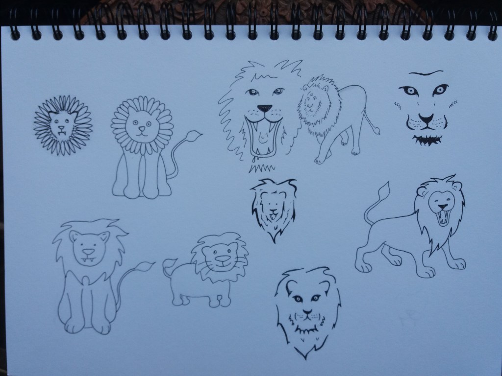
I drafted some different lions. Those towards the left hand side of the pages are aimed at the 3-5 year old audience; whereas, those on the right hand side of the page are aimed at the 7-9 year old audience. For the younger audience, the lions are quite cute; whereas for the older audience they’re showing some signs, such as teeth, of being fierce beasts. I’m contemplating experimenting with digital collage for the younger audience.
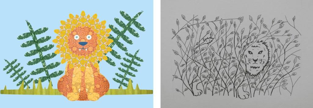
The next stage is to create an image of the animal that also communicates the word ‘wild’ and making sure that there is consistency in style among the character and different elements of the image. I began with the image for 3-5 year olds. I decided to make this in digital collage using 1970’s wallpaper swatches. I was conscious with this image to make the character dominant and keep the background quite simple.
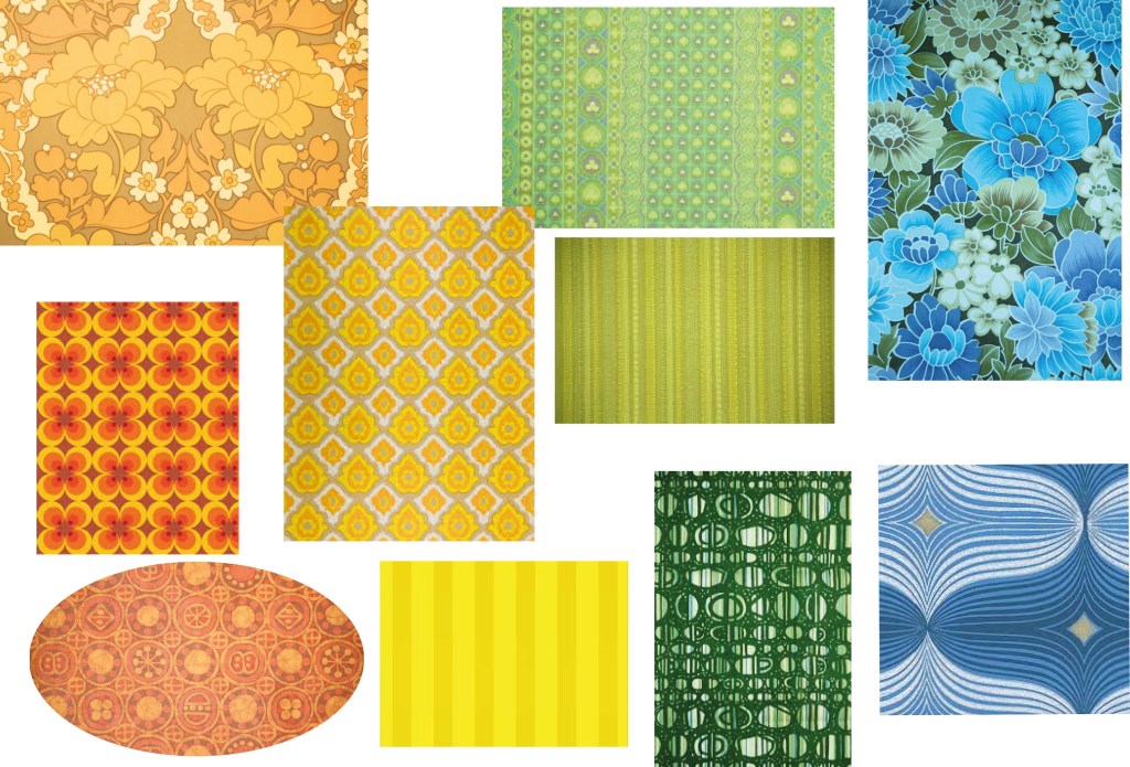

I’m really pleased with this image. I think that it’s simple and effective. Maybe I could have adopted a wilder pose for the lion – but I think his staring eyes and teeth give him a certain wildness. It was relatively quick and effective to make the image using digital collage.
For the next image I’m going to make it in the black and white style used in reading books for older children. I’ve decided to go for the 9+ age range, rather than 7-9 year olds. From my initial lion sketches, the image that most jumps out the page at me is the top right image of a lions face, so I’m going to develop an image in this style.
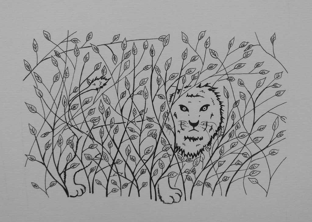
I wonder if my image for older readers is a little complicated, when compared to some of the examples that I looked at earlier. I think that the image lacks a certain liveliness; maybe I should have had the lion in a more dynamic pose. I think it’s quite sad that a lot of books for older readers lack colour illustrations.
