
The brief for this exercise was to produce a series of illustrations for packaging to be used for a range of organic biscuits for children. There are three varieties of biscuit – raisin, choc chip and ginger. Each illustration should feature an extinct animal interacting in some way with the biscuit. Full colour drawings need to reflect the flavour of the biscuit.
I began by doing some market research into biscuits aimed at children. Such packaging is typically brightly coloured, with cartoon animals and fun font styles. Some interesting designs had transparent areas, where you could see through to the actual biscuits, that were integrated with the illustration e.g. the transparent area was within the animals mouth. As well as appealing to children, many of the packages also had something to appeal to parents. For example, by including some nutritional information on the packet.
To narrow down the brief a little, I have decided that the packaging should be colourful with a fun font and a cartoon animal or animals interacting with the biscuits. I’ll include some nutritional information for adults, alongside the word ‘organic’ in order to try to make the biscuits appear wholesome. The colours of each packet will reflect the flavour.
I began by thinking about the colour of the packets. Raisin might be purple, pink, dark, pink or red. Ginger could be oranges and yellows. The most obvious colour for choc chip is brown but this isn’t very bright and appealing, so maybe, reds, blues, purples, greens – there isn’t an obvious clour associated with this flavour.

I began by exploring and brainstorming different types of extinct animals. This also made me start thinking about how the biscuits might be incorporated into the image. I wondered about whether the packets could help tell the story of how the animal went extinct e.g. sailors stealing biscuits from dodo’s nests, biscuit asteroids wiping out the dinosaurs. This might have a little educational value that could appeal to parents. Alternatively the animals might be playing with the biscuits e.g. pterosaurs ‘bombing’ with biscuits, pleisiosaurs playing ping pong with biscuits etc. Alternatively the biscuits could be part of the animals anatomy e.g. biscuit ammonites. In this part of the exercise I was colouring with felt tip pens. I think these might be appropriate for the final image – childish and brightly coloured.
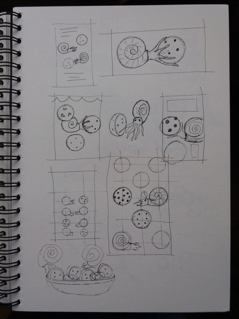
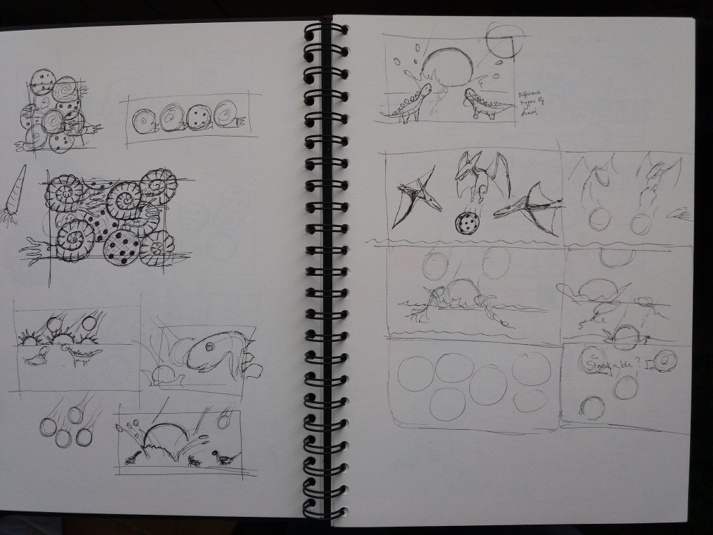
I decided upon using pterosaurs, ammonites and dinosaurs for my designs. I began by thumbnailling the ammonite design. I tried having amonites catching biscuits, or being confused by floating biscuits. At this stage my favourite ammonite designs were more abstract with lots of ammonites and biscuits in a pile. I struggled with how to get the ammonites to interact with the biscuits and decided to move onto the dinosaurs where I had a more obvious story.
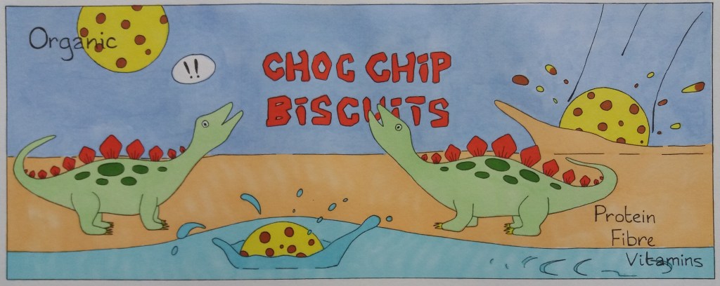
I quite quickly came up with a design I liked in which the dinosaurs were being surprised by a biscuit-asteroid impact. I then had the idea of this impact being caused by the pterosaurs bombarding them with biscuits. This made me wonder about having boxes with individual designs that stack together to form a bigger pictre or story. This would increase children’s pester power as they would want to collect the boxes to create the whole picture. Ethically, I’m not too happy with encouraging over-consumerism in children but from the perspective of the brief I think that it works well.

I then had a look into suitable fonts before moving onto the line visual stage. At this stage I needed to decide on a shape and size for the boxes. I have been struggling with how much time and detail to put into line visuals.


I’m really pleased with the line visuals – both in terms of the design and because I’m happy with the amount of detail in them. I think that the composition of the ammonite raisin biscuit design needs a little work – there’s not a lot going on on the right hand side of the packet. I am pleased with how the designs work together to tell a story.

Before making a mock up of one of the designs I thought about colour by making rough sketches of the layout of the boxes. The yellow of the biscuits will run through and tie together all three designs but the biscuits will have orange highlights for ginger, brown choc chips and purple raisins. The blue of the sky will continue from the pterodactyl ginger biscuits to the dinosaur choc chip biscuits. Then a different blue for the sea will run from the choc chip biscuits into the ammonite raisin biscuits. In order to emphasize the ginger theme, the pterodactyls will be orange. For the raisin theme the ammonites will be in purples and blues maybe with highlights of brighter colours. The dinsaur packet is more difficult, I want to avoid lots of brown, I will try to get red rather than brown into the image.

I’m please with the final design. I think that it’s fun and colourful. I like that the packets tie together to tell a story. If I were to produce this again, I might make the dinosaurs and biscuits a bit bigger and make the colours even more vibrant and bright. I really enjoyed this exercise – I’m sometimes surprised as to which exercises I most enjoy as I wouldn’t have thought that I’d particularly enjoy designing packaging.
