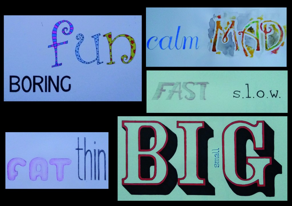
The first part of this exercise was to take a set of pairs of words and to write them in a descriptive way. I think that the most effective of these words are calm and mad.
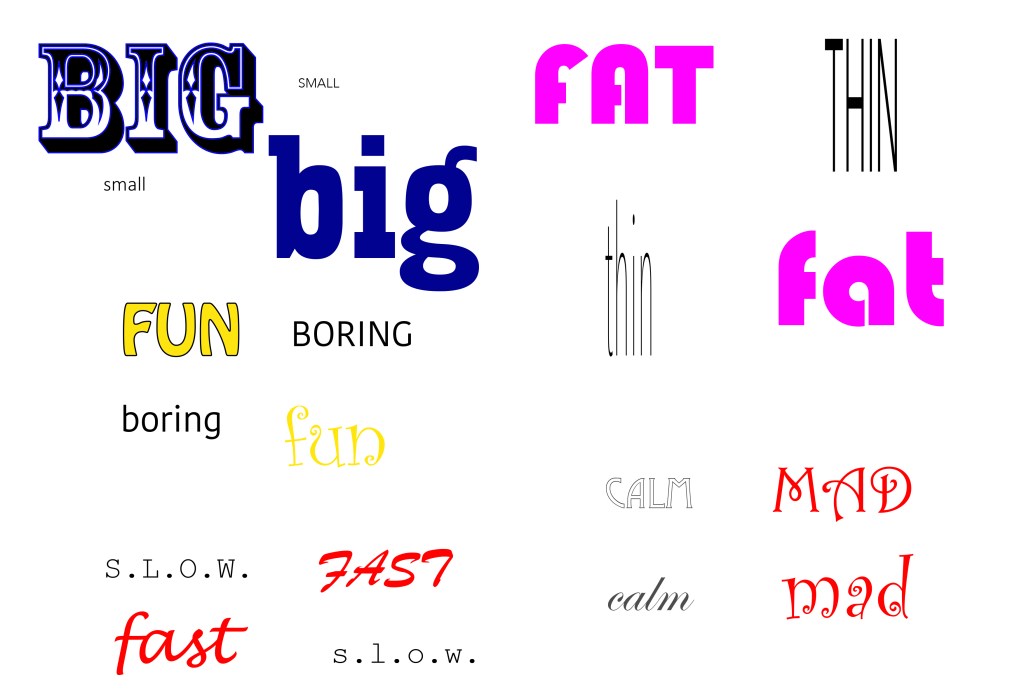
I then found some digital fonts that illustrated the words well and chose colours that I felt fit with the meaning of the word. I was struck at this point by how limited using fonts in illustrator is. They don’t necessarily quite do what you want. Of these fonts, I think that the lowercase ‘thin’ works quite well. I didn’t find a font that I felt illustrated the words fast or fat well.
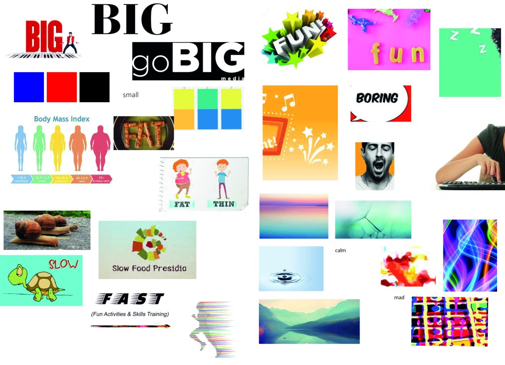
I then created a moodboard for the pairs of words. I found this quite useful for thinking about colour and texture. This gave me good ideas for how to get movement in the word fast – I love the runner at the bottom of the image with his streaky lines. It also gave me the ideas to use lines of colour for mad.
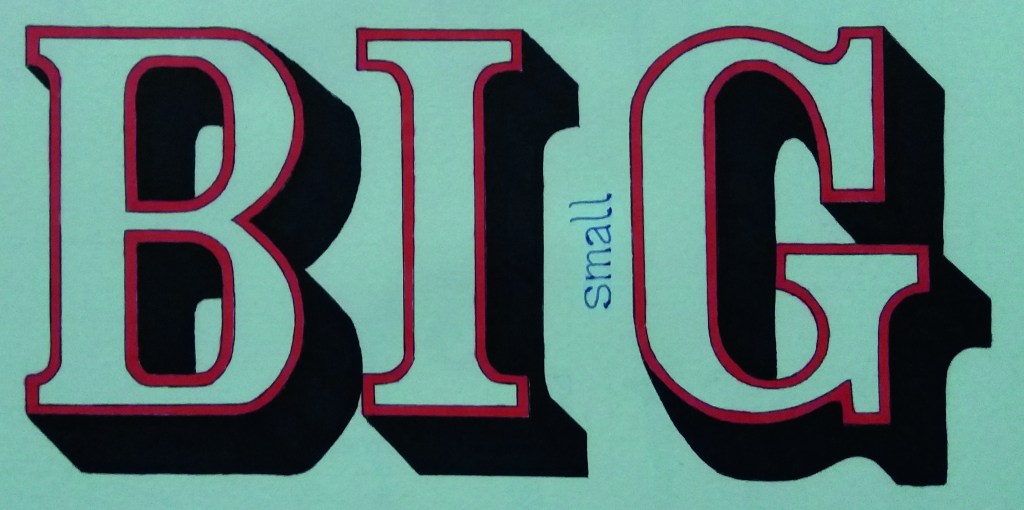
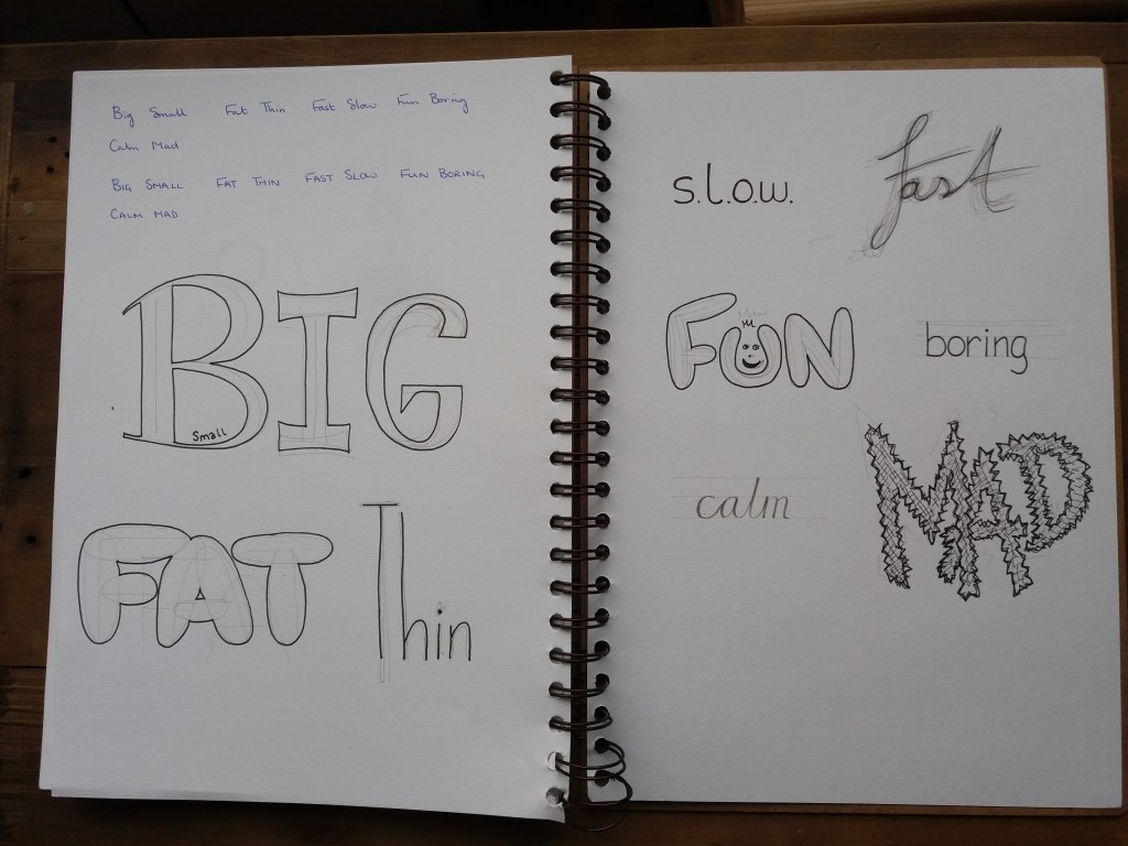
Below are my words. I’m particularly pleased with how the word big worked in it’s bold 3D font. I’m also pleased with the colourful and curly ‘fun’ and the simple blue ‘calm’, which is little changed from myoriginal idea. Using pencil crayons for the fat and thin didn’t work well, they look like something taken from a school art wall. If I redid the word fast, I’d be more accurate about the spacing of the lines and shape of the letters – I think the design is a good idea, however, it’s not well executed.