The brief for this assignment is to produce an illustration on one of the following topics: lost; disaster; discovery; or guilty secret. The illustration should be based on a still life for which I can select the items. The rest of the content, the method used to produce it and the colours are my choice.
For this assignment I have decided to work with the theme ‘lost’.
Selection of objects for still life on the theme of lost
The first thing that I need to consider is what objects to use for the still life that evoke the theme of lost.
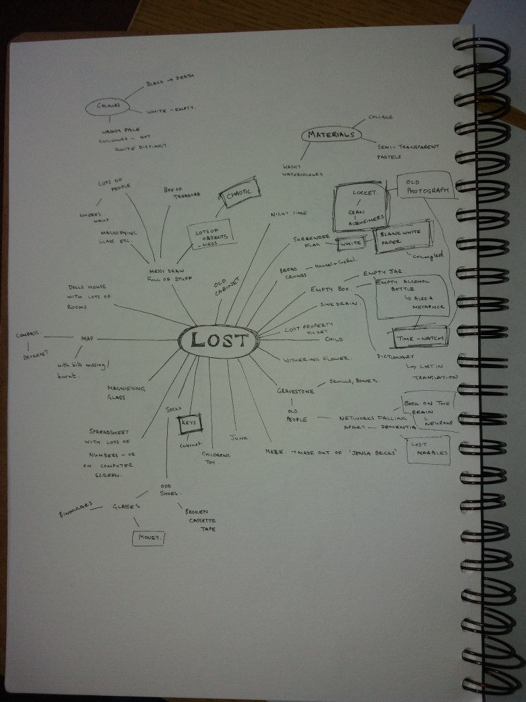
I found the brainstorming process quite interesting. I began by thinking about quite obvious objects – mazes, lost children, decaying flowers and gradually things became more metaphorical – empty bottles, time, death etc. Retrospectively, these are all quite negative, whereas I actually find getting lost in nice places a form of freedom. The process of thinking about objects to use for the still life, also made me start to think about materials and colours – white for empty, black for death, watery pale colours to represent things not quite being clear.
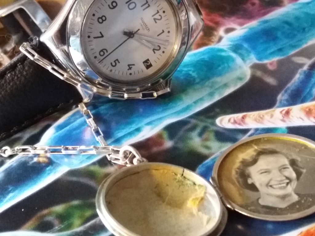
For the still life I chose a locket that belonged to my Great Grandmother, with a photograph of my Grandmother as a teenager inside it. By the time this photograph was taken my Grandmother had lost both of her parents. My Grandmother died several years ago having suffered from alzheimers for many years. So for me this is an object tied up in the theme of lost. In the early stages of alzheimers my Grandmother described this disease as like all of the hooks in her brain coming loose. For my objects, I decided to use: an image from a book of the maze of neurons in the brain; and a watch to represent the passing of time. The subject matter seems rather dark at the moment. I’m hoping that at some point in the process I can introduce this idea of ‘lost’ and ‘loss’ actually being quite freeing … I’m unsure how.
For the next stage of this exercise I’m going to take photographs of the objects from different angles – probably slightly disorientating angles and try focussing on different objects and where the edges of the image are. I’ll use this to help me to make thumbnails for producing the objective drawing. The brief does not state anything about the shape of the final image, other than it should be smaller than A3. I’m already quite excited about distorting this image. Maybe having some of the neurons wrapping around the object in the image, or ‘falling’ out of the book.
In terms of the composition I think that it should be a bit chaotic and disorientating so that it makes you feel lost when you look at it – the book is upside down; the chain of the locket is tangled up around the watch (a happy accident from trying to get the locket to stay put and not slide off the book). I’ve included some crumpled white cloth, for texture and to signify emptiness.
I experimented with photographing the objects from different angles and rearranging them. I think that this first image is interesting, it focuses on the watch and locket. However, I’m not sure that it is clear that the background image is of neurons.
The second image clearly shows the neurons in the background image; however, the composition is boring.
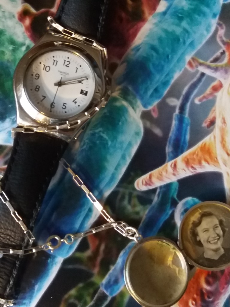
I like that the image below is out of focus. I think that this could be a useful way of distorting the image to give a feeling of being lost. I also like that this image shows more of the background image of neurons and has more of a sense of space. I also like that the locket is almost held by the neurons.
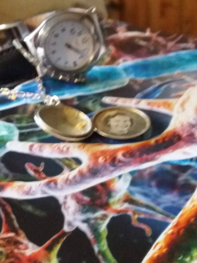
This image zooms out to show more of the book. I don’t think it is as interesting as the close up images of the watch and locket.

For the thumbnails, I began by drawing a set of different shaped spaces in which to work. This was to force myself to try different compositions. However, as I progressed I found it easier to draw sections of the still life and then choose portions of the drawn image.
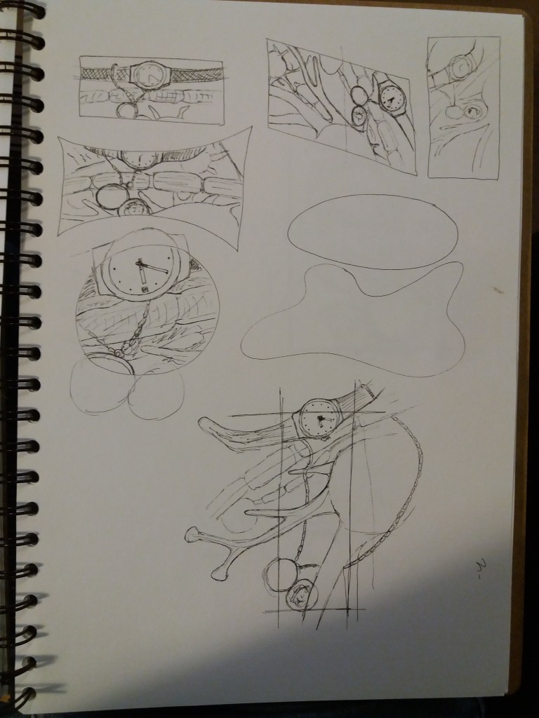
As I progressed I began to distort the image. In particular by making the locket and the watch larger than in real life and then tangling them among the neurons. On the page shown below I like the composition in the top image. However, I’m wondering how easy it would be to introduce a character or sense of place into this image because the objects are being viewed directly from above. I’m wondering about having a character who is lost, wandering around the chaos of the image and I think that this would be easier with an image viewed from the side. Another idea would be for this to be the contents of a cupboard, the view through a window, or a map. Going back to the photographs I think it would be interesting to have parts of the image out of focus, or being erased to symbolise memory loss. Maybe I could just have the figure, or silhouette of somebody sat with this image as a backdrop.
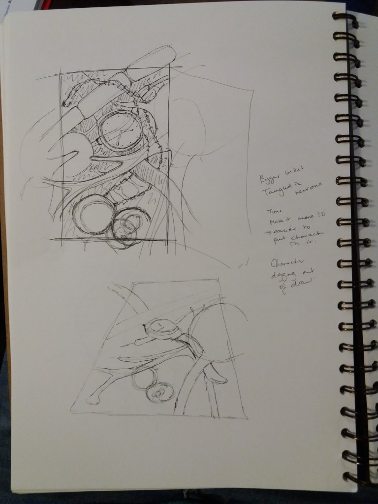
I tried to make the image more 3D. I’m starting to quite like this design and it’s chaos. When I was drawing the version below, I decided that it would benefit from another object, so I added in an old key. I’m wondering about rotating the image for the final design so that the perspective is all wonky and disorientating to add to the lost feeling. This is turning into an image abut losing your mind and your memories. I wonder about having this image as the view through a window but partially obscured with a landscape and people wandering through the landscape also wandering through this image.
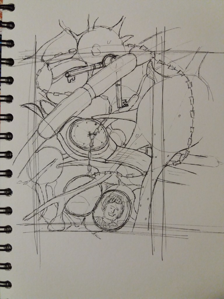
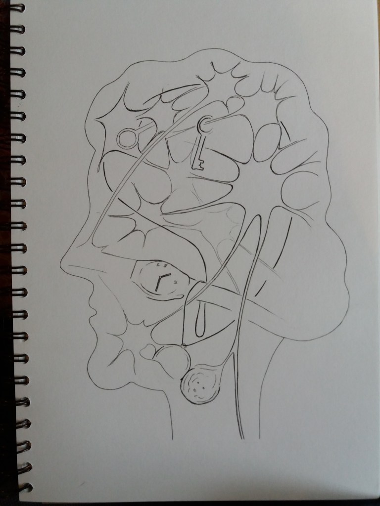
Below is my objective drawing of the keys, watch and locket wrapped in the neurons from the photograph in the book.
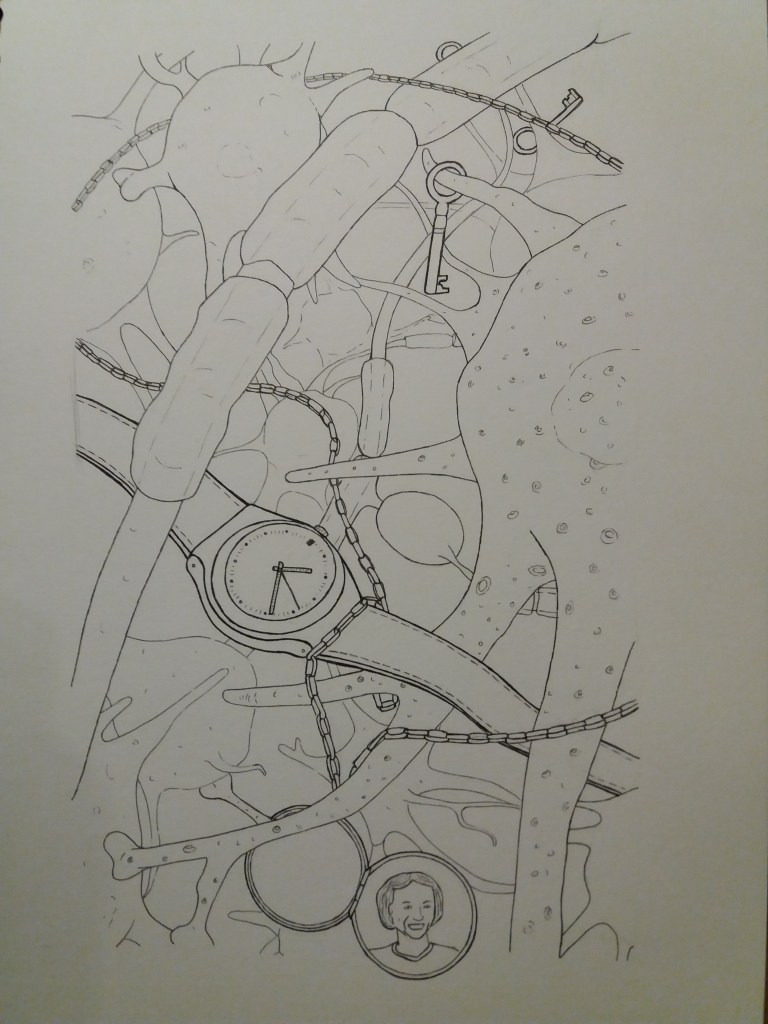
I tried to make this initial drawing in quite a detailed scientific style. I really like the maze of neurons in this image – I think this gives it a disorientating maze-like feel. I think the sketchier thumbnail versions actually work better – they give the image more movement and I like that they aren’t contained within their boundaries. I ended up making the objects in the image bolder as they did initially get a bit too lost. I think that making these items bolder helps to lead the eye around the image. However, I am concerned as to whether somebody looking at the image for the first time would understand that these are neurons and what the image is about.
I think for the tonal image I want to make the neurons a bit more styalistically neuron like, or else just make it clear that they form a network and have that network starting to fall apart. I’m wondering whether to use bleeding water colours for the neurons. then superimposing the objects in collage. Another idea is to have a play with masking and water colour and either have the neurons in white, or else the objects, maybe with some sketchy lines here and there to highlight bits of objects.
Tonal drawing of still life
Before I make the tonal image I’m going to do a little research into ‘dreamlike’ images and memory loss to see if that helps with my choice of materials.
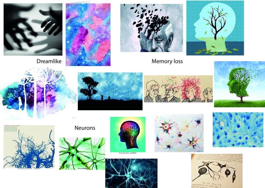
Several of the dreamlike images use characters in either black or white, silhouetted against a colourful background in pastel shades of blue and pink. The night sky is also used to symbolise the dream theme. I also like the out of focus hands, this gives a feel of both dreamlike and things feeling a bit lost. I could do something similar to the bright white stars in the night sky to represent the neurons in my image. However, maybe they shouldn’t be so clear and bright if they’re decaying.
I looked up some other peoples’ images of neurons. One of the surprising things that struck me is that blue is quite a common colour used in these images. I think I’m going to move away from the scientific drawings of neurons and try to do something simpler and more irregular. I don’t have much experience in using watercolours, or ink, so I think I need to have a play with different effects. I really like the white neuron. However, I’m wondering if I have white neurons and white objects if there will be too much white in my image. I think the black head filled with a network of colourful and white lines is effective in explaining the image. I’m wondering about rather than having a character in my image, instead having the image contained within a head to give it location.
The images about memory loss are quite interesting. Again, it’s common and effective to use the outline shape of a head. They are all fragmenting in some way. I could make use of this in my image, have it gradually fragmenting at one side or something. I wonder if I could use something like this for my images. Have them silhouetted in white but with some line drawing with in them that is becoming jumbled and fragmented in some way.
I think the next step is to have a play with some inks and watercolours and pen and ink drawing. I think these should be really effective media for making the image free and not quite retained within its edges.
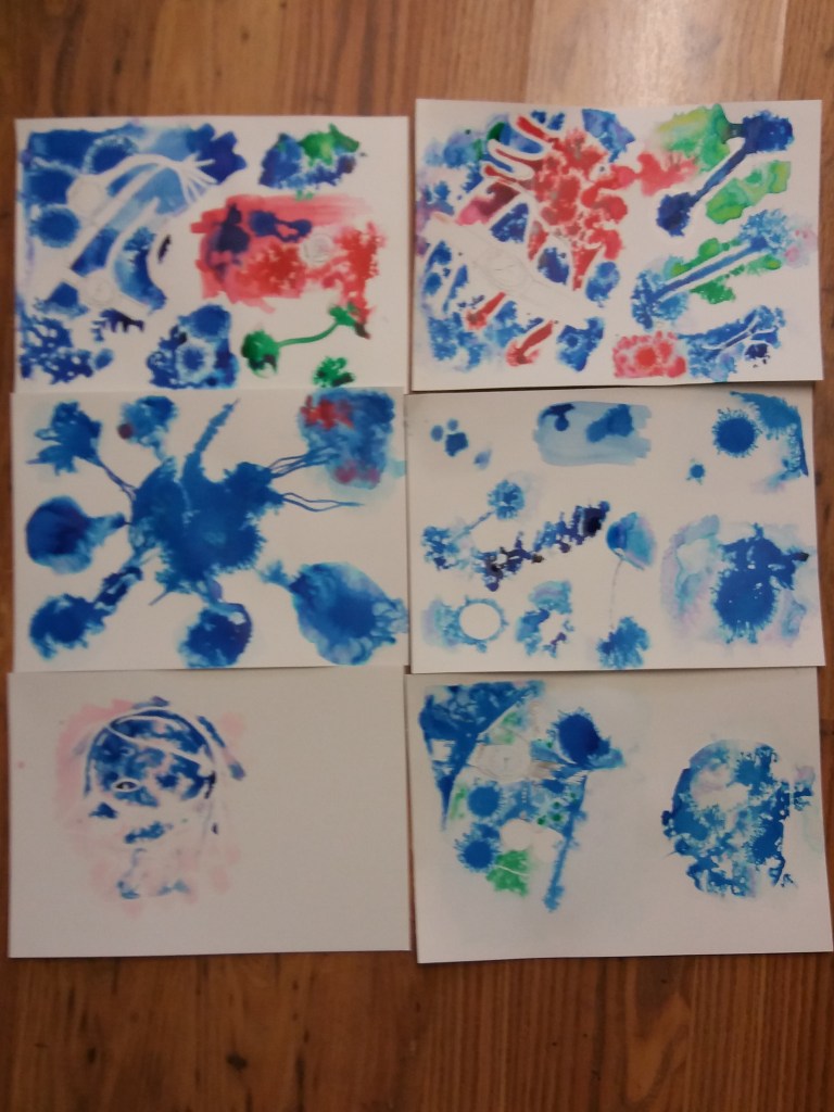
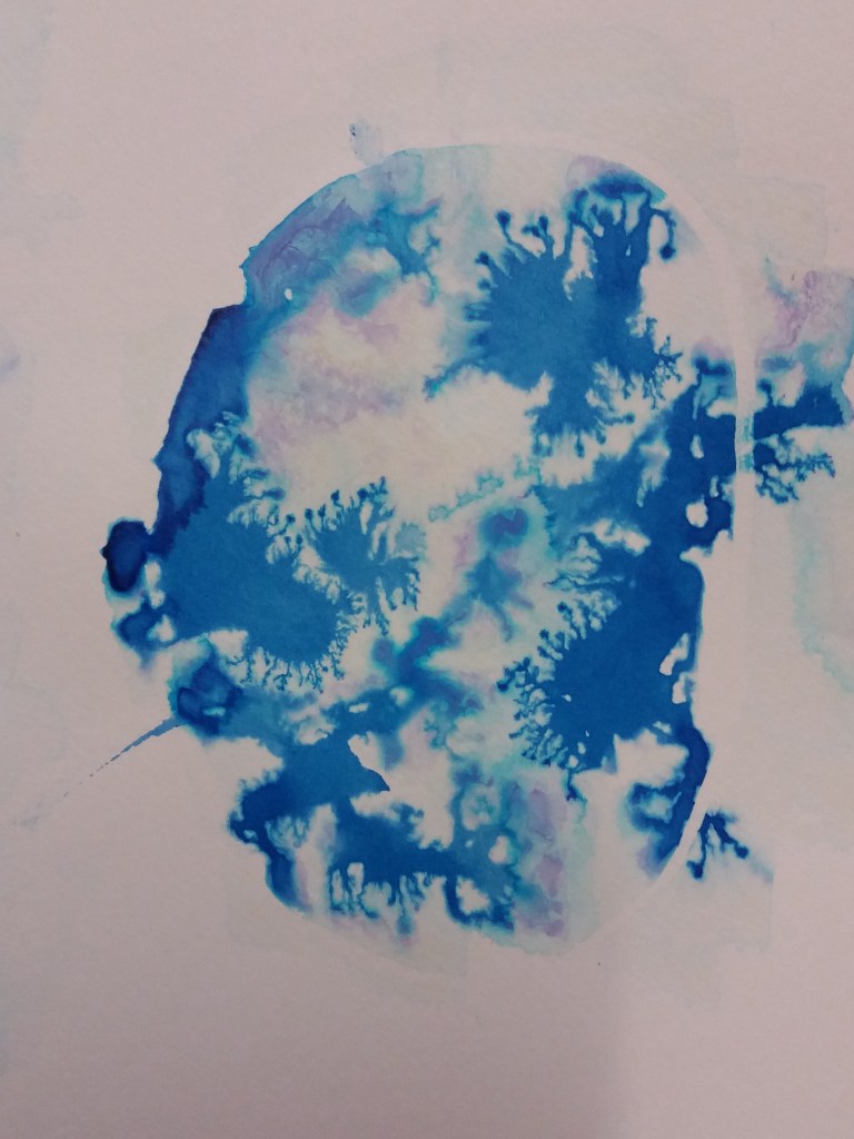
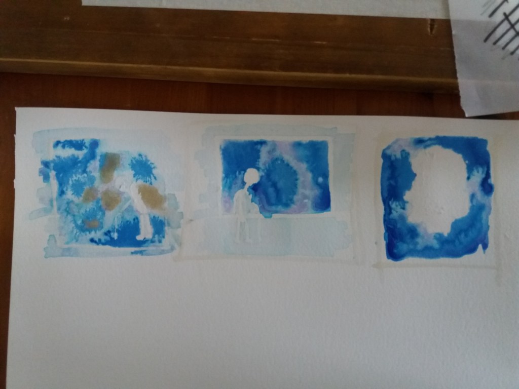
I played around with watercolours ink and wet paper. I found that blue ink on hot press watercolour paper made the most effective and interesting dendritic patterns that could represent the neurons in the image. I also found it most effective to paint using a dropper, rather than a paint brush. I played around with masking – both using it as a boundary to stop the bleeding ink and also to mask out areas where the objects are.
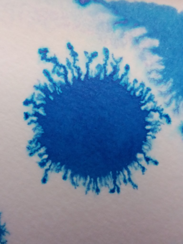
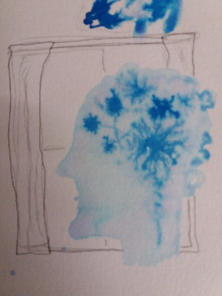
One of my favourite images to come out of this experimentation is this image of a head. I think this might be quite helpful for ‘explaining’ the neurons. I don’t think that on their own it is obvious what these dendritic blobs are meant to represent. However, giving a vague head shape to the image helps.
One thing that I learnt from the image below is to be a bit sketchy with the masking fluid, rather than creating big blobs of white because this helps integrate the objects into the mess of neurons. I tried adding sketchy lines and pencil crayon to help bring out the objects. The pencil crayon didn’t work at all and I tink it’s much better to leave the objects whole – it makes them a bit more empty and lost. The image below also has far too much ink in it. I like the amount of white that is left in the image above. I think that it makes for a more interesting and effective image.
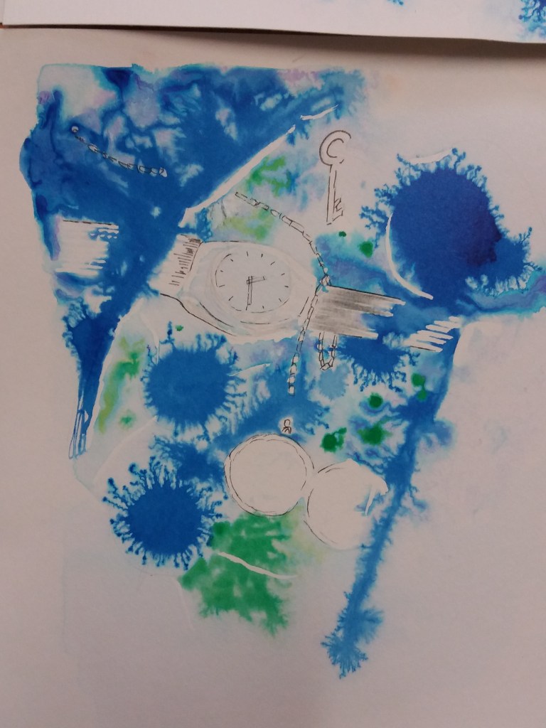
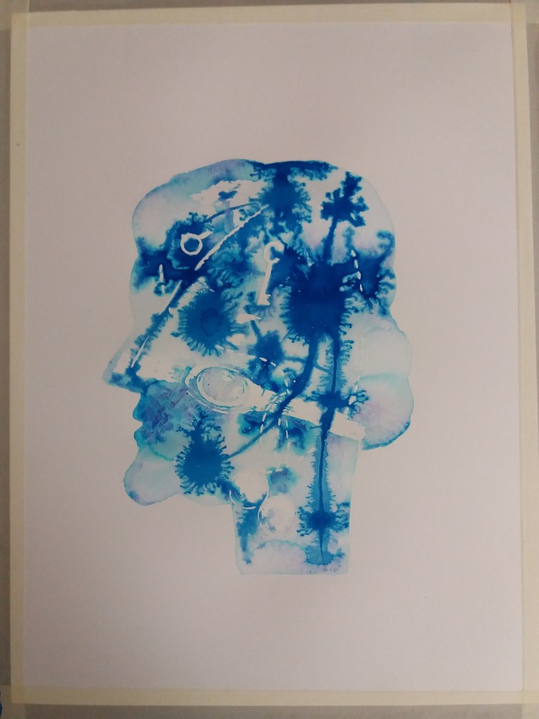
To create the final tonal image I’m going to produce a sketchy version of my line drawing from earlier. Then I’m going to roughly and sketchily go over some of the pencil lines using masking fluid. I’ll then apply a pale green wash and then add the blue ink but be more sparing than in the image above. One of the things I quite like about working with the ink and wet paper is that it has a bit of a life of its own that I then have to accomodate and work with – sometimes with good effect, sometimes not.
I think the blue ink on wet paper and masking of the objects in the tonal image works quite well. I’m still not sure how much sense this image makes without context. I decided to sketch/ colour the objects using gold ink. Partly to give the image a slightly dreamlike non-real feel and also because the image is about lost memories and memories are precious.
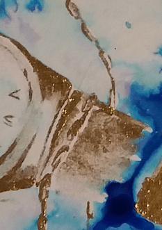
I particularly like areas where the gold ink is mixed with water. I think that it gives a print-like finish. I’d like to try to have more of this style in the final image, rather than the thick and goopy gold paint. I also added roman numerals to the watch face to give it a feeling of age.
Character and location development
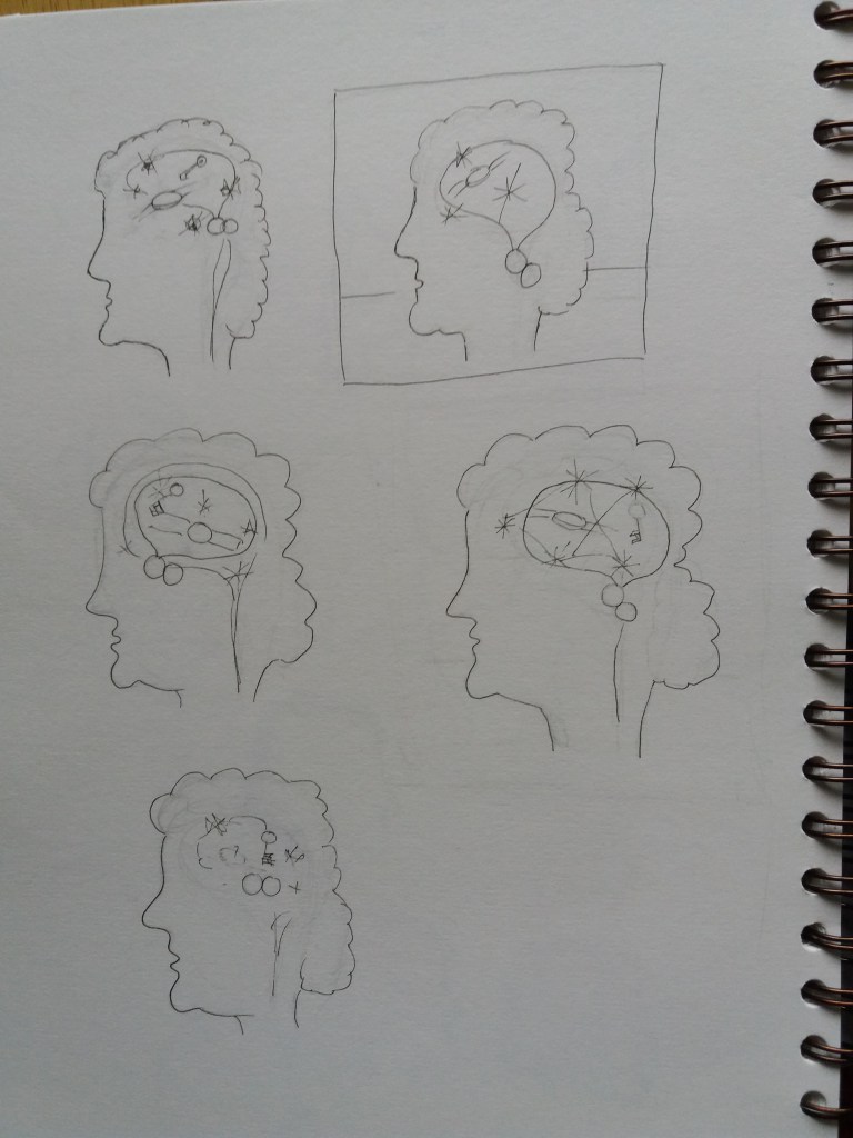
I think this is the real challenge now, how to make it clearer that the image is about lost memories and how to suggest a narrative. Originally I was thinking about having a small character, maybe a little girl exploring within the image – sort of lost within the image. Another idea is to silhouette an old person over an area of the image – again so that they are lost within the image. I like the head that I made earlier but I wonder whether for this to work the neuron illustration should just be within the brain area. Alternatively I might have the image in a window or doorway – to give a feeling of the disorientation and lost feeling of dementia.
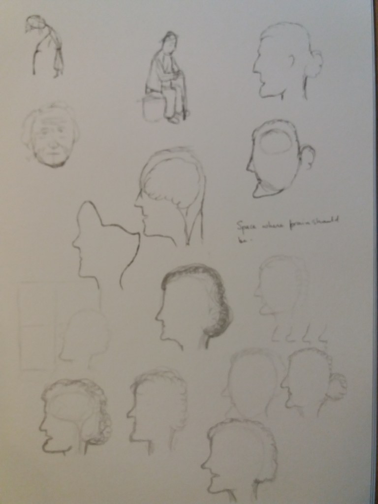
An initial idea is to roughly sketch over the image in ink, with an old person looking out of a window at a chaotic mess of memories. As a result of this I started to think about body positions for old people – stooped over, or sitting. At the same time I was quite interested in developing the head idea and roughly sketched in pencil and also in ink, different head shapes that might imply that the person is old and also different techniques in ink.

I like the effect of a head with the neurons and objects superimposed on this I also played with the idea of including a window behind them. However, I decided that once the detail was inside the head then this would lead to a complicated image. I also played with different colour washes that might go behind the head. I think the yellow complements the blue well.
I then returned to the idea of having masked figures in front of the neuron-object artwork. It’s been helpful in this exercise to make thumbnails in ink – previously I’ve tended to thumbnail in pen and then add some watercolour.
Something that I notice about the previous images that I collected on the theme of memory loss is that where theres a head involved there is some kind of horizontal horizon line that gives the head a sense of place, rather than floating.
I decided that I prefer the image with a head containing the artwork, rather than an image of a person within the artwork. Therefore I set about experimenting as to whether to restrict the artwork to the brain area of the head, or to included the artwork within the whole head.
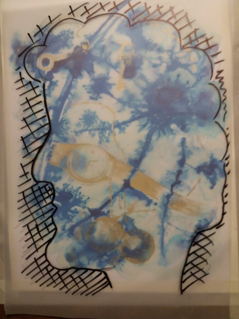
Line visual of final artwork
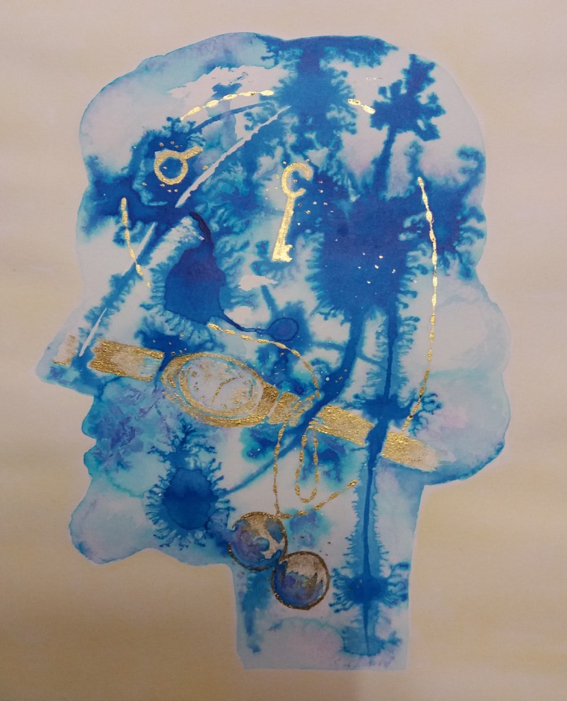
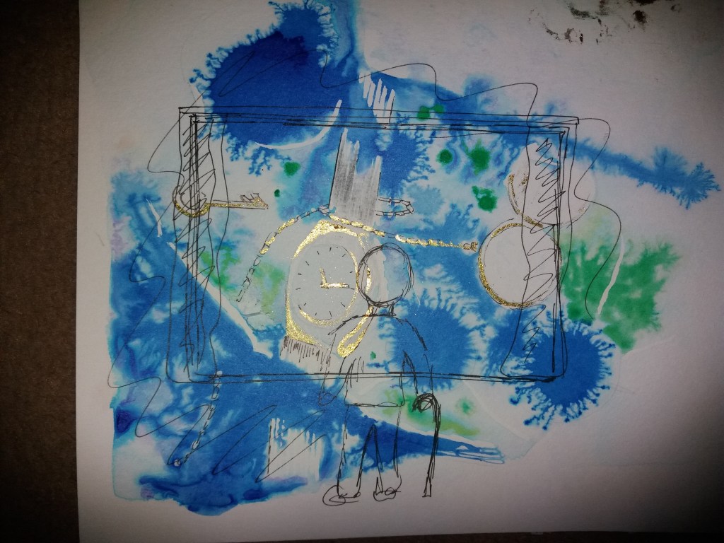
Ultimately I decided that the whole head should contain the artwork but to include a concentration of neurons within the brain area.
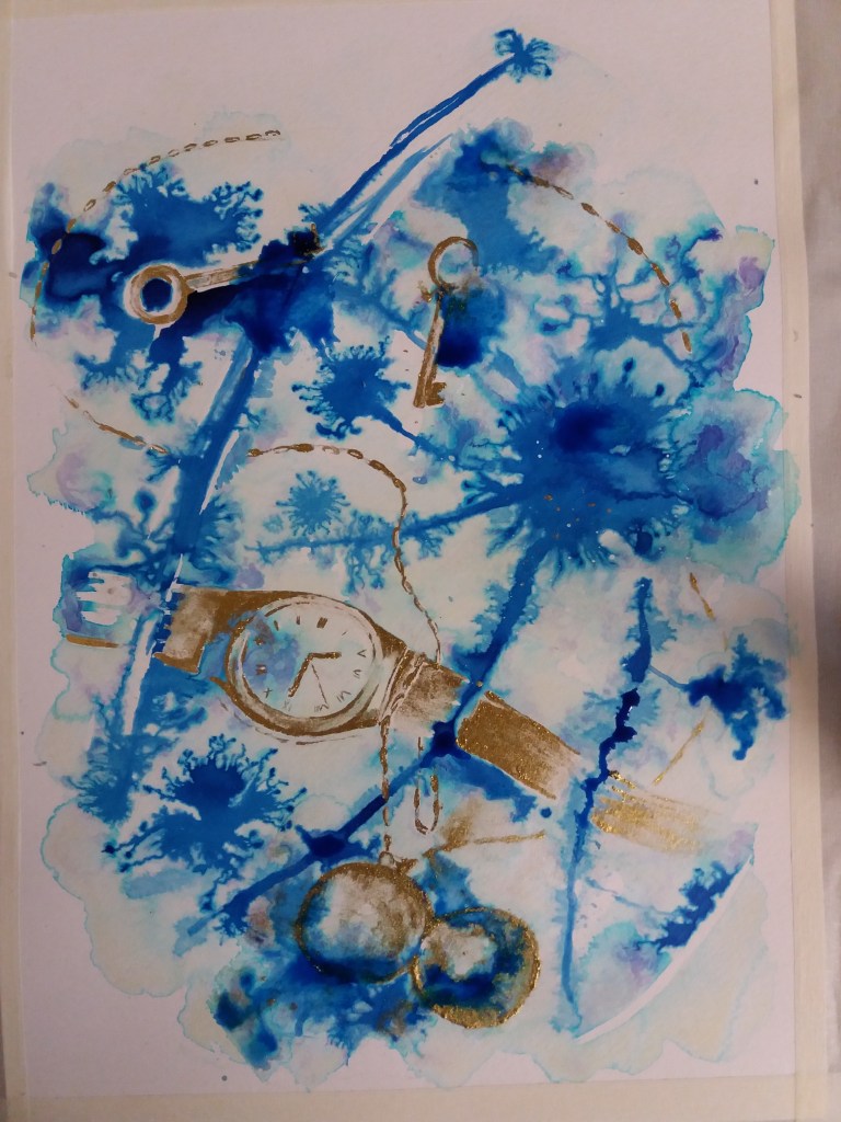
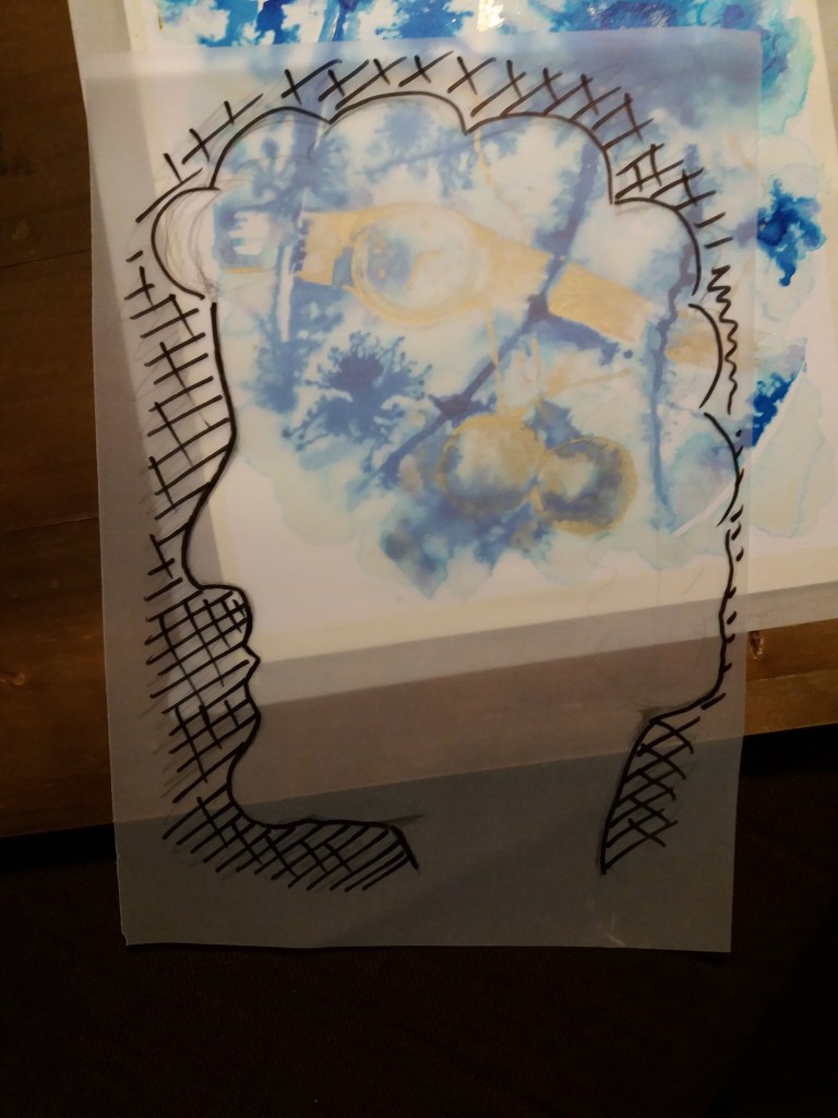
Final artwork

I’m really pleased with the way that I represented the neurons in the image. In earlier images I’m not sure that it was clear what they were; however, by placing them inside a head I think that becomes clearer. I love this technique of dropping ink onto wet paper, I like the slight unpredictability of what happens and the interesting marbled colours that it produces.
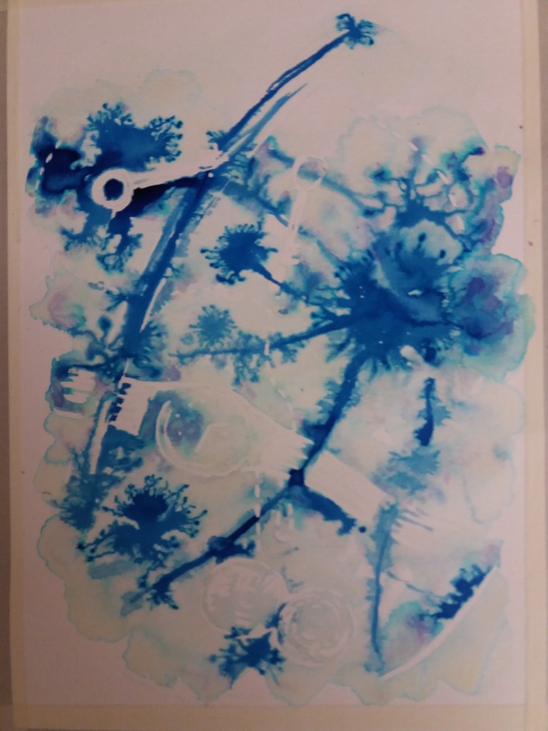
I’m somewhat unsure about how well making the objects in gold ink works. For the final image I struggled to recreate the print effect that I liked in the earlier image. Below is the final image in progress, before I applied the gold ink. I find this simpler image produced in a single colour quite effective.
I tried to include a horizon line in the final image by changing the tone of the yellow wash in the background; however, this wasn’t particlarly effective. It also doesnt make complete sense to have a horizon line for a disembodied head. Maybe the head should have shoulders so that it doesn’t float around the page.
The original brief for this piece was to convey the theme of lost. As the image evolved it became more specifically about lost memories. Having been so involved in the image and having used such personal objects, I find it difficult to decide how well the image conveys the theme. An element that hasn’t come out well is that it is meant to be the head of an old woman. Maybe it would have been useful to give the image better context, for example show an old lady sitting thinking in front of a window. However, this would have reduced the size of the head with the objects in it and potentially also distracted from the objects.
This part of the illustration course was about developing my own style. However, rather than clarifying what my style is, it has illustrated to me that I am enjoying experimenting with different materials and don’t yet really have my own style. I do really like taking quite a technical or scientific image and turning it into something more free and artistic. I think this is potentially quite an interesting way to represent scientific concepts.
I really enjoyed the process of producing the images for this assignment. At the outset I had no idea what the final illustration would look like. I enjoyed the way that it gradually evolved – I felt like I discovered the final image as I went along.
