The aim of this exercise is to produce colour client visuals for three posters that advertise a museum and are aimed at three differentage groups: child (5-9); teenager (13-16); and a general adult audience. Each poster is to be based on an object that has been selected from the museum’s collections.
For this exercise I visited SeaCity Museum in Southampton, which has a titanic exhibition and an exhibition about other events in the history of Southampton.
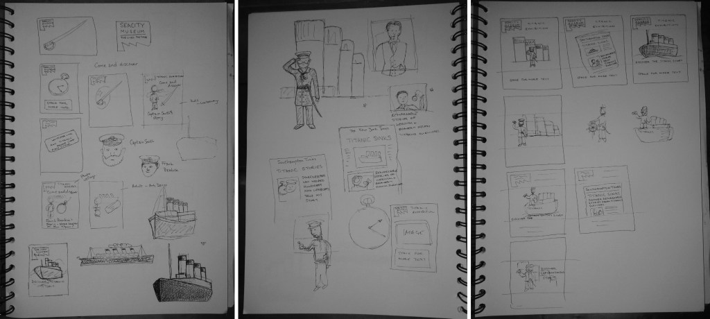
In order to have a coherent theme running through the three posters I’m going to use the three objects from the titanic. I think that the sword will be the most interesting object for children. I’m personally drawn to the dinner ticket, I think because of it’s simplicity, therefore I’m going to use this object for adults and then the pocket watch for teenagers. Both the sword and the pocket watch belonged to specific people so I could use characters alongside the objects on the posters.
I am a little rushed for time with this exercise so I’m going to jump straignt into drafting some different poster ideas for each of the objects. The museum has a distinctive logo that I will use to help tie the three posters together. In the museum they are keen to tell the stories of individual people who survived or perished on the titanic, so I intend to include this within the posters i.e. to include the person alongside their object. I think that this will be particularly helpful with the posters for children and teenagers. I’m also thinking about including some similar text on each poster e.g. ‘ Come and discover ‘ and the name of the person and their object.
I’m thinking of using a similar layout for each poster but using a different style. Titanic sank in 1912, so for the adult poster I might try to use an art deco style. I’ll make the kids poster in a cartoon style. I’m unsure what style would appeal to teenagers. The tricky thing about all of these posters is that the museum is about a horific event in which 1500 people died so I don’t want the posters to appear flippant or disrespectful.
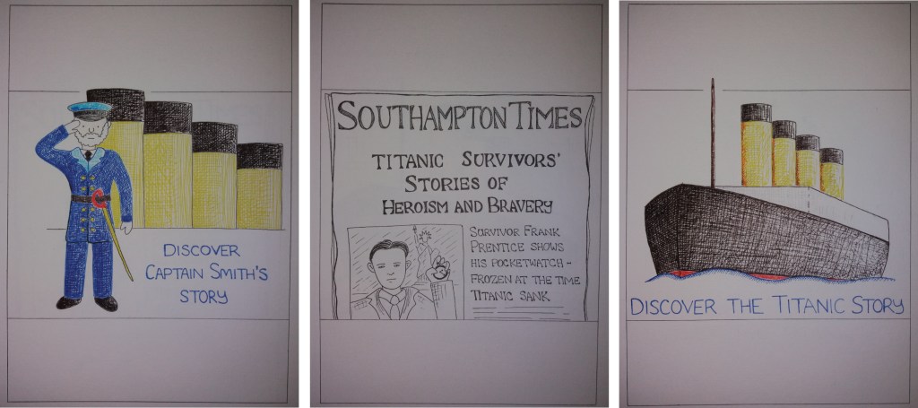
For the poster aimed at children I’ve decided to have a cartoon of the Captain, complete with sword standing on the deck of the titanic. I’ve opted to focus on the character rather than the sword because this is the focus of the museum – telling the story of the people aboard titanic. The challenges that I found with this poster was how to fill the space when you’re using a single character. I thought about including more characters but this distracted from the main character. I also experimented with having the Captain standing on a cartoon titanic but this felt a little too jovial for the topic.
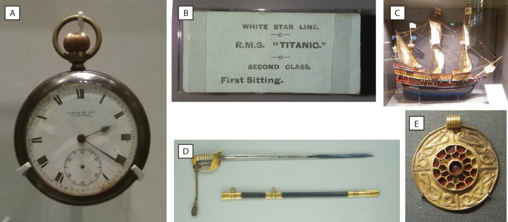
For the poster aimed at teenagers I also wanted to incude a character. I played with showing the character of the storekeeper whose pocketwatch is in the museum. However, the cartoon style felt a little childish for teenagers. I also experimented with using old photos of the pocket watch the storekeeper and the titanic, however, this didn’t look interesting or coherent. However, as I was working in black and white this somehow led to the idea of using the front of a newspaper. Putting text on the newspaper also led me to think about adding a tag line to each of the posters.
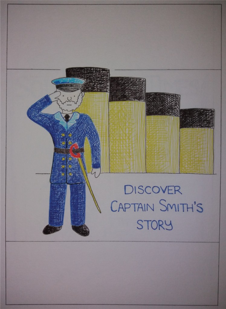
For the poster aimed at adults, I started by including the image of the dinner ticket. However, I realised that for a museum about titanic it would be good to show the titanic herself. I decided to try to include an image of the ship on the poster in a simple, bold, graphic style.
I’m presuming that the final posters will be on standard-sized paper. I’ve decided to produce the client visuals at A5 scale as this is the smallest they are likely to be produced. However, my intention is that the poster could be scaled up to A0 or larger.
I’m quite pleased with the poster aimed at children; it’s simple and bold. It will benefit from coloured banners at the top and bottom of the page. I do wonder if I could have got more movement into the cartoon, which would make it a little more exciting. I did realise retrospectively that of the characters that I chose for the posters, this person drowned with the titanic, so was maybe an inappropriate choice for the children’s poster. I quite like the funnels in the background and that this is repeated in the adult poster.

The poster for teenagers was the one that I most struggled with. I quite like the final design, although I wonder if it is a little childish. The poster definitely needs some colour in the banners, or the whole of the background to make it stand out.

I like the simple image of the titanic in the poster aimed at adults. I think it would be quite eye catching at a range of scales. I wonder if I’ve made it so simple that it’s not instantly recognisable as titanic; however, I think this would be okay once integrated into a poster with the museum’s branding etc. In the end it’s bold and graphic but it’s not particularly art deco but I’m quite happy with that.
I like using pen to make client visuals as it’s reasonably quick and feels quite free. I think the pen works well for the poster aimed at teenagers. For the poster aimed at children I’d use bolder, blockier colours – I might well make the final version digitally. For the poster aimed at adults, I actually prefer the image of titanic from my sketchbook. I’d consider using a sketchier style that gives the image a bit more movement.
