The aim of this exercise is to produce a cover illustration for a natural history book for children aged 7-11. The book will be entitled ‘Animals from Around the World’. For this illustration, I need to consider that people have expectations of such a cover will look like but also to think aout how to attract a modern audience to the book. I need to produce three sets of coloured client visuals for the book cover and include information on the final size and format and where the type will be positioned.
NB – note in learning log decisions made through the design process.

I began by researching designs for covers of children’s books about animals. Most books, use simple but realistic depictions of animals. The book covers that really appeal to me are the two covers that break from the mold and have bold, stylised images of a tiger and a wolf on their covers. These two alternative designs would definitely stand out on the shelf of a book shop or library. I’m unsure how appealing these covers would be to children; however they might at least appeal to the adults who are likely to be buying the book. I don’t think that the designs that include maps of the world work particularly well from a distance, although they might be quite attractive to children once up close.
I think that an important choice with the book cover design is whether to include a single animal of many animals. Using a single animal is visually eye catching, however, it doesn’t represent the content of the book particularly well.
Colours is also important in these book covers. Most of them use bold, bright colours with greens and blues dominating.
I decided to begin by loosening up and sketching lots of animals to help me to start learning how to draw animals and to think about what animals to include. I also sometimes get a bit frustrated at the research stage that I want to be drawing. At the same time I started sketching thumbnails as they came into my head. I tried to choose a range of animals that are distinctly representative of different parts of the world.

I started thinking about the cover design in my sketchbook using thumbnails. However, I next decided to take a different approach to previously. I decided to digitally ‘cut out’ my sketches and play around with different designs in adobe illustrator.
I found thumbnailing in illustrator a bit limiting because I could only move the existing ‘characters’, change their position on the page, scale them and rotate them. I couldn’t play with what the characters were doing, where their legs are etc, which I can do in my sketchbook. This also led me to do a bit of research into graphics tablets as I think that these could be a really useful tool for this part f the design stage. I also found working electronically frustrating because the file sizes quickly get big and it takes a lot of time to save images.
I liked one of the designs from my illustrator thumbnails – the one with three animal faces in front of a globe. I think that having eyes looking out from the cover of a book grabs attention.
At the thumbnail stage I experimented with books of different shapes and sizes. For the three final images I decided to go with an A4 book cover as this seems to be a fairly conventional size for this type of book.
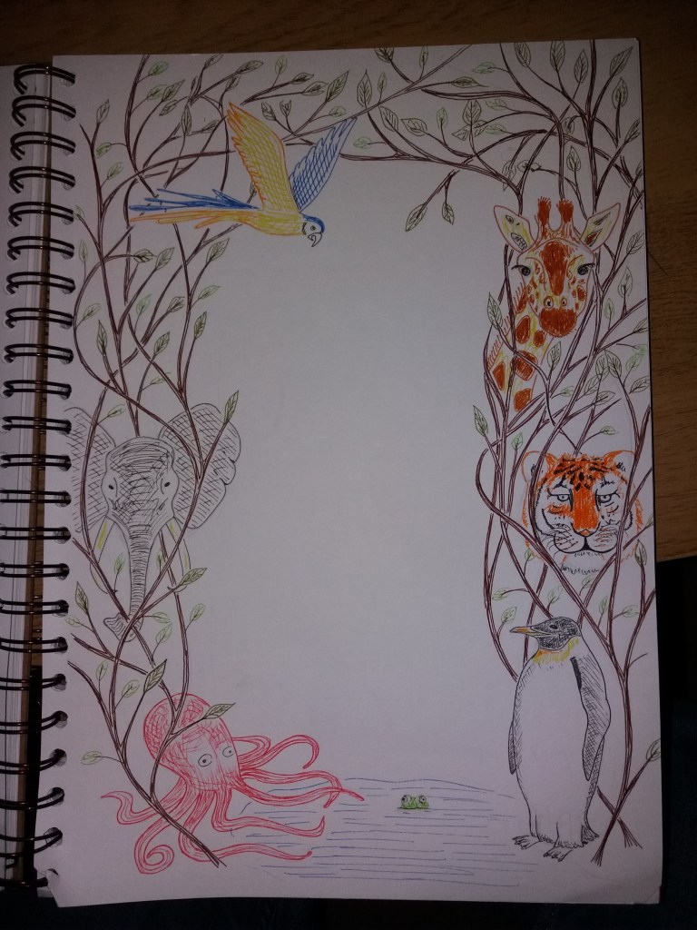
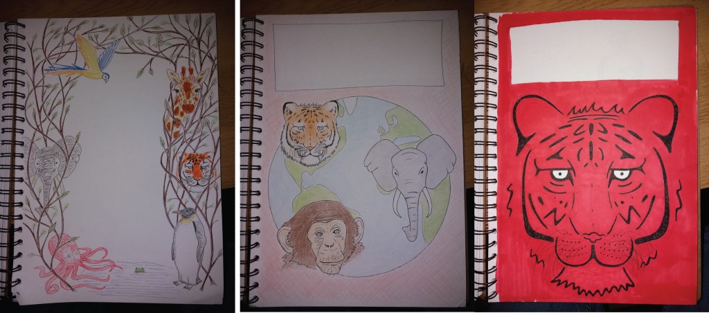
My first book cover is a bit of a rebellion against the constraints I felt trying to draw thumbnails in illustrator. I decided to draw freestyle animals as a border around the book title, with the animals entwined in some sort of plant. I decided to sketch this in coloured fineliner, both because this is relatively quick for producing client visuals and also because they are vibrantly coloured. I think that the design is fun; however, it probably isn’t particularly striking from a distance. If this design were used for the final book cover then it would benefit from a different colour background and maybe more animals and plants. This cover does give the impression that the book is about many types of animals. However, it is a bit boring and conventional in its design.
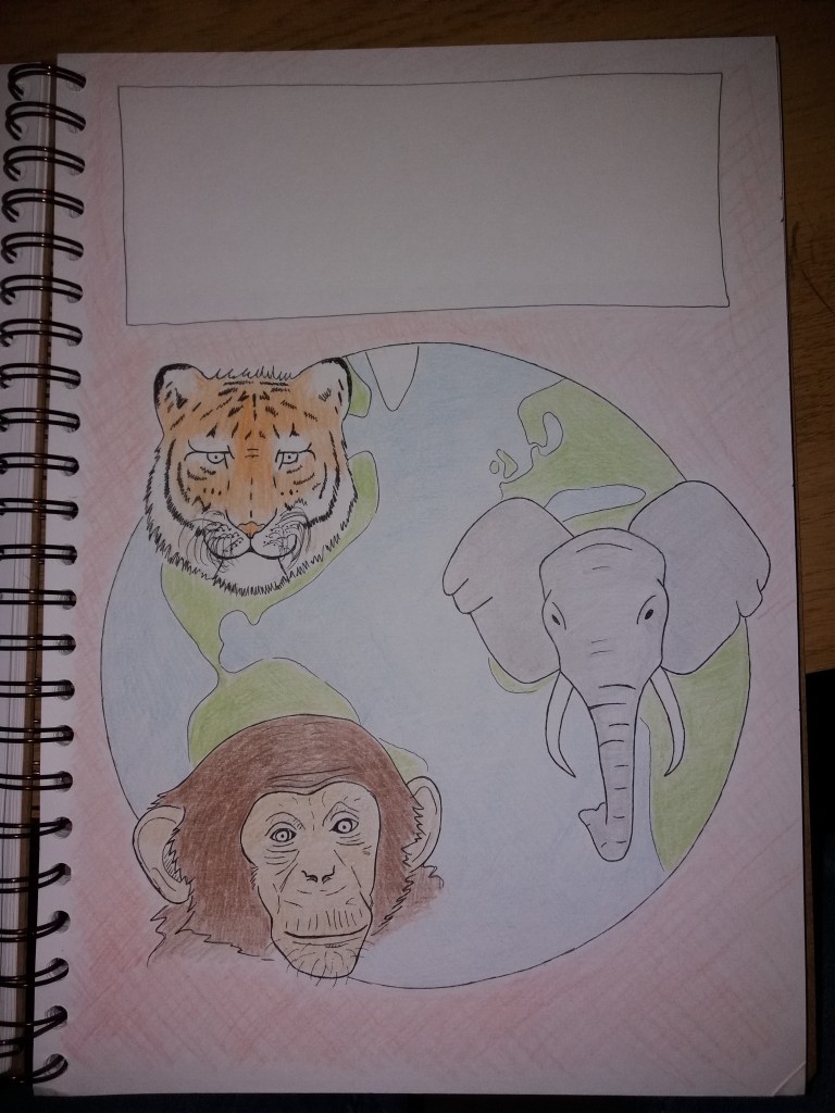
For the second cover design I decided that I wanted to better explain that the book is about animals from around the world. I also wanted to have several animals staring out from the cover. I originally drew the cover in black fine liner and then quickly added some colour with pencil crayon. I think that this design explains the content of the book well. I also like that by making the animal heads larger than in the first cover design, it’s possible to include a bit more detail and realism. If I were to take this on to a final cover design then I’d consider ,making the animal faces larger and also positioning appropriate animals on different parts of the globe.Whilst I’ve broken away from the traditional blues and greens with the colour of this book, I think that it would work well in attracting attention. The disadvantage in quickly shading in pencil crayons for this image is the lack of vibrancy in the colours. I think that if I used this design for a book cover then I might stick with pencil crayons but make the colours much deeper. This design is quite conventional but I think that in a modified form it would work well.
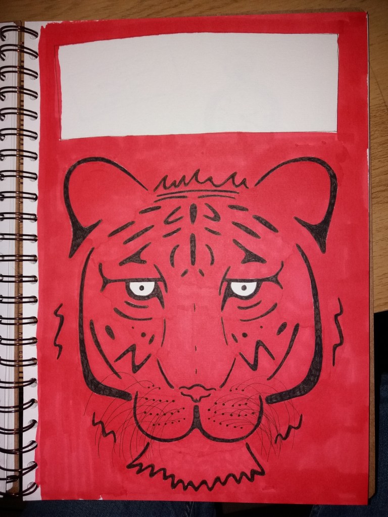
For my final design I decided to break from convention and go for a simplified graphic image of a tigers face. I think that it’s quite a striking image; however, it seems wholey inappropriate for the book. It doesn’t really explain what the book is about and if anything might be a bit scary – it’s a bit of a demonic tiger, particularly with the red background. I think that the image could be improved by leaving more areas of white on the tiger and using a less vibrant red for the background. I made this design using romarker and black fineliner. This didn’t work particularly well as the promarkers bled on the paper I was using. This would be a relatively easy design to create in adobe illustrator. This would have been a better approach as I could also play with the colour and tone of the background colour.
If I were the client I would opt for a modified version of the second cover design, with larger animal faces and in more vibrant colours.
This exercise has led me to wonder about how it’s best to put together colour client visuals – how much time to put into them, how rough and sketch they should or shouldn’t be
