The aim of this exercise is to study and develop illustrations that use a particular medium. I have chosen to look at collage. To begin, I collected together a variety of illustrations that use collage (both traditional and digital).
I then catalogued the images according to style. I identified two main styles. The first style uses swatches of colour to create new images; whereas the second style uses existing images to create a new image. The latter is commonly used to create surrealist images. In addition some of the examples that I chose used collage alongside other media such as printing and drawing.
It seems quite effective in the surrealist images to use some of the found images to represent themselves e.g. the people in the image by Hannah Hoch; but then use other images to represent something other than themselves e.g. the ‘angels’ in the Hoch image are made from eyes, babies, plants etc. The surrealist images also play with scale, for example the smoking woman in the Loli collage.
I chose to look at the image by Loli in more detail. The image shows three characters observing an erupting volcano; then from the side a giant woman apprarently creating the smoke from the volcano from a cigarette. The image appears to have been made by taking a background image of a landscape and adding a layer of rock rubble in the foreground. Then the characters have been added, all of whom have are in quite dynamic positions. Then finally the giant woman smoking the cigarette comes in from the side.
All of the layers have a vintage, 1950s feel, from the colour tones in the landscape image, to the clothing that the characters are wearing, to the image of the woman smoking. This helps the image to hang together. Interestingly all of the images are in colour apart from the woman smoking. The eye is drawn to the three characters in the foreground because they are in the brightest colours.
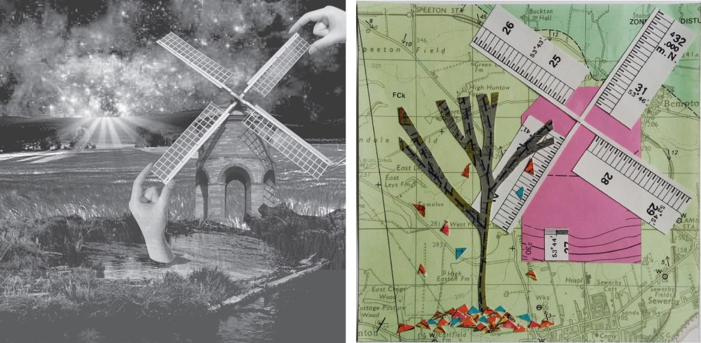
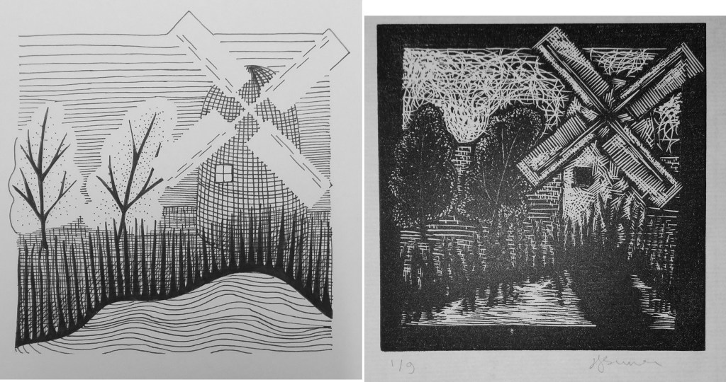
The next part of this exercise is to take an image from a previous exercise and render it using ideas from the above image. I’ve chosen to continue developing my windmill image from the first exercise of this illustration module. I decided to begin by using digital collage.
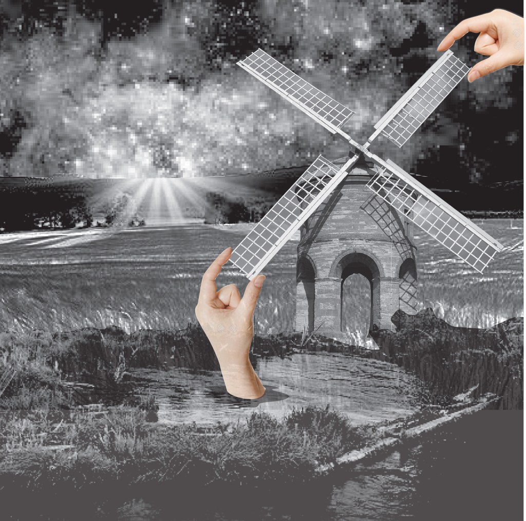
In my new collage image I chose to use black and white for everything apart from the hands. For the sky I chose to use an an image from space but to tone it down by making it greyscale. I then combined three images for the landscape to make the hills, fields and pond, and then added the windmill. I decided to convert all of these images to greyscale. I then added the hands that are placing the windmill in colour. I don’t think that my use of colour only on the hands works particularly well. I think that either the windmill needs to be in colour, or else the hands in black and white.
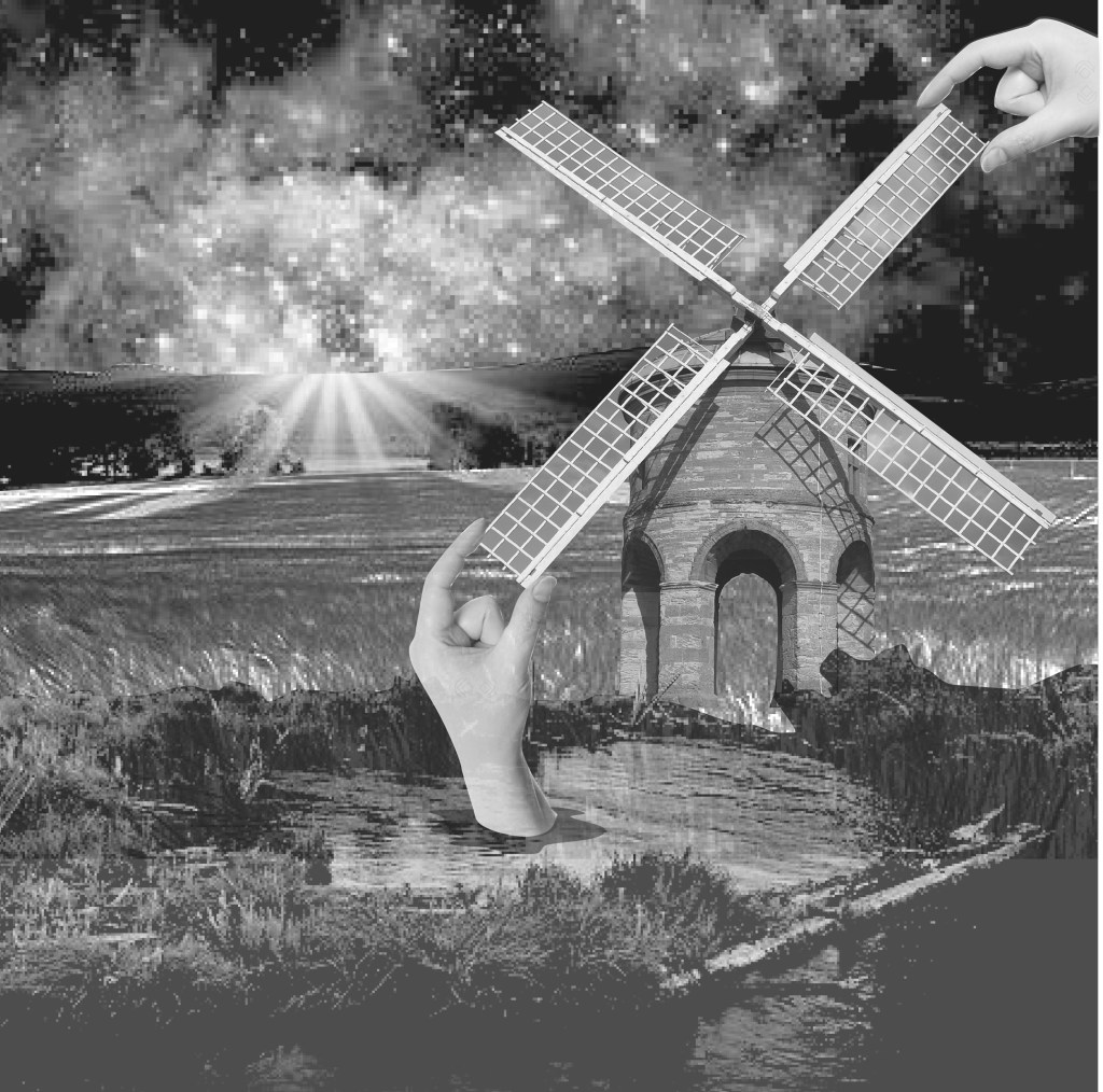
I prefer the image all in greyscale – the hands are less gratuitous. I do like this element of digital media – being able to make adjustments very quickly and easily and convert them back again if they don’t work. I like that scale is unclear in this image – is the windmill a toy, or are the hands giant.
Next I decided to try the same image with a totally different form of collage – to use something like the simple, colourful style of Hanane Kai which uses cut shapes in colourful paper to create the image. The image from Hanane Kai below is from a children’s book.
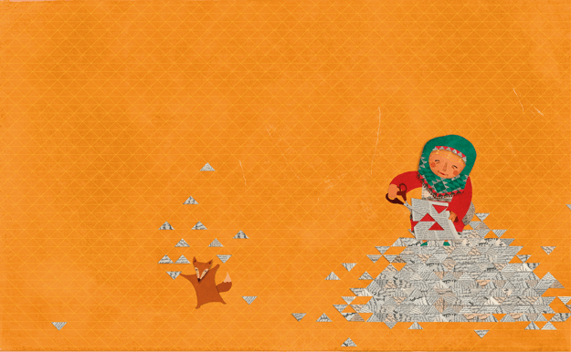
I really like the simplicity of this image – a plain background with no distractions that makes you focus on the characters. Putting the main character in the corner of the image somehow makes the composition more interesting than if the character were centered. I think that the positioning is also quite important to prevent the figures from floating around the image. The colour scheme of this image is also very simple – a few shades of orange and red, green and white.
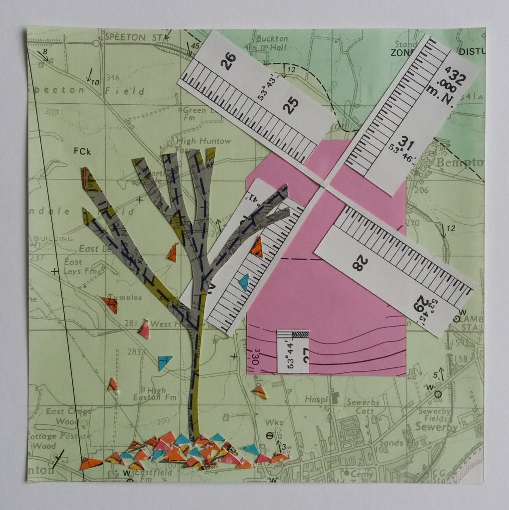
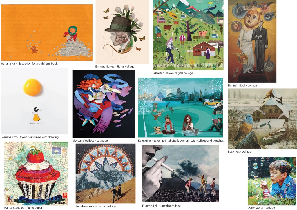
My windmill image is made from pieces of old geological maps that were being thrown away at work. I thought that I was being clever using the scale on the border of the maps for the windmill sails; however, I think that this detail detracts from the tree in the foreground. I don’t think that I had really decided what I wanted the focus of the image to be before I started making this image. I had a play in photoshop at making the colours a little more vibrant, which I think improves the image. If I were remaking the image, I think that I might make the windmill less bright, maybe a more natural grey or brown colour, so that the tree, with its brightly coloured leaves would become the focus of attention.

