The aim of this exercise is to understand how to create clear visuals that break an image down into its most important, structural elements. I chose two book cover illustrations and tried to break them down into their fundamental structural elements.

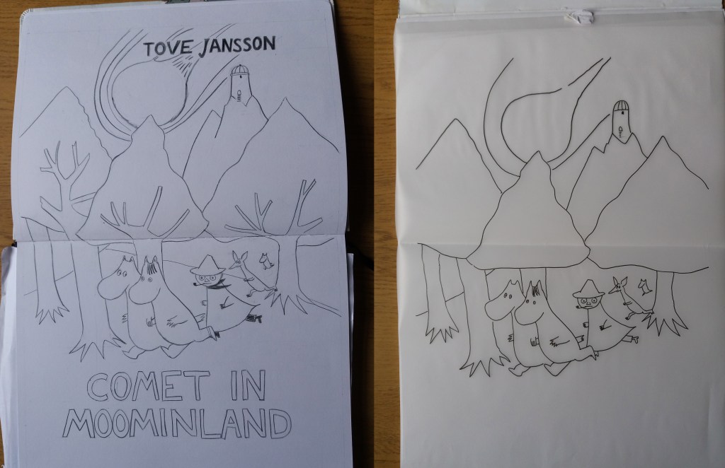
I think that some of the detail in the first image isn’t necessary – for example the tree branches. However, I think that the second image loses some of the movement of the image by oversimplifying the comet, which is a key element in the image. In the first image I used black pencil crayon for the lines, however, in all subsequent images I used a thick fine liner, which was easier to work with and produced cleaner lines.
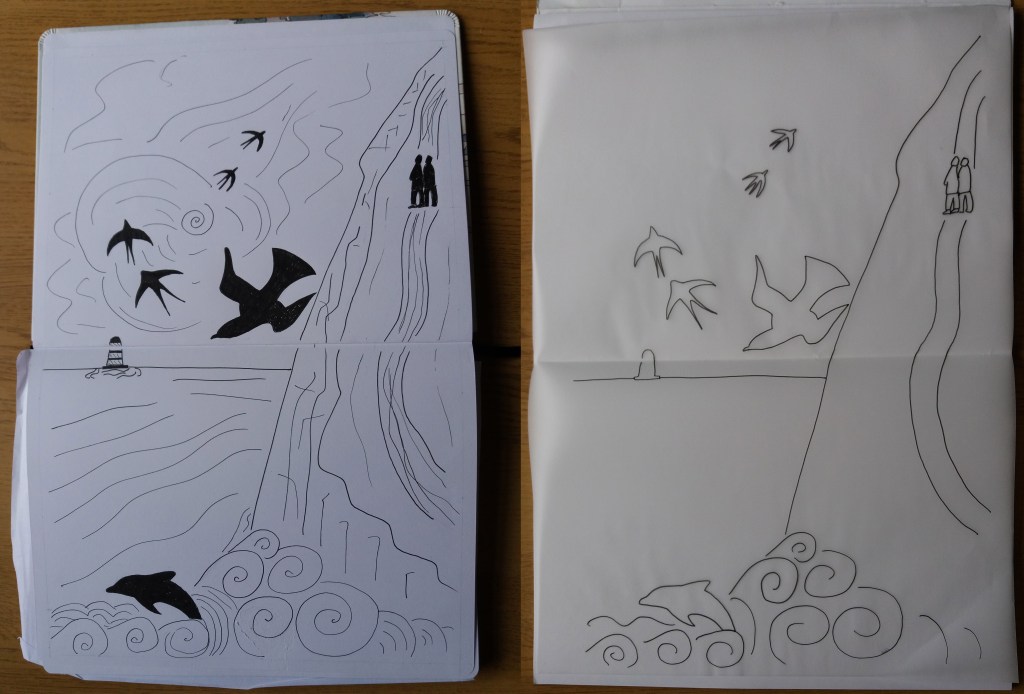
I really like the linework in the Salt Path book cover. I don’t think the very simplified image on the right works very well. The silhouetted birds, dolphin and figures somehow give the first image depth. A key element of the final illustration is the detailed linework, therefore it makes sense to show some of this in a visual aimed at clients.
