In the first part of this exercise I listened to Beethoven, senata number 15 in C sharp minor and tried to create marks that I thought conveyed the essence or mood of the piece. I found this exercise frustrating. What I created on the page looked like a mess that in no way represented the music. I started again and tried to illustrate something that for me gave a feeling of the music. I had forgotten from my childhood that I dislike this type of piano music – I find it horrible and frustrating to listen to.
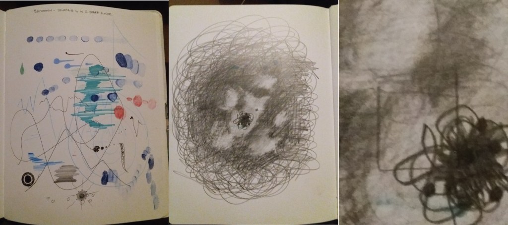
In terms of an adjective that describes the tone of the piece – I think that I would choose ‘irritating’. I think that the central part of my image best illustrates the word ‘irritating’ – where the cloudy grey meets solid lines. I chose to develop the image sticking with the same media – 5B pencil.
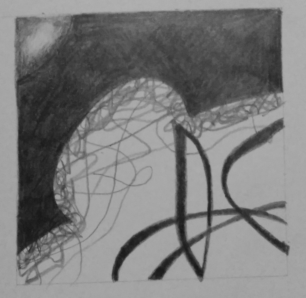
I think that the final piece is interesting. I don’t think that it is suitable for a CD cover – at least not if you want to sell any copies of the CD. I think that the final piece lacks the energy and emotion of the earlier markmaking, it’s become too stylised.
