The aim of this exercise was to take three objects (a tree, a child and a building) convert them to greyscale and experiment with composition.
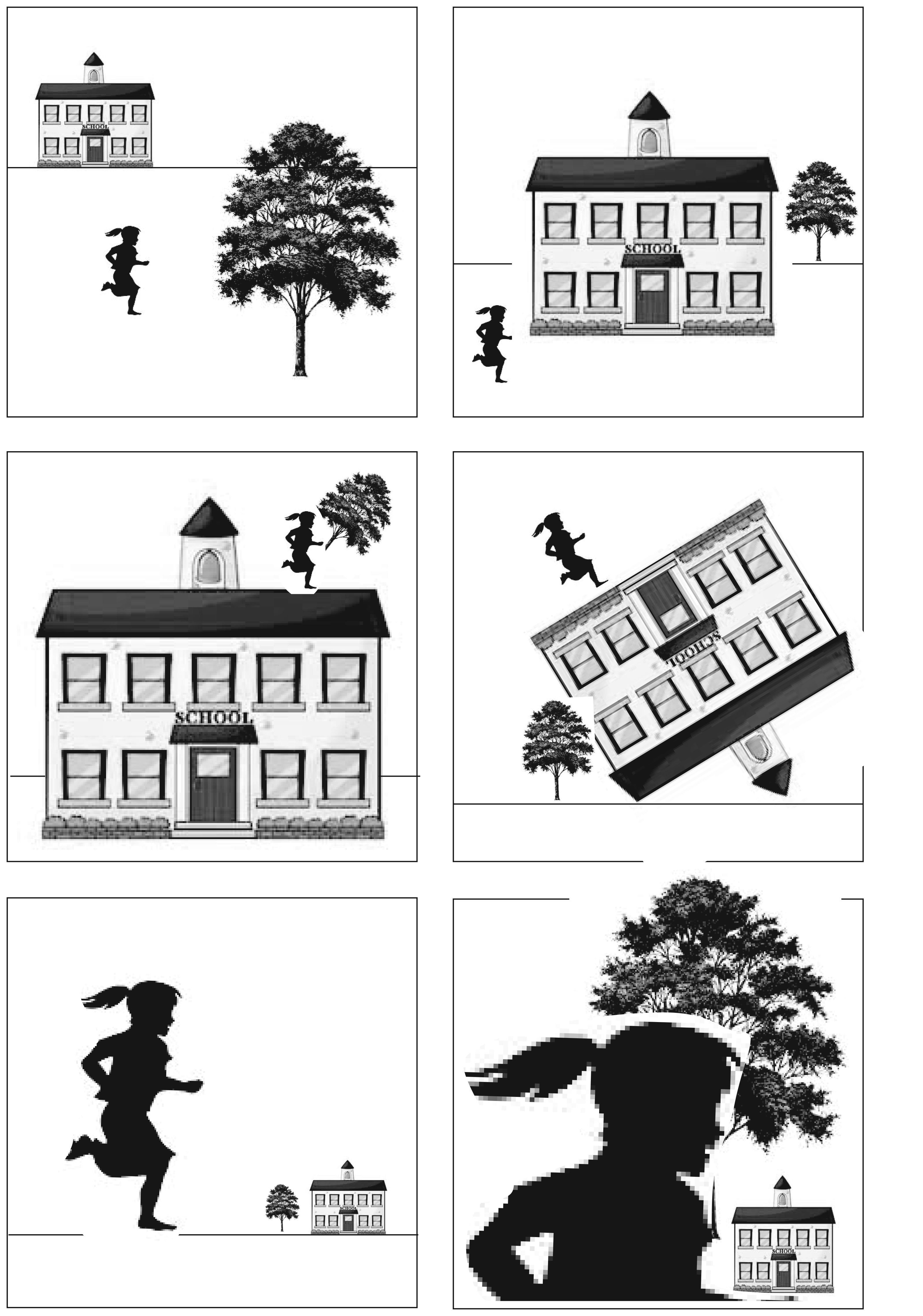
When the child is smaller than the house and tree then it makes the image look realistic – i.e. everything appears to scale. These images are quite boring; whereas I think that the images where the child is larger than the other elements are more interesting and more dynamic. In the case of the bottom left image, either the child is monstrously large, or the building and tree are toys.
When the elements of the image are aligned with the horizontal and vertical then it gives the image a feeling of order – everyting is where your brain expects it to be. When the elements are at angles to the frame rather than being aligned with the horizontal and vertical then this gives the image a feeling of chaos, or quirkiness. Things are not quite right, what has gone on to create that scene?
My favourite composition is the bottom left image where the child is large relative to the building and tree. I think that I find this image interesting because the figure, who is naturally the character in the image, is dominant. I like the possibilities of this image – what has happened to make the elements out of scale with one another?
