In the feedback for Part 2 of this course my tutor suggested many different illustrators, animators and styles for me to take a look at the work of. Having scanned through their work I chose a few illustrators to look at in more detail in order to try to understand their style and produce some sketches in a similar style.
Noma Bar
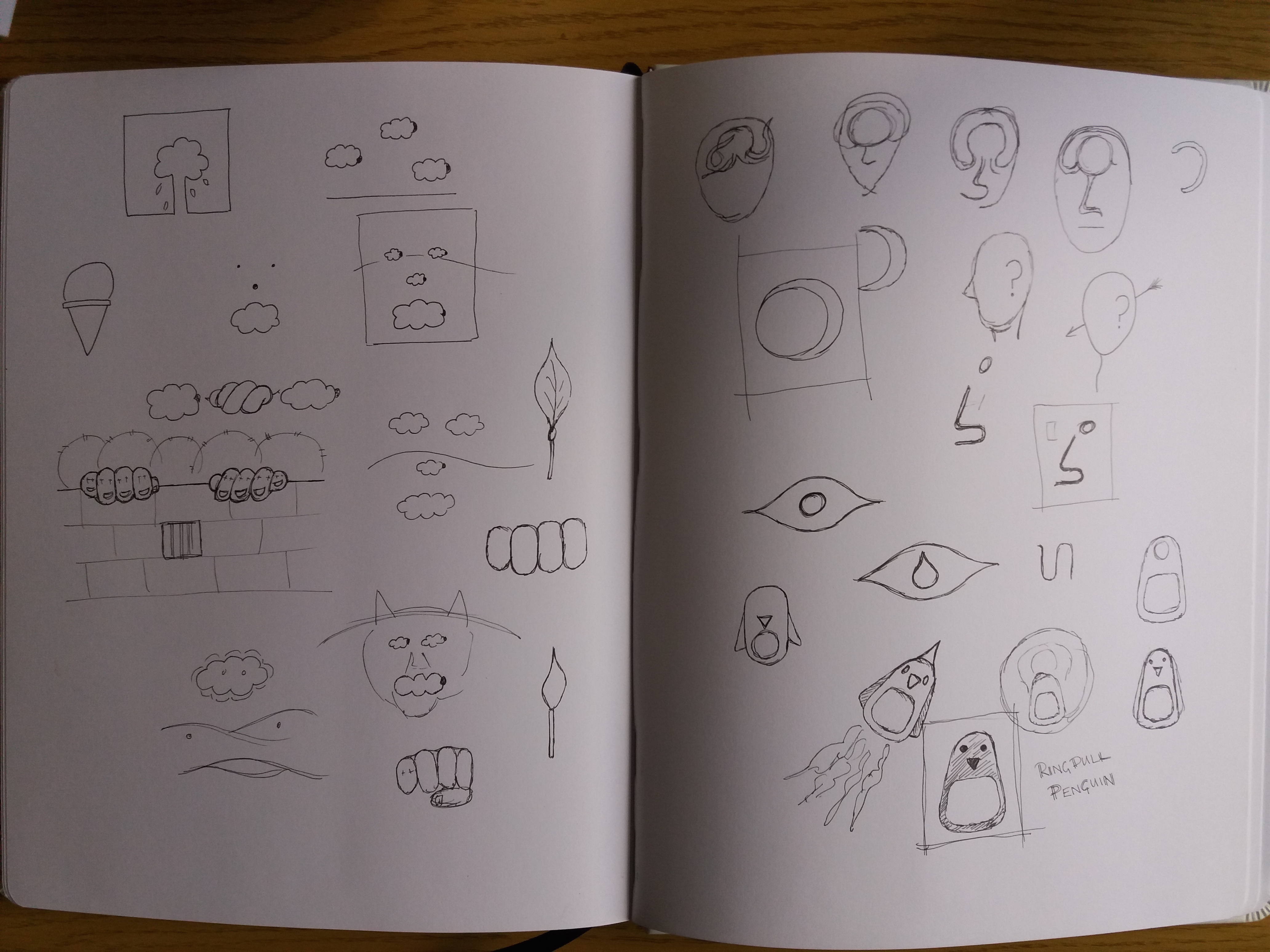
Based on the graphic style that I’ve used in some of my illustrations, and also use of metaphor, my tutor suggested taking a look into the work of Noma Bar. Noma Bar’s work looks simple but is really clever. There is usually more than one image that can be seen in each illustration – one object transforms into something else. The style is really simple and graphic and there’s typically a simple colour scheme with less than three colours. One quote that I saw from him stated that he’s aiming for ‘maximum communication with minimal elements’. Some of his work is political, some of it is witty. I decided to brainstorm ideas of objects that can be transformed into something else. My favourite from these sketches is ‘Ringpull Penguin’.
Hannah Hoch
In the ‘Choosing content’ exercise in part two I used a ‘found’ background and drew my illustration of a wartime detective on top of this. My tutor suggested taking this further and using parts of the background texture as elements of the character. He suggested taking a look at the work of Hannah Höch.
Hannah Höch used photomontage to creat whimsical images that typically feature people in some form or another. I find the images quite disturbing – partly because different elements in her images can be at very different scales, which is unsettling.
In order to have a play with this style. I decided to take ‘Ringpull penguin’ from my previous sketches and develop it further using photomontage.
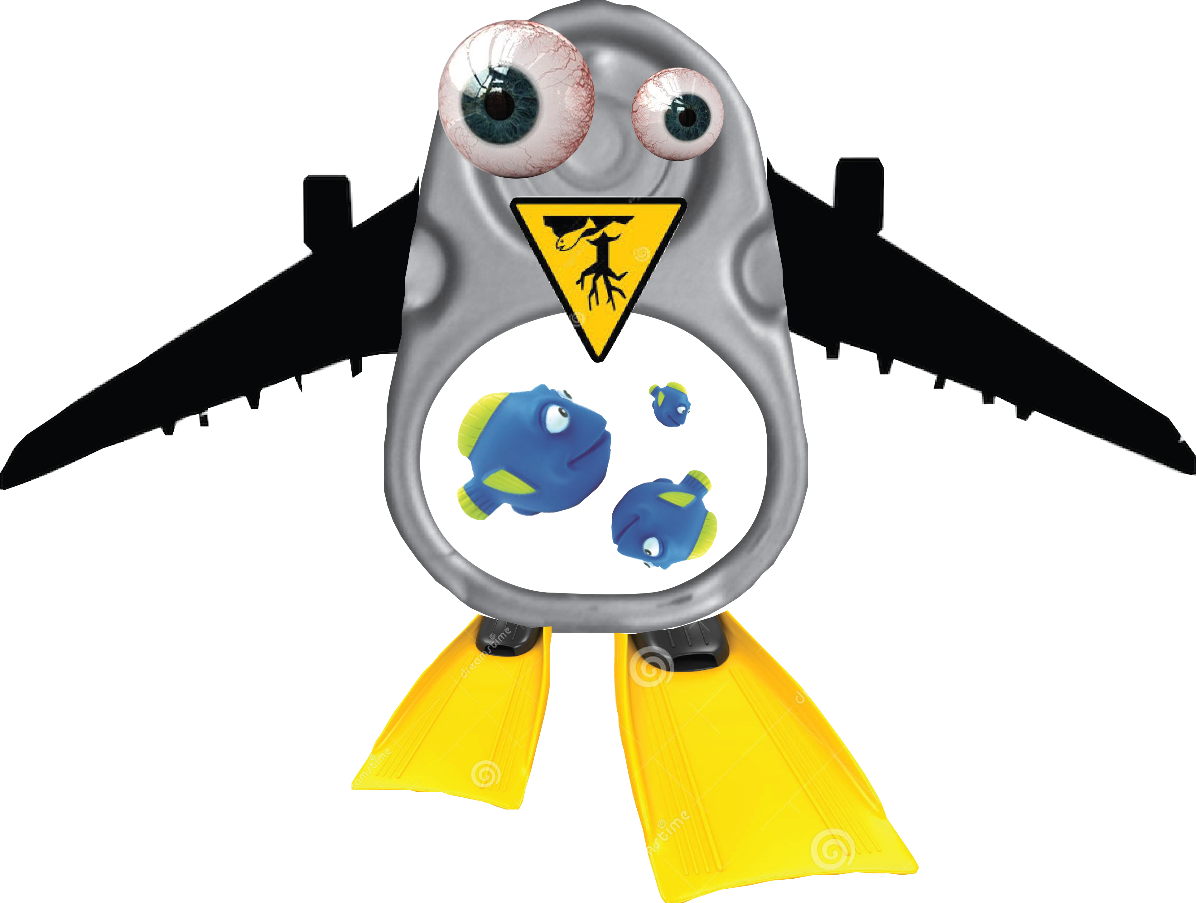
I find Ringpull Penguin quite disturbing. I did not make things as out of proportion as in the work of Hannah Höch as I already found the process of making Ringpull Penguin uncomfortable. I could imagine this style being quite powerful if you were trying to make a statement – for example in this case it could be an environmental statement about the impact of human populations on the natural world.
Op art
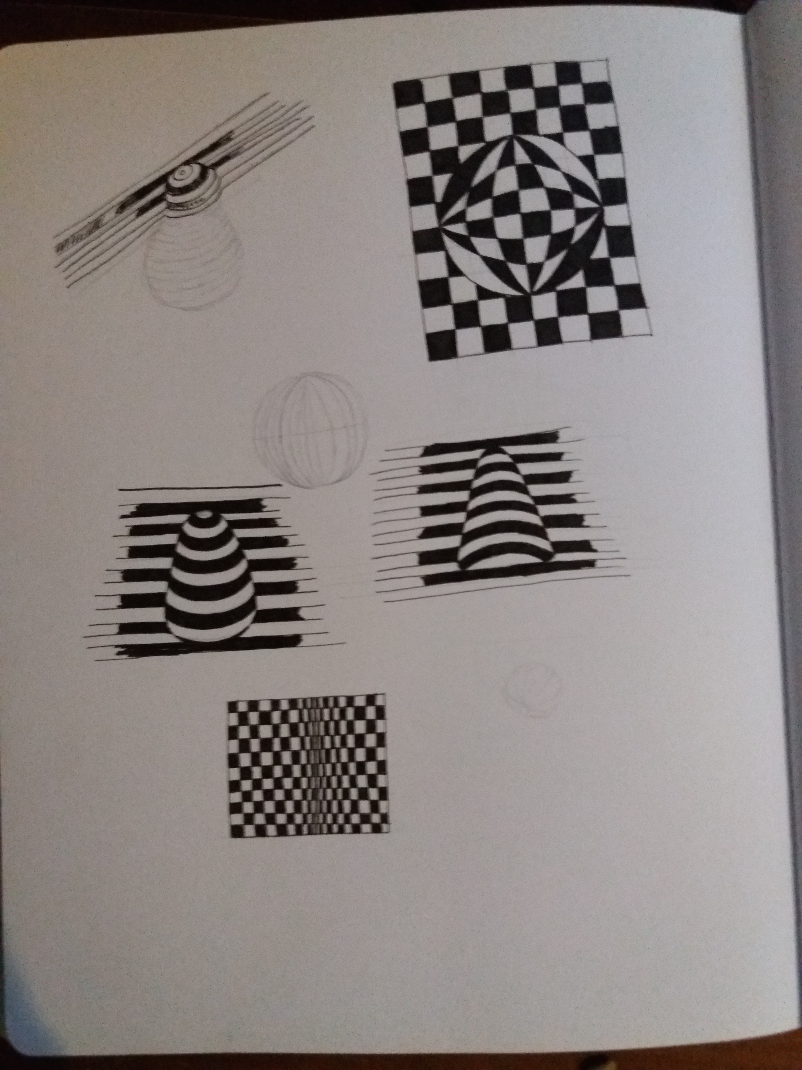
In my assignment for Part 2 I created an image of a strawberry using offset lines. My tutor suggested that it might be interesting for me to take a look into Op Art (optical art). Op Art is a form of abstract art that uses optical illusions to create special effects within an image. These special effects include making the image appear three-dimensional, hiding images withing images, or making elements of the image move. A lot of Op Art is created in black and white varying the thickness of lines, changing the scale of patterns or offsetting black and white lines. Other Op Art makes use of colours to create optical illusions. I had a play in my sketchbook with some basic Op Art techniques. I’m not sure any were particularly successful – more time and effort needed – however, I think these techniques are useful to be aware of to incorporate into future illustrations.