The aim of this exercise was to produce a line image around the word ‘sea’, then to invert the image and use shapes cut from the inverted image to fill in the original image.
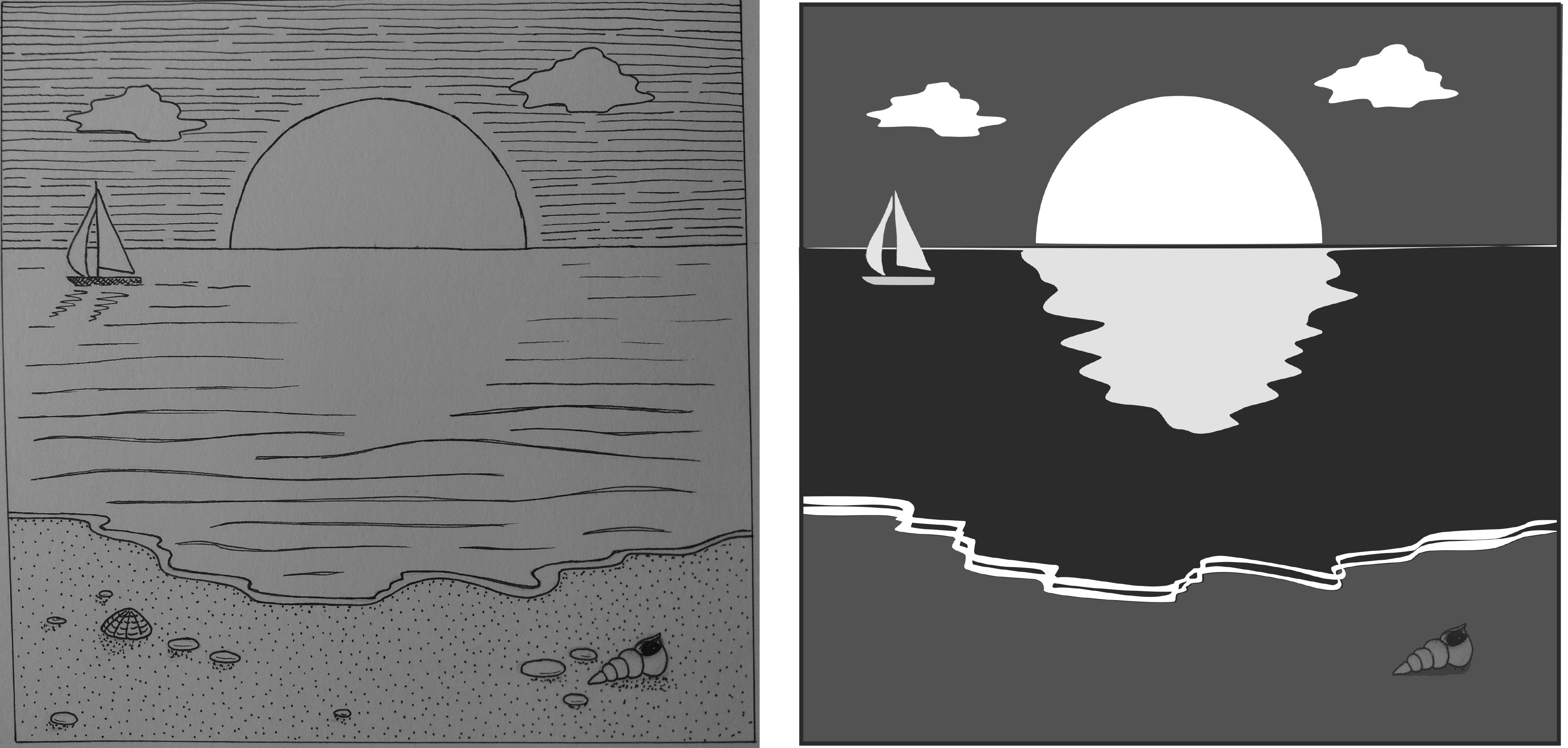
My original line image did not work well for this exercise as there were too many different marks in it. Therefore when I inverted the original image using adobe photoshop I removed a lot of these detailed marks from the image. As I didn’t have access to a printer I decided to do the ‘cutting and sticking’ using adobe illustrator.
I like how bold the final image is when compared to the original. I cheated a little by using different tones for the sea, sky and sand, rather than sticking rigidly to black and white. A disadvantage of doing this task digitally is that I lost the ragged edges and texture that I would have got from cutting and sticking paper.
The final image has a very different feel to the original – day has turned to night and the sun has become the moon. The final image reminds me of a monochrome version of the types of images used on the US National Park posters that I discussed in an earlier post – simple, graphic, bold.
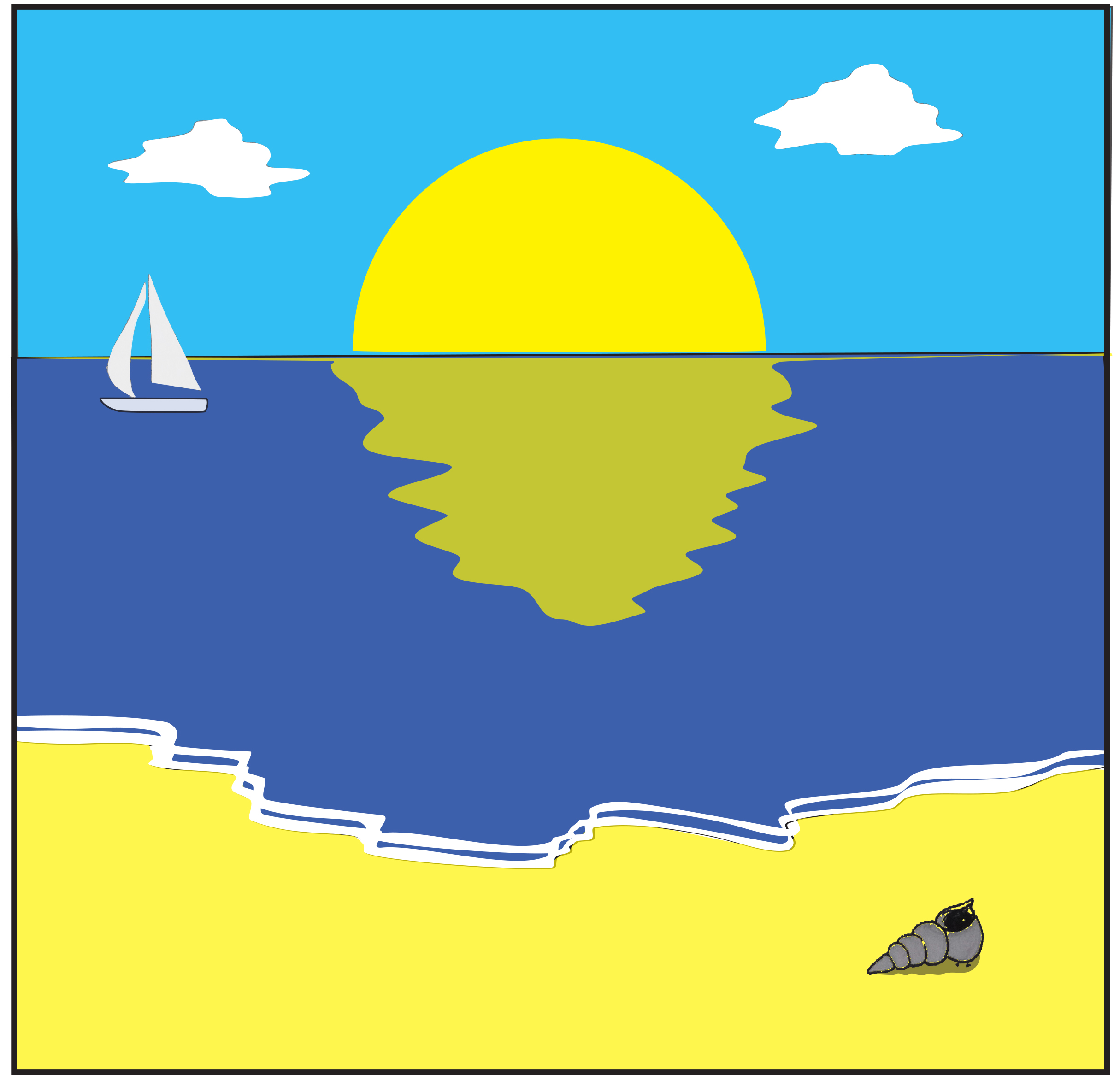
As I produced the final image in illustrator I decided to have a quick play with converting the monochrome image to colour but with a limited colour palette.
