The purpose of this exercise was to collect reference material in order to build up a picture of the 1950s from a visual perspective and then to produce an illustration that would give a modern teenager an idea of the 1950s.
The 1950s
Prior to doing this research I had thought of the 1950s as being quite a boring and drab post war era. However, my research revealed that many of the bold colourful designs of the 1960s were beginning to evolve albeit with a somewhat subdued colour pallette.
The 1950s seems to be an era in which people were beginning to have disposable income. House interiors are becoming more colourful; furniture is sleek and no longer purely functional; and colourful geometric patterns are common for wallpaper and soft furnishings.
Much of the advertising that I found from the 1950s was for the latest household gadgets. Advertising is bold and colourful and relies on illustration rather than photography. My main impressions of the 1950s from advertising are that everybody is terrifyingly happy despite the grotesque gender stereotyping that is being depicted.
Research
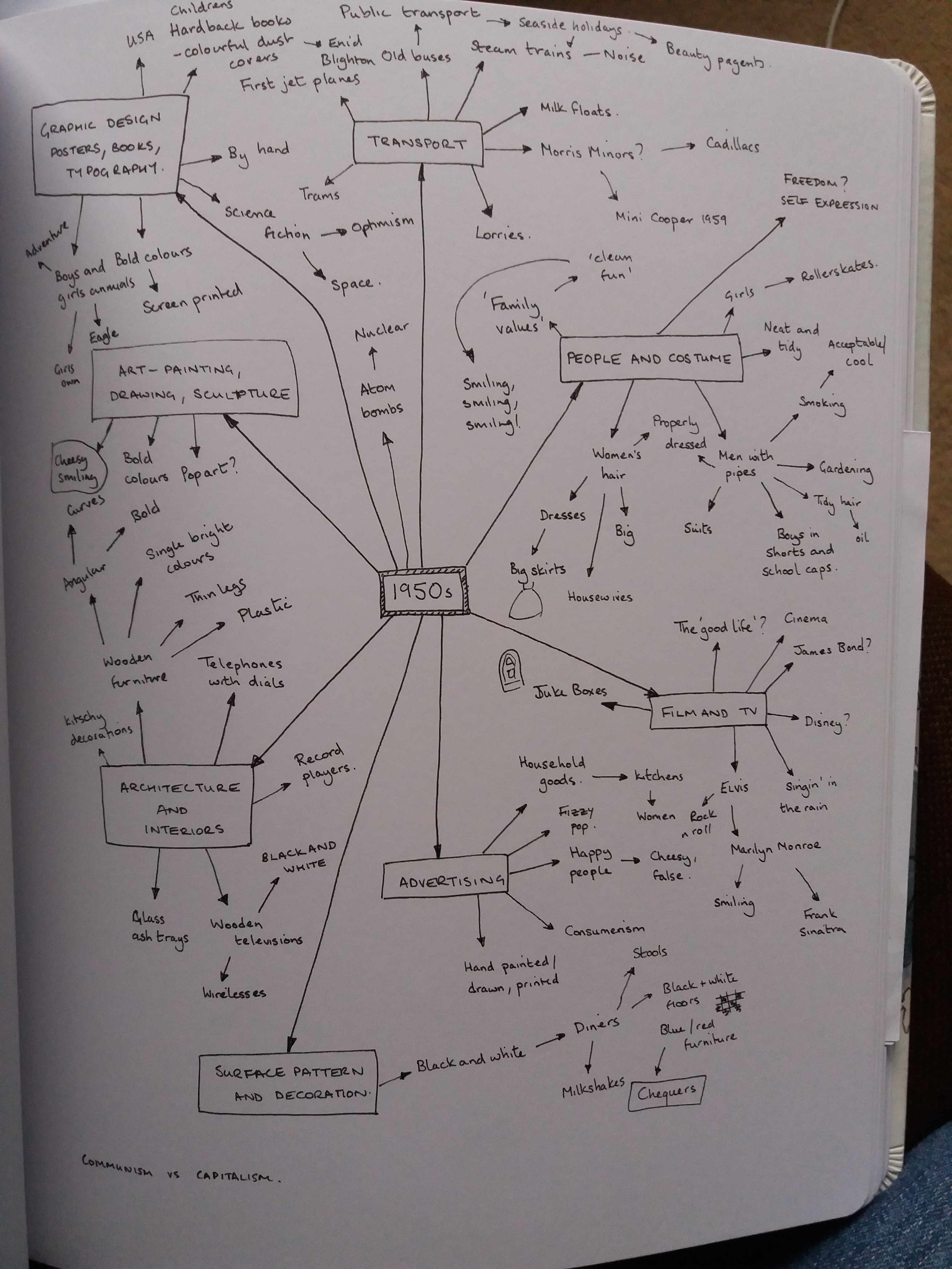
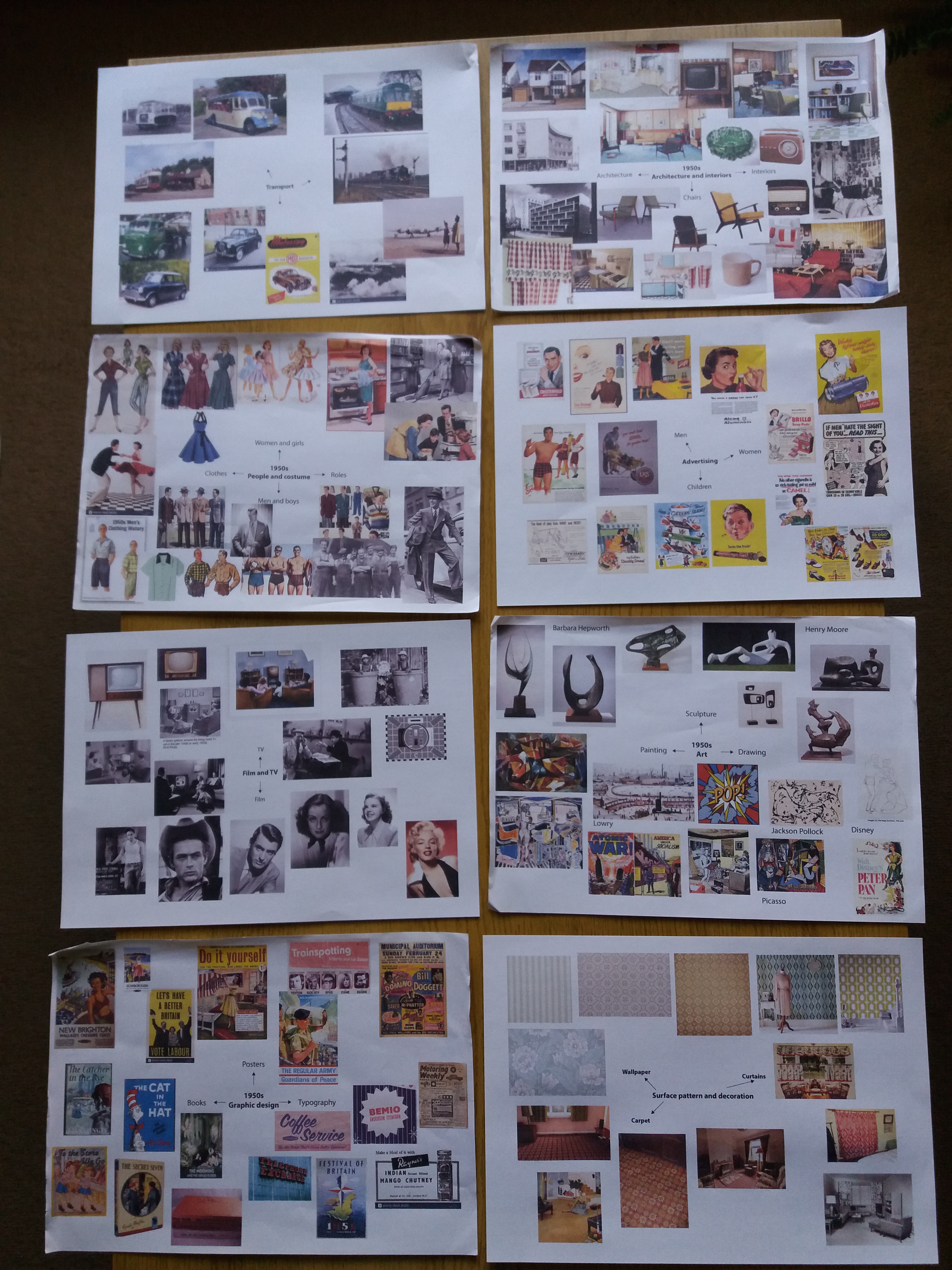
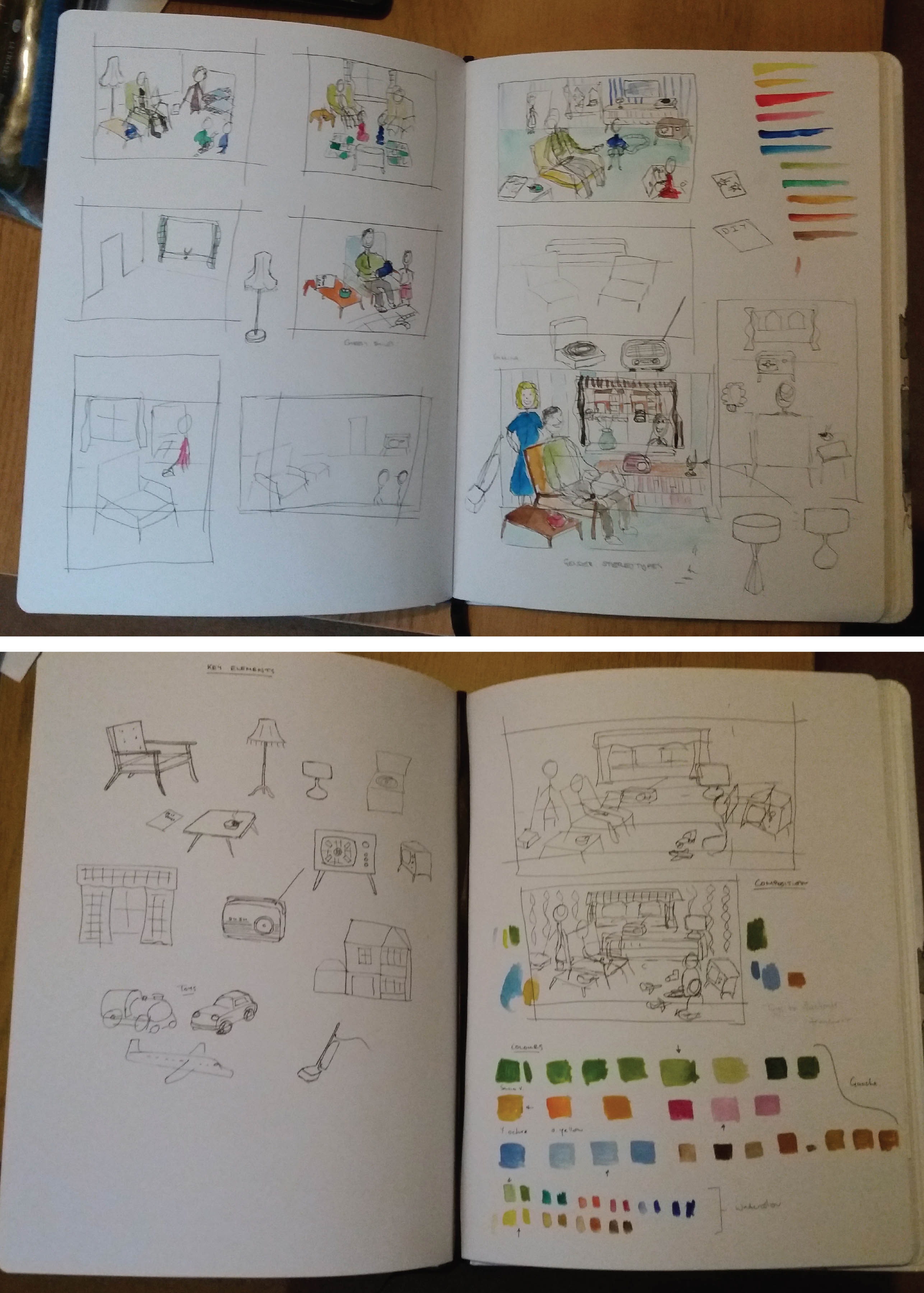
I began by brainstorming my pre-existing knowledge of the 1950s before pulling together moodboards on the topics of: people and costume; architecture and interioirs; art; graphic design; advertising; transport; film and TV; and surface pattern.
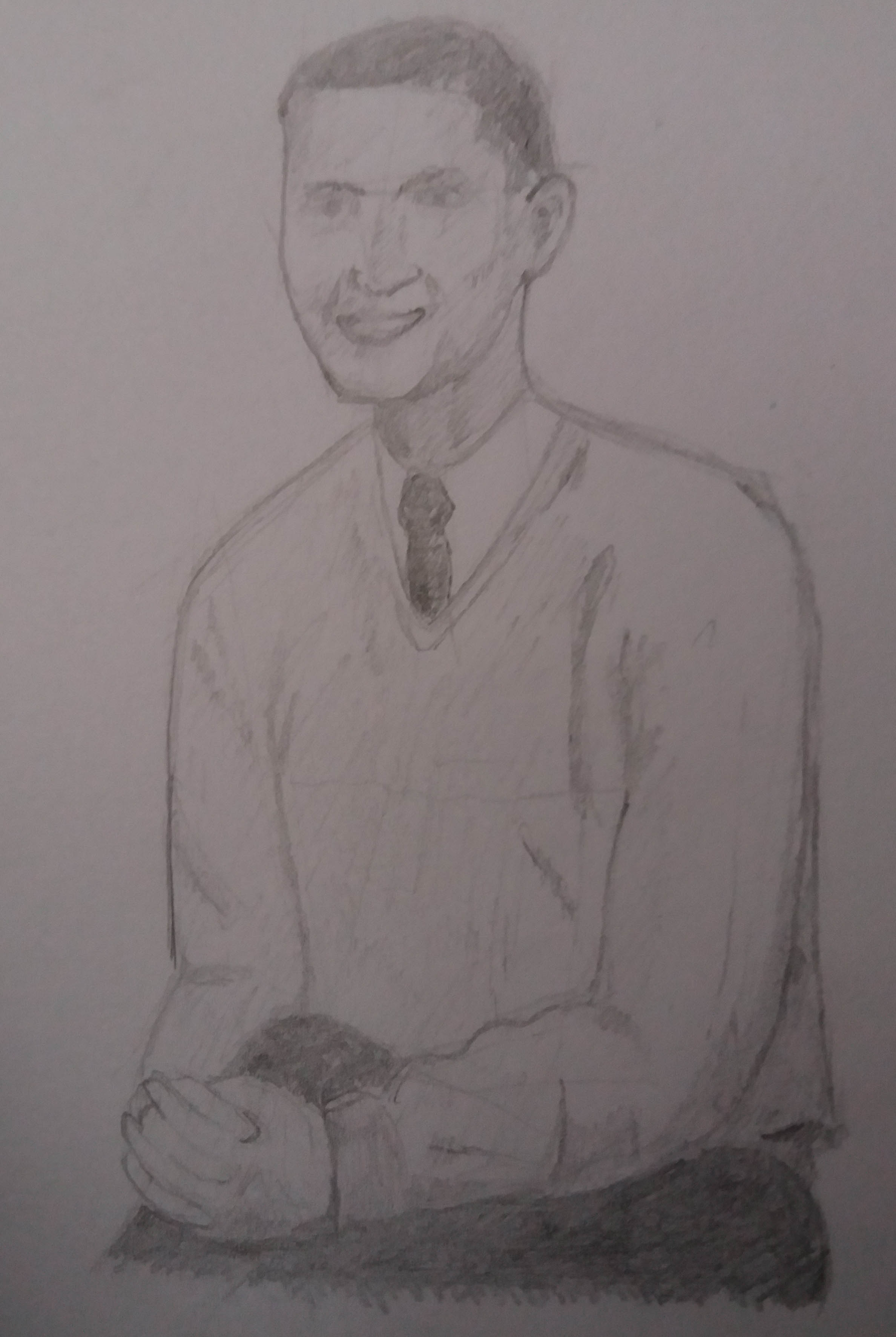
I also incorporated 1950s themes into my sketching practice.
One of my aims with this course is to experiment with different media, so I bought myself some watercolour paints and began to play around with using these to add colour to pen and ink drawings. I really liked how quickly they enabled colour to be added to rough sketches.
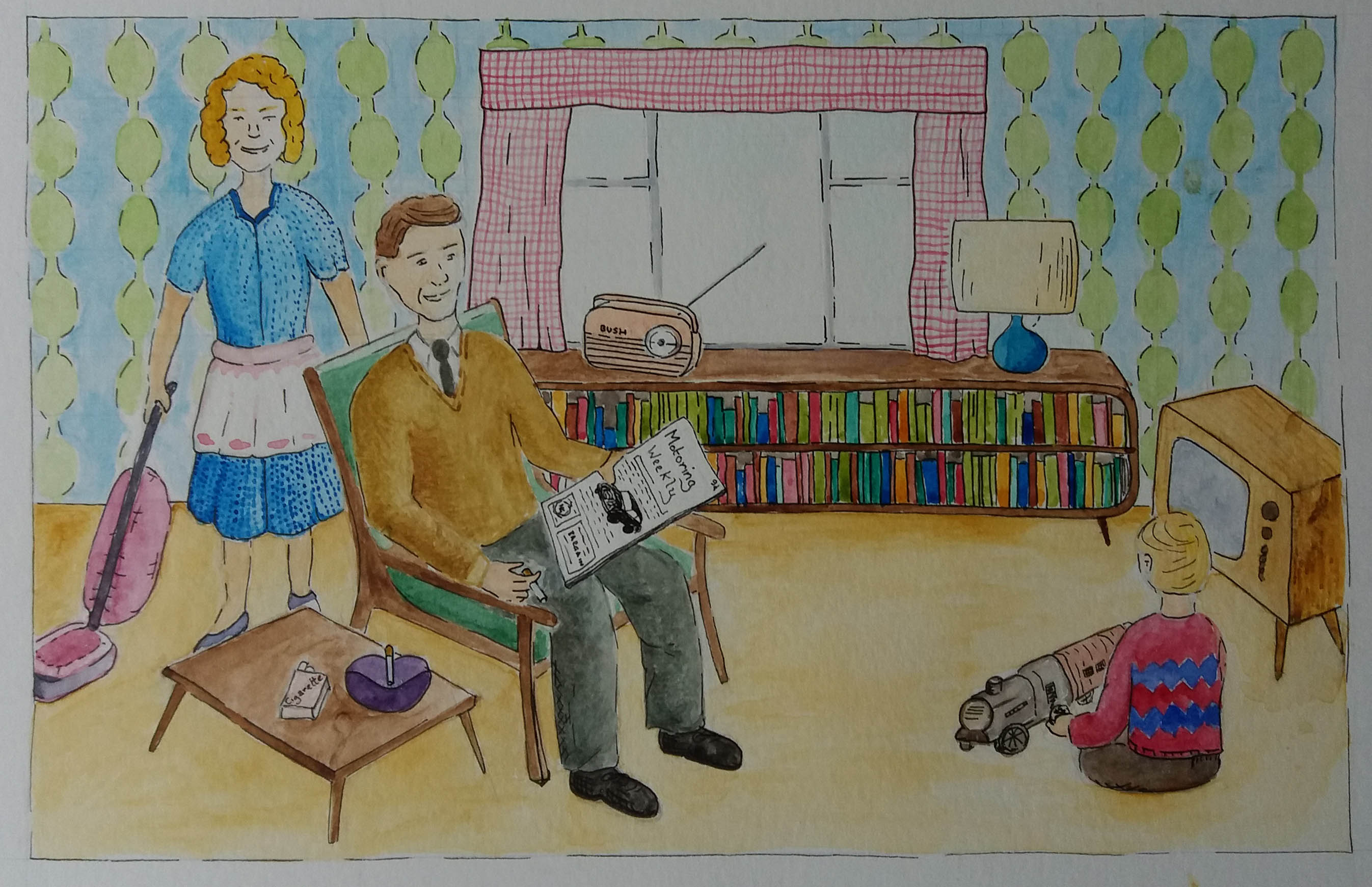
I thought about key objects that I felt represented the 1950s. I considered a range of compositions for the piece. I was keen to include reference to the gender stereotyping that I had discovered in 1950s advertising and the ubiquitous smiling. I considered different ways to illustrate objects from outside the home, for example by showing architecture and transport through the window or having a child play with toy cars and trains. In the end I decided to include the car in the magazine that the man is reading and a toy steam train that the child is playing with. In my draft compositions I also considered getting elements of 1950s art into the illustration by for example including a Hepburn style ornament, or some other artwork. However, this disapeared in the final piece because it felt too busy.

The original brief was to make an illustration of somebody sitting in a chair surrounded by typical artefacts to give a teenager an idea of the 1950s.
I really enjoyed using watercolours for this illustration. Originally I had planned to exclusively use paint; however, I ended returning to my ‘safety net’ of black ink in order to highlight different objects. I think that the illustration probably does a better job of illustrating gender stereotypes than really answering the brief. I think that I should have gone the whole hog on 1950s gratuitous smiling. Retrospectively I’m not sure that this scene would necessarily appeal to a teenage audience and maybe I should have opted for the character to be a teenager in a different setting, maybe their bedroom. If I were to spend more time on the illustration I think that it would be a fun challenge to make the illustration in the style of a 1950s advertising poster.
